- All Instrument Types
- Indices
- Equities
- ETFs
- Funds
- Commodities
- Currencies
- Crypto
- Bonds
- Certificates
Please try another search

Gold Miners Are Waiting On This Chart

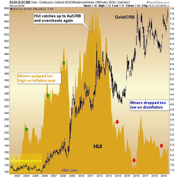
It’s not a chart of nominal HUI with upside technical targets. Rather, it’s a companion to other charts we’ve been reviewing over the last several months showing the under-valuation of the gold stock sector relative to gold’s performance vs. cyclical assets/markets. For example, gold has risen strongly vs. the CRB index and that is a sector fundamental under valuation.
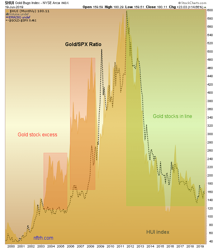
But on the macro picture, do you think that maybe gold stocks would benefit if gold manages to turn up vs. the U.S. stock market? This chart appears to hold the key. HUI has been in a beautiful correlation to Gold/SPX since the 2011 top. To this point, the ratio has not turned up but you can see why I harp so much on the need for Au/SPX to get in gear. If it does, and joins Au/CRB and others, hang on to your hats and prepare for some upside targeting beyond the bounces of the last few years. We’d then go from identifying value mode to acquiring targets mode.
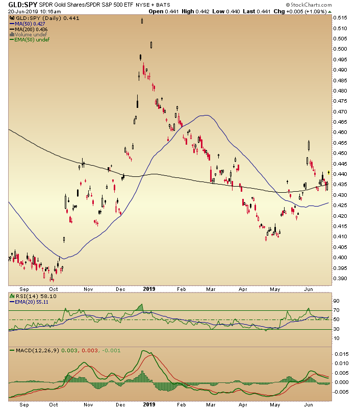
For a little perspective, here is the GLD/SPY ratio (daily chart) nearly an hour after Thursday’s open. It appears to be breaking upward from a bull flag and a hold of the SMA 200. If it holds up, it could be an initial hint about the above scenario unfolding.
Related Articles

While market cap weighting is still the go-to for many investors due to its low cost and low turnover, it's becoming increasingly fragile these days thanks to the concentration...

The oldest ETF, the SPDR S&P 500 Trust, had the most inflows in February. The $14.6 billion in inflows allowed it to surpass the Vanguard S&P 500 ETF. Which ETFs saw the...

Leveraged exchange-traded funds (ETFs) substantially increase the potential reward of an investment by affording investors the chance to generate double or triple the returns of...
Are you sure you want to block %USER_NAME%?
By doing so, you and %USER_NAME% will not be able to see any of each other's Investing.com's posts.
%USER_NAME% was successfully added to your Block List
Since you’ve just unblocked this person, you must wait 48 hours before renewing the block.
I feel that this comment is:
Thank You!
Your report has been sent to our moderators for review


Add a Comment
We encourage you to use comments to engage with other users, share your perspective and ask questions of authors and each other. However, in order to maintain the high level of discourse we’ve all come to value and expect, please keep the following criteria in mind:
Enrich the conversation, don’t trash it.
Stay focused and on track. Only post material that’s relevant to the topic being discussed.
Be respectful. Even negative opinions can be framed positively and diplomatically. Avoid profanity, slander or personal attacks directed at an author or another user. Racism, sexism and other forms of discrimination will not be tolerated.
Perpetrators of spam or abuse will be deleted from the site and prohibited from future registration at Investing.com’s discretion.