- All Instrument Types
- Indices
- Equities
- ETFs
- Funds
- Commodities
- Currencies
- Crypto
- Bonds
- Certificates
Please try another search

Chart Of The Week: Eurozone Credit Risk

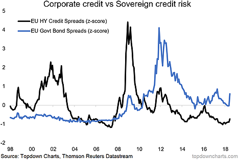
This week it's a look at credit risk pricing in the eurozone. This is a chart I've been using a lot in recent months, of course as of the last week it's looking a bit more interesting! The reason why I've highlighted this chart in the past is that post-financial crisis, sovereign credit risk pricing did calm down, but at a new plateau. In contrast, corporate credit risk pricing just got back to business, down to pre-crisis lows.
The chart comes from a report on eurozone equities, where I discussed the revised outlook based on changing signals from valuation, risk pricing, economic sentiment, and the earnings/macro backdrop. I think this chart is certainly one of the key risk monitor charts investors should have on their radar.

Briefly, on the actual detail, the black line is European high yield credit spreads, and the blue line is the spread between the benchmark eurozone 10-year government bond yield, and that of Germany. For both indicators, I have taken the Z-Score in order to standardize them and put them on a comparable scale.
The reason I think this chart is so important, is firstly I would say that European high yield credit risk pricing is simply too complacent at these levels. We know that obviously the ECB played a part here in that QE purchases of corporate bonds have artificially suppressed credit spreads. But the key is the relative aspect (corporate credit looks too relaxed vs sovereign credit risk pricing). And the final point to note, tactically speaking, is that flareups in these indicators can take some time to play through, so it's probably too soon to call the all-clear on the current flareup.
Related Articles

When it comes to the economy, we’re in a bit of a weird spot: The data tells us that, despite inflation fears, interest rates are likely to fall in the year ahead. Falling rates...

Telegram Group Inc. is a globally recognized messaging service company, offering a cloud-based mobile and desktop messaging application. Known for its strong focus on security,...

Many investors regard passively managed index mutual funds or ETFs as favorable options for stock investing. However, they may also find that actively managed funds offer...
Are you sure you want to block %USER_NAME%?
By doing so, you and %USER_NAME% will not be able to see any of each other's Investing.com's posts.
%USER_NAME% was successfully added to your Block List
Since you’ve just unblocked this person, you must wait 48 hours before renewing the block.
I feel that this comment is:
Thank You!
Your report has been sent to our moderators for review


Add a Comment
We encourage you to use comments to engage with other users, share your perspective and ask questions of authors and each other. However, in order to maintain the high level of discourse we’ve all come to value and expect, please keep the following criteria in mind:
Enrich the conversation, don’t trash it.
Stay focused and on track. Only post material that’s relevant to the topic being discussed.
Be respectful. Even negative opinions can be framed positively and diplomatically. Avoid profanity, slander or personal attacks directed at an author or another user. Racism, sexism and other forms of discrimination will not be tolerated.
Perpetrators of spam or abuse will be deleted from the site and prohibited from future registration at Investing.com’s discretion.