- All Instrument Types
- Indices
- Equities
- ETFs
- Funds
- Commodities
- Currencies
- Crypto
- Bonds
- Certificates
Please try another search

Bonds Could Be The Fourth Quarter Trade Of 2014

If you have been paying close attention to the stock market, market internals/breadth, and bonds for the past three months, you’ve likely come to the same conclusion that I have. The US stock market is showing signs of severe weakness with the market breadth and leading indicators pointing to a sharp correction for stock prices.
With fewer stocks trading above their 50 and 200 day moving averages each week, while the broad market S&P 500 index continues to rise, this bearish divergence is a red flag for long term investors. When a handful of large-cap stocks are the only things propelling the stock market higher while the majority of small-cap stocks are falling, you should keep new position sizes smaller than normal and start moving your protective stops up to lock in gains/reduce losses in case the market rolls over sooner than later.
Small cap stocks are typically a leading indicator of the broad market. The Russell 2000 index is what investors should keep a close eye on because it’s the index of small-cap stocks. Since March of this year, the Russell 2000 been trading sideways and actually making new lows. This tells us that big-money speculative traders are rotating out of the stock market and into other investments like high dividend paying stocks, blue chips, and likely bonds.
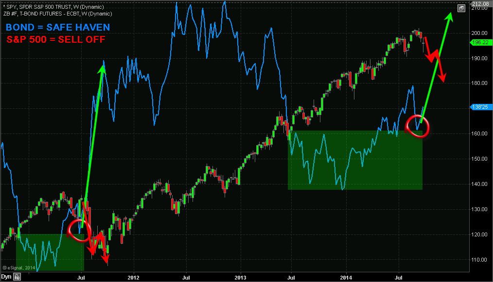
Looking at the chart below I have overlaid the S&P 500 index (via the SPDR S&P 500 (ARCA:SPY)) and the price of bonds. History has a way of repeating itself. Although it may never feel the same and the economy may be different, the price action of investments have the tendency to repeat.
In 2011 we saw the stock market and bonds form specific patterns. These patterns clearly show that money was rotating out of the stock market and into bonds. During times of uncertainty in the stock market, money has the tendency to move into bonds, as they are known as a safe haven. Bonds tend to reverse before the stock market does, so if you have never tracked the price chart of bonds before, then you should start.
From late 2013 until now, bonds and the stock market have repeated the same price patterns from 2011. If history is going to repeat itself, which the technical and statistical analysis is also favoring, we should see the stock market correct 18% to 30% in the near future. If this happens, bonds will rally to new highs.
It’s important to realize the chart above is weekly. Each candle represents five trading days, and four candles represents one month. So while this chart points to an imminent selloff from a visual standpoint, keep in mind this could take 2 to 3 months to unfold, or longer. The market always has a way of dragging things out. If the market can’t shake you out, it will wait you out.
So if you are short the market or planning to short the market, be very cautious as it could be choppy for the next several weeks and possibly months before price truly breaks down and we see price free-fall.
Related Articles

When it comes to the economy, we’re in a bit of a weird spot: The data tells us that, despite inflation fears, interest rates are likely to fall in the year ahead. Falling rates...

Telegram Group Inc. is a globally recognized messaging service company, offering a cloud-based mobile and desktop messaging application. Known for its strong focus on security,...

Many investors regard passively managed index mutual funds or ETFs as favorable options for stock investing. However, they may also find that actively managed funds offer...
Are you sure you want to block %USER_NAME%?
By doing so, you and %USER_NAME% will not be able to see any of each other's Investing.com's posts.
%USER_NAME% was successfully added to your Block List
Since you’ve just unblocked this person, you must wait 48 hours before renewing the block.
I feel that this comment is:
Thank You!
Your report has been sent to our moderators for review


Add a Comment
We encourage you to use comments to engage with other users, share your perspective and ask questions of authors and each other. However, in order to maintain the high level of discourse we’ve all come to value and expect, please keep the following criteria in mind:
Enrich the conversation, don’t trash it.
Stay focused and on track. Only post material that’s relevant to the topic being discussed.
Be respectful. Even negative opinions can be framed positively and diplomatically. Avoid profanity, slander or personal attacks directed at an author or another user. Racism, sexism and other forms of discrimination will not be tolerated.
Perpetrators of spam or abuse will be deleted from the site and prohibited from future registration at Investing.com’s discretion.