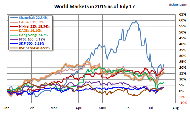
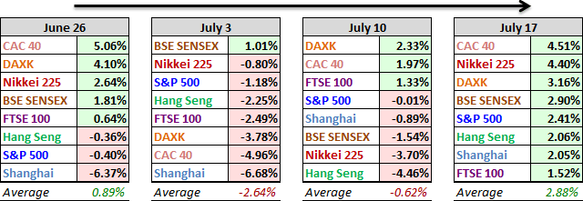
With Greece now a back-page story, the past week, on a collective basis, was the third best weekly advance so for this year for our world market focus group. All eight were in rally mode with an average gain of 2.88%. FYI, the second best was 3.37% for the week ending on January 23rd, and the best was 3.63% for the week ending April 10th. France's CAC 40 took first place with a 4.51% gain. But probably the most watched of the eight was China's Shanghai Composite, which paused its recent plunge with a 2.05% weekly gain.
Here is an overlay of the eight for a sense of their comparative performance so far in 2015.
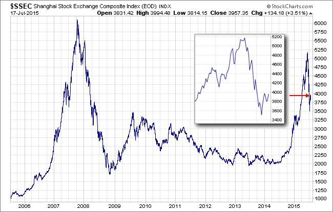
Let's take a closer look at the Shanghai over the past nine years. Below is a log-scale daily chart illustrating the bubble that peaked in 2007 and the rally that started last year. The plunge from the 2015 peak has been astonishingly swift and severe. The rally this past week has boosted hopes the worst is over. But a comparison with 2007-2008 suggests skepticism.
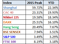
Here is a table of the 2015 data performance, sorted from high to low, along with the interim highs for the eight indexes. All eight indexes are in the green, with China still remaining at the top despite its stunning sell-off.
A Closer Look at the Last Four Weeks
The tables below provide a concise overview of performance comparisons over the past four weeks (through year's end) for these eight major indexes. We've also included the average for each week so that we can evaluate the performance of a specific index relative to the overall mean and better understand weekly volatility. The colors for each index name help us visualize the comparative performance over time.
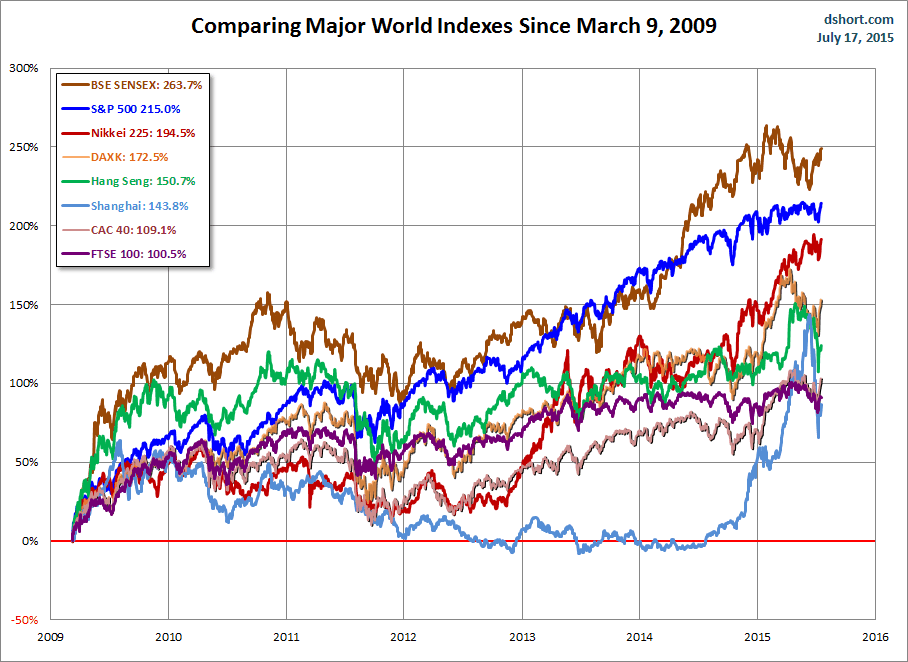
The chart below illustrates the comparative performance of World Markets since March 9, 2009. The start date is arbitrary: The S&P 500, CAC 40 and BSE SENSEX hit their lows on March 9th, the Nikkei 225 on March 10th, the DAX on March 6th, the FTSE on March 3rd, the Shanghai Composite on November 4, 2008, and the Hang Seng even earlier on October 27, 2008. However, by aligning on the same day and measuring the percent change, we get a better sense of the relative performance than if we align the lows.
A Longer Look Back
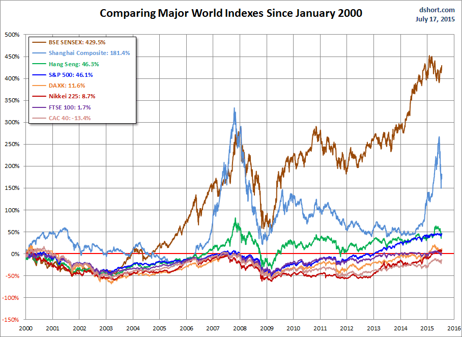
Here is the same chart starting from the turn of 21st century. The relative over-performance of the emerging markets (Shanghai, Mumbai SENSEX and Hang Seng) up to their 2007 peaks is evident, and the SENSEX remains by far the top performer. The Shanghai, in contrast, formed a perfect Eiffel Tower from late 2006 to late 2009.
Check back next week for a new update.

