Former Budget Director of the White House, David Stockman, ranted and raved as follows on April 22, 2015
“There are no markets left in any meaningful sense of the word – just a raging casino infected with the madness of the crowds and the central bank pied pipers who mesmerize them. Every day there are new confirmations of the mania. Last night, for instance, the Shanghai stock market closed up another 2.4%, meaning that it is now 114% above its level of just 9 months ago!“
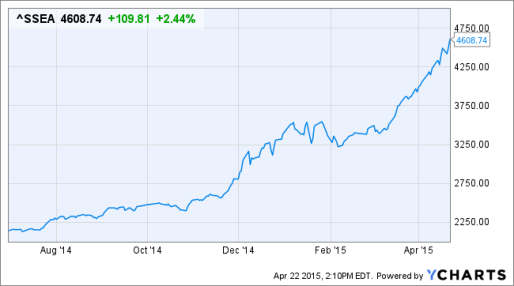
Not only the price movements of stocks and stock indexes run in 3 distinct phases:
1. Sideways movements / consolidations, in which period not much can be done as price increases are not sustainable while prolonged corrections dominate.
2. Strong upward trends / boom phases, in which the price increases strongly without major pullbacks reaching new highs in short times.
3. Strong downward trends / bust phases, which occur mostly after strong upward trends or after negative fundamental developments.
These 3 superior trends are visible especially with the NASDAQ index: 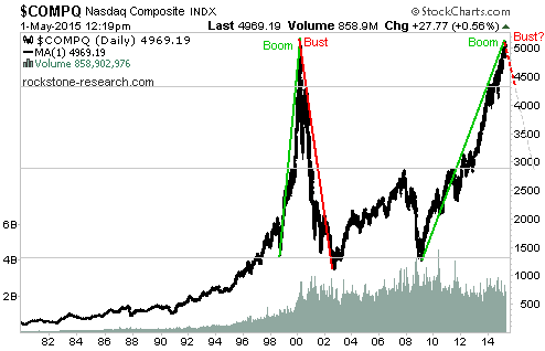
The Dow Jones index does not move as concise as the NASDAQ, but the 3 price phases (especially the sideways movement) become the more obvious in detail: 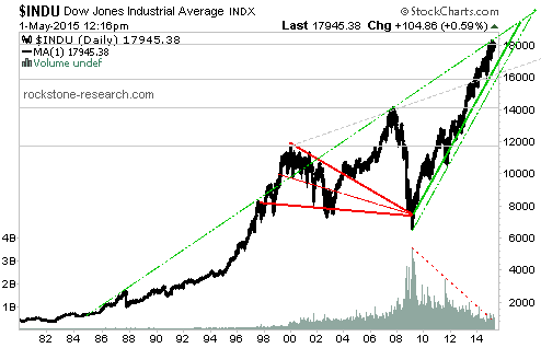
Between 1997-2011, the DOW moved sideways respectively consolidated within the limiting legs of the (red) triangle. At the end of the triangle, approximately 3 / 4 before the triangle`s apex, the price typically starts a so-called breakout, whereas classically a so-called pullback to the former resistance follows in order to test and potentially confirm it as new support (in order for a new and sustainable upward trend to start thereafter).
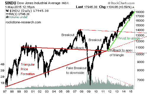
As per above chart of the DOW, a breakout and pullback occurred between 2006-2009, whereas the pullback was not able to hold on the (red) triangle leg; hence the price turned into a breakout to the downside in late 2008 / early 2009. In retrospect, this breakout to the downside can be classified as a so-called fake breakout to the downside; as it only occurred for short time before rebounding back into the triangle. In 2011, new breakouts and pullbacks were attempted and finally completed successfully as the price started to thrust to the upside (after the apex was confirmed as support). As per definition, a thrust is the final movement out of a triangle: either a strong and fast upward trend or an appropriate downward trend. As the DOW has started to rise after reaching the apex in 2012, this movement can now be classified as a thrust. However, the question now is: How long does a thrust continue? As per definition, the goal of a thrust is to transform the resistive high of the previous triangle (incl. breakout; thus approximately 14,000 points) into new support – in order for a new and sustainable upward trend to start thereafter. Because no pullback occurred after the rise above the resistive 14,000 level, this level has not been tested and confirmed as new support. This probably means that the current upward trend has been built on sand and that a pullback to the 14,000 level must occur eventually. For such reasons, I value it as more probable the DOW heading for a correction soon in order to catch up for matters neglected in the past. Not only from a technical standpoint such a correction should be in the interest of a subsequent price resurgence as it would provide healthier characteristics in contrast to a skyrocketing price.
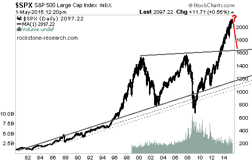
The S&P 500 succeeded in rising above the (grey) triangle leg at around 1,600 points, whereafter a fulminant breakout started. To make this price increase sustainable, a pullback to the 1,600 level appears to be crucial – in order to test and potentially confirm this decisive level as actual support. A longer termed sell signal is generated only when breaching this support.
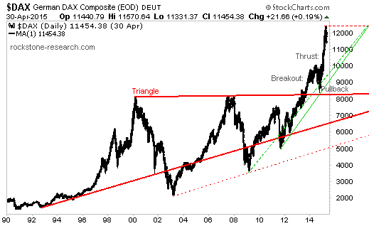
The German DAX looks healthier than its US peers, because the price is definitely thrusting to the upside after the completion of a successful breakout and pullback. However, the end of the thrust may be ending shortly, whereas short but sharp pullbacks during thrusts are also not uncommon. A more definite sell signal is generated only when breaching the green and red supports:
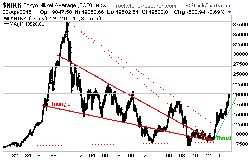
For around 20 years, the Nikkei 225 index consolidated within a downward sloping (red) triangle, out of which a thrust started in 2013 (after multiple breakouts and pullbacks). The goal of this thrust is to rise above the former highs (30,000-37,500 points), whereas short but sharp pullbacks during thrusts should not surprise but to be considered healthy. As the psychologically important 20,000 level has been reached most recently, a new buy signal is only given when rising above this resistance; thus an inferior (short- to mid-term) sell signal dominates at the very moment. The probabilities of a breather/correction at least to the (green) support at around 17,500 points are pervasive as long as the 20,000 level has not been conquered.
These technical forecasts are supported by the extraordinarily high levels of margin balances in stock markets like the NYSE, which historically occurred hand in hand with the burst of market and credit bubbles:
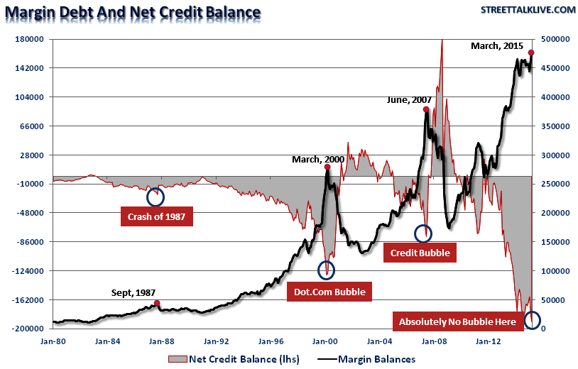
"Along with the markets currently being more overbought now than at any other point in history, they are also more leveraged as well. Late last week the NYSE released its latest margin debt figures for March. Despite a rather sluggish market, investors piled on margin debt pushing levels to all-time highs as shown below. It is worth noting that when net credit balances have plunged very negative levels, it has been coincident with major mean reverting events in the market. "While this time could certainly be different," the reality is that leverage of this magnitude is "gasoline waiting on a match." When an event eventually occurs, that creates a rush to sell in the markets, the decline in prices will reach a point that triggers an initial round of margin calls. Since margin debt is a function of the value of the underlying "collateral," the forced sale of assets will reduce the value of the collateral further triggering further margin calls. Those margin calls will trigger more selling forcing more margin calls, so forth and so on. Notice in the chart above that margin debt reductions begins innocently enough before accelerating sharply to the downside." (Lance Roberts on April 29, 2015)
Disclaimer: The above does not represent a recommendation to buy, sell or even hold any market, stock or the like. Please act on your own responsibility and due diligence.
