Trend Model signal summary
- Trend Model signal: Neutral
- Trading model: Bullish
The Trend Model is an asset allocation model which applies trend following principles based on the inputs of global stock and commodity price. In essence, it seeks to answer the question, "Is the trend in the global economy expansion (bullish) or contraction (bearish)?"
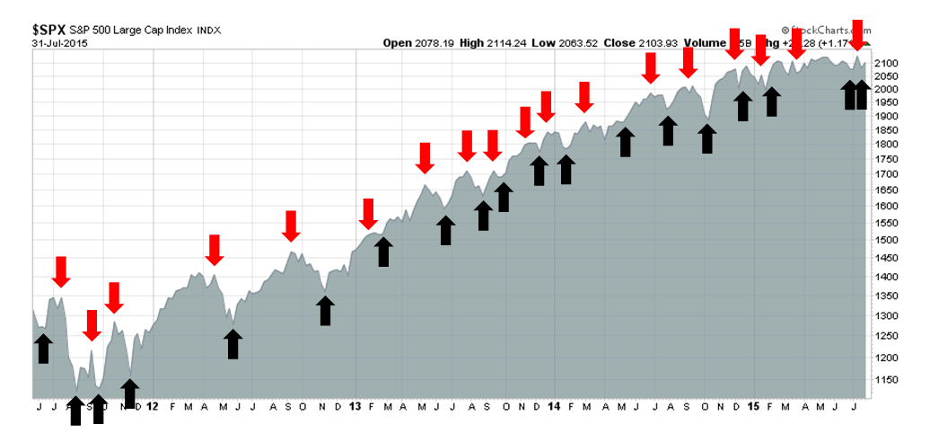
My inner trader uses the trading model component of the Trend Model seeks to answer the question, "Is the trend getting better (bullish) or worse (bearish)?" The history of actual out-of-sample (not backtested) signals of the trading model are shown by the arrows in the chart below. In addition, I have a trading account which uses the signals of the Trend Model. The last report card of that account can be found here.
Trend Model signal history
Update schedule: I generally update Trend Model readings on weekends and tweet any changes during the week at @humblestudent.
A multi-horizon market review
I had several discussions in the past couple of weeks with people, about my market views in which the question came up, "Wait a minute, but I thought you were bullish (or bearish)?" I then had to explain that my bullishness or bearishness depended on the investment time horizon.
It is therefore useful to lay out how I would be positioned based on different time frames. My focus is mainly on the path of US equities, though I do use the signals from other markets to make my points. If you don't want to read everything, here is the summary: I remain long-term bullish on US equities, but expect a correction to begin in the next few months, probably in the September-October time frame.
Long term (next few years) bullish
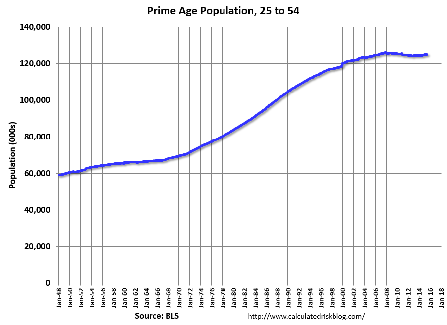
First, I am long-term bullish on US equities. Bill McBride at Calculated Risk highlighted an important chart in early July, showing that the American prime age population was growing again.
This development has important investment implications. The chart below graphically shows how American age demographics are likely to develop over time.
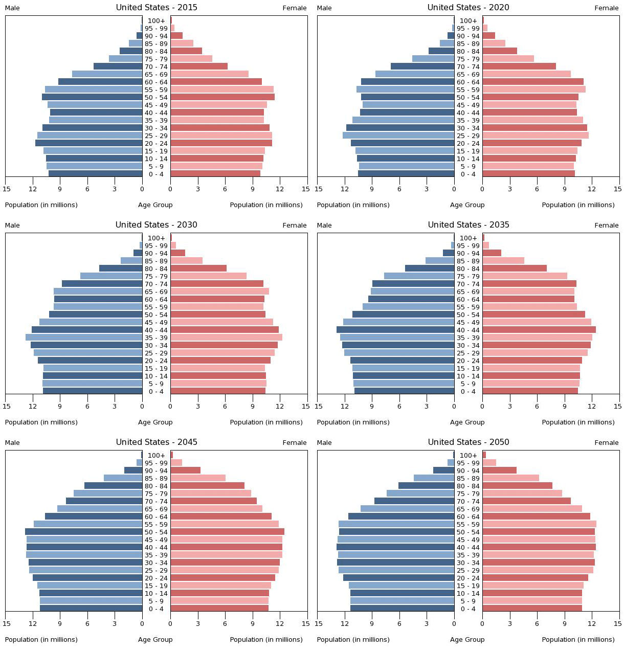
The age demographic developments confirms the thesis advanced by two teams of demographic researchers that I had written about some time ago (see Wait 8 years for a new bull?, which was written in 2010, and A stock market bottom at the end of this decade). Two papers, one from the San Francisco Fed (see paper here) and the second from academics, i.e. Geanakoplos et al (see paper here) made the point that Baby Boomers are likely to take money out of the stock market as they retire. The outflows are offset by cash flows from Echo Boomers going into the market.
The inflection point where buying pressure starts to become positive is somewhere between 2017 and 2021. As we approach the end of 2015, the turning point is not that far away and demographic based savings patterns are likely to change from a headwind to a tailwind for US equity returns.
If you are to be invested in equities, the US remains the place to be. I wrote in my last blog post (see Is China getting hit with THE BIG ONE?) that the major world economies are going through a deleveraging process. The US is furthest in the process, the eurozone is somewhere in the middle and China is just beginning to deleverage.
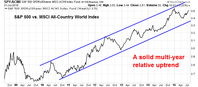
The chart below shows the relative performance of SPX (via SPDR S&P 500 (ARCA:SPY)) compared to global equities (via iShares MSCI ACWI (NASDAQ:ACWI)). US stocks remain in a well defined relative uptrend, largely because of the success of how US fiscal and monetary authorities have reacted to the Great Financial Crisis as compared to other major economic blocs. There is no reason to believe that this trend is likely to change.
While the above chart shows a relative performance analysis between the US and global equities, the chart below shows the relative performance of US equities and bonds (via the U.S. 30-Year Yield). The bull market in risky assets that began at the 2009 bottom remains intact. As bear markets are caused by either recessions (none on the horizon) or overly aggressive Fed tightening (you've got to be kidding me), this equity bull still has a long way to run.
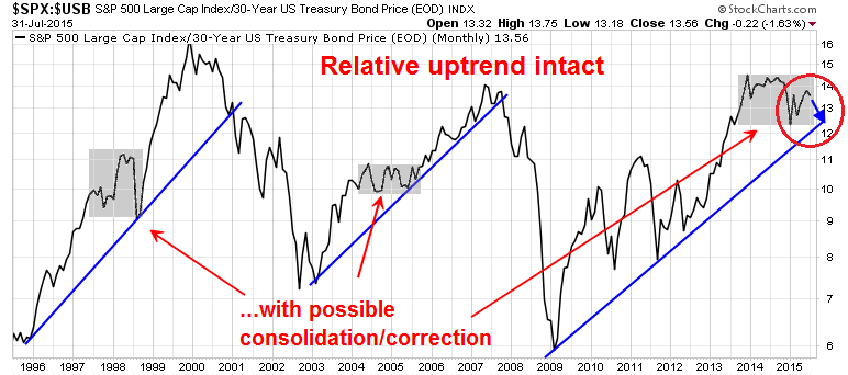
I would like to point out, however, that the shaded areas show periods of market consolidation and correction that have occurred in past secular bull markets. This secular bull is no different and we may be in for a corrective period ahead.
Intermediate term (next few months) correction ahead
If we were to shorten the time horizon from a multi-year perspective to one of only the next few months, breadth and momentum indicators are lining up for a correction of unknown magnitude.
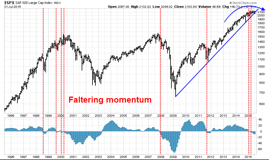
My greatest area of concern for stock prices has been the loss of momentum that has been observed in the past few months. The 20-year monthly SPX chart below shows the relationship between stock prices and price momentum, as measured by the MACD histogram in the bottom panel.
Every time momentum has turned negative, stocks have either been in a bear phase or about to enter a bear phase (marked by vertical lines). Other research that goes back further reveals similar outcomes (see Why I am bearish (and what would change my mind)). Moreover, the chart below also shows that the market is losing momentum and the SPX is very close to breaking the trend line that began in 2009, which is another warning sign that a correction may be around the corner.
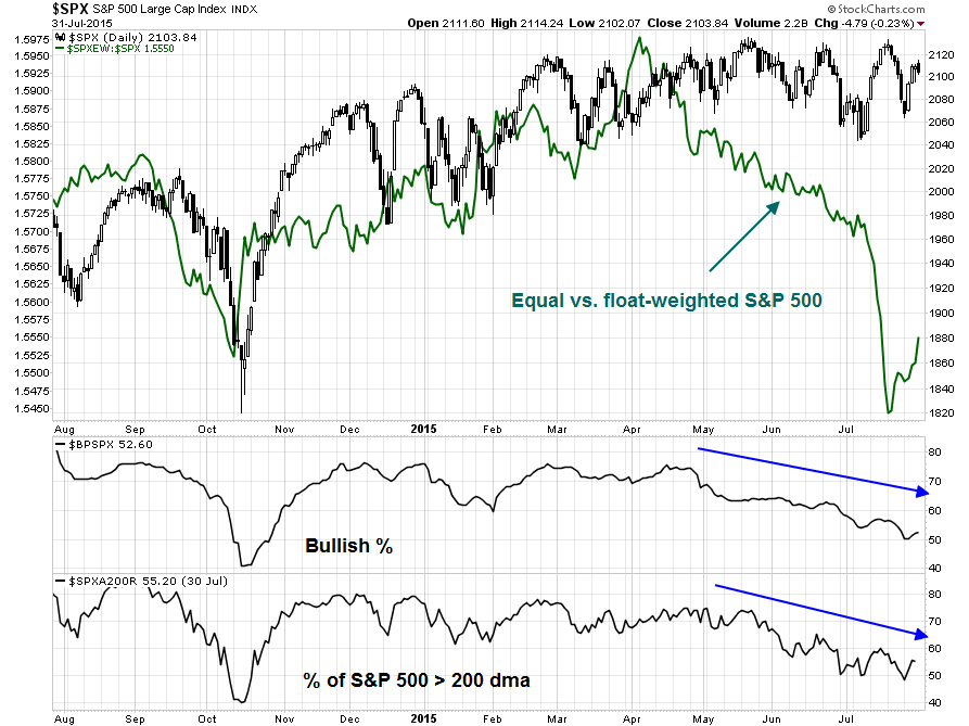
Then there are the breadth measures. Normally, I use words like "negative" to describe technical indicators, but a word like "negative" doesn't even begin convey the depth of the divergences we have seen recently. "Awful" and "abysmal" are probably better descriptions of how market breadth is behaving right now.
The chart below shows different ways of measuring breadth. The green line in the top panel is the ratio of equal-weighted SPX to float-weighted SPX (apples to apples comparison with the same stocks, with different weights) which shows the narrowness of the leadership and how it has deteriorated since April. The other panels of bullish percentage and % of stocks in SPX above their 200 dma also tell a similar story. The generals are leading the charge but the troops aren't following.
To be sure, Michael Batnick pointed out a breakdown in market breadth is not an immediate concern. On average, breadth tops out about a year before the market does. In the case of the late 1990s, the Tech Bubble didn't pop until two years after the top in the NYSE Advance-Decline line.
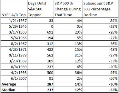
This analysis from BCA Research (via Zero Hedge) shows, however, that depending on how you measure breadth, the top was seen as early as a year ago in 2014 (bottom panel). So are we due for a correction?
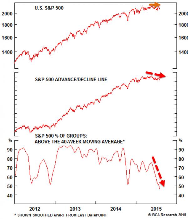
Batnick`s analysis does make the point, however, that breadth deterioration is nothing to panic about. As long as the heavyweights hold up and the fundamentals remain sound, the stock market can remain healthy. With that point in mind, I analyzed the quality of the current leadership from a sector perspective. The current sector leaders are Healthcare (16% of SPX), Consumer Discretionary (11%) and Financials (16%). The laggards are Industrials (11%), Energy (8%) and Materials (3%). So the bulls are winning with a combined weight of 43% in the winning sectors compared to 21% in lagging sectors.
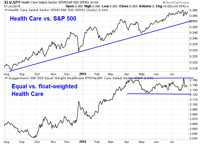
Let's look at breadth in the winning sectors. Here is the profile of Healthcare stocks via the Health Care Select Sector SPDR (ARCA:XLV) and the Guggenheim Invest S&P 500 Equal Weight Health Care ETF (NYSE:RYH). The top panel depicts the relative performance of the sector compared to the market, which shows that Healthcare remains in a healthy relative uptrend, and the bottom panel shows the relative performance of the equal vs. float-weighted indices within Healthcare (apples-to-apples comparison of the same stocks with different weights).
While the equal weighted outperformance ended in April, the bottom panel shows that they remain range-bound and therefore confirms the relative uptrend of Healthcare stocks. So far, so good.
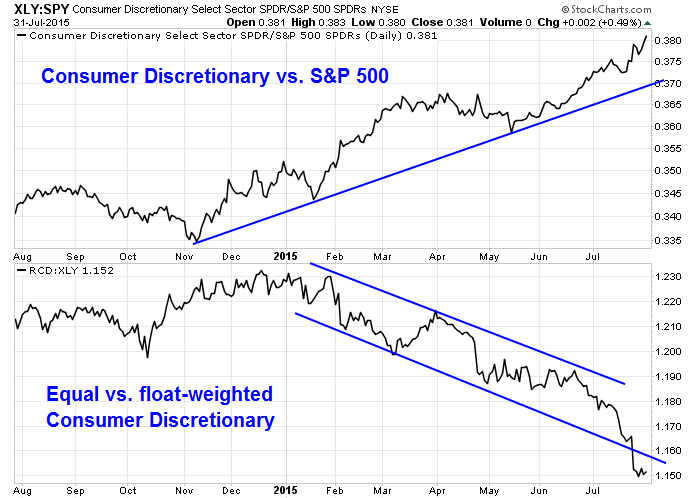
The breadth picture of Consumer Discretionary stocks, via the Consumer Discretionary Select Sector SPDR (ARCA:XLY) and the Guggenheim Invest S&P 500 Equal Weight Consumer Discretionary ETF (NYSE:RCD), presents a very different picture. While the sector has been in a relative uptrend against the market, breadth has been deteriorating for all of 2015. Does this look like a healthy advance?
The same comment is true of Financial stocks, via Financial Select Sector SPDR (ARCA:XLF) and Guggenheim Invest S&P 500 Equal Weight Financials (NYSE:RYF). The sector began to outperform in May, but saw breadth deteriorate in April, a month before outperformance began.
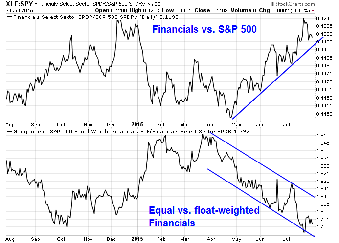
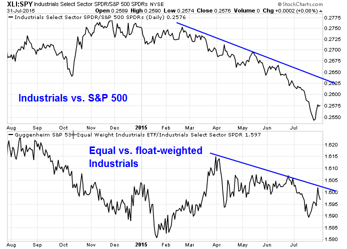
What about the laggards? Here are the Industrial stocks, via the Industrial Select Sector SPDR (ARCA:XLI) and the Guggenheim Invest S&P 500 Equal Weight Industrials ETF (NYSE:RGI), which are dominated by General Electric (NYSE:GE) on a float-weighted basis. Even as the sector underperformed, the equal weighted index underperformed the float weighted index, which confirms the weakness.
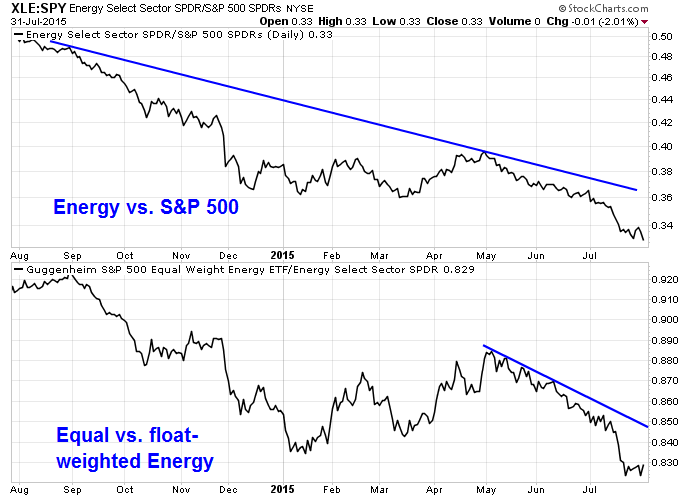
Here is the chart of the other large laggard sector, Energy, via the Energy Select Sector SPDR (ARCA:XLE) and the Guggenheim Invest S&P 500 Equal Weight Energy ETF (NYSE:RYE), at 8% of the SPX. Even as this sector lagged the market, the troops are running away faster than the generals.
I have heard it said that Technology has been one of the market leaders. That's not true.
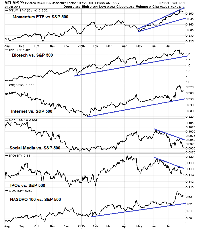
Large cap old Tech has performed roughly in line with the market. In fact, some groups within the sector, such as the semiconductors, have badly lagged the market. As well, equal and float-weighted breadth have deteriorated in the past month. However, the high beta glamour stocks—such as iShares MSCI USA Momentum Factor (NYSE:MTUM), iShares Nasdaq Biotechnology (NASDAQ:IBB), PowerShares Nasdaq Internet (NASDAQ:PNQI), Global X Social Media (NASDAQ:SOCL), Renaissance IPO (NYSE:IPO) and PowerShares QQQ Trust Series 1 (NASDAQ:QQQ)—which include many Tech names, have been hot.
As the relative performance chart below shows, momentum stocks (top panel) and the all important NASDAQ 100 (bottom panel) continue to lead the market.
There are trouble signs ahead. Conor Sen recently warned that the market action looked "heavy" and the market is not prepared to accommodate the companies in the IPO pipeline:
Good companies like LinkedIn and Tableau are trading down heavily on good earnings reports. Same to a lesser extent for Facebook (NASDAQ:FB) – multiples are coming down as valuations shift from revenue multiples to EBITDA and earnings multiples.If 80 unicorns all wanted to go public now, it’s not clear if there are enough I-bankers and underwriters to work the roadshows and make the deals all happen in a short period of time (the whole liquidity problem), to say nothing about prospective investor demand in the public markets.
In a separate post. he warned about the health of the IPO market:
Most of the tech IPO’s of this cycle have ranged between disasters and underwhelming. And yet there are 80+ unicorns in the pipeline, all of whom are dreaming of IPO riches to afford a middle class life in the Bay Area. Companies that…are trying to avoid going public as long as possible. While I’m always impressed by the talents of my friends in I-banking, it strains credulity to think that public investors will continue to line up at the trough for IPO’s when so few of them are winners.Watch out for the Square S-1. Box took 6 weeks to go from confidential filing to S-1. If Square takes the same amount of time that’ll be mid-September. Tech market leadership has been thin, with a handful of companies accounting for all of the YTD index gains. If it looks like Square will be a busted IPO that could create a race to the IPO exits for unicorns.
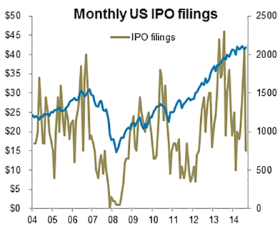
Callum Thomas of AMP Capital also highlighted similar concerns about the health of the IPOs:
IPO (initial public offering) activity can provide clues to a top in the market and the cycle more broadly – but it’s not a perfect indicator.As I was trawling through various datasets and trying to think up new things I thought it worthwhile comparing IPO stats to the SP 500 index to see if it provides any clues. There are some tentative clues but before we discuss the data and charts it’s worth thinking about the logic or intuition. More IPOs mean more supply of stock (all else equal – although it’s not quite equal because strictly speaking you should look at *net* supply - IPOs and capital raisings less buybacks). IPOs also happen in greater frequency in boom times because usually in boom times the economy is going well and it’s much easier for new companies to be successful and thus go on to do IPOs. Also, the pricing is better and the greater market enthusiasm increases the likelihood that the IPO will be successful.
So we can therefore say that there will be more IPOs when the market and economy are booming, and if the economy or market stops booming it will be harder to sustain IPO activity. So, we have a supply argument and a cycle argument that says there should be information in IPO activity. In terms of the charts there is a loose link: IPO proceeds (amount of capital raised) moves in line with the market as you would expect. When it rolls over it can mean a change in trend or rolling over of the cycle – however, it is more or less a coincident indicator. The monthly pace of IPO filings is also a potentially useful indicator where a surge in filings can flag a short-term top in the market. Looking at the longer-term data for the number of IPOs, it’s a little tricky because in the past there were many more IPOs than in recent times. So in terms of its efficacy it is ‘mixed’ but it is another information point worth considering. There is a potential red flag in that there was a surge in filings and the volume and proceeds seem to have rolled over.
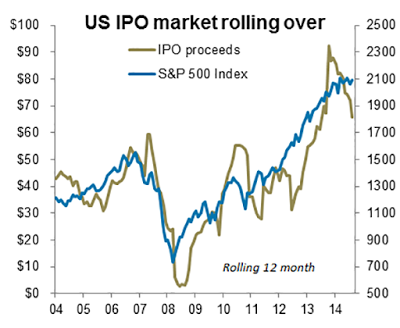
As Batnick's analysis indicates, these are all warning signs of market weakness. None of them point to an imminent downdraft in the stock market.
Short term (next few weeks) bullish
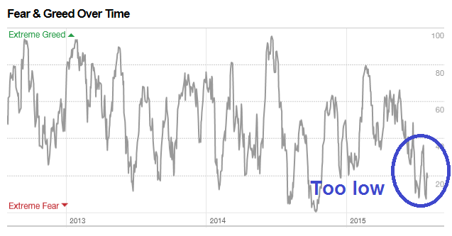
Even though I believe that a correction is just around the corner, the environment for the next few weeks is supportive of higher stock prices. First of all, the CNN Money Fear and Greed Index is too low and too far in fear territory. Major corrections and bear markets don`t start with this indicator at these levels.
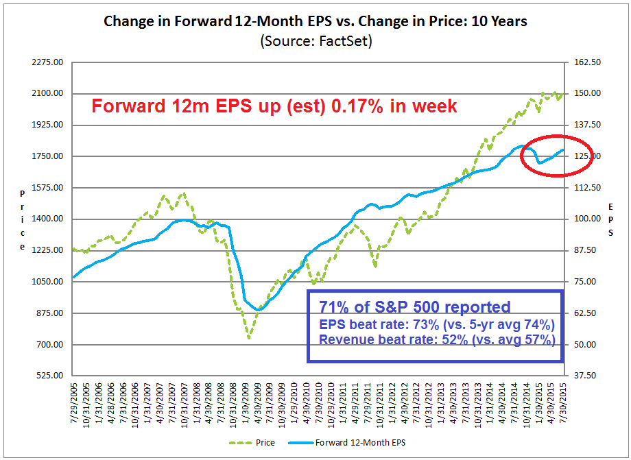
We have gone through most of earnings season with 71% of SPX components having reported. The chart below from John Butters of Factset (annotations are mine) show that beat rates on the top and bottom lines are marginally below average. More importantly, the Street has responded by raising forward 12 month EPS estimates, which has been highly correlated with stock prices in the past.
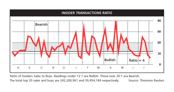
As the majority of companies have reported, we can start looking at insider activity again. Even though this indicator is highly noisy, the Barron`s insider trading activity report shows that this is the second week in a row where this indicator is in the buy zone:
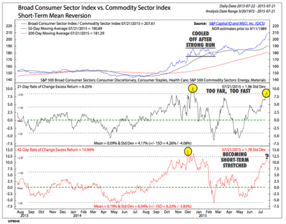
There may also be signs of a cyclical upturn. Maybe it's my imagination, but I am detecting the nascent signs of a turn in commodity prices, which could raise the outlook for global growth. NedDavis Research charted the relationship between consumer and commodity stocks. Even though they believed that the commodity bear is nowhere finished, this chart indicated that the decline is overdone and commodities are due for a bounce.
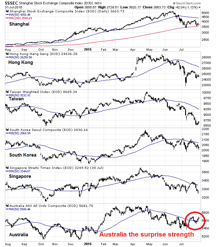
The conclusion of the NDR analysis is confirmed by what I am seeing in Asia. Even as I wrote about the possibility of impending doom in the Chinese economy (link to article, above), I was struck by this chart of the Shanghai Composite versus the stock markets of China's Asian trading partners—Hong Kong, Taiwan, South Korea, Singapore and Australia. They are all below their 50 dma, except for (surprise!) commodity-sensitive Australia.
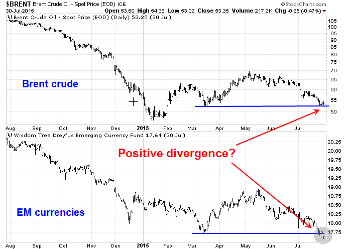
An examination of the price of Brent crude, which is unaffected by some of the transportation issues that have distorted the price of WTI, compared to EM currencies (via WisdomTree Emerging Currency Strategy (NYSE:CEW)) also showed a ray of hope for commodity prices. Even as EM currencies tanked in response to slowing Chinese growth and possibly in anticipation of Fed rate hikes, the price of Brent fell to a technical support level and did not make a new low. Is this a positive divergence?
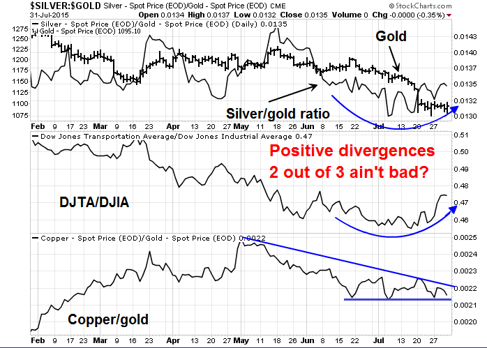
Finally, a couple cyclical indicators are also showing early signs of bottoming. The top panel shows the price of gold and the silver/gold ratio. Silver has long been regarded as the more volatile and high-beta precious metal. Even as the gold price tanked, the silver/gold ratio turned up, indicating a possible bottom. The ratio of the DJ Transports to the DJ Industrials also provides an important clue as it turns upward.
On the other hand, the bottom panel of the cyclically sensitive copper price to gold ratio has not risen yet. (Oh well, two out of three ain't bad.)
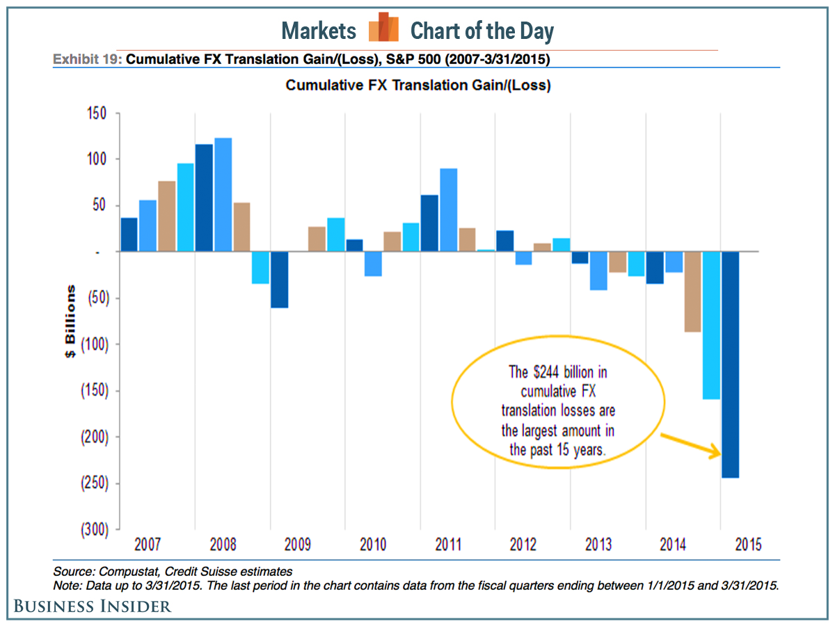
During this latest earnings season, one frequently cited excuse for poor earnings results has been the USD strength. Should commodity prices rally, the USD would likely fall because of their historical inverse relationship. A falling USD would therefore relieve some of the earnings pressures on US companies and raise EPS estimates and outlook for US stocks, at least for as long as greenback weakens (chart via Business Insider).
I have tried to reconcile my bearish view of an intermediate term correction with my shorter term bullish view, based on a robust and improving growth outlook. The key to squaring this circle is to look for a fundamental trigger for a correction. The most likely triggers would either be a negative reaction to a Fed rate hike (as per Jim Paulsen), which is likely to be in September, or the realization of the macro repercussions of a downshift in the Chinese growth outlook. Or both.
My base case scenario calls for a stock market rally to test the old highs and possibly make new marginal highs, with a top in the September-October time period. Don't hold me to that forecast though, it's just a wild guess.
The week ahead: Uncertain
As I look ahead to this coming week, my inner trader is having trouble getting excited about being overly bullish or bearish. We have seen a market bounce. Though I continue to believe that stocks are likely to pull back and possibly test the lows we saw last Tuesday, it's not a high conviction call.
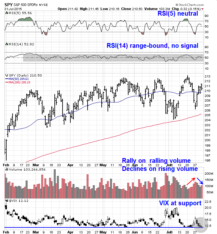
The SPY daily chart doesn't provide much in the way of clues as to market direction, though I am leaning slightly bearish. The RSI(5) or RSI(14) are both in neutral territory and the latter momentum indicator continues to be range-bound and has not flashed an overbought or oversold reading in all of 2015.
However, volume studies does show that market rallies have been on declining volume and market weakness has been accompanied by rising volume, which is a cautionary sign. As well, the VIX Index (bottom panel) is at support and at the bottom of its 2015 range, which is also bearish.
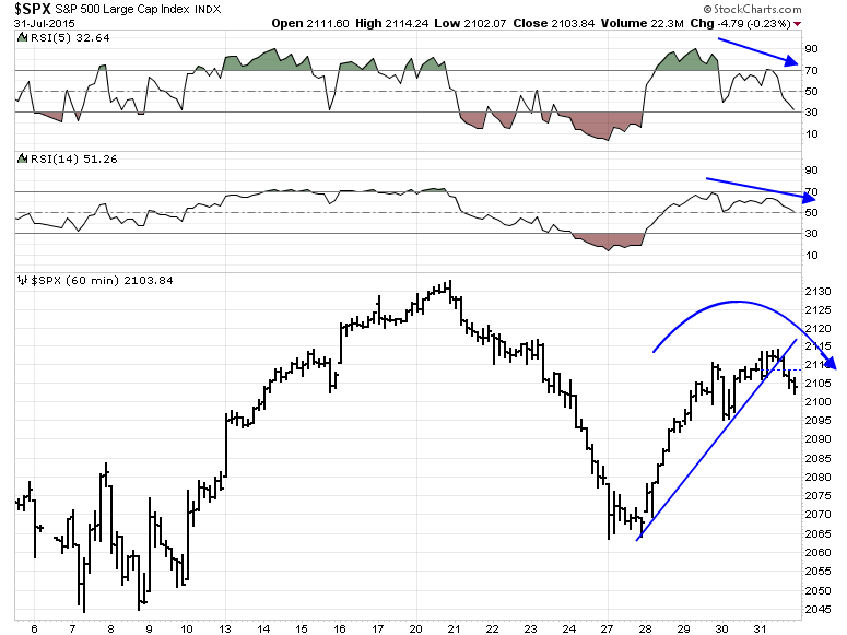
The hourly chart of SPY also provides some bearish clues.SPY breached a short-term uptrend and it is rolling over. We are also seeing negative divergences on RSI(5) and RSI(14). While it does suggest that the market will weaken, it does not indicate magnitude. A test of the Tuesday lows is not necessarily in the cards next week.
On the other hand, any weakness may be short-lived. The ISE equity-only call/put ratio has shown two consecutive days when it has been below 100%. This is a rare event and Dana Lyons showed that such occurrences have been accompanied by a 1-2 day decline and a rebound in the 1-3 week time frame, though the sample size is very small at six. If this were to be the scenario, then look for a pullback, but don't expect a test of the lows seen last Tuesday.

My inner investor is waiting neutrally positioned and waiting for the correction to buy stocks at more attractive prices. The weeks and months ahead are likely to be volatile and full of twists and turns.
My inner trader is just confused. He is awaiting further developments before making any conviction bets on market direction.
Disclaimer: I have also noticed that from the tone of some Twitter) questions and comments, some readers are following me carefully. Please view any replies or posts that I write in context. I have differing time horizons for different situations. In addition, my risk tolerance and pain threshold that are very different from yours.
Cam Hui is a portfolio manager at Qwest Investment Fund Management Ltd. ("Qwest"). This article is prepared by Mr. Hui as an outside business activity. As such, Qwest does not review or approve materials presented herein. The opinions and any recommendations expressed in this blog are those of the author and do not reflect the opinions or recommendations of Qwest.
None of the information or opinions expressed in this blog constitutes a solicitation for the purchase or sale of any security or other instrument. Nothing in this article constitutes investment advice and any recommendations that may be contained herein have not been based upon a consideration of the investment objectives, financial situation or particular needs of any specific recipient. Any purchase or sale activity in any securities or other instrument should be based upon your own analysis and conclusions. Past performance is not indicative of future results. Either Qwest or Mr. Hui may hold or control long or short positions in the securities or instruments mentioned.

