In light of the recent weakness of the Dow Jones Transports, there has been a greater focus on the idea of market breadth and what it tells us. I have heard a lot about how the Transports don`t represent the US economy or market in the same way when Charles Dow first devised the Dow Theory. When you boil it all down, the divergence between the DJIA and DJTA represents a form of breadth divergence.
The best representation of market breadth can be explained this way. When an army is advancing, you want to know if only the generals are leading the charge or if the whole army is moving forward. In market terms, the generals represent the heavyweights of the market, while the army represent the broader market. A market rally on positive breadth is said to be supported by the broad market. By contrast, a rally on narrow breadth is led only by the leadership of the heavyweights and such advances are interpreted with greater skepticism.
In the past, common breadth measures have included the NYSE Advance-Decline Line or NYSE Composite. In more modern times, one problem with this approach is that the underlying components of NYSE-listed stocks do not include the more growth oriented NASDAQ stocks. In addition, the NYSE Composite has a number of closed-end funds and REITs which may not be representative of the broad market (aka the army).
An apples-to-apples breadth metric
What is needed is an apples-to-apples comparison of market breadth.
Enter the S&P 500 A-D line and Equal weighted SP 500 as a breadth benchmark for the SPX. These measures do not suffer from the shortfalls of the NYSE A-D Line or NYSE Composite because they measure the breadth of the same stock universe.
Each is slightly different. The A-D Line is a diffusion index. A single stock advancing will have the same impact on the A-D Line regardless of whether the magnitude of the advance is 0.1% or 10%. By contrast, a 0.1% advance in a stock will affect the Equal-weighted SP 500 differently than a 10% advance. The difference between the equal-weighted and float-weighted SP 500 is that the movements in heavyweights such as Apple (NASDAQ:AAPL) will affect the float-weighted index far more than the smallest stocks in the index.
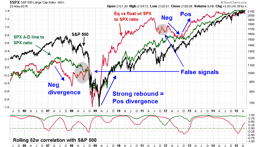
The chart below shows the 10-year record of the SP 500 and the A-D Line and Equal-weighted SP 500. In order to graphically exaggerate divergences, I have graphed the ratios of the A-D Line to the SP 500 (in green) and Equal-weighted SP 500 to the float weighted SP 500 (in red).

The bottom panel of the chart shows the rolling 52-week correlation of each of the indices to the SPX. As the correlation analysis shows, the A-D Line ratio is highly correlated to the SPX, which makes spotting divergences difficult. The correlation of the returns of the equal to float weighted ratio is relatively high and positive, but fluctuates. This makes the task of spotting divergences a little easier.
These indicators did a relatively good job of confirming stock market trends over the last 10 years. They were able to give early warnings of a negative divergence ahead of the market top in 2007; they confirmed the powerful rebound at the bottom in 2009; and gave early warnings of market weakness and subsequent rally in 2012. No indicators are perfect, however. The equal-float weighted ratio gave a false signal and turned bullish prematurely in 2008 and it was unable to spot the market rally in 2011.
A market distribution warning
What are they telling us now about market internals?
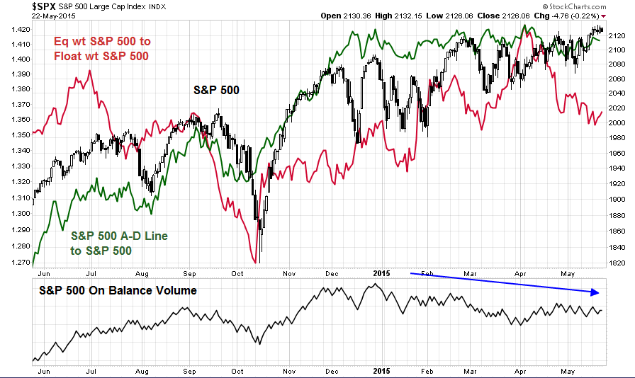
As the chart below shows, but of these indicators are showing negative breadth divergences. The equal-float weighted ratio has been falling while the stock market has rallied in the last two months. During the same period, the A-D Line ratio has been flat, which is another sign of the lack of broad market participation in the current rally. In addition, the bottom panel shows a negative divergence in On Balance Volume, which is an additional warning of distribution.

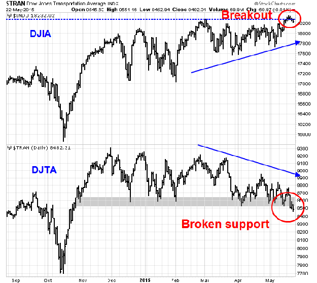
In light of these negative breadth divergences, it makes the recent divergence between the DJIA and DJTA create concerns for stock prices (see How worried should you be about the weak DJ Transports). As the chart below shows, the DJIA rallied to new all-time highs last week, while the DJTA weakened. Its breach of a technically important support zone is further confirmation of the divergence. These conditions set up a Dow Theory non-confirmation of the new highs in the DJIA.

Taken into a broad-based context of widespread weakness in market breadth, all of these signs are worrisome for the near-term health of the current bull run.
Disclosure: Cam Hui is a portfolio manager at Qwest Investment Fund Management Ltd. ("Qwest"). This article is prepared by Mr. Hui as an outside business activity. As such, Qwest does not review or approve materials presented herein. The opinions and any recommendations expressed in this blog are those of the author and do not reflect the opinions or recommendations of Qwest.
None of the information or opinions expressed in this blog constitutes a solicitation for the purchase or sale of any security or other instrument. Nothing in this article constitutes investment advice and any recommendations that may be contained herein have not been based upon a consideration of the investment objectives, financial situation or particular needs of any specific recipient. Any purchase or sale activity in any securities or other instrument should be based upon your own analysis and conclusions. Past performance is not indicative of future results. Either Qwest or Mr. Hui may hold or control long or short positions in the securities or instruments mentioned.

