I would like to start this report by looking at the HUI:SPX ratio chart I posted late Friday night that shows a time objective out to October of this year. If both the time and price elements play out according to this ratio chart, then the Gold Bugs Index (HUI) should be close to a major bottom, making a round trip from bull market to bear market and back to a bull market again against the S&P 500. There doesn’t have to be a V bottom specifically, since good bottoms take time to build out. 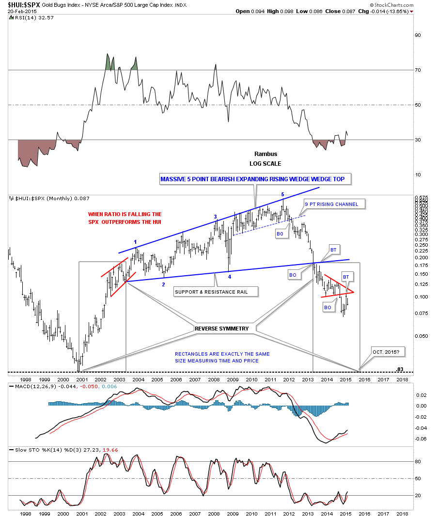 Next, a slightly different way to use these rectangles to show price and time objectives. These rectangles measure each impulse leg with a halfway pattern in the middle. Sometimes they can work out extremely well but the main point to take away from these charts is it gives you a place to start looking for the move to end.
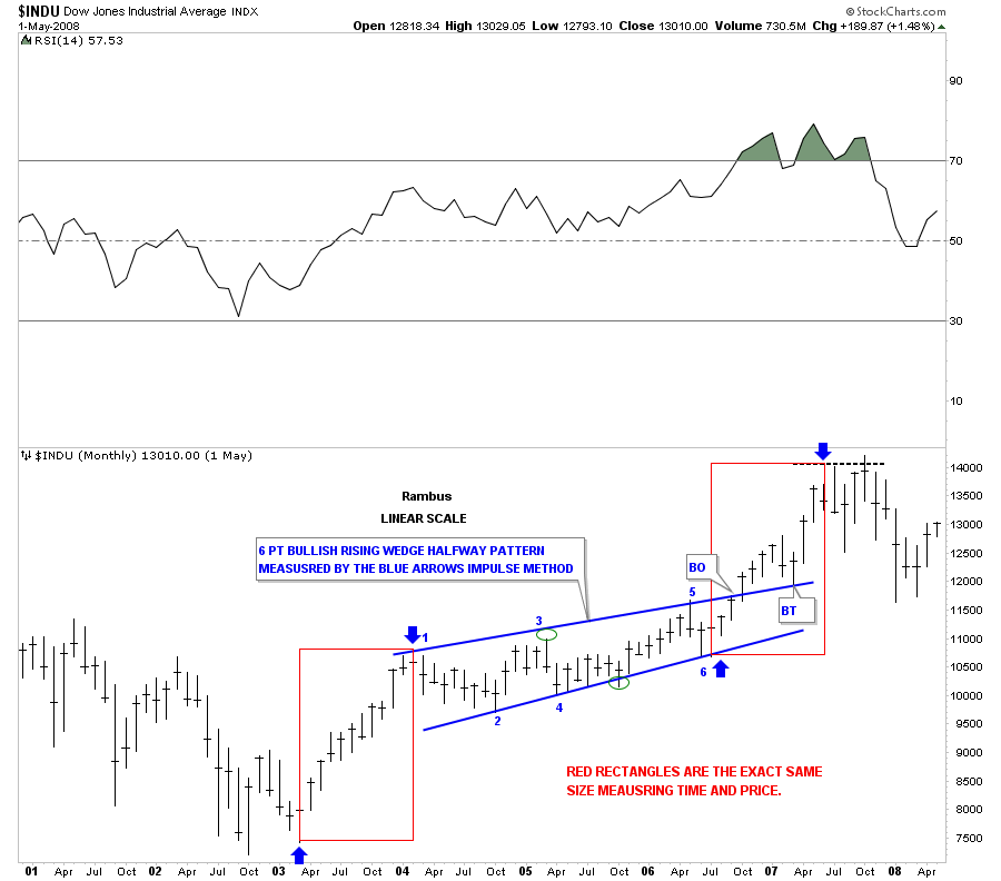
Below is a weekly chart for the NASDAQ Composite that shows where to begin looking for a top during the tech bubble in 2000. This was an extremely bullish setup as the halfway pattern was a bullish rising flag. The red rectangles measure each leg of the final blow-out phase in that bull market. 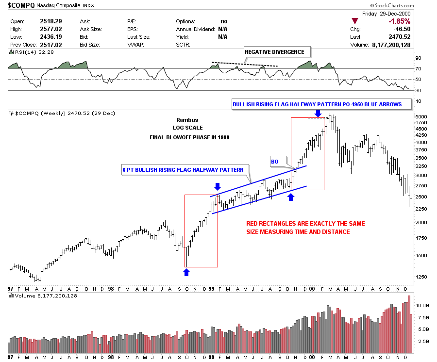 Below is a monthly chart for the INDU which shows a similar setup to the chart above but this time it was the rally phase off of the 2003 crash low. As you can see the INDU formed a blue bullish rising wedge as its halfway pattern that gave me a place to look for a top of some kind to start forming in 2007 as shown by the red rectangles that are exactly the same size. As you know, that top ended up being the top that led to the 2008-2009 crash low.
  The next chart, a weekly chart for silver, shows how these rectangles can measure time and price, and illustrates the parabolic move to silver's bull market high in April of 2011. Here you can see how the 2 blue rectangles measured each half of the impulse move up separated by the red bullish rising flag.
Once again, it gave me a place to start looking for some kind of top to begin forming. I also used the BO-to-BO method which came in just a tad higher at 47.65 or so. It showed April as the month for the high. 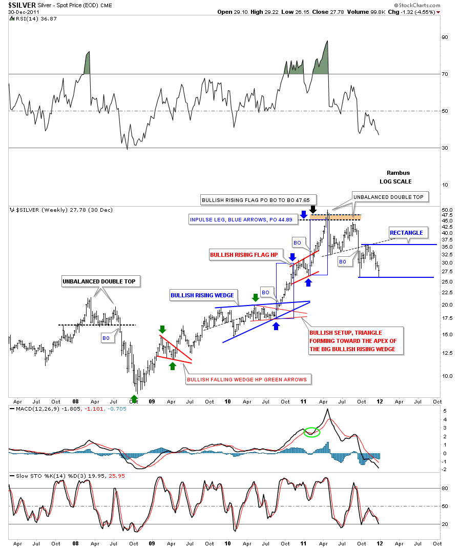 Now I would like to come full circle and put this technique into practice by looking at a long term weekly chart for Gold in log scale. If you recall, the HUI:SPX ratio chart showed a bottom in October of this year.
The time and price rectangles on the COMPQ and INDU showed each half of their impulse move up was separated by a bullish rising flag and wedge, respectively, which told us the move was very strong. Gold has yet to break down out of its possible bearish falling wedge but until gold can trade back above the 1305 area, a bearish falling wedge is what I'm labeling this chart pattern with the last reversal point being at 1305.
The black rectangle measures each half of the impulse move down, as shown by the blue arrows. The lower black rectangle shows us a price objective down to the 850 area that should occur sometime in October of this year. If the bearish falling wedge breaks out close to where I have it labeled, the BO-to-BO method would also give us a price target down to the 850 area.
Just to give you an idea of where I think we are, look at the top blue arrow at 1800 and count down about 5 weeks or so. There is still a lot of work gold has to do to reach its price objective, but if 1305 is the last reversal point in the falling wedge then we are about as close to the high as you can get. It’s now all about watching the price action to make sure nothing important has changed. 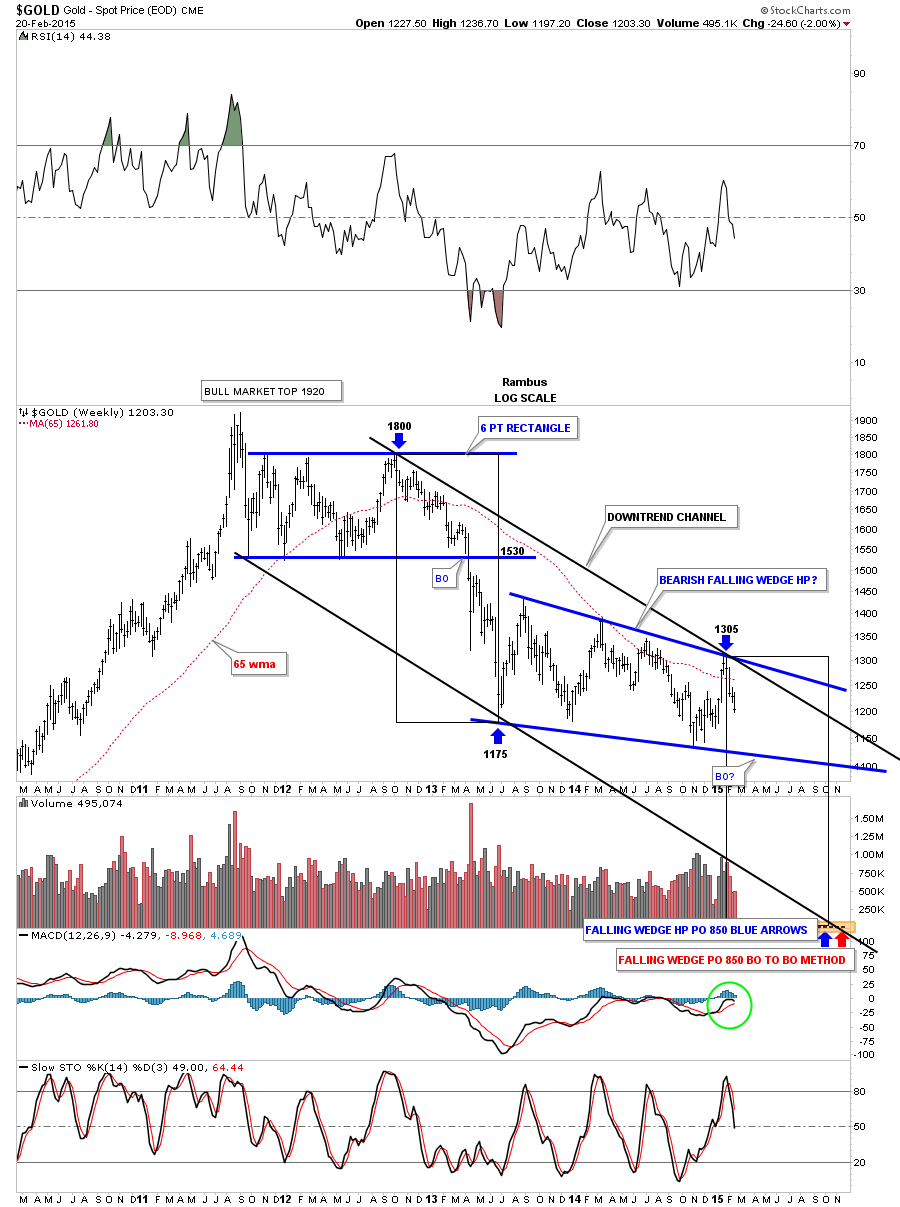 Let's now take a weekly look at silver again, this time going back to 2007 which shows a H&S consolidation pattern similar to the one gold formed back then, which launched its final parabolic run. On the left hand side of the chart you can see the H&S bottom with the right shoulder being the blue bullish rising wedge.
The H&S called for a price objective up to the 45.34 area which coincides pretty closely to the red rectangles' price and time objectives with the red bullish rising flag forming at the halfway point. You may have noticed that once these time and price rectangle patterns complete, there is usually a big trend reversal that takes place. This is a very important clue to know in advance since we should be able take advantage of the situation as we see the price entering into the price objective.
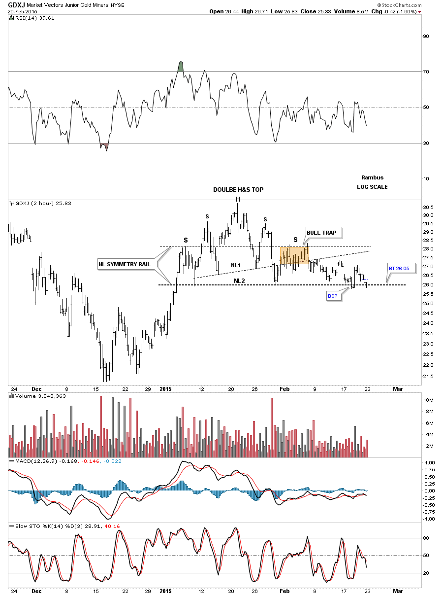
Silver has been leading to the downside as it broke out of its blue triangle halfway pattern last September and had a backtest move that ended about 5 weeks ago. It will be interesting to see how this one plays out as it is so far ahead of gold and the PM stocks. 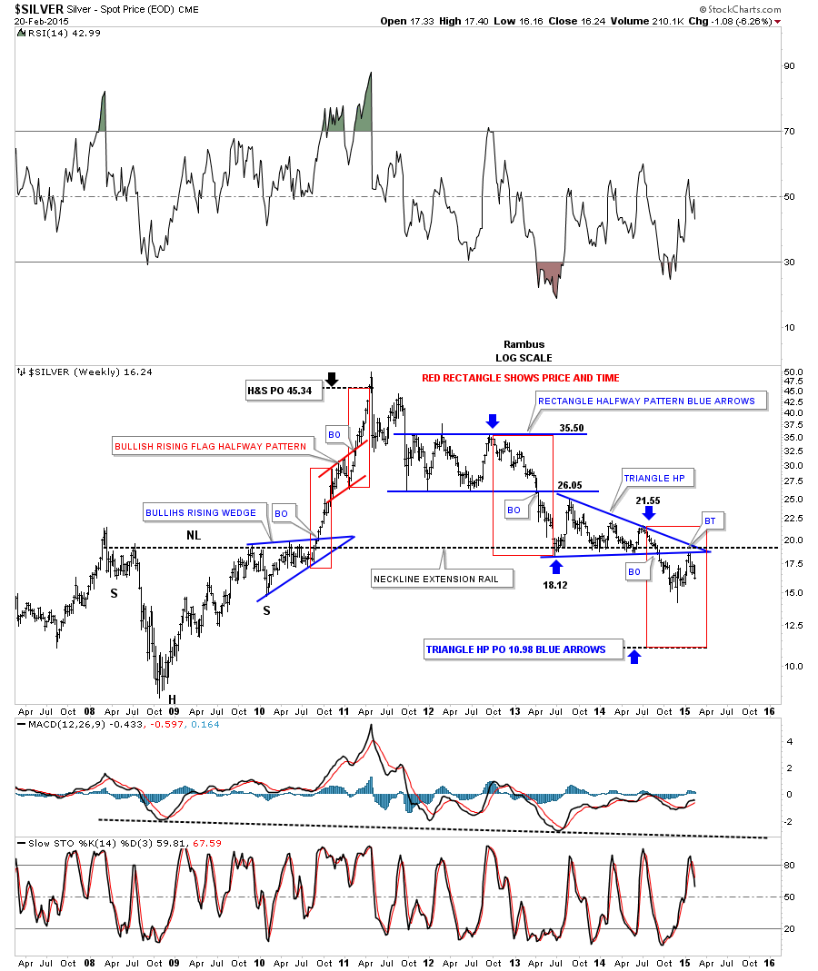 Now let's focus in on the Market Vectors Junior Gold Miners (ARCA:GDXJ) and some of the different chart patterns I’ve been showing, starting with this 2-hour chart that shows the double H&S top and the brown shaded area I showed as a possible bull trap between the neckline symmetry rail and just above NL1. This possible H&S top is starting to become pretty unbalanced so the price action needs to break below NL2 to get the show on the road.
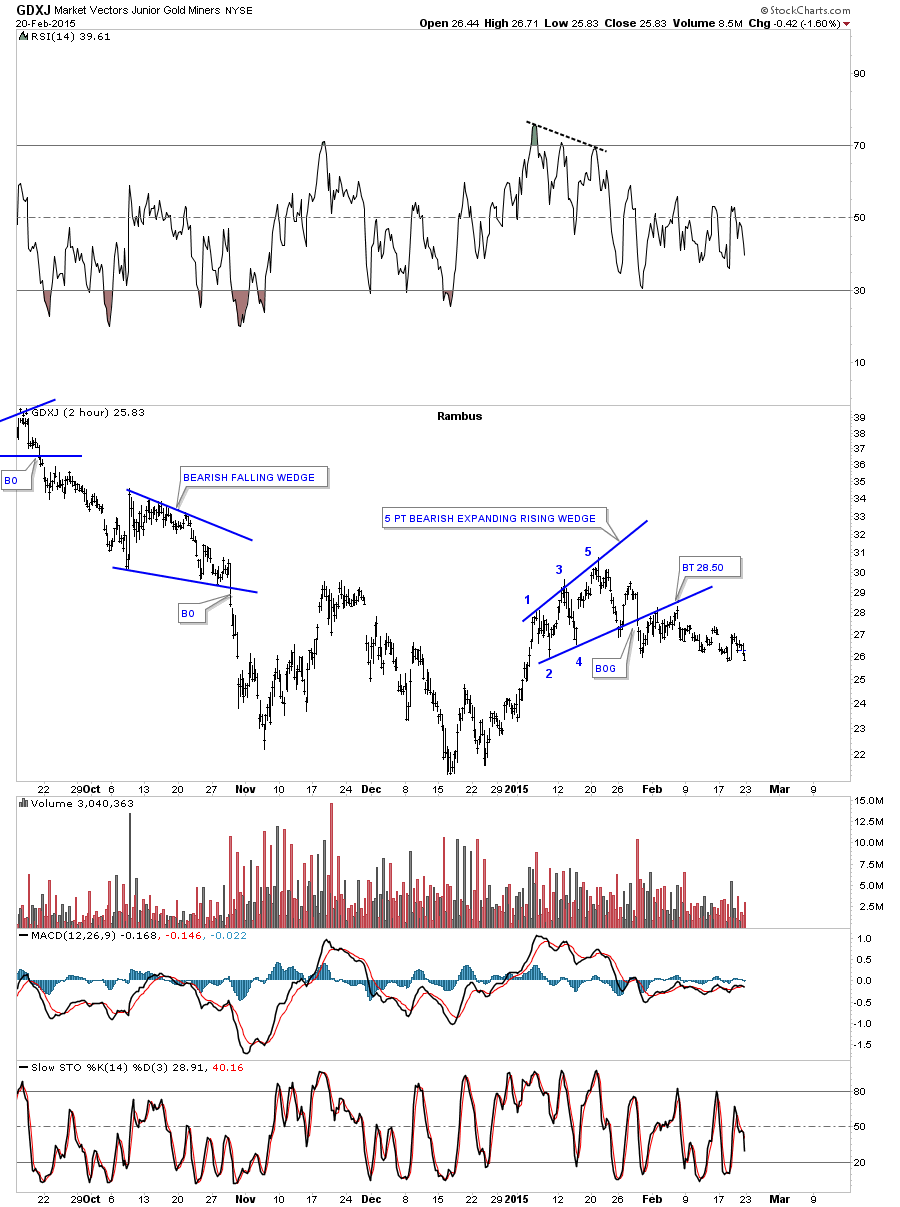
  Below is another 2-hour chart pattern that shows the 5 point blue bearish expanding rising wedge.
  Below is a daily chart I posted a week or so ago that shows how similar the two tops are, as shown by the red circles. These patterns don’t have to play out exactly but you can see what happened to the higher topping pattern after it broke below the horizontal support line.
About 2 weeks later there was a backtest to the underside which would have scared off most folks invested in the Direxion Daily Junior Gold Miners Bear 3X ETF (NYSE:JDST). The GDXJ is currently sitting on the black dashed S&R line which it needs to break to the downside so we can move on to the next leg lower. Also you can see I’ve labeled the rally off the November low as an expanding triangle which is different from the big cap PM stock indexes as they show a clear double bottom. This tells me the GDXJ has been weaker than the big caps and will probably make a lower low first. We shall see. 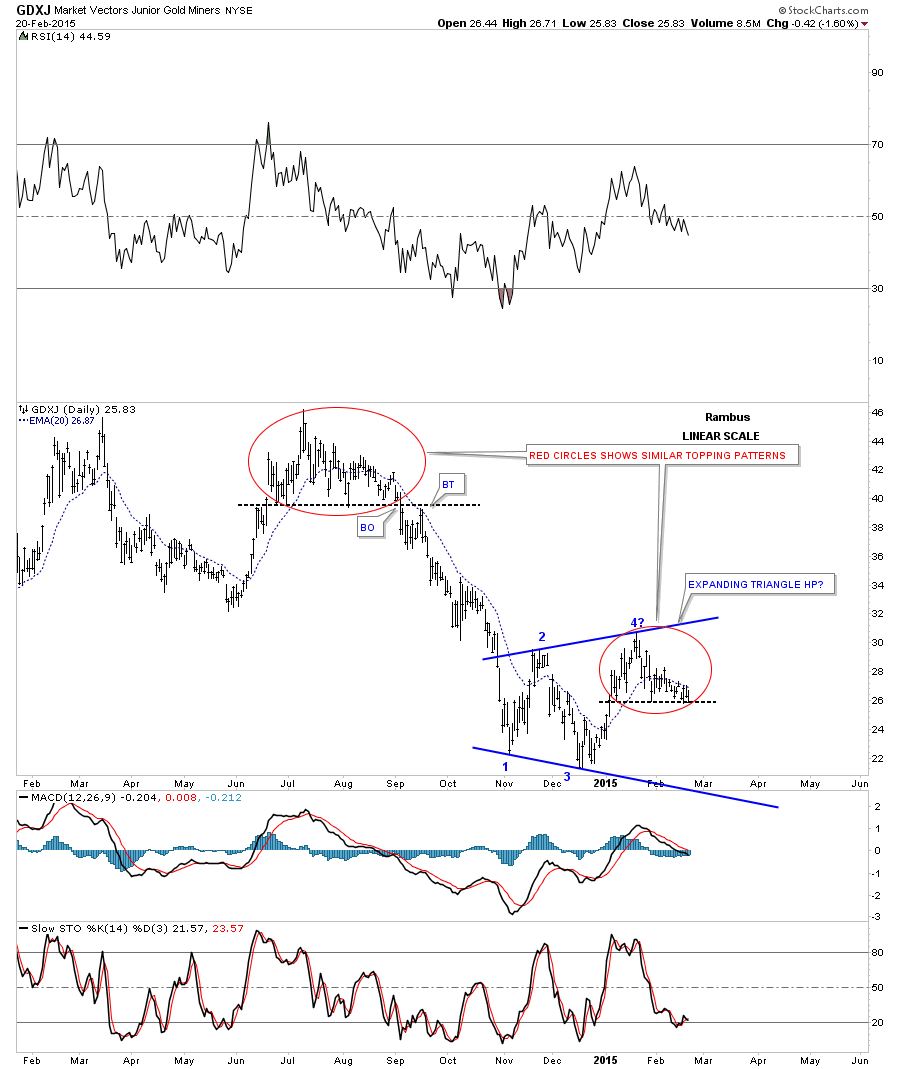 The next daily chart for GDXJ shows our two double H&S tops and the blue expanding triangle. If the blue expanding triangle plays out as a halfway pattern to the downside, then GDXJ should see some type of bottom in May of this year, around the 14.70 area where it could start to build out another small consolidation pattern.
Again, there is a lot of work to be done by GDXJ to get this next impulse move going, but the pieces of the puzzle are starting to come together. First we need to see the lower neckline broken to the downside. For longer term readers you may recall buying a bunch of JDST just before the neckline gave way on the higher H&S top. We did get whipsawed on the backtest, but we got right back in again and rode that impulse move down. 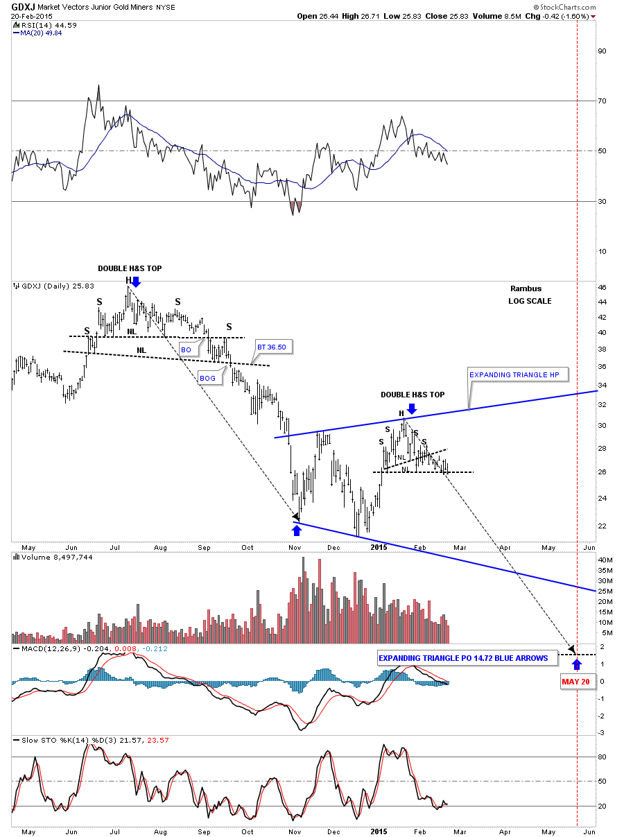 This last chart for the GDXJ is a weekly look. I took the liberty of changing the lower consolidation pattern that started to form in 2013. I have shown many times in the past how a chart pattern can have what I call, a false symmetry breakout of the top and bottom rails. Here you can see the two red circles, one on top and the other below, which, if you erased them, you would get a very symmetrical 6 point rectangle consolidation pattern.
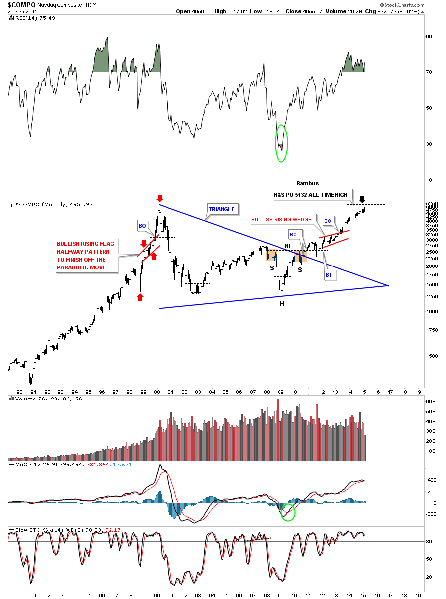
As you can see, the rally off of the November low has fallen just shy of reaching the bottom rail, or what I’m labeling as a 6 point rectangle consolidation pattern for now, as the backtest. If the rectangle plays out as a halfway pattern to the downside you can see the brown shaded area at the bottom of the chart that has two price objectives using the impulse method, blue arrows, and the breakout to breakout method. Interesting times. 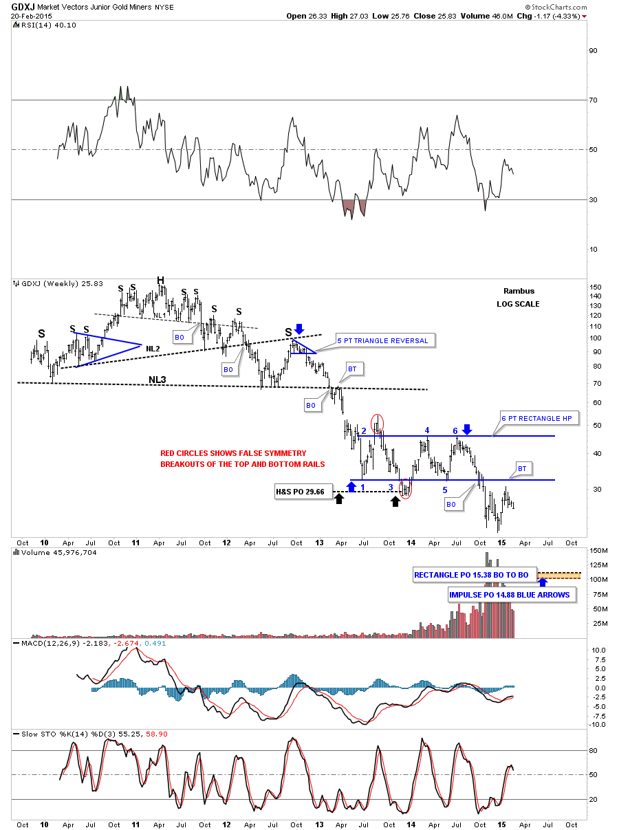 Next I would like to show some of the different U.S. stock market indexes since many are breaking out to new all time highs. The first is a daily chart of the COMPQ that shows the blue rectangle consolidation pattern that broke to the upside seven days ago with a breakout gap and no backtest so far.
You can see I have two price objectives at the top of the chart. The blue one is how I would measure the blue rectangle which has a halfway pattern as shown by the blue arrows. The lower black price objective is its all time highs made back in 2000. Normally when you see such an important high such as this one, a stock will initially find resistance at the old high. Even in a strong market there will be a lot of sellers at that point.
This should be a good guide to take some profits off the table. Hopefully we may see a small consolidation pattern form, just below the all time high at 5132 before the COMPQ breaks out to new all time highs. 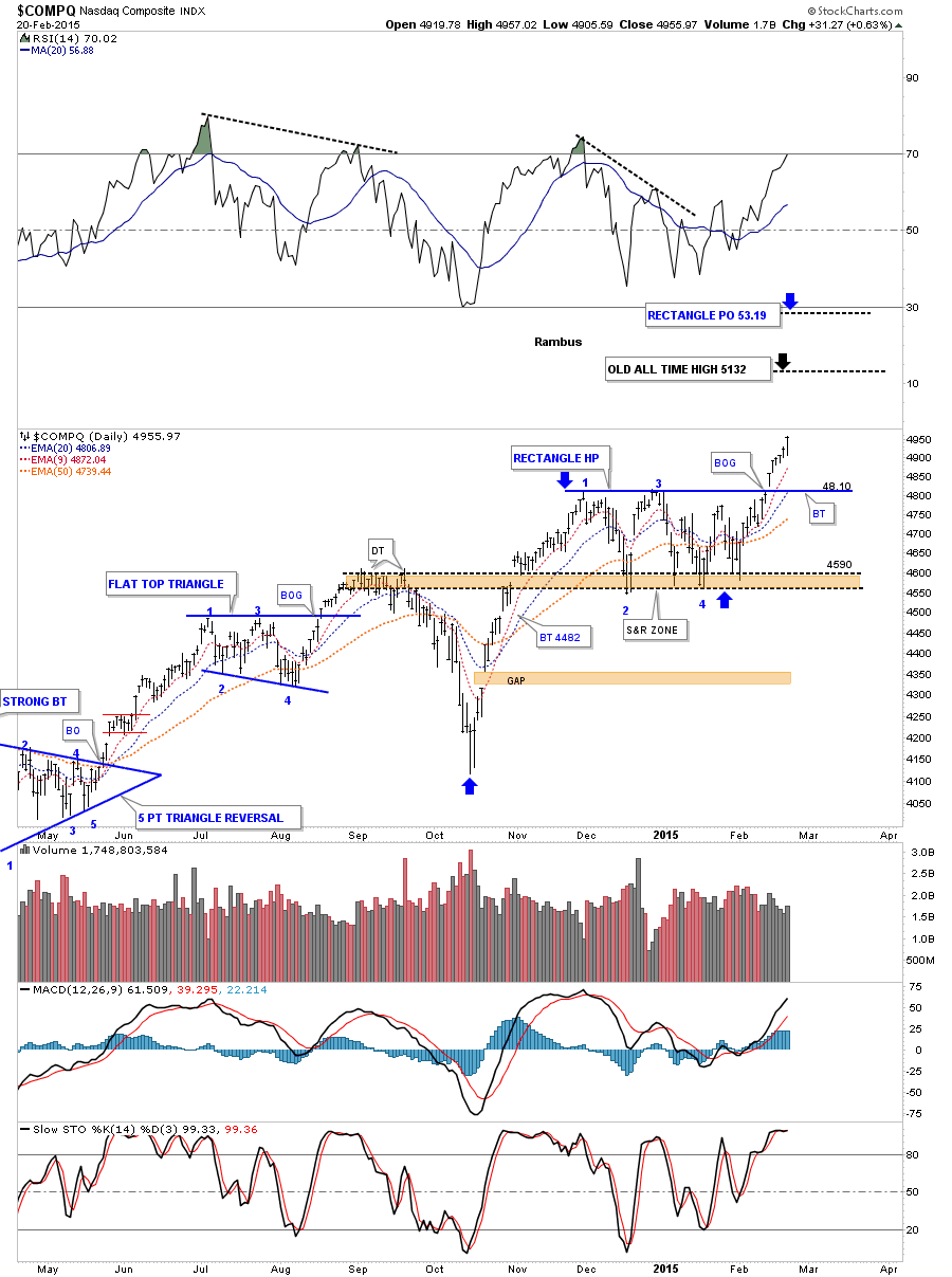 Below is a monthly chart for the COMPQ which shows where the old all-time high at 5132 comes into play. Even though I think the COMPQ is going to rally much higher, we just have to overcome the old high and get it behind us. Actually, most of the other stock market indexes are already breaking out to new all time highs.
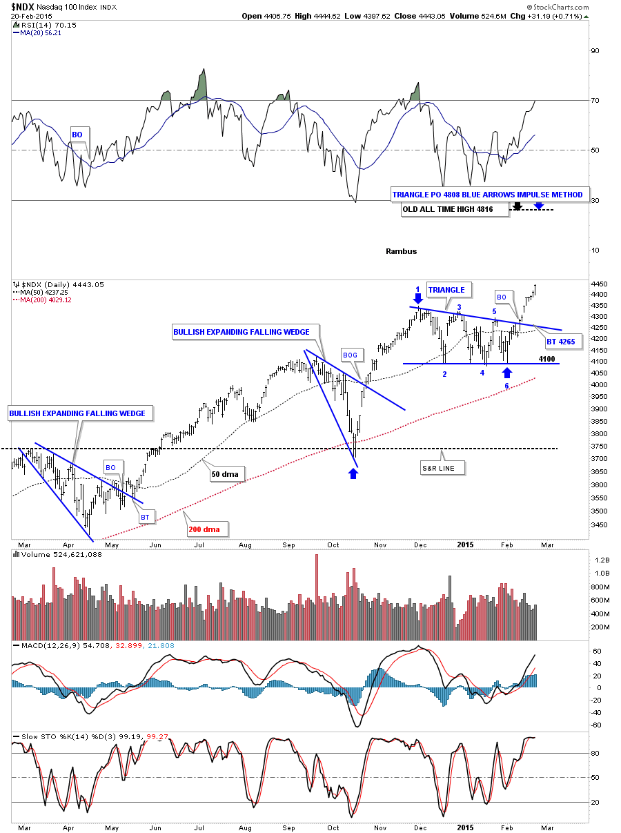
  The NASDAQ 100 shows an interesting price objective up to the 4808 area which is the old all-time high for this index of the 100 biggest tech stocks.
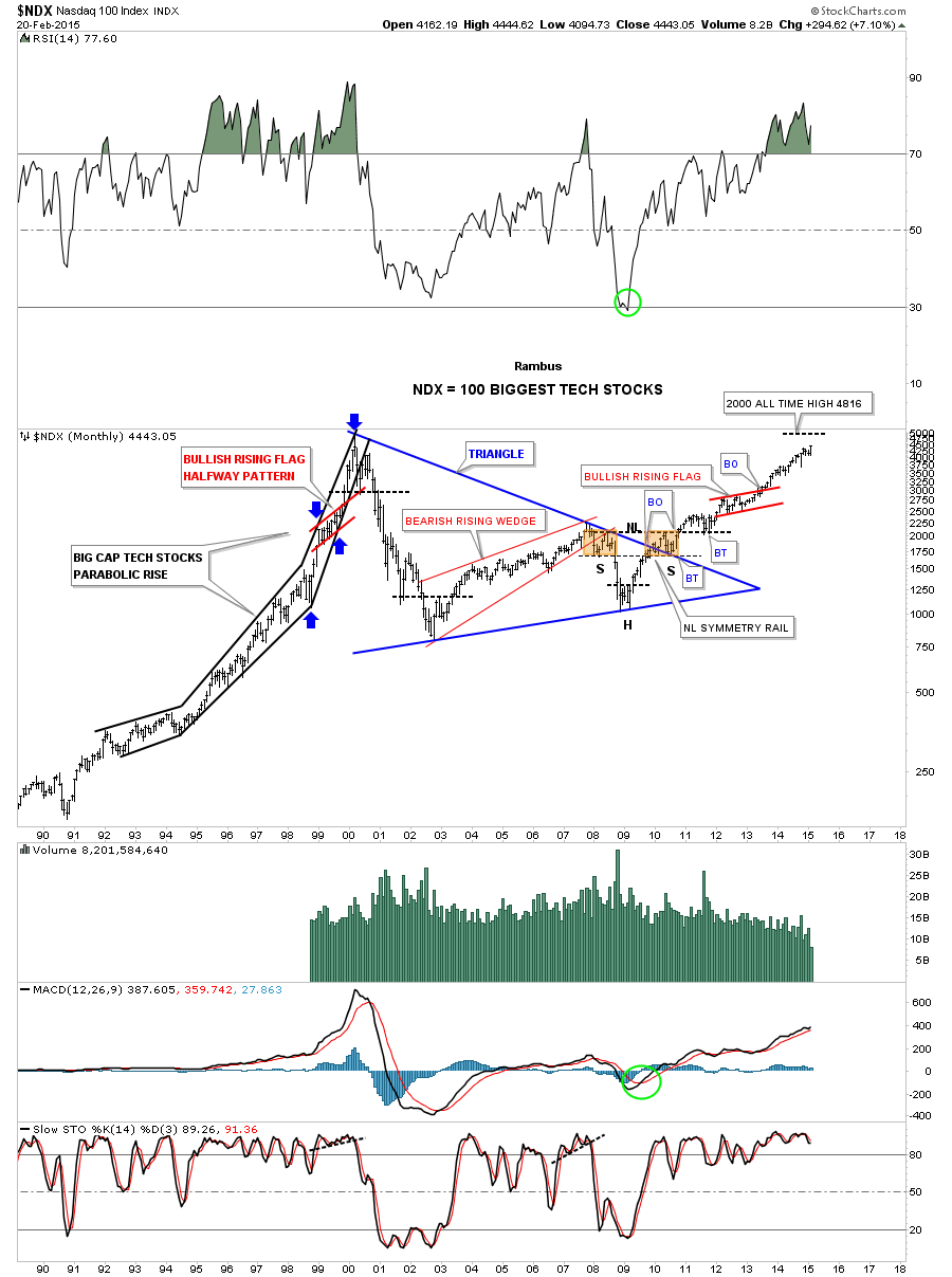
  Below is the monthly chart for the NDX 100 which shows where the old high comes into play at 4816.
  The daily chart for the Russell 2000 shows it breaking out above the top rail of the massive blue expanding triangle. I just tweaked the top rail a bit.
Note the spike high just before the top rail was touched 2 weeks ago and sold off. That’s typical on the initial hit. After the backtest to the top rail of the blue rectangle, it then rallied up and through the top rail of the expanding triangle. Note the last bar on this chart which I’m now labeling as the backtest to the top rail of the blue expanding triangle.
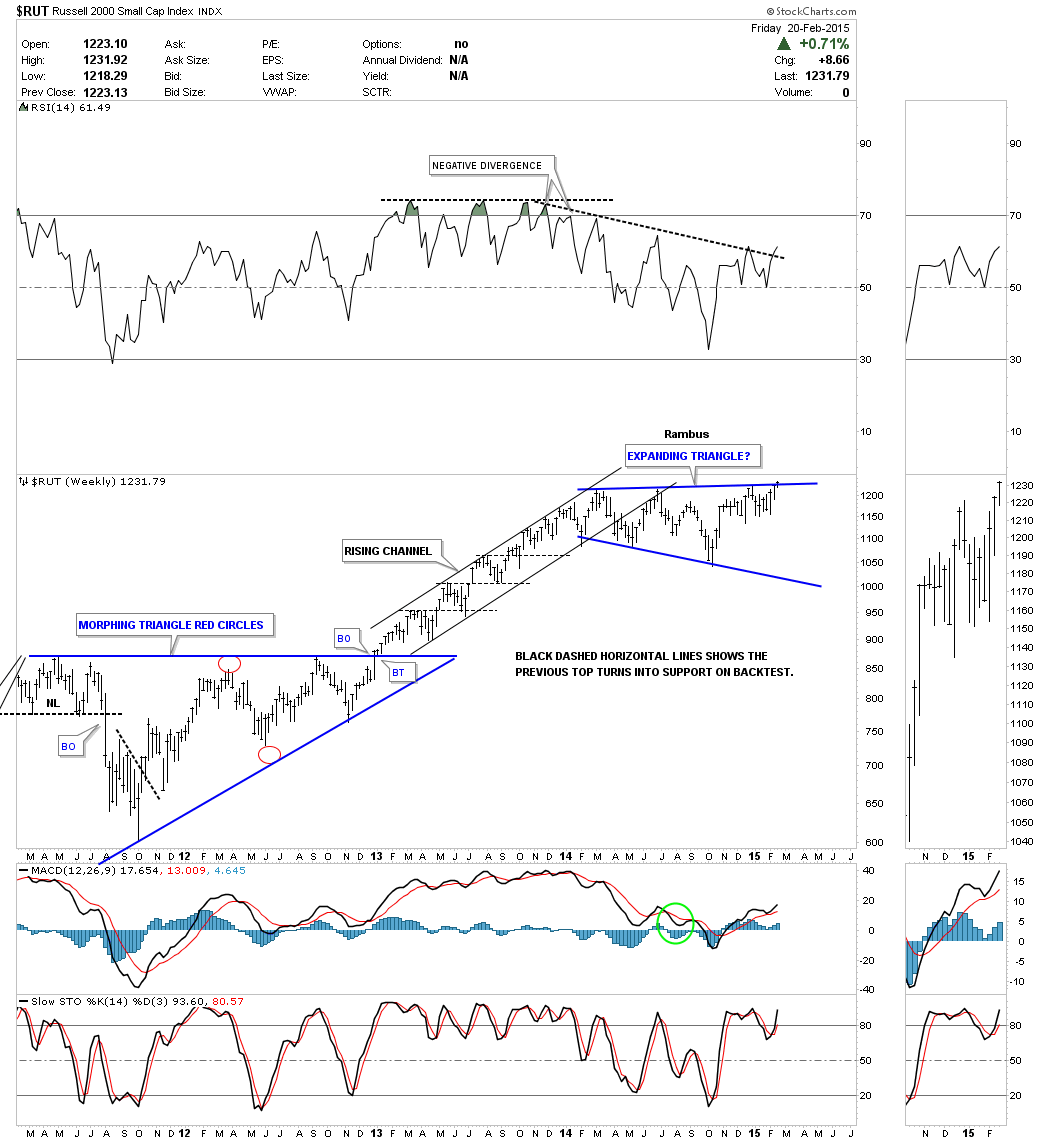
Until the RUT weakness last Friday morning I had the top rail just a bit higher, but seeing the low on Friday shows me where to the backtest actually occurred. We shall see if this is the correct position now for the top rail on any further backtesting. 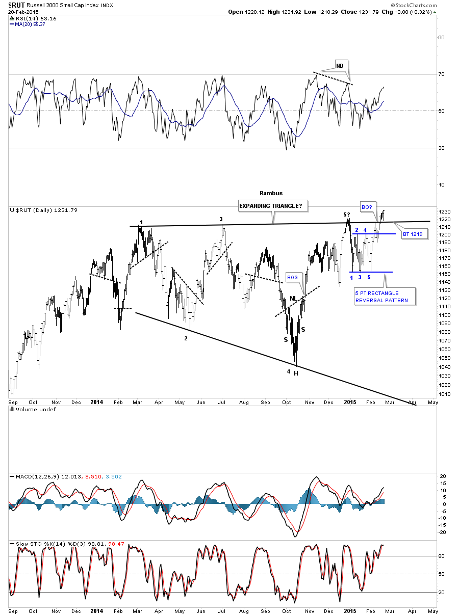 The weekly chart shows you just how important this year-long expanding triangle is to the bigger picture. This is what a bull market looks like.
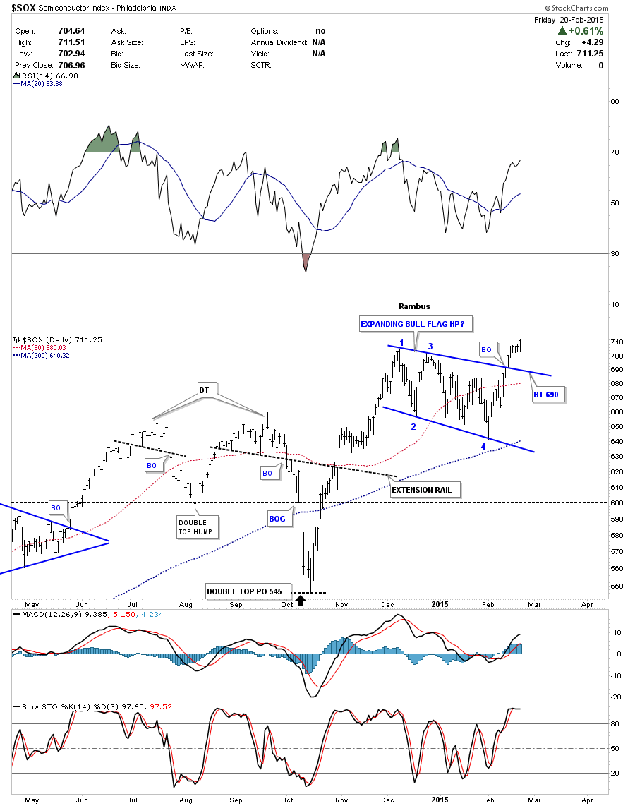
  The daily chart for the Semiconductor Index (SOX) shows it breaking out of an expanding bull flag. A backtest would come at the top rail around the 690 area.
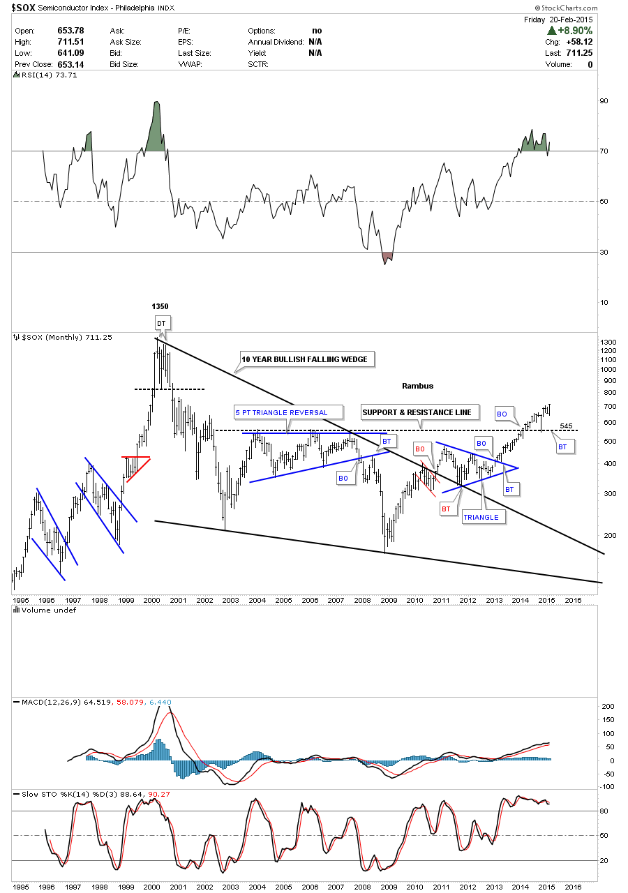
  The monthly chart for the SOX shows it's now trading at a new multi year high going all the way back to the early 2000s. I think this is going to be a sector that will be playing catch-up with the other tech indexes.
  This should bring everyone up to speed on the PM complex and the US Stock Markets. There are a lot of positive things happening right now if you’re long the stock markets and short the PM complex.
Nothing goes straight up or down. It’s usually two steps forward and one step backward until you get where you’re going. A longer term time horizon is best suited for most investors even though the short term swings can catch us off guard sometimes. For those members who are working on the mechanical trading system keep up the good work. Perseverance will pay off in the end. As Sir Fully likes to say, all for one and one for all, for all the knights and ladies of the roundtable.