Investing.com’s stocks of the week
The story on Wall Street and CNBC continues to be that we’re in a correction and this is a buying opportunity. Even Warren Buffett joins the chorus of stock market cheerleaders for the skeptical public. Well, I agree with the skeptical public, not the experts here!
The bull market from early 2009 into May 2015 looks just like every bubble in history, and I’m getting one sign after the next that we did indeed peak last May.
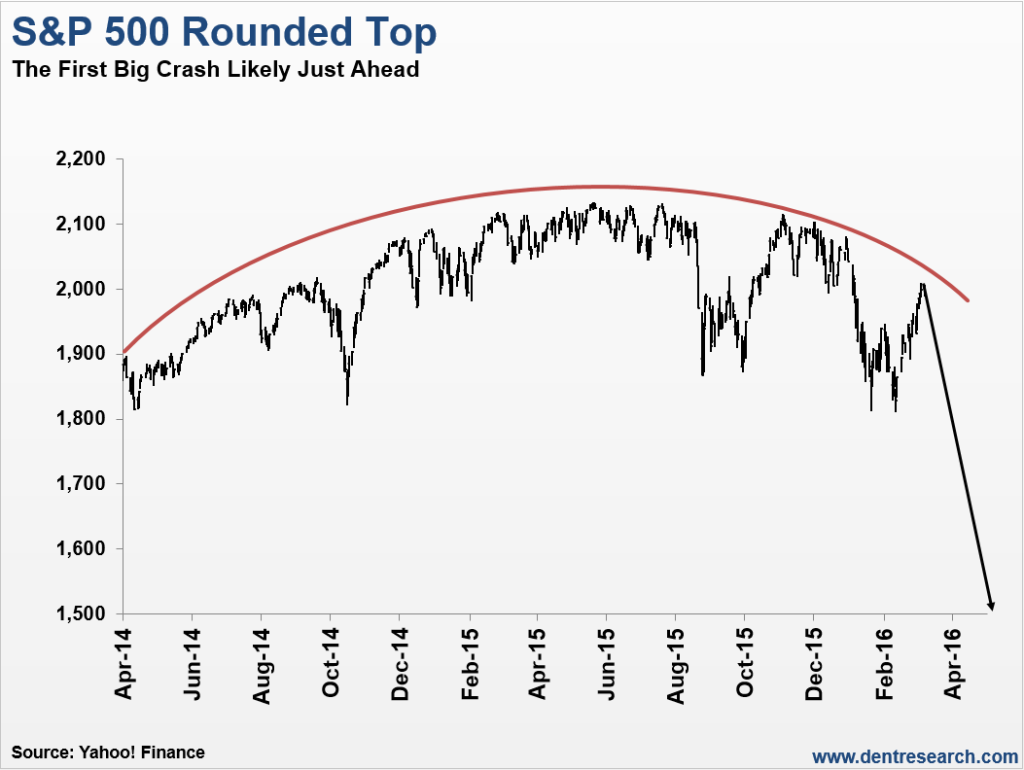
I’ve been telling our Boom & Bust subscribers for months now that the dominant pattern in the stock is the “rounded top” pattern I show in the chart below:

After trading in a steep, bubble-like channel from late 2011 into late 2014, with only 10% maximum volatility top to bottom, the market finally lost its momentum… just as the Fed finished tapering its QE. That’s because the Fed was the primary driver in this stock bubble in the first place!
But the first sign that the bubble had indeed peaked was the break of that upward channel last August. Surprise, surprise! Without the Fed’s stimulus, stocks started to sputter out!
With that sign we can point to what now looks like a series of major tops, in one major index after the next, since late 2014.
Dow Transports, November 2014. Dow Jones Utilities, January 2015. The DAX in Germany and the FTSE in the UK: April, 2015. The Dow and S&P 500, May 2015. The Shanghai Composite in June 2015. The NASDAQ Composite, Biotech and the Russell 2000: July 2015. And finally, the Nikkei Index in Japan that peaked in August 2015.
The Shanghai composite crashed 45% in 2.5 months, similar to the Dow in late 1929 on its first 2.5 month wave down. That one was so obvious that when I said it was about to burst, it peaked that day and rolled over the next!
Then there’s the Biotech bubble that crashed 40% into its February 11 bottom, another one that’s clearly done for. And I showed in the March issue of The Leading Edge for our lifetime subscribers how major global banks are crashing, with even Deutsche Bank (DE:DBKGn) in Germany down 59% from its 2015 highs… and 89% from its 2008 highs. You don’t even want to look at the larger banks in Italy!
But one analyst after the next still doesn’t think it’s a bubble!
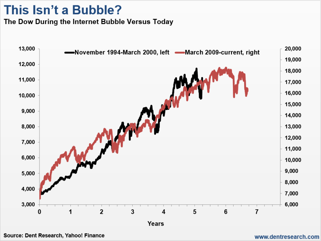
So I pull out the next chart, comparing this bubble with the obvious bubble in stocks from late 1994 into early 2000 – the infamous tech bubble.

Again, this looks like every major bubble in history!
As I told Grant Williams in an interview for Real Vision, this bubble along with every other follows the Masters and Johnson chart for the male orgasm – there’s a rise, a climax, and a sharp fall! From the moment we’re born until we kick the bucket, humans are cyclical along with everything they do.
That’s the other thing Grant and I talked about: what’s consistent across humans is that we absolutely refuse to recognize a bubble when we see it. That’s why they call it “living in a bubble!” I told Grant that someone once handed one of my books to Bill Clinton, and I told the guy “you’re wasting your time!”
Economists are bad at seeing bubbles, but politicians are even worse!
If the economy does well, they want to take credit for it. If it doesn’t, it’s probably the last party’s fault! They attribute everything to government and give consumers a back seat. It’s laughable!
The markets on crack are still in denial about the bubble and its ultimate collapse. The typical stock bubble crashes between 70% to 90%. In other words, they don’t correct… they don’t have a soft landing… they BURST. No exceptions in history.
In the rounded top scenario above, we’re getting close to the point where the markets are very likely to fail for the second time to make a new high since the peak in mid-May.
When that happens and the S&P 500 falls to new lows below the 1,810 threshold, reality might finally kick in. The markets will then see a more serious wave down, likely into around early July or so. And eventually, it’ll carry the Dow to around 5,500 to 6,000 likely by late 2017. The greatest crash of your life is just ahead…
