Trend Model signal summary
Trend Model signal: Risk-on
Trading model: Bullish
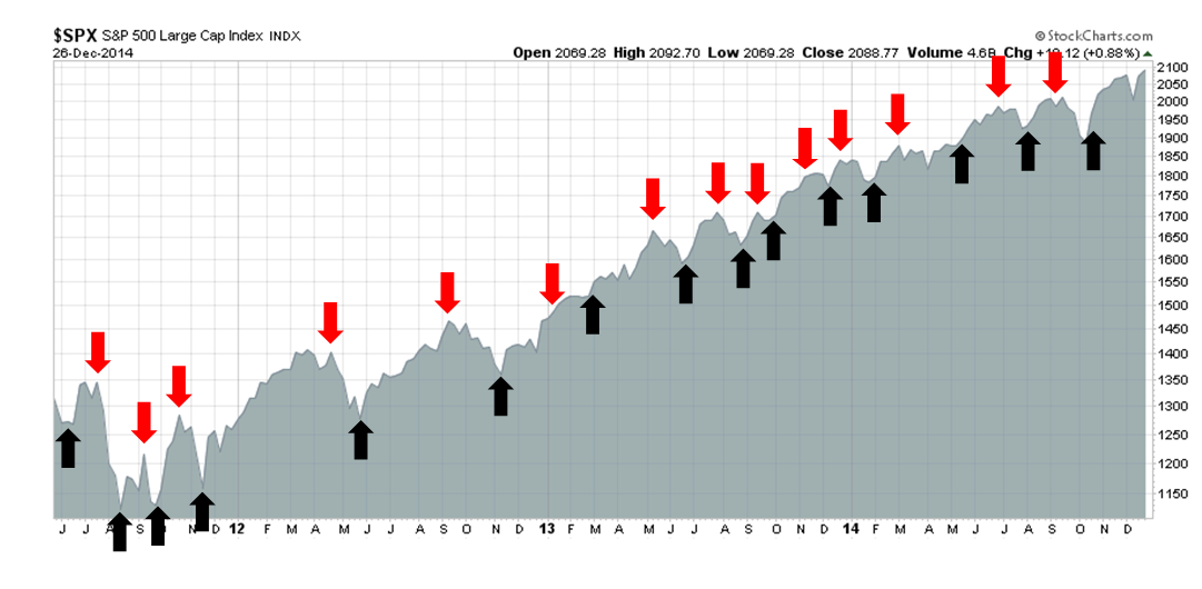
The Trend Model is an asset allocation model used by my inner investor. The trading component of the Trend Model keys on changes in direction in the Trend Model - and it is used by my inner trader. The actual historical (not back-tested) buy and sell signals of the trading component of the Trend Model are shown in the chart below:
Update schedule: I generally update Trend Model readings on my site on weekends and tweet any changes during the week at @humblestudent. In addition, I have been trading an account based on the signals of the Trend Model. The last report card of that account can be found here.
A classic Santa Claus Rally
I wrote in last week's commentary (see What happens after Santa leaves?) that I believed that this year was shaping up to be another classic year-end Santa Claus rally, which consists mainly of an oversold rally bounce of washed out tax-loss selling names. I further expressed concern about the bearish message from overseas markets.
So far, the market is exactly following the script that I laid out last week.
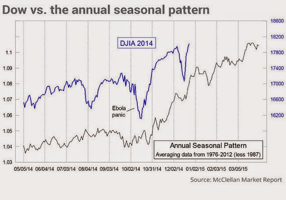
Tom McClellan recently laid out the typical seasonal pattern of a Santa Claus rally and the 2014 stock market seems to be fairly typical of past markets. If history is any guide, the current episode of market strength is likely to start petering out in the first week of January.
I wrote last week that I was closely monitoring the behavior of the leaders and laggards to watch 1) whether this is a Santa Claus rally; and 2) for the sustainability of this rally:
The key indicator to watch for the sign that the Santa Claus rally can continue into year-end and beyond is the nature of the market leadership during this period. Will relative strength led by the recent high-beta leadership, such as biotechs and semiconductors, which would be a sign of continued market strength, or down-and-out groups such as small caps and energy, which are the most likely tax-loss selling candidates and whose rallies would likely peter out soon?
Sure enough, the classic signs of a Santa Clause rally emerged as the leaders started to falter relative to the market (via the iShares NASDAQ Biotech ETF, IBB)):SPDR S&P 500 ETF, SPY and vs the Semiconductor index:
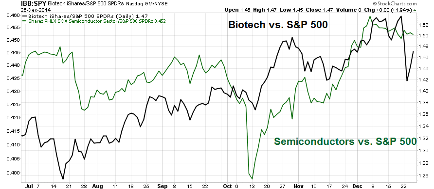
...and the laggards rebounded. The outperformance of energy stocks, as measured by the SPDR Energy Select Sector Fund XLE:SPY ratio on the bottom panel, is particularly impressive as oil prices were flat during the week.
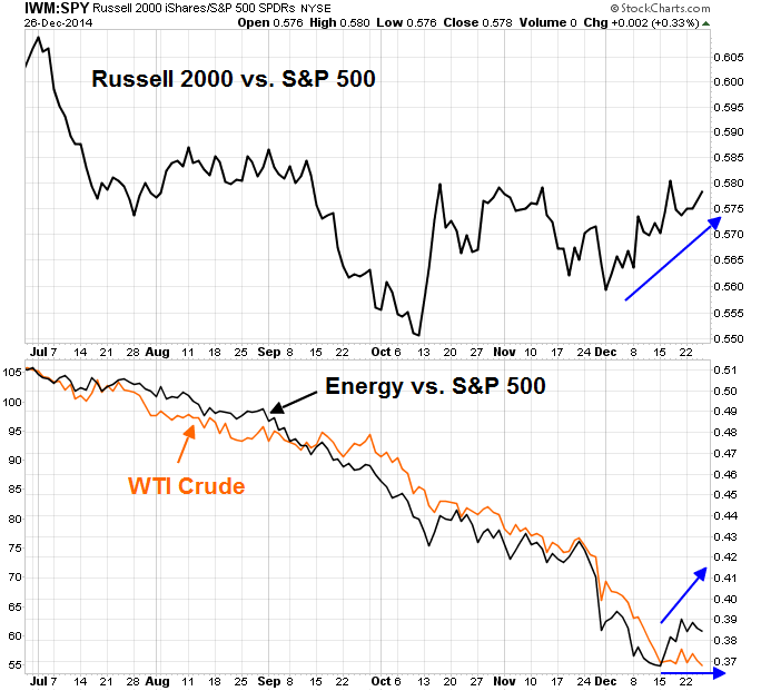
The rebound in small cap stocks saw both the Russell 2000 (via the iShares Russell 2000 Index ETF (ARCA:IWM) and the S&P 500 stage upside breakouts to new all-time highs on Friday. We may see additional positive momentum in small cap stocks as technically inclined traders jump on the breakout.
However, I am somewhat skeptical about these breakouts for two reasons. First, the breakout was achieved with the tailwind of seasonal strength. As well, the nature of the current market leadership, which is the defensive Utilities sector (via SPDR Select Sector - Utilities (NYSE:XLU)), stands in stark contrast to the relative strength of high-beta small cap stocks.
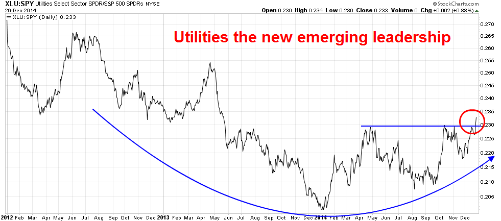
The chart below shows the market relative returns of Consumer Staples (via SPDR - Consumer Staples ETF (ARCA:XLP)), another defensive sector. This defensive sector also shows a similar pattern of a rounded relative bottom.
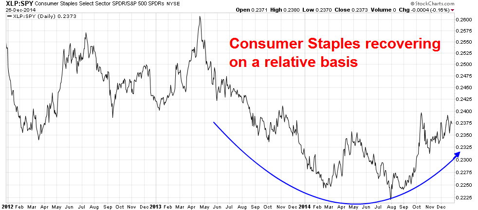
What does the relative breakout of Utilities and the emerging leadership of such defensive sectors of Utilities and Staples say about the nature of a market?
Overseas headwinds
Once the seasonal tailwinds are gone, it will be time to go back to the basics of my Trend Model. Unfortunately, my Trend Model is flashing warning signs because of the market action from non-US markets. As regular readers know, my Trend Model monitors the US, European and China-related markets for signs of global strength and weakness as inputs to its signals.
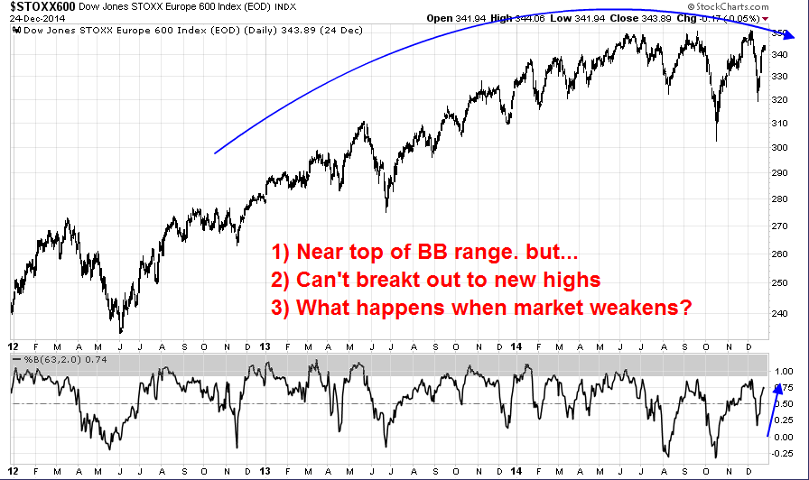
In Europe, the STOXX 600 has been rolling over and appears to be forming a rounded top. The bottom panel of the chart below shows the deviation from the 62-day Bollinger® Band, which is a de-trended measure of three month average market action. Currently, readings are near the top of the historical band, indicating that the STOXX 600 is nearing an overbought reading.
Here is a tough question for the bulls: If this index is rallying, as indicated by its positive deviation from the BB, but it has difficulty making new highs during a period of market strength, what happens when the current period of seasonal strength subsides? Is this a sign of underlying market strength?
As for China, the recent strength in the Shanghai Composite has not been confirmed by my other indicators. The WSJ reported a surprise Christmas present from the PBOC this year as the central bank told Chinese banks that they will be able to "add deposits from nonbank financial institutions to their calculations of their loan-to-deposit ratios". The Shanghai Composite rallied on that stimulus announcement. It seemed that Beijing had blinked yet once more and gone back to the same-old-same-old trick of credit fueled infrastructure growth.
What I found disturbing was that commodity and commodity related markets did not respond positively to that announcement. The AUD/CAD cross-rate, which is a measure of Chinese economic strength as Australia is more sensitive than Canada to Chinese growth, remains in a downtrend. In addition, industrial metal prices are also in a downtrend indicating slowing global growth momentum.
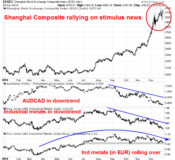
Even if I were to argue that commodity prices are down because of the strength of the USD, the picture still doesn't look good. The bottom panel of the above chart shows industrial metal prices in euro, which negates much of the effects of USD strength. Even that chart shows that industrial metal prices have been making a rounded top. The most constructive comment about that chart is that it is testing a key support zone and prices haven't totally cratered yet.
Do the charts of European stocks and commodities tell a story of rising or slowing global growth? Does Friday`s failure of the Dow Jones Transports to make a new high, which would flash a Dow Theory buy signal, tell a story of continued market strength?
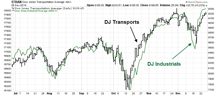
As the period of seasonal strength draws to an end in early January, do you think that you should be greedy or cautious?
This is not THE TOP
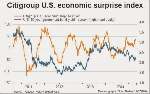
Let me make this very clear. Unless I start seeing unusual strength in some of my Trend Model indicators (European stocks, commodity prices), my base case calls for some near-term market weakness in January. But this is not a call for an intermediate term top in US equities. The US growth outlook remains healthy and supportive of higher stock prices in the medium term. The chart of the Citigroup US Economic Surprise Index is still rising, which indicates a rising number of beats vs. misses in macro releases:
I would also like to reiterate my comment from last week that I expect that falling oil prices will eventually result in rising EPS estimates, but that will come with a lag:
While I continue to believe that the Street will eventually raise growth estimates because of lower oil prices, these changes will occur with a lag because the analyst community haven't fully quantified the effects of falling energy prices (see 2015: Bullish skies with scattered periods of volatility). Corporate America will see eventually benefits from decreased input costs and higher consumer spending as oil prices decline...
It`s just that EPS growth estimates have not risen much because the benefits of lower oil prices are diffuse and the Street hasn't quantified them yet.
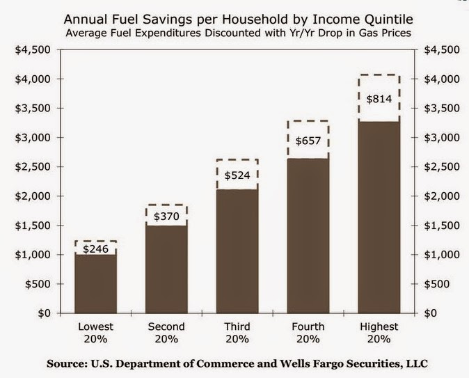
The benefits of lower energy prices will start to become apparent to the Street as we move through Q4 Earnings Season. Those upward revisions should be a catalyst for an equity rally. Already, we are seeing top-down analysis like this one from Wells Fargo Securities (via Business Insider) quantifying the positive effects of lower gasoline prices on the American consumer. It will not take long for the same effects to appear on a bottom-up company by company basis once Earnings Season is under way.
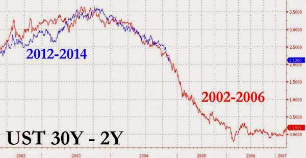
I would also remind my readers that analysis from Zero Hedge indicate that a major market top is some time away. That Prince of Market Doom recently pointed to the flattening 2x30 yield curve and suggested that "this will not end well". However, an examination of the history of that yield curve shows that, even if we were to follow the ZH's dire 2002-2006 scenario, that day of reckoning is about three years away:
Here is what the SPX did during that same period. There's still plenty of upside left:
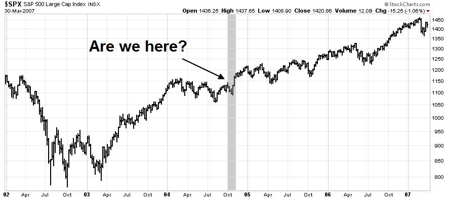
In the meantime, my inner investor is thinking about whether he wants to lighten up his equity positions from the current aggressive risk-on position to a more neutral stance so that he can take advantage of potential market weakness to buy back in at lower prices.
My inner trader is watching breadth and sentiment indicators very, very closely and he has his finger poised on the "sell" button. For the time being, he remains long the Santa Claus rally trade.
Disclosure: Long TNA
Cam Hui is a portfolio manager at Qwest Investment Fund Management Ltd. ("Qwest"). This article is prepared by Mr. Hui as an outside business activity. As such, Qwest does not review or approve materials presented herein. The opinions and any recommendations expressed in this blog are those of the author and do not reflect the opinions or recommendations of Qwest.
None of the information or opinions expressed in this blog constitutes a solicitation for the purchase or sale of any security or other instrument. Nothing in this article constitutes investment advice and any recommendations that may be contained herein have not been based upon a consideration of the investment objectives, financial situation or particular needs of any specific recipient. Any purchase or sale activity in any securities or other instrument should be based upon your own analysis and conclusions. Past performance is not indicative of future results. Either Qwest or Mr. Hui may hold or control long or short positions in the securities or instruments mentioned.
