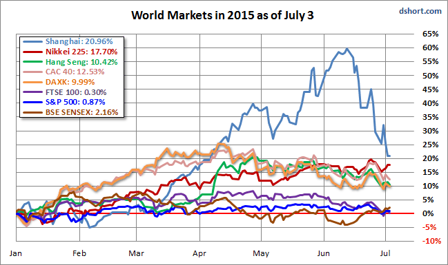
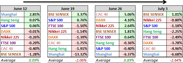
India's BSE SENSEX was the only index in our eight-index world market focus group that posted a weekly gain, up 1.01%. The attention grabber was, again, China's Shanghai Composite, down -6.68% for the week. From its 59.72% year-to-date gain on June 12th, it took the Shanghai a mere 10 sessions to warrant the stigma of bear market (a -20% decline) on Monday of this past week, and it's now down -24.26% three sessions later in its holiday-shortened week. Meanwhile, the drama in Greece continues to pummel the European Indexes. The weekly number for the FTSE 100 was -2.49%, the DAX -3.78% and the CAC 40 -4.96%.
Here is an overlay of the eight for a sense of their comparative performance so far in 2015.
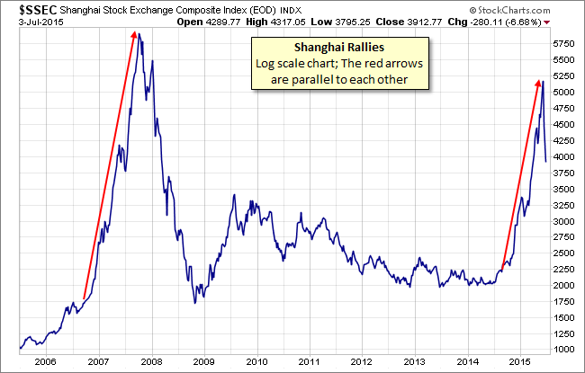
Let's take a closer look at the Shanghai over the past nine years. Below is a log-scale chart illustrating the bubble that peaked in 2007 and the rally that started last year. We've added an arrow to highlight the big bubble and then used the same angle to annotate the latest lunacy.
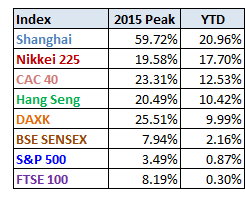
Above is a table of the 2015 data performance, sorted from high to low, along with the interim highs for the eight indexes. All eight indexes are in the green, with China remaining at the top despite its three-week plunge.
A Closer Look at the Last Four Weeks
The tables below provide a concise overview of performance comparisons over the past four weeks (through year's end) for these eight major indexes. We've also included the average for each week so that we can evaluate the performance of a specific index relative to the overall mean and better understand weekly volatility. The colors for each index name help us visualize the comparative performance over time.
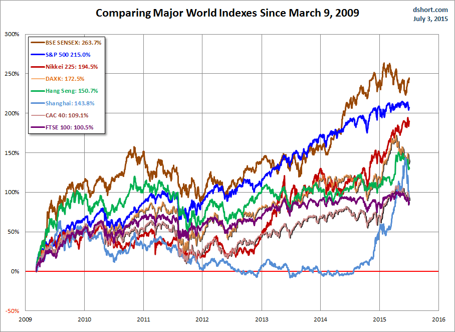
The chart below illustrates the comparative performance of World Markets since March 9, 2009. The start date is arbitrary: The S&P 500, CAC 40 and BSE SENSEX hit their lows on March 9th, the Nikkei 225 on March 10th, the DAX on March 6th, the FTSE on March 3rd, the Shanghai Composite on November 4, 2008, and the Hang Seng even earlier on October 27, 2008. However, by aligning on the same day and measuring the percent change, we get a better sense of the relative performance than if we align the lows.
A Longer Look Back
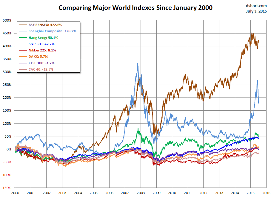
Here is the same chart starting from the turn of 21st century. The relative over-performance of the emerging markets (Shanghai, Mumbai SENSEX and Hang Seng) up to their 2007 peaks is evident, and the SENSEX remains by far the top performer. The Shanghai, in contrast, formed a perfect Eiffel Tower from late 2006 to late 2009.
Check back next week for a new update.

