In my weekly S&P 500 #ChartStorm in which I pick out 10 charts on the S&P 500 to tweet. Typically I'll pick a couple of themes to explore with the charts, but sometimes it's just a selection of charts that will add to your perspective and help inform your own view - whether its bearish, bullish or something else!
The purpose of this note is to add some extra context and color, not isn't necessarily to arrive at a certain view, but to highlight charts and themes worth paying attention to. Inevitably if you keep an eye on the charts they tend to help tell the story, as you will see below.
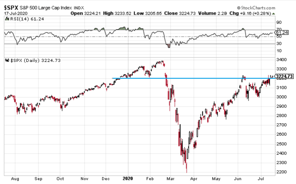
1. S&P500 Closed Above 3,200 Line, But Can It Hold?
Stocks consolidated near the top of the range last week in quiet summer-like trading – something we haven’t seen too much of. We are back at the June 8 peak. It’s been an interesting dynamic between large cap growth stocks (which garner much of the attention) and small cap value – both have taken turns leading the market higher since late March.
Of course, the S&P 500 is driven by the former. The index remains at an important level as this 3200 zone is right about where the market broke down from in late February. Seasonally, the first three weeks of July are typically quite bullish, then things get more dicey during the final third of the month through much of August.
Also, note the RSI at 61 – still within the ‘bullish’ zone between about 40 and 90, but much weaker than it was at the peak at the June 8 high on the SPX. Putting it in perspective, perhaps that is a good thing as the late May into early June timeframe was almost had that melt-up feeling.
Bottom line: The S&P 500 is above the 3200 by a little bit, less than 1%, but it was a choppy-trade to end last week despite a more than 1% advance on the week. Stocks may be dealing with some important resistance at these levels. Let’s call this a very tentative breakout on stocks – but there’s still more left to be proven.
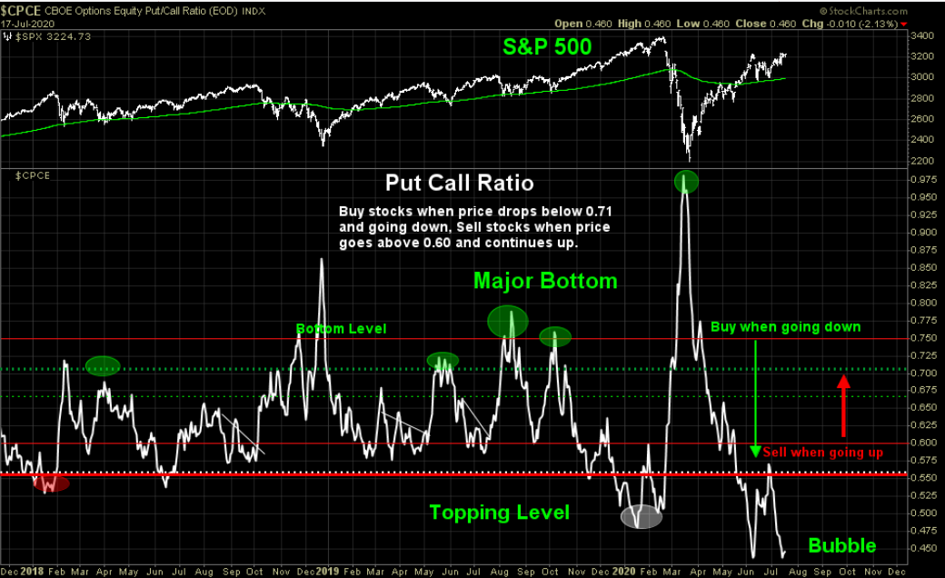
2. Put Call Ratio
Thanks to @ThinkTankCharts for an update on one of our favorite charts – the equity put-call ratio on the S&P 500. This is a red flag if there ever was one. The indicator is back at its June 8 level – beyond extreme. Traders are holding considerably more calls than puts right now, indicative of a frothy market with little concern for downside protection. Corrective price moves can happen fast, and capitulation may come quicker.
ThinkTankCharts provides nice context here – major market bottoms are noted when the put-call ratio spikes, but you can also see when the ratio bottomed as the SPX peaked earlier this year. The June 8 spike down is also evident. Is it different this time? There does not appear to by any good reason why it should be different now.
Bottom line: The bells and whistles should be going off when investors see this chart. It is a huge short-term risk flag being waved. Sticking with the components/theme of this chart, maybe now is the time to consider picking up a little insurance by way of put options to mitigate the risk.
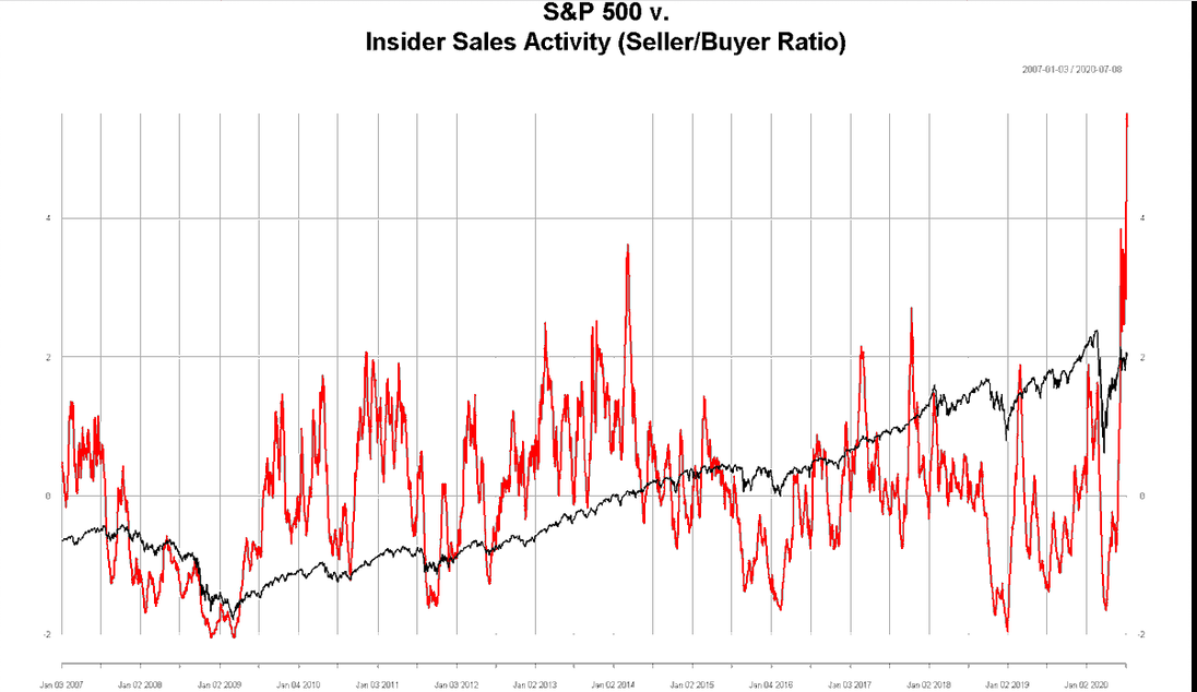
3. Insider Selling Climax
@BrightramLLC brings us another warning flag for the S&P 500 – price versus insider selling activity (seller/buyer ratio). Since 2007, there has never been a bigger spike, which indicates insiders are selling at a torrid pace. Do they know something we don’t? Well, of course not, that would be illegal, right? Tongue-in-cheek there, but we can compare historical peaks to see how price action followed. Unfortunately, we have never seen the ratio this high, so it’s hard to draw a good comparison.
Nevertheless, the move that stands out is the jump seen in early 2014. Recall that time – the market had just come off a stellar 2013 during which the index climbed about 30% on somewhat low volatility (not unlike 2017 for you younger traders). Perhaps it was natural for insiders to take some profits during the first half of 2014. The middle 2014 to early 2016 was the commodity collapse, which led to a weak global recession when analyzing some historical data points. Another recent spike came in late 2017 – once again after a huge equity market advance.
Now here we are after 50% surge on the S&P 500 from the intraday March 23 low, and insiders are booking profits again. Notice how insiders were net buyers at the market bottom – that’s a tidy little profit!
Bottom line: Chalk this up as another short-term warning flag the market is waving to us. Insiders have been net sellers after stocks have rallied in the past, and it appears to be happening once more. Insiders were buyers earlier this year near the lows, but may be inking the profits now.
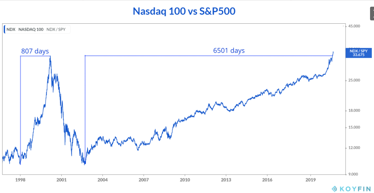
4. Nasdaq Versus S&P500: Another Perspective
@haumicharts tweeted out a very cool look at the duration of the Nasdaq 100’s outperformance of the S&P 500 since the late 1990s. Notice how the Nazzy’s alpha came in a relatively short 807 calendar days during the tech bubble of the late 1990s. Now contrast that to how long it took the Nasdaq 100 to beat the S&P 500 this time around. It’s been 84 years (insert the Titanic gif) – just kidding – it’s been 6501 days, or nearly 18 years. It sounds a lot longer than the former 2-year stretch in the late 90s, but it’s still an impressive period of outperformance from the biggest 100 non-financial firms on the NASDAQ Composite.
Technicians love digging into the past, but where do we stand today? The NDX/SPY ratio chart is at all-time highs, breaking out above the March 2000 peak. Technicians also love our cute sayings – such as “the bigger the base, the higher the space.” While this uptrend in the Nasdaq 100/S&P 500 ratio chart is not a classic basing chart, the implication could still be that there is still room for tech stocks to run since they are just now breaking out relative to all US large cap equities.
Bottom line: It took nearly 18 years for technology equities to breakout from the 2000 peak – at least on a relative basis vs. the S&P 500. While many pundits call for sharp underperformance of mega cap tech due to valuation, the ratio chart suggests there may be more to the move.
5. ConsensUS-A
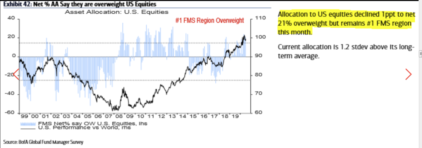
Thanks to @keanferdy for this chart. The Bank of America/Merrill Lynch Global Fund Manager Survey produced each month always has some good nuggets. This chart shows surveyed allocations to US equities relative to the rest of the world. Positioning to US stocks declined just a hair from the prior month, but the USA remains the most favored equity region that BofA tracks. The current allocation is more than 1 standard deviation above the long-term average.
It’s interesting to look at the survey results during the early-mid 2000s – investment managers were largely chasing performance – when foreign equities were having their day in the sun, investment managers favored them. It wasn’t until the Global Financial Crisis hit in 2008 when the allocation/sentiment shifted from international equities back home, and it was a remarkable 7-year stretch when managers favored the US. The black line on the chart below is the relative performance chart of US equities versus the rest of the world.
Bottom line: It continues to be a great run for the S&P 500 versus the all-country world index, so portfolio managers keep placing a halo on US stocks versus the foreign equities. We may be near a cautious point though with the current allocation being significantly above the long-term mean.
6. US Equity Valuations
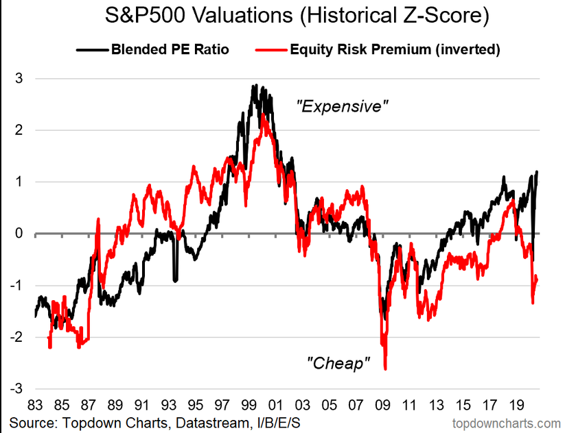
We posted our half-time update for our 10 charts to watch in 2020 post. This is a touchy subject right now - US stock market valuations. While the standard forward PE ratio gets a lot of buzz nowadays, there are other methods by which to analyze how expensive US equities are. The macro environment is always shifting, so it’s never a 100% apples-to-apples comparison over time. I.e. interest rates today are far more favorable than they were during the 1990s. So, we prefer to use a blended PE ratio approach to highlight the current market valuation.
Stocks are about 1 standard deviation above the long-term average. But now take a look at the equity risk premium (inverted on the chart) – it is nearly 1 standard deviation BELOW its long-term average. So the equity risk premium suggests the S&P 500 is somewhat cheap.
Of course, the bearish counterpoint is that bonds are simply really, really expensive, which we generally agree with. But often when making asset allocation decisions, it comes down to a relative value approach. Do I put money here or there? If investors don’t like bonds, stocks may be the alternative. I could add a paragraph on ‘TINA’, but I’ll save you on that.
Bottom line: Absolute valuations have their place in equity market analysis, but so too does relative valuation. The blended PE ratio on the S&P 500 is quite high, but bonds are also expensive – which makes stocks look relatively ‘ok’ versus bonds. Just something to keep in mind.
7. "What If"
Turning from a controversial topic like the S&P 500’s valuation to something we can all agree on – The Fed. Well, maybe not. But here we go….
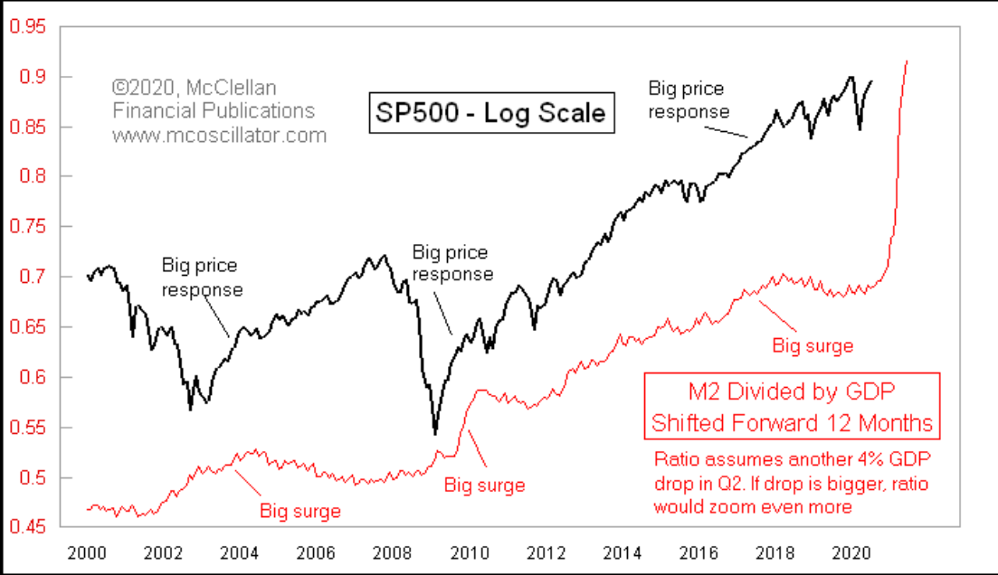
@McClellanOsc provides this chart of the S&P 500 (black) and the controversial money supply (red). The first of our ‘What-Ifs’, could it be that the S&P 500 is gearing up for (or is already in the process of) a huge move to the upside given the extremely active US Federal Reserve? The Fed has bought huge amounts of assets, boosting their balance sheet from $4 trillion to $7 trillion over the last few months in response to the COVID-19 economic crisis.
Looking back, when the money supply has outpaced GDP, stocks have typically jumped following the Fed’s moves. A critic may say “well, we’ve already surged 50% from the March low” – which is probably a strong point, but we are still below the February stock market high while M2 dividend by GDP has gone straight up to all-time highs. Ironically, if we see a bigger Q2 drop in GDP, the red line will go up further, so would that may imply more supportive policy action, and then higher stock market prices? Some crazy things to consider.
Bottom line: The Fed is an important factor (some might say the most important fundamental) for equity market analysts and those positioning portfolios to weigh. The stock market is not what you want it to be, it just is. Investors must acknowledge, if not embrace, the Fed’s role in how the S&P 500 behaves. Historically, jumps in M2 (the money supply)/GDP have preceded big bullish price responses.
8. "What If" 2.0
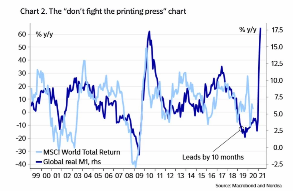
Our second what-if comes from a chart tweeted out by @AndreasSteno. Let’s show some love to the rest of the world by analyzing the MSCI World Total Return chart (which the US is still nearly 60% of..) and the global money supply. We are looking at a year-over-year percentage change chart since 1999.
The point here is that when global money supply goes up, global stocks usually respond favorably – the lead-time of the change in global money supply to stock prices appears to be about 10 months. A few things jump out on the chart – the dips and rallies during the prior 2 bear markets and then of course the major increase in Global M1 in the last few months. What’s interesting here is that global stock prices have yet to respond. Is there time to jump on board a potential global equity market surge? Hard to say, but what if…
Bottom line: It’s been a global effort by central banks to fend off the devastating economic impacts from COVID-19. When extremely accommodative action takes place, stock prices tend to follow. Again, you may disagree with the monetary policy actions, but this is the world in which we live and invest.
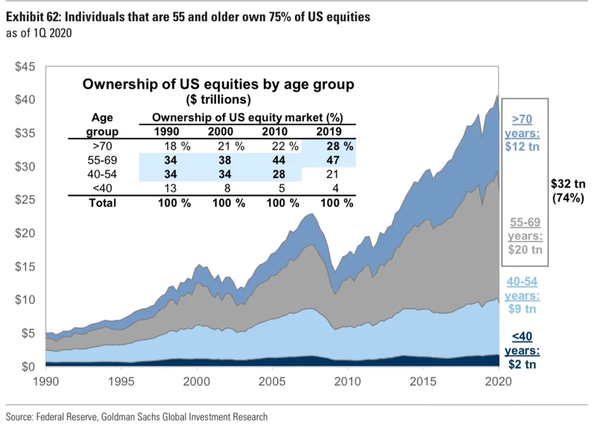
9. 55+ Demographic Dominating The Market
Those aged 55+ owned 75% of US equities in 2020 That figure was 52% in 1990 Meanwhile the under-40's held just 4%. Turning to demographics & ownership, @GunjanJS brings us this chart which breaks down equity ownership by age. This one generated a lot of buzz during our TweetStorm. The chart demonstrates that the senior crowd owns more stocks relative to other age groups than at any other time over the last 30 years.
It’s important to consider a generally aging population, student loan debt/more young people going to college, estate tax that will ultimately be paid, wealth transfers that will naturally take place in due time.. but this chart is still concerning for the younger generations. And maybe those youngster Robinhood traders weren’t moving the market all that much earlier this year since those under 40 own just 4% of the stock market!
The economic & demographic narrative to be draw here is that Millennials and Gen Z are not really participating in the S&P 500’s outstanding returns both since 2009 and just from the March 23 low. The economic hardship is real for so many Americans, but those owning stocks have likely seen a much better rebound in their financial prospects over the last few months. Imagine being someone in their early 20s, saddled with student debt, maybe out of a job due to COVID-19, and not owning any stocks to at least cushion the economic blow this year.
Bottom line: Mentioned earlier, the market is always shifting. No two periods are exactly alike. Old folks own a lot more stocks relative to young people today. Eventually it all must go somewhere, but the divide has only been growing.
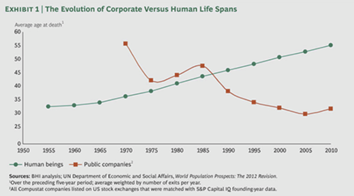
10. Divergence Between Human Vs. Corporate Life Expectancy
The average Human is dying older the average Business is dying younger. Sticking with demographics, two trends that may keep on going are people living longer and the average length of public company become shorter. Of course we hope the former does not reverse any time soon – we like that uptrend. The latter trend appears to be bottoming out, but the usual public company lifespan is still a fraction of what is was during the 1970s and 80s.
Gone are the days of industries like automobiles and telecommunications lasting decades upon decades. Today’s economy is more geared to fast-moving technology trends – what is novel today, is old-news in a few years. It’s fascinating to consider where the mega cap tech companies will be 10 or 20 years from now, or what they will look like.
Bottom line: People are living longer and companies are dying sooner. Or at least transitioning sooner. A tech-driven world demands firms keep pace, and that is a tall order.
So where does all this leave us?
1. A tentative breakout with short-term risk flags
Stocks slumped following the late May and early June melt-up, but the rebound in the last few weeks has been significant. The S&P 500 has demonstrated resilience in face of increasing COVID-19 cases of late. While price action appears to be solid, there are some warnings signs. The equity put-call ratio is once again at warning sign levels – indicating that investors are speculating on the call side rather than holding the insurance of put protection. Another risk flag is the level at which insiders are selling their holdings. The executives timed it well earlier this year with heavy buying in Q1 and early Q2. Meanwhile, fund managers are once again positioned very strongly in favor of US stocks versus foreign equities, or at least so they say. It all seems just a bit frothy. Meanwhile, the leaders keep leading with US tech stocks, as measured by the Nasdaq 100 ETF, breaking out to fresh all-time highs versus SPY.
2. Valuations and What-Ifs
We live in a world of trade-offs. Stocks are expensive on their own, but compared to bonds, equities are not such a bad deal as the PE-pushers suggest. The bears must also acknowledge the role of central banks – historically, there has been positive price action following massive monetary stimulus. Is there still room to run after a 50% return from the March 23 nadir? What if..?
3. Demographics
Robinhood traders have been capturing all the headlines in the last few months with regards to trading volume, but the under 40 crowd owns just 4% of the total US stock market. The older, slower money has been growing in prominence since 1990 – but who knows, maybe Gen X and the seniors are savvier with their trading apps than we think. Speaking of technology, US listed public companies have shorter lifespans than the years-past. To end on a positive note though, human beings across the globe continue to live longer.
Summary
Stocks have been climbing the wall of worry with the help of central bank liquidity. Earnings season is underway, and we continually monitor not the liquidity of firms, but their solvency. The economic environment is still hard, but price action on equity indices has been generally favorable. Some underlying indicators suggest playing defense could be the prudent strategy right now. Looking ahead, expect more news narratives with a bearish tone as COVID-19 cases and deaths are on the increase across America. For stocks, the latter half of the third quarter is always a scary/wary one as seasonality turns against the bulls...
