Tuesday was a big achievement for the large-cap U.S. index. After a waterfall decline of over 30% in March, equities have been a steady climb higher to recover the loss from the first quarter. While new highs are historically bullish and rightfully so celebrated, Tuesday’s move leaves me scratching my head due to the very weird price action experienced in many other corners of the market.
I tweeted Tuesday evening while doing some of my nightly charting, how many other indices actually closed down as the S&P 500 hit its new high watermark. It’s not that we need to see everything move together, but it’s odd to have small caps, mid caps, Dow Jones Industrials, Dow Jones Transports, semiconductors (which have been a strong leader for most of the recovery), equal weight S&P 500, and the high beta factor all close down on the day.
Meanwhile, under the hood the cumulative advance-decline lines for the small caps, mid caps, and large caps all took a step lower. There was an uptick in the percentage of stocks trading above their respective 50-day moving average for the Dow Industrials, NASDAQ 100, and S&P 500. What went higher along with the SPX on Tuesday? Oddly (again)…volatility. Now of course there were some corners of the market that joined the SPX in rallying on Tuesday. Communications, Technology, Consumer Staples), and Consumer Discretionary were all positive too.
Looking under the hood, there are a few charts that really stand out when plotting the record closing high for the S&P 500. Let me share a few…
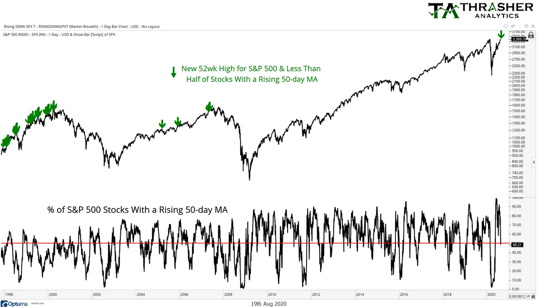
First, yesterday was the first time since 2007 the index made a new 1yr high while less than half of the underlying stocks enjoyed a rising 50-day moving average. This happened quite often in ’98 and ’99 but was a condition that for the most part disappeared after the dot-com bubble popped.

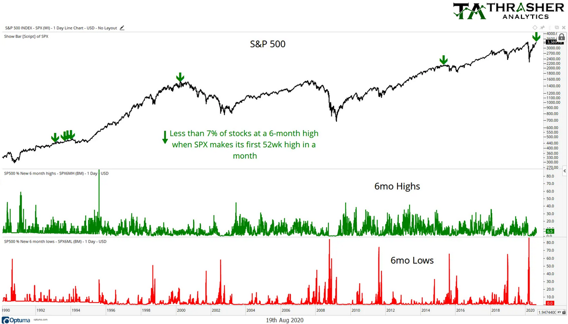
While the index was hitting fresh air, only 6.5% of the underlying stocks were even making a 6-month high. We don’t need to set a high bar for participation in a new 1 year high but you’d expect at least 10% to be making a 6-month high right? The chart below shows when the index made its first new 52-week high in a month with less than 7% of stocks at a 6-month high. We haven’t seen this low level of participation since 2015 and before that, in 2000 and 1993.

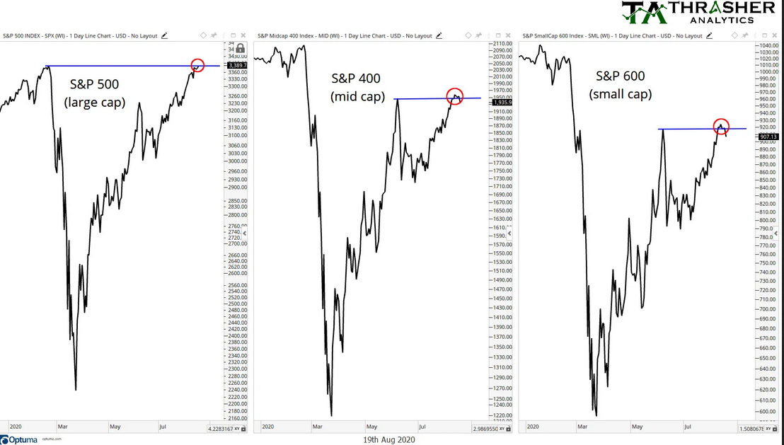
The recovery off the March low has not been one with tremendous strength in small or mid cap stocks. The strength has solidly been found in mega caps, specifically the FAAMG names. But while the large cap index broke out, oddly the mid cap and small cap S&P indices began to fail at their prior June highs. Again, we don’t require all stocks to trend together, but to see a break down like this while the SPX makes a new high is just….weird.

So what’s it all mean? The main point I keep in mind with all forms of looking under the hood at market internals is that price confirmation is key! Trend is your friend and until price begins to ‘respond’ to the wacky nature of barely any participation yesterday, it simply doesn’t matter…yet. Finally, this was just one day. One day’s worth of data is not enough to discredit the breakout in SPX. It raises some yellow flags for sure and I’ll be watching of if the breakout can hold, but as long as those few names carrying the broad index higher sustain, then we can’t ignore the fact that’s all the market currently needs to maintain the up trend in place.
Disclaimer: Do not construe anything written in this post or this blog in its entirety as a recommendation, research, or an offer to buy or sell any securities. Everything in this post is meant for educational and entertainment purposes only. I or my affiliates may hold positions in securities mentioned in the blog. Please see my Disclosure page for full disclaimer.
