There is one "green shoot" in U.S. markets as of Friday's close.
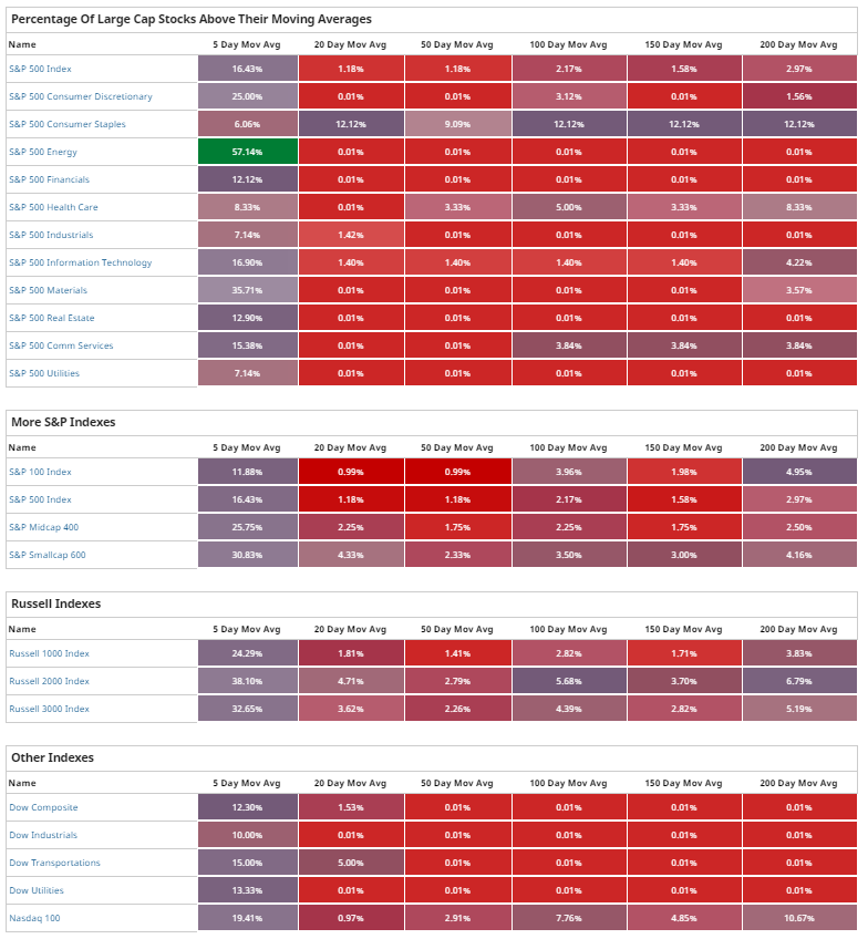
The following heatmap shows the percentages of stocks within the Sectors and Major U.S. Indices that are currently trading above a variety of moving averages.
The one "green shoot" is the percentage of stocks in the Energy Sector now trading above their 5-day MA...a refreshing change in a constant sea of red for the past weeks. The heatmap shown in my post of February 29 was completely devoid of any green.
You can quickly see which of the Sectors and Major Indices are the weakest and strongest of the weak by which ones have the least/most stocks above their 200-day MA.
With regard to the Major Indices, the NASDAQ 100 is the strongest, while the Dow Composite, Dow Industrials, Dow Transports and Dow Utilities are the weakest.
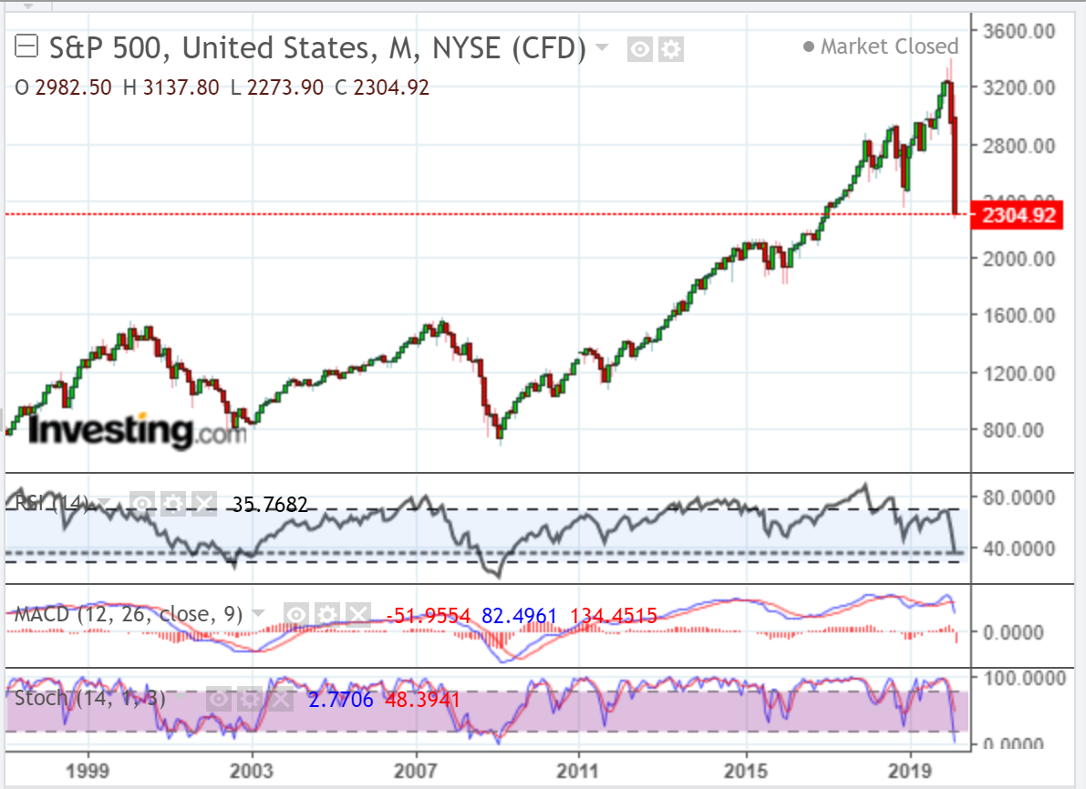
The following monthly chart of the SPX shows the RSI at a 10-year low of 35.77, while price nearly hit February 2017 lows.
This downward plunge shows no signs of slowing any time soon.
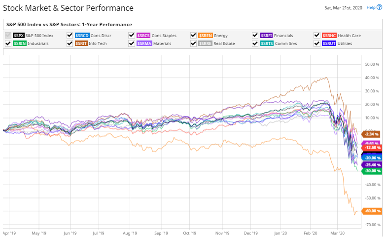
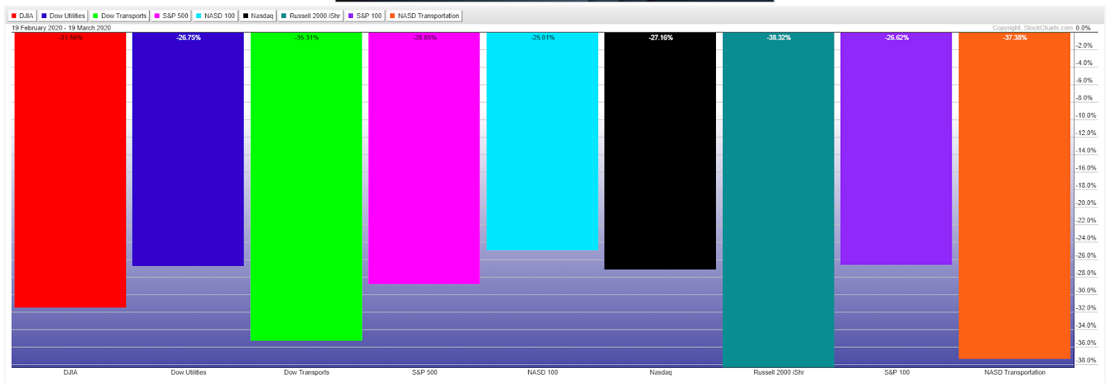
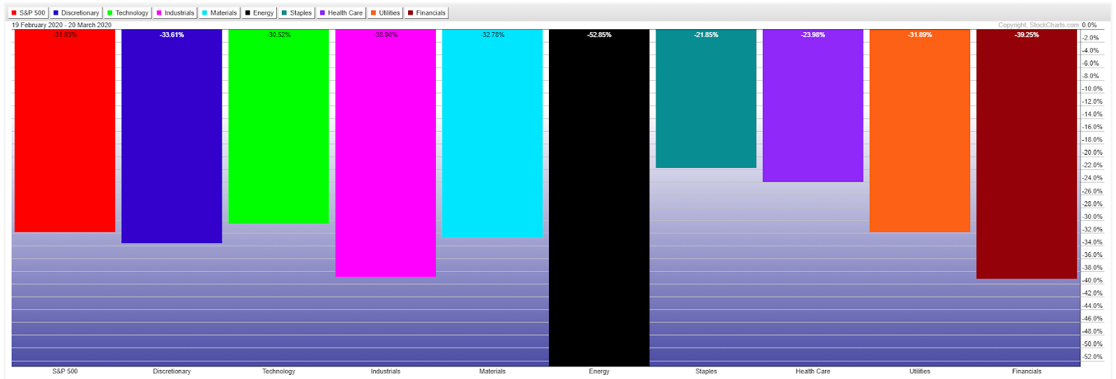
The following percentages-lost graphs taken from February 19 show the destruction that has occurred in just one month in the Major Indices and Major Sectors.
The Small-Cap and Transport Indices and the Energy and Financial Sectors have suffered the most.
MY 2-CENT SERMON:
Markets are like gardens.
What shall we harvest from our gardens...sustenance or weeds? As we sow, so shall we reap. Are we tenders or raiders? Do we prepare the soil and provide nutrients and water for the seeds, or do we sow despair and destruction? If we love our gardens, they will love us back.
So, too, if markets continue to be raided, they will become barren beyond recovery.
