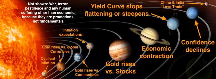
As we have noted over the many years of the gold sector’s bear market, the gold miners will not rally for real until the real sector and macro fundamentals come into place. Those fundamentals do not include commonly promoted inflation, China/India “love” trades, a US dollar collapse or especially, war, pestilence or any other human misery than economic. The more astute gold bugs do not fall for that.
The gold miners are counter-cyclical as they leverage gold’s performance (whether positive or negative) relative to cyclical assets and markets. Hence the handy picture showing the key fundamental items with the 4 largest planets orbiting the golden sun being the most important.

So the 3 Amigos (of the macro) were saddled up last year in order to guide us to the point of macro change. Linked here is the most recent update. In this post let’s look at just one macro fundamental indicator among several important macro and sector fundamentals; the ratio of gold to developed stock markets.
As a side note, the macro fundamentals indicate whether the larger economic cycle and investor sentiment backdrops are right for the gold sector and the sector fundamentals that we track indicate whether gold mining companies are likely to improve, operationally. The gold stock sector is a real value now, assuming the turns in stock markets are for real, unlike the February spike down.
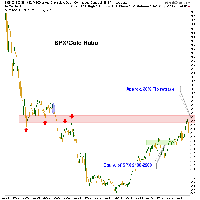
By “for real”, we are looking for the SPX/Gold ratio to decline to the green shaded zone on the chart below, which would theoretically guide nominal SPX to a target zone of 2100-2200; which in turn could serve up a lot of pain for conventional stock market players. Importantly, the SPX/Gold Ratio crashed into a ceiling known as the resistance we have been watching for years now. The big picture trend is still up, but this monthly chart gives a visual of just how abrupt and hard the macro smash has been.

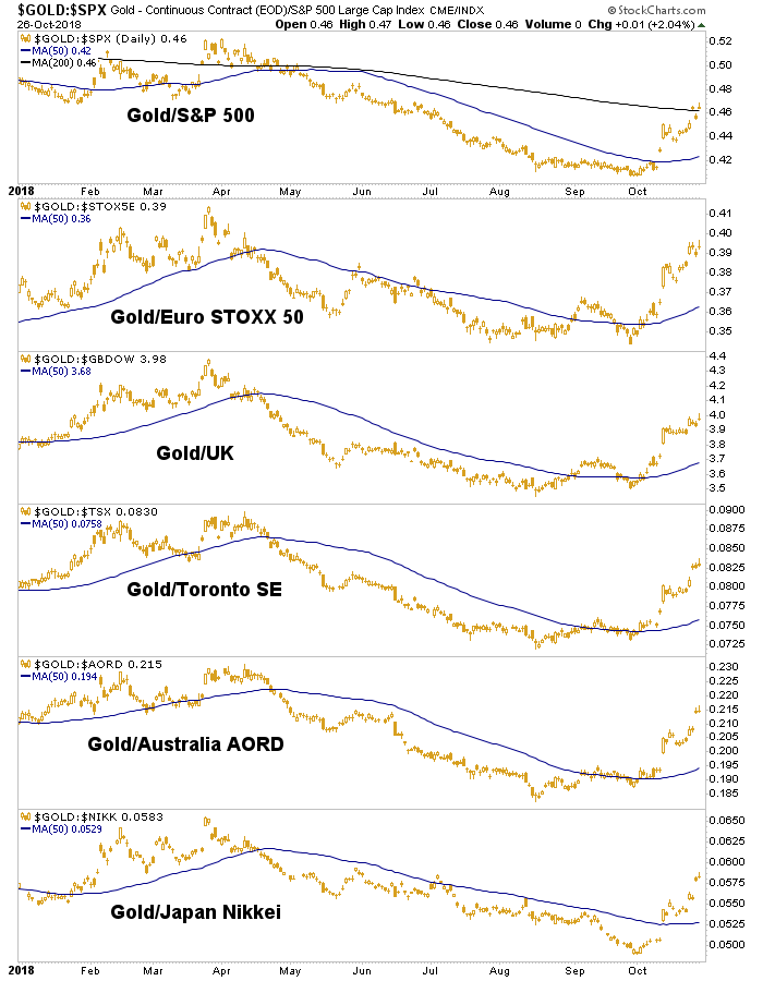
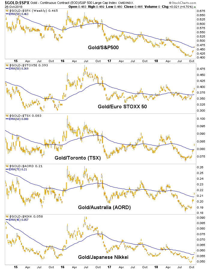
Flipping the above ratio over and dialing in daily and weekly views, let’s look at a couple charts of gold vs. stock markets—the EuroStoxx 50, UK's FTSE, Canada's TSX, Australia's All Ordinaries and Japan's Nikkei. The month of October has seen gold vs. developed stock markets rocket higher, even closing Friday above the 200 day moving average vs. the S&P 500.

Change starts somewhere and that somewhere has been on the daily charts. Next order of business will be to turn the weeklies up. The trends are still down, but… give it time and have patience. There will short-term ups and downs aplenty on the way to changing the trends.

Meanwhile, nominal gold stock indexes and ETFs have not really moved other than bouncing around after forming short-term bottom/bounce patterns. We manage the daily, weekly and monthly chart technicals routinely in weekend reports and in-week updates. Why, I’m even going to pop a 30 minute chart of HUI into my site this weekend, as it will help answer some questions for those who are very short-term oriented.
So ongoing technical analysis of nominal charts is helpful, but it is nothing but noise absent the macro and sector fundamentals, just one of which we’ve highlighted in this post (gold vs. stocks). Unsurprisingly, this setup is not playing out in an inflationary growth situation as bonds bounce as expected, it is not due to war (other than the damaging inputs of the Trade War, which is economic war), India’s weddings, China’s love or any other rationalization other than the macro looks like it is changing, finally. Well hallelujah.
But we need to continually check assumptions and develop the story. So far so good.
