Those that follow my personal account on Twitter will be familiar with my weekly S&P 500 #ChartStorm in which I pick out 10 charts on the S&P 500 to tweet. Typically I'll pick a couple of themes to explore with the charts, but sometimes it's just a selection of charts that will add to your perspective and help inform your own view—whether its bearish, bullish, or something else!
The purpose of this note is to add some extra context and color. It's worth noting that the aim of the #ChartStorm isn't necessarily to arrive at a certain view but to highlight charts and themes worth paying attention to. But inevitably if you keep an eye on the charts they tend to help tell the story, as you will see below.
So here's another S&P 500 #ChartStorm write-up:
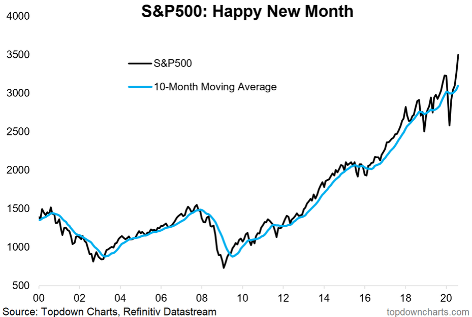
1. Happy New Month! The S&P 500 surged 7% in August and climbed to a 10% advance on the year. For the quarter, SPX is up 13% as of August 31. Growth stocks led the rally, particularly in the final three weeks of the month while value stocks underperformed. The same story of FAAMG, representing more than a quarter of the S&P 500, drew headlines left and right. You can even include Nvidia (NASDAQ:NVDA) and Netflix (NASDAQ:NFLX) in that handful of glamor stocks to create the FANGMAN short-hand.
The S&P 500 CBOE Volatility Index (VIX) also increased during August, an ominous sign for bulls ahead of the often volatile September-early October period (we’ll talk more on this coming up). Sector-wise, Information Technology boasted the best gain of 12% followed by Consumer Discretionary and Communication Services (of course, Apple (NASDAQ:AAPL), Microsoft (NASDAQ:MSFT), Amazon (NASDAQ:AMZN), Google (NASDAQ:GOOGL) and Facebook (NASDAQ:FB)) are found in those sectors). Three of the smallest S&P 500 sectors were the worst performers – Real Estate, Energy and Utilities.
The S&P 500 had its best August since 1986, surging above the 10-month moving average to a fresh all-time high. FactSet notes that the trailing 12-month P/E ratio on SPX is near 28, above the 5-year average of 20.2 and 10-year average of 17.9. The forward P/E is similarly stretched.
Bottom line: The wall of worry continued to be climbed in August. Large cap growth tech stocks continued their dominance, but risks loom ahead.
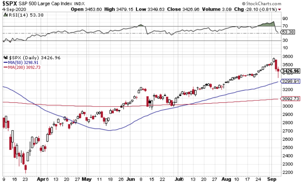
2. Not so happy start to the month... S&P500 in selloff mode after reaching overbought levels. While August ended on with a flourish, it was a tumultuous start to September. Optimism reigned on Wall Street on Tuesday and Wednesday, but then heavy selling pressure took place Thursday and into Friday morning. SPX rallied from 3500 to 3588, a new intraday all-time high, but then a global selloff on Wednesday sent the index to near 3450.
Support was found on Friday at 3350 and the bulls brought stocks to close more than 2% off the low of the day, still good for a 0.8% decline ahead of the Labor Day weekend in the States. The RSI (14) reached extremely overbought levels in late August and during the first two days of September, so perhaps the pullback was overdue. Bulls want to see the RSI hold the 40-50 level as that is often seen as the bottom of the ‘bullish’ range of that momentum index.
Where is price support? We are eyeing the 3400 level on a closing basis. It held so far, but there is a long way to go before the end of ‘volatility season’. Is this just another dip to be bought, or are we finally encountering a sustained correction after a heck of a springtime and summer rally on Wall Street? We’ll explore that question later on.
Bottom line: The August rally seems like a distant memory after the price-action on Thursday and Friday. Momentum was clearly extended, and the S&P 500 had ventured quite a ways above its 50 day moving average and 200dma. A pullback was in the cards. Was Friday’s impressive intraday comeback a sign of the dip being bought or was it a head-fake ahead of more selling this week? We’ll know soon.
3. Seasonality - Tis the season for volatility. We hinted at it earlier, but this time of year can be perilous for the bulls. Seasonality runs weak during the latter half of Q3 and into the first few days of the fourth quarter. We are finally seeing it play out. Ironically, volatility was already rising in advance of this small pullback (so far). The twist this year is that it is presidential election season in the US, so a slight variation on the usual seasonality can be at play.
Still, there’s no doubt that September and October are known to feature some of the wildest market moves of the year. 2020 has been its own animal though, with stocks collapsing during February and March—usually a somewhat bullish time of year, then rallying during July and August which can be choppy months on the calendar. It’s hard to argue against a strong run from mid-October through year-end. Since 1990, the average advance on the S&P 500 is about 5% during that stretch – but we have to get their first. It could be a volatile ride, so fasten your seatbelts.
Bottom line: Seasonality is a friend to the bears for the next four weeks. September is the worst-performing month for the S&P 500 across most lookbacks. Volatility tends to increase when stocks decline, and we are certainly seeing that already in the market. Technology stocks in particular are featuring higher volatility than what we were seeing earlier this season.

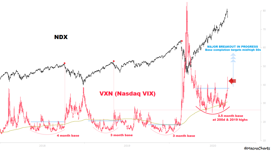
4. An update to that NASDAQ volatility chart from the excellent @MacroCharts ..."If/when Vol breaks higher, be ready for a Major change." We looked at this chart of NASDAQ 100 volatility last month. We get excited about key breakouts, so it is apt to showcase it once more. A 3.5 month base was broken to the upside last week.
We saw that play out in price action with Apple falling 7% on back to back days (though recovering substantially intraday Friday). The handful of huge tech stocks are seeing their implied volatility readings shoot higher, and that is being reflected in the VXN (the VIX of the NASDAQ). Heck, we can even see it in the S&P 500 VIX moving from the low 20s to mid-30s of late.
Back to the chart—a major breakout is in progress on tech stock’s volatility. MacroCharts identified three prior instances of multi-month bases being broken to the upside. Those three red dots happened at important peaks on the NASDAQ price chart. Could this be the fourth ominous horseman?
Bottom line: Volatility among tech stocks has climbed in the last few weeks—even with prices going up. Technicians often describe that kind of market action as unsustainable in that the index almost becomes out of control. A correction usually is the result. On cue, The NASDAQ 100 index indeed retreated 10% (even) from the intraday peak on Wednesday to the intraday trough Friday. Naturally, prices rose 4.25% during the day Friday. More volatility is on the way though.
5. An astounding surge in call option buying: @SentimentTrader brings us this options trading chart highlighting just how much small traders are getting in on the options trading action. Talk about a red flag! Retail traders are going all-in with premium-spending surging from under $100 billion in notional volume (trailing 4-week cumulative moving average) to north of half a trillion dollars. Half a trillion. It’s hard to believe—you can barely even see the uptick around the March 2000 high.
Under semi-quarantine, working from home (or attending college classes from home), with excess cash from stimulus, and most other entertainment spending down big .. what else to do than trade options now that commissions are zero and every brokerage firm has a quick and easy app. It is one of the more fascinating narratives that has seemingly played out this year.
2020 may be the year of “YOLO” when it comes to betting on stocks for fun. As market analysts, this is almost too much for us! The size of this red flag could cover Wembley Stadium. What will these day-traders do when we finally see a return to volatility and a pullback in stocks? What if the equity indices even retreated to re-test the March lows? There would likely be an extra layer of panic given the participation among retail traders this time around.
Bottom line: Ma and pa traders, or maybe your cousin taking online college classes, are buying up calls like it’s on their monthly budget. Retail spending on options trades (this needs to be a thing in the retail sales report each month if you ask me) has gone up 400%+ since the beginning of the year. Of course, the $500 billion figure is a notional volume. A confluence of factors has led to small traders getting in on the action, but this is often a sign of a market top, not of a good buying opportunity for investors.

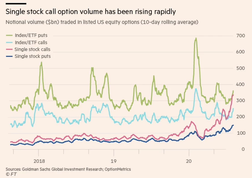
6. Most of the action in call buying is on single names. Thanks to @trevornoren for helping detail where equity options trading is taking place. The data shows that single stock call volume has seen the biggest uptick. But all groups, indexes and single issues as well as calls and puts, have been on the increase in the last couple of months. It’s interesting to analyze the trends in the last few years on this chart. Index put buying soared during the Q4 2018 correction and then jumped huge at the March 2020 equity market bottom—all while single-stock options trading was nothing to write home about. But there was a little jump in single stock call and put volume in advance of the bear market earlier this year ..hmm…
Maybe the story-stocks of Tesla (NASDAQ:TSLA), Hertz (NYSE:HTZ), Zoom (NASDAQ:ZM), and the like have stirred in some FOMO among folks at home watching financial news all day. There’s no quicker way to participate than to buy a few calls option contracts. With the casino closed, it’s the next best thing to scratch that impulsive itch. We all know the likely companies on which calls are buying bought.. the FAAMG stocks and all of the quarantine darlings like Zoom.
Bottom line: A good SPX correction would help remove some of this frothiness. It’s hard to believe that needs to be said considering we just had a 34% bear market earlier this year. But retail traders are compelled to find excitement in options trading with typical leisure and travel activities unavailable.
7. AAII portfolio allocation survey sees cash allocations drop from 26% in March to 16% in August. Not truly "all-in" just yet (compared to where previous low points were) but getting there... @topdowncharts features this American Association of Individual Investors (AAII) chart of cash allocation since the 1990s. Investors liquidated assets during the 2020 bear market which caused cash positioning to jump from under 15% to 26%.
Stocks have of course recovered, and investors have deployed cash into more risky assets. As it stands now, cash is 16% of investors’ portfolios – the lowest since just before the COVID flash-bear market. Historically, this chart needs to bottom closer to 10% before we can claim ‘all-in’ among individual investors. We could be on the way at the rate of this summer’s cash deployment. It’s interesting to take a step back and look at the trend on both the AAII cash deployed chart and the price chart of SPX from 2009 through 2019 – cash slowly but surely got put back to work as stocks climbed. It’s a classic contrarian indicator.
Also notice how much lower cash allocations are in today’s market regime versus the 2000s. Perhaps that is driven by ZIRP and TINA. Back in 2006, you could earn about 4-5% on cash in a savings account. Not anymore. So the spike to 40%+ during early 2009 may not be quite as impressive given it was coming from a base of 20-30% of cash allocation in the 2003-2007 bull market.
Bottom line: Individual (retail) investors have been putting cash to work rather aggressively in the last few months. The group panicked earlier this year, resulting in a 10-year high in their cash allocation when the VIX soared north of 80. But here we are with stocks near all-time highs (though volatility has returned modestly), and individual investors are closer to being fully invested.

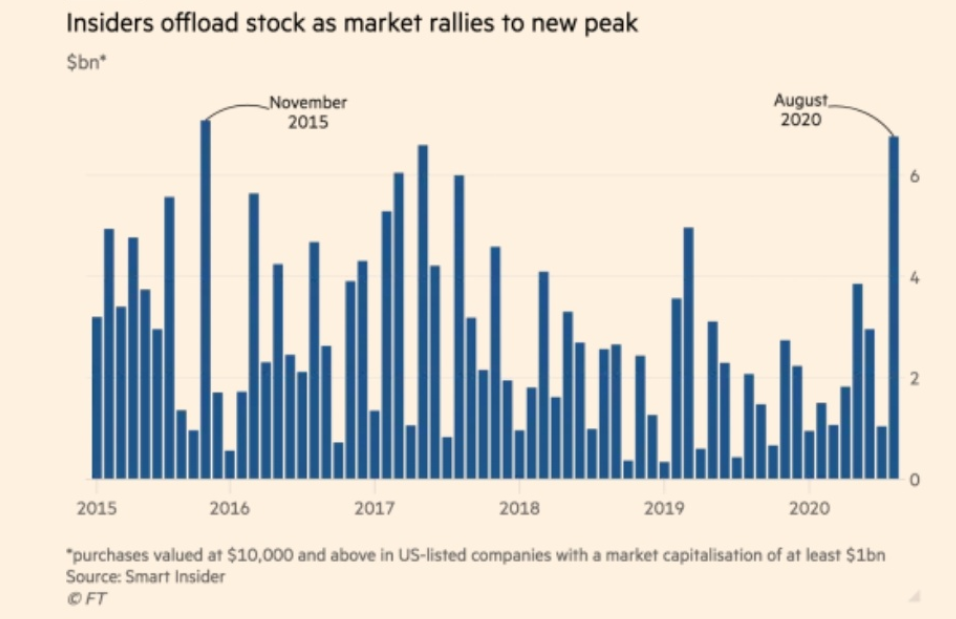
8. Insiders cashing their chips. @Chigrl brings us this look at insider activity among US-listed companies with a market cap of at least $1 billion. The insiders have been dumping stocks aggressively in the face of all-time highs on SPX. August 2020’s total matched that of November 2015 for the most selling volume since the beginning of 2015.
The response bulls have to this chart is always that we don’t really know why they are selling. But in aggregate, analysts can get a good feel for what the smart money is thinking by way of this chart of insider selling activity. Corporate managers perhaps feel uneasy about where the business environment may be headed with COVID fears still present and election uncertainty (tax policy risk) on the rise.
Bottom line: Insider selling climbed to multi-year highs last month as stocks had their best August since 1986. It’s quite the contrast – particularly considering the activity among small investors that we outlined earlier. So the smart money is selling, and the not-so-smart money is almost all-in ….
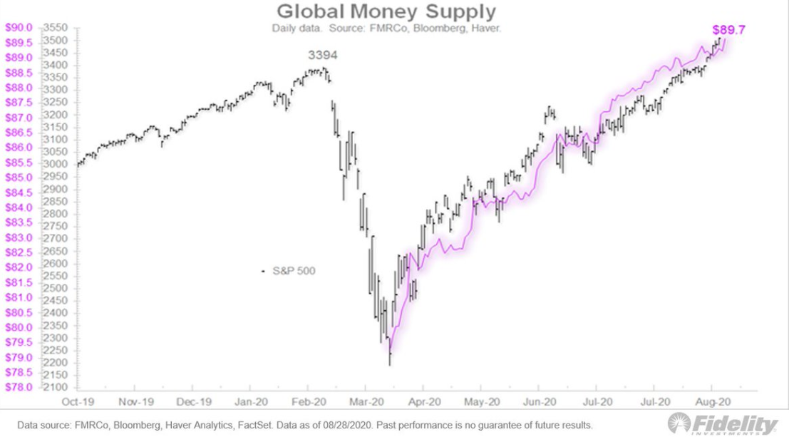
9. Something tells me it ain't over yet... @TimmerFidelity provides this chart of S&P 500 prices and the Global Money Supply. The uptrends since the March bottom are crystal clear. Global money supply has expanded at a very fast clip as central banks have fought to support financial markets during the pandemic. Timmer notes that if the money supply keeps expanding, stocks could do well along with hard assets like gold and real estate.
A natural question then arises—when do we start to see inflation kick up in a sustained way? Well, maybe we already are – US 10-year breakeven inflation expectations have jumped from under 1% per annum to just shy of 2%. Higher inflation would also imply valuation multiples should retreat from their current sky-high figures. The caveat to that however is the global risk-free rate is still essentially 0%. There are a lot of questions and market-pondering to be drawn the chart from Fidelity’s Director of Global Marco Research.
Bottom line: The response to COVID-19 by central banks has been to vastly expand the money supply by purchasing assets and taking rates to near zero (or into negative territory). The actions have been largely successful as financial markets have stabilized and increased in value. The longer-term ramifications of their actions are still unknown, however.
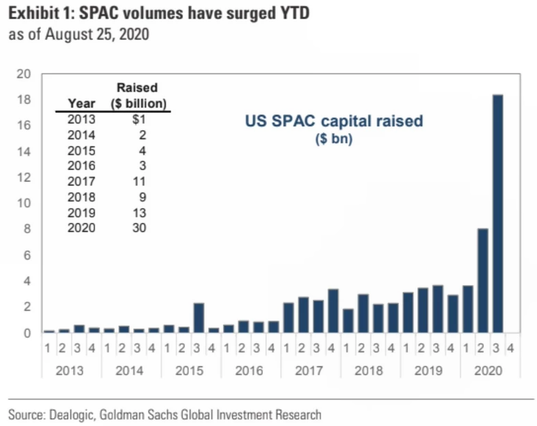
10. Record capital raised by SPACs goes to show the type of environment we're in: investors are deploying cash where they don't even know what the ultimate investment will even be. In addition to gold and real estate, money is also going into the unknown. SPACs, special purpose acquisition companies, often referred to as “blank-check” entities, are shell-firms with no operations used with the intent of M&A corporate events.
To date in 2020, $30 billion has gone into SPACs, outpacing each year since 2013 by a huge margin. @fintechfrank grabbed this great look from Goldman Sachs Global Investment Research last week. Cash being put to work in SPACs is another sign that investors are stepping out on the risk spectrum in search of a return now that we are back in the world of 0% rates.
Bottom line: SPACs are seeing huge inflows as financial markets stabilize and political uncertainty increases. Also, as money supply grows around the world, folks need to find assets and entities to park all that liquidity. It’s an interesting situation in which insiders are selling equities, yet contributing funds into SPACs.
So where does all this leave us?
1. Monthly review.
It almost feels like 2009 all over again. Stocks puked during the first quarter, but have climbed a major wall of worry from Q2 through August. Massive central bank liquidity has supported financial markets and fiscal stimulus has helped individuals and businesses. Remarkably this time around, retail sales and the housing market have been on fire. For price-action in the equity markets, stocks made fresh all-time highs during August – even the ACWI index notched all-time highs recently. Volatility is still around, however. The VIX spiked above 38% on Friday, this highest since mid-June, after bottoming in the 20-21% range in August. The VIX on the NASDAQ 100 nearly hit 50% – about a double from its August nadir. Seasonality is in favor of the vol bulls, too. The S&P 500 has historically done poorly from early September through early October. Last week’s pullback was not unexpected though given how overbought SPX was last month.
2. Little money and options.
$600 unemployment checks, zero commissions, free trading, travel & leisure activity down massively, working & learning from home – what to do? Trade options. Namely, buy up some calls. If the stock market is the new casino, perhaps CNBC is the new ESPN. Individual investors are putting cash to work in a ‘fun’ way by buying single-name call option contracts (likely in the well known FAAMG and other technology stocks). All of it should be seen as a warning sign to market analysts. Ma & pa investors are turning bullish – not just in their sentiment, but also in their decreasing cash allocation as equity indices have marched higher.
3. Big money and macro.
While retail traders are getting their kicks in the options trading arena, the big money is busy selling stocks – at least according to insider transaction activity. On the other hand, as insiders dump equity shares, they are putting money to work in special purpose entities for corporate M&A activity. So there are a lot of moving parts. How all of these groups and activities get impacted by rising volatility remains to be seen. Meanwhile, global central banks continue to support financial markets by increasing the money supply. Liquidity is all around us, but future solvency is another issue.
Summary
Seasonality and volatility trends are finally on the side of the bears. We have seen it play out already during the back half of last week with technology stocks plunging 10% in less than two full trading days. The dip-buyers emerged late Friday, but was it too early? We’ll soon find out. It is a red flag when individual investors are bullish while institutional investors are defensive – and that appears to be the current environment.
