Those that follow my personal account on Twitter will be familiar with my weekly S&P 500 #ChartStorm in which I pick out 10 charts on the S&P 500 to tweet. Typically I'll pick a couple of themes to explore with the charts, but sometimes it's just a selection of charts that will add to your perspective and help inform your own view—whether its bearish, bullish, or something else!
The purpose of this note is to add some extra context and color. It's worth noting that the aim of the #ChartStorm isn't necessarily to arrive at a certain view but to highlight charts and themes worth paying attention to. But inevitably if you keep an eye on the charts they tend to help tell the story, as you will see below.
So here's another S&P 500 #ChartStorm write-up!!
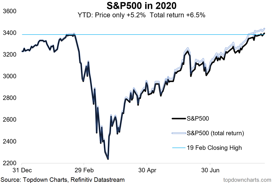
1. Well, it's official now, new closing ATH secured. Here's some interesting stats: the S&P 500 on a YTD basis is now up +5.2%. The drawdown from the 19 Feb. close to the 23 March close was -34%, and the rebound so far from the 23 March close to Friday's close is +52%.
Fast and steady wins the race? It’s been a heck of comeback for the S&P 500 from the March 23 bottom as the rally surpassed the 50% threshold in the last several days. Recent gains have been led by some familiar friends—mega-cap tech. FAAMG is on fire. No two ways about it. Apple (NASDAQ:AAPL) soared another 5% on Friday alone. A 5% move on the world’s most valuable company was an addition of more than $100 billion in market cap. AAPL is now up nearly 30% since announcing its split back on July 30. We won’t even get started on Tesla’s (NASDAQ:TSLA) post-split announcement advance. The fervor is at a fevered-pitch for the FANG+ Index. As for the rest of the S&P 500, trading action is much tamer. Nevertheless, the equal-weight version of the S&P 500 is still chugging along.
The onus is now on the bulls to hold the line with respect to the February 19 closing peak. Seasonality turns sketchy through early October, and that is seen in the S&P 500 volatility index futures curve which suggests slightly higher volatility priced into the market from late September through the third Friday of October. We talked about this last week.
Bottom line: The COVID-crash is in the books. New highs, both on a daily and weekly basis, are etched in stone. Some say a bear market does not officially end until new highs are made. If you were hiding under a rock this year, then simply looked at the S&P 500’s total return of 6.5%, you might say ‘ho-hum’. But what a ride it has been.
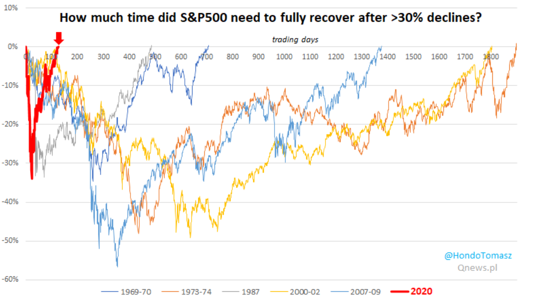
2. Here's the 2020 flash-bear vs other 30% declines. Thanks to @HondoTomasz for this look at drawdown recoveries since the 1960s. Blink, and you would’ve (almost) missed it in 2020. It took just over 100 trading days, not even 5 months, to claw back all of the losses during the 5 weeks from February 19 to March 23. Contrast 2020’s "flash bear market" to 2007-2009; the peak was October 2007 near 1570—that level was not eclipsed until early 2013. We’ve all heard of a ‘flash-crash’, but perhaps we can aptly describe 2020’s craziness as a ‘flash-bear.’ While history may rhyme, every bear market is different, too. Who can forget all of the bear market analog charts that were crafted during the height of volatility earlier this year? They proved not so useful.
While the S&P 500 has made it to the promised land of fresh all-time highs, other areas remain significantly below their recent peaks. Small caps, value stocks, foreign equities…all have work to do. The huge move in large cap US stocks leaves the S&P 500 richly valued with future returns likely below historical norms.
Bottom line: That was fast. It took 6 months for stocks to drop 34% then rally 52% to make new all-time highs. If you want to find similar lightning-fast moves, you have to go back to the post-1929 crash and ensuing volatility. Back then, of course, US large cap stocks did not make new highs until 1954. May you live in interesting times..
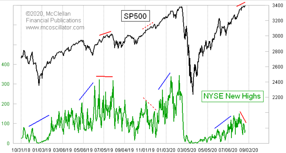
3. While the S&P500 is making new All-Time Highs, the 52-week New Highs club remains very exclusive. H/t to @McClellanOsc for this chart contrasting new highs on the S&P to the lack of 52-week highs among the broader market’s single issues. Remarkably, last week’s all-time high took place on declining NYSE new highs. Prior breakouts in the S&P coincided with more than 300 NYSE index fresh 52-week highs.
This time around though it is a third of that figure. The 52-week high club is apparently quite hard to get into. Tom also noted that there were occasions during which the S&P did not yet put in a new peak, but NYSE components were breaking through to highs. During such times (early 2019, middle 2019, early 2020, and even early July 2020), SPX went on to further gains. What will come of today’s action (marked in red on the chart)? The lack of participation is concerning—call it a ‘red’ flag.
Bottom line: Bull markets are built on broad participation. It’s troubling when just a handful of names are leading the way. Cracks can lead to crashes (in worst-case scenarios). The bulls want to see smaller names and beaten-down sectors show better signs of life. There was solid rotation from mid-June through early July, but that rotation got stuck in the last few weeks.
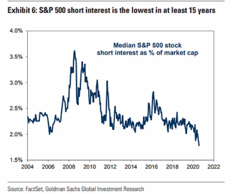
4. S&P500 Short Interest... extreme low. And where shorts are heroically being placed, it's mostly in Energy stocks (and Real Estate, Utes, Consumer, Financials etc) @Schuldensuehner delivers us this chart from Goldman Sachs) displaying 15-year lows in short interest on the median stock in the S&P 500. Investors are shying away from placing short bets on the mega cap names, but are still somewhat active in the beaten-down sectors.
Ironically, the chart did not spike during the flash-bear market earlier this year. The trend has been downward since 2008-2009, though there was a brief spike in early 2016. The stealth global bear market of 2014-2016 hit energy stocks hard with oil falling from above $100 per barrel to under $40; so the bears pounced by shorting some of those names. As the energy sector has gotten smaller and smaller (relative to the S&P 500), there may be less juice left to squeeze out for the shorts. But then again, those Long/Short managers need to find something to take the other leg of their trades.
Bottom line: As the S&P makes fresh all-time highs, short interest continued down, making 15-year lows. The two usually go hand-in-hand. This contrarian indicator could be cause for concern for the bulls.
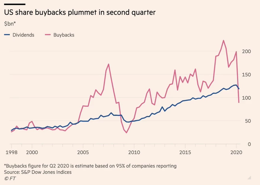
5. Bye Bye Buybacks. Buybacks took a lot of heat during the first half of the year as bailouts were requested by firms who had steadily repurchased shares over the years as a means of juicing EPS for investors. The tax structure makes buybacks more favorable than issuing dividends to shareholders despite a low tax rate on dividends right now. Buybacks are also by their nature more flexible than dividend policy for corporations.
The trend in the last few months is thus not surprising—buybacks have taken a sharp turn lower. Companies are cautious, too. There is high uncertainty regarding if the consumer will take a hit from a possible second wave of COVID-19. And what if Congress doesn’t act with another round of stimulus? Dividends have declined, too. Many firms hit hard by the pandemic’s effects were forced to cut dividends to shore up capital. The ironic thing is stock prices have shot higher. Total shareholder yield has likely dipped significantly from the past few years’ average.
But take a look at the 2007-2009 period. A similar event took place with share repurchases moving down big and the dollar amount of dividends turning lower. The market obviously goes through cycles, and bear markets usually cause companies to be stingier with their cash. The good news is that all-time lows in interest rates make issuing debt more attractive from a cost of capital perspective. But then round-and-round we go.. companies start to lever-up and grow riskier.
Bottom line: It was a terrible public relations situation for firms who were requesting loans and bailouts from the government, having just bought back billions of dollars of stock in the prior few years. Like the Great Financial Crisis, shareholder accretive activities have been on the decline, but certainly more pronounced in buybacks than dividends.
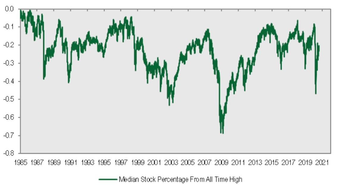
6. Back on the ATH topic... here's an interesting perspective: the median S&P 500 stock is still about 28% from its all-time high. Fuel for upside? or trouble under the hood? Thanks to @MichaelKantro for this chart proving that the average stock is not doing quite as well as the traditional cap-weighted indices. While FAAMG leads the SPX higher, small caps and mid caps are still about 10% their all-time high.
The small cap index in fact peaked about two years ago, and remains arguably in a bear market. Mid caps peaked earlier this year, but are also about unchanged from late 2017-early 2018. That begs the question—does it mean there is more fuel to the upside IF these out of favor stocks catch-on or will these laggards eventually drag down the entire market? Bulls certainly want to see better breadth—more stocks making 52-week and all-time highs. Consider that the NYSE FANG+ Index is up about 100% in the last 10 months while an equal-weight version of the S&P 500 is up just a few percent.
Bear in mind, however, that the chart below very rarely approaches the 0.0 line. There will always be groups of equities that are down from their all-time high (i.e. there will always be a place for stock-picking). The peak you can expect, based on history since the mid-1990s, is the median stock being 5-10% off its all-time high.
Bottom line: Participation is weak among the broader stock market. The median stock remains about 20% off its all-time high while mega cap tech marches on. Once again, the stock market could benefit from some rotation into out of favor names.
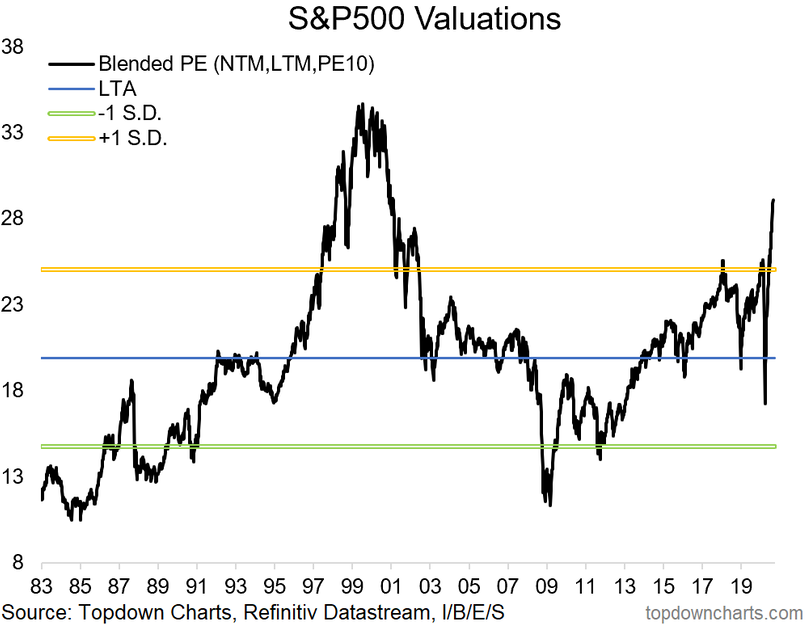
7. Valuations aren't quite at a new ATH, but are definitely on the high side. (Of course, this indicator contains the trailing + forward PE, which have been swung all over the place with the collapse in EPS.) Turning to valuations, our Blended PE approach shows large cap US stocks as being particularly overvalued right now. It was a fleeting moment when the S&P 500’s valuation was below the long-term average earlier this year—once again, blink and you would’ve missed it.
Record low interest rates also help to drive-up valuations across most equity arenas. So while today’s valuation is below that of the dot.com mania, it really is a different landscape versus 20+ years ago when you consider where interest rates are today versus then. It will be fascinating to see this chart evolve as the horrendous earnings quarter of Q2 2020 rolls off from the trailing P/E metric. Q2 2020 was quite the anomaly—the earnings decline was the worst since 2009 yet EPS numbers beat expectation by a record amount according to both Bank of America and FactSet. And you guessed it—mega cap tech stocks contributed the bulk of the earnings and earnings-beat numbers.
Now we turn our eyes to the recovery period of the second half of 2020. Can companies keep on executing? Will consumers keep spending? How will earnings track without the aid of stimulus from the US Congress?
Bottom line: Absolute valuations on the S&P 500 are stretched by nearly every measure. Our Blended P/E approach, combing the next 12 months’ earnings, the last 12 months’ earnings and a longer-term and smoothed approach shows the most richly valued market since the early 2000s.
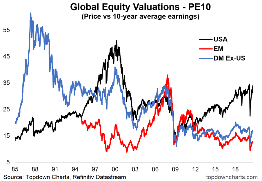
8. The PE10 ratio (less susceptible to the wild gyrations in EPS that we are going through right now) is not as extreme, but definitely elevated (especially vs peers). Turning to the global market valuations. USA stocks are comparatively much more expensive than both emerging market stocks and the developed world outside of the USA. On this chart, we also use the PE10 figure which is less susceptible to wild swings in earnings. The chart below might be the best look at the global equity market valuation spectrum. Indeed, it helped play a key role in our bullish global equities call back in March.
Investors should consider (and be realistic about) long-term returns from here. In our capital market assumptions, we calculate US large cap equity returns to be rather disappointing in the ensuring 5-10 years while opportunities exist overseas. Perhaps this latest round of ‘mania’ among the FAAMG names only adds fuel to the fire—sucking in new market participants in believing that the only game in town is in the mega cap/tech space. While we don’t think the US market is in a pronounced bubble, higher returns should be expected elsewhere.
It’s interesting to see the chart’s history. There WERE bubbles before. Japan in the late 1980s (which caused the developed world (ex-US) to spike o valuation). Then in the US during the dot.com craze. Finally, emerging markets went through their boom and bust during the 2000s. Now here we are. No single area is off the charts, but that doesn’t mean asset allocation doesn’t matter.
Bottom line: US equities look expensive vs history and vs the rest of the world (while the rest of the world looks cheap on both counts).
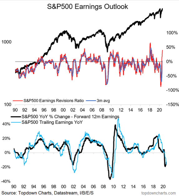
9. Note the gyrations in earnings. As an interesting side note, a plunge in earnings revisions is not necessarily a bad thing (and a surge, not necessarily a good thing...). Another chart we feature on @topdowncharts—the S&P 500 earnings outlook using the Earnings Revision Ratio. Comparing price to the ERR, you’ll notice the spikes lower on the ERR are usually a contrarian indicator (often a good time to buy). When the ERR jumps, it’s harder to glean much from those moves though (if anything, it can sometimes be a sign to tighten up on risk management).
For readers who might not be familiar with the Earnings Revision Ratio. The ERR is calculated by taking the difference between analyst upgrades and downgrades then dividing that difference by total analyst revisions. So it’s a look at how Wall Street analysts have been tweaking their outlook (and really in that sense a sentiment indicator based on analysts!). Recently, they have not been ‘tweaking,’ but rather ‘sharply revising.’ Analysts went on a downgrade hunt earlier this year due to the pandemic’s effects, but have since turned more optimistic. Imagine that—analysts were too bearish when stocks were near the low, and have now turned much more optimistic!
Looking at history, there is only one other time to which you can compare 2020—that would be the 2008-2010 period. However, you might be able to draw a parallel to the ERR of the 2000-2002 bear market when the ERR initially dived, then turned higher, before yet another plunge.
Price drives the financial media narrative, but it also drives analyst opinions. Wall Street sell-side analysts are known to suffer from conservatism bias—that is being too slow to update views to new information. So they end up making calls that are simply based on what has already happened (hence why sometimes for this indicator good is bad and bad is good).
Bottom line: Analyst forecasts have been about as volatile as the S&P 500 this year. Earnings revisions were perhaps the most negative in history during Q1, but then they snapped back to be the most positive since the Tax Cuts and Jobs Act of late 2017 was announced.
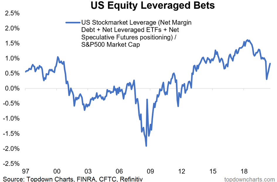
10. Leverage bets on the stock market (at least in terms of margin debt etc) have not unwound previous deleveraging. No new ATH in this (yet). The flash-bear market did not do much to reduce speculative positioning in terms of the amount of leveraged bets versus the S&P 500 market cap. Normally a 20%+ drop in stocks removes a lot of frothiness, but you wouldn’t know it when looking at this chart of US Equity Leveraged Bets. Perhaps record low interest rates and the sheer speed of the decline did not bring about enough of a fundamental change in the trading landscape? It’s hard to figure.
Traders are still trading on margin, playing their hands with leveraged ETFs, and participating in the futures trading markets. The 2008-2009 period saw a massive unwind of leveraged positioning – perhaps that feature caused the Great Financial Crisis bear market to be more drawn-out versus the COVID-crash earlier this year. The aura of speculative trading has certainly come back in full-force over the last 5 months. But another important feature to this chart is that the S&P 500 is of course making all-time highs, but speculative positioning remains below its early 2018 peak (so some might therefore argue that there is scope for speculative fervor to ramp up).
Bottom line: Traders are engaged in speculative and risky strategies according to the US Equity Leveraged Bets chart. It will be interesting to see if/when this chart takes out the all-time highs from early 2018.
So where does all this leave us?
1. We’ve come a long way since March.
The S&P 500 is up about 5% so far this year—no big deal right? It’s been an interesting road to say the least—a 34% drawdown over a few weeks from late February through mid-March then a meteoric 52% advance off the March 23 low. The 2020 drawdown took just 5 months to be clawed-back, led by the usual suspects. Speaking of FAAMG, breadth has been weak this month as mega cap tech/growth powers higher, leaving small caps and value stocks in the dust. In fact, Friday was capped off with Apple gaining $100 billion of market cap alone. We see fewer new highs on the NYSE index as the S&P presses higher.
2. The Times They Are A-Changin.'
Short-interest has dropped sharply this year despite a 34% bear market. Usually, short-interest ticks up during tough times for stocks, but we did not see it during the flash-bear of 2020. What else has changed? US share buybacks are way down from the peak of the last few years as investors and the financial media scrutinize firms for using cash to repurchase shares, leading to riskier capital structures. But dividends have also taken a small hit due to Q2’s harsh impacts. Meanwhile, analysts have been all over the place this year with negative revisions early-on, and now a slew of positive changes as news has turned more positive. Trading behavior, on the other hand, has not seen as sharp of a recovery in terms of leveraged bets.
3. Earnings, global valuations.
While the median stock is still 28% below its all-time high, US equity valuations remained stretched, particularly compared to global equities. With interest rates at historic lows, it’s not surprising to see elevated valuations for large cap US equities. Where we don’t see expensive equities is overseas. Emerging markets and developed markets (ex-US) actually look attractive based on valuation.
Summary
The last few weeks have featured a lack of rotation and participation: FAAMG took a respite during parts of June through July, but have returned with full vigor this month. Of all things, it took stock split announcements from Apple and Tesla to bring about another round of mania-like buying activity in these winners of the last ten years. The market has grown even more divided between the winners and the losers with the SMID caps and value stocks sharply lagging. Investors should be wary of some of these moves—particularly considering a not-so-friendly seasonal stretch for stocks in September and early October, not to mention the looming election which on many fronts could be a turning point.
