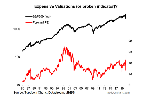
The forward PE ratio is broken. It has the rona. Stop using it.
And the PEG ratio is worse than broken, it never worked in the first place.
As an investment research professional I spend much of my time working on analytical tools and frameworks to help understand the risk/return outlook across financial markets.
Aside from building indicators it also involves the regular discarding or at least down-weighting of various factors and indicators through the cycle and through time as their efficacy ebbs and flows and the strength/validity of their signal comes and goes.
As you might guess, when I see broken, misleading, or ineffective indicators getting attention it kind of bothers me. Normally I wouldn't say anything, but I think in these extraordinary times you almost have a public duty to participate in the discussion and set things right.
So join me if you will on a journey through the guts of these broken indicators.
1. The Faulty Forward PE: The forward PE ratio takes price divided by the consensus estimate of earnings over the next 12 months (so it is sometimes called the next 12 months or NTM PE). The typical behavior of this indicator is that it will rise during a downside shock to earnings; giving the appearance of an expensive market. So it should be no surprise that with the global economic shutdown earnings expectations have collapsed and thus we are left with the impression that the market is expensive...
2. In Search of a Reliable Valuation Anchor: Enter the PE10. The PE10 takes price divided by the average of trailing (historical) earnings of the last 10 years. The reason for doing this is it provides a more stable anchor for making judgments about the level of valuations. That's why it is sometimes referred to as the cyclically adjusted or normalized earnings PE ratio.
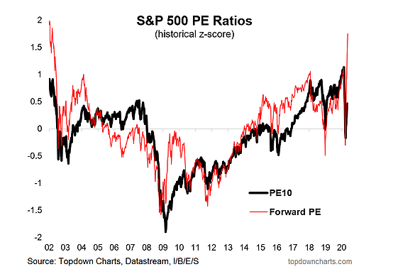
The chart below shows a standardized (historical z-score) view of the PE10 and the forward PE. Let's focus on 2009: shortly after the market bottom the forward PE ratio shot up to "expensive" levels. Meanwhile the PE10 (with the benefit of hindsight) remained at "cheap" levels.
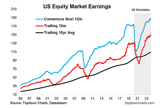
3. Earnings Illustration (and a simple simulation): To dive further into it, the next chart shows the path of consensus earnings, trailing earnings, and trailing 10-year average earnings.
Which one would you use as your valuation anchor?
By the way, for argument's sake, I ran a simple simulation applying a similar path of earnings as the 2009 experience. Clearly, if it played out this way the trailing 12 month and consensus estimates would experience substantial swings and give wildly different valuation signals through the period.
But ultimately it comes down to this: which earnings figure do we believe is "representative"?
Because I will concede that if earnings are going to be structurally/permanently and materially lower in the future, then the PE10 will give you a misleading signal (for instance, compare and contrast the earnings of Greek stocks in the 10 years before and after the financial crisis: 99.3 vs 37.3—i.e. earnings never recovered there).
So if you believe that the collapse in earnings will be permanent then by all means use the forward PE, but if you believe we return to some semblance of normal then give more weight to the PE10.
4. What about the PEG Ratio? Well first of all, this indicator (Price/Earnings-to-Growth ratio) uses the forward PE, and we've already covered how troublesome and misleading that one can be, so there is never going to be much hope for an indicator that uses it as an input.
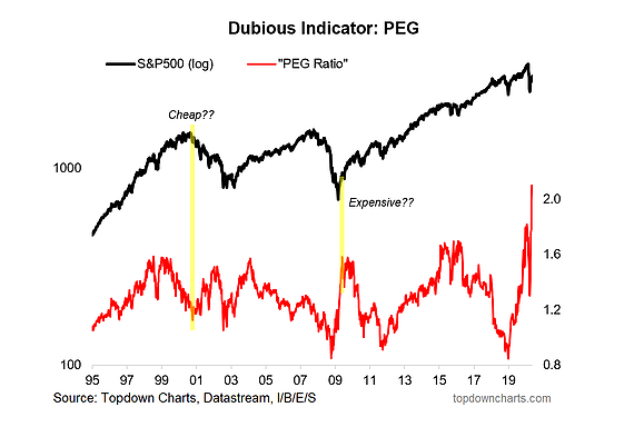
But for argument's sake I have replicated the PEG ratio in the chart below. There are a handful of times where it does give the right signal (let's face it, even a broken clock is right twice a day). But I've highlighted two of the most obvious times it was worse than broken.
According to this indicator the market was cheap at the peak of the dot-com bubble, and expensive at the great 2009 market bottom. Two "generational opportunities" from a long-term market timing standpoint that would have been right buggered up if using this indicator as your main market timing tool.
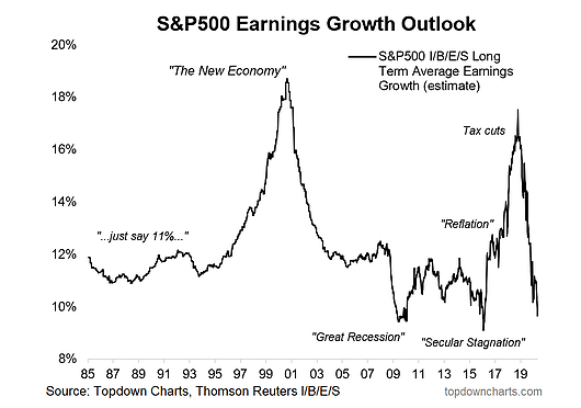
5. Long Term Earnings Growth: And what about the denominator? For this version of the PEG it's using the I/B/E/S long term earnings growth estimate. This is a curious indicator, it seems to have fundamentally changed after 2009 (prior to that, with the exception of the dot-com euphoria, it was relatively stable). That should be your first warning sign.
Indeed, in the past I've remarked how this seems to work more as a sort of sentiment indicator. In that sense, when you get extreme bearish readings (which often times are actually bullish contrarian signals) it would give the PEG ratio a big boost... and in times of earnings euphoria (which often occur when the market is toppy and sentiment is too optimistic) it would tell you to jump in the pool.
So I think we can lay this one to rest (there are simply much better alternatives - e.g. check out the deep dive on the PE10 ratio I did a few weeks back).
Final Thoughts and Bottom Line
Bottom line: the forward PE ratio is broken at the moment, and the PEG ratio is worse than broken as it never really worked in the first place.
As outlined, it's important to be thoughtful in the use of indicators—yes they are quantitative, data-driven, and in concept present objective facts, but this article I hope really highlights how you need to deploy thoughtfulness in their application.
Indeed, I even conceded that the forward PE ratio might not be broken... but for that to be true you would have to believe that the collapse in earnings implied by analysts will be permanent/representative of the future. In my view the PE10 really comes into its own in an environment like this—times like now are pretty much why it was invented in the first place. But this is just my analysis and opinion, and I could be wrong too (the market has an oceanic capacity to humble you in ways you can't even begin to imagine)—so make sure you think, and question what gets put in front of you.
