In the short term picture the markets are likely to get a bounce from the 50 day SMA line which it closed right at on Friday afternoon. The big picture, however, is what has been putting pressure on stocks in the past couple of weeks.
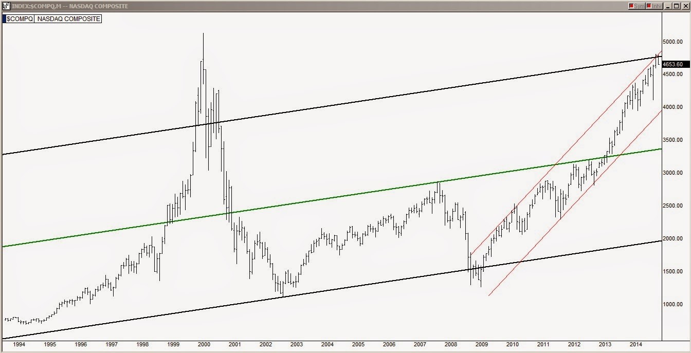
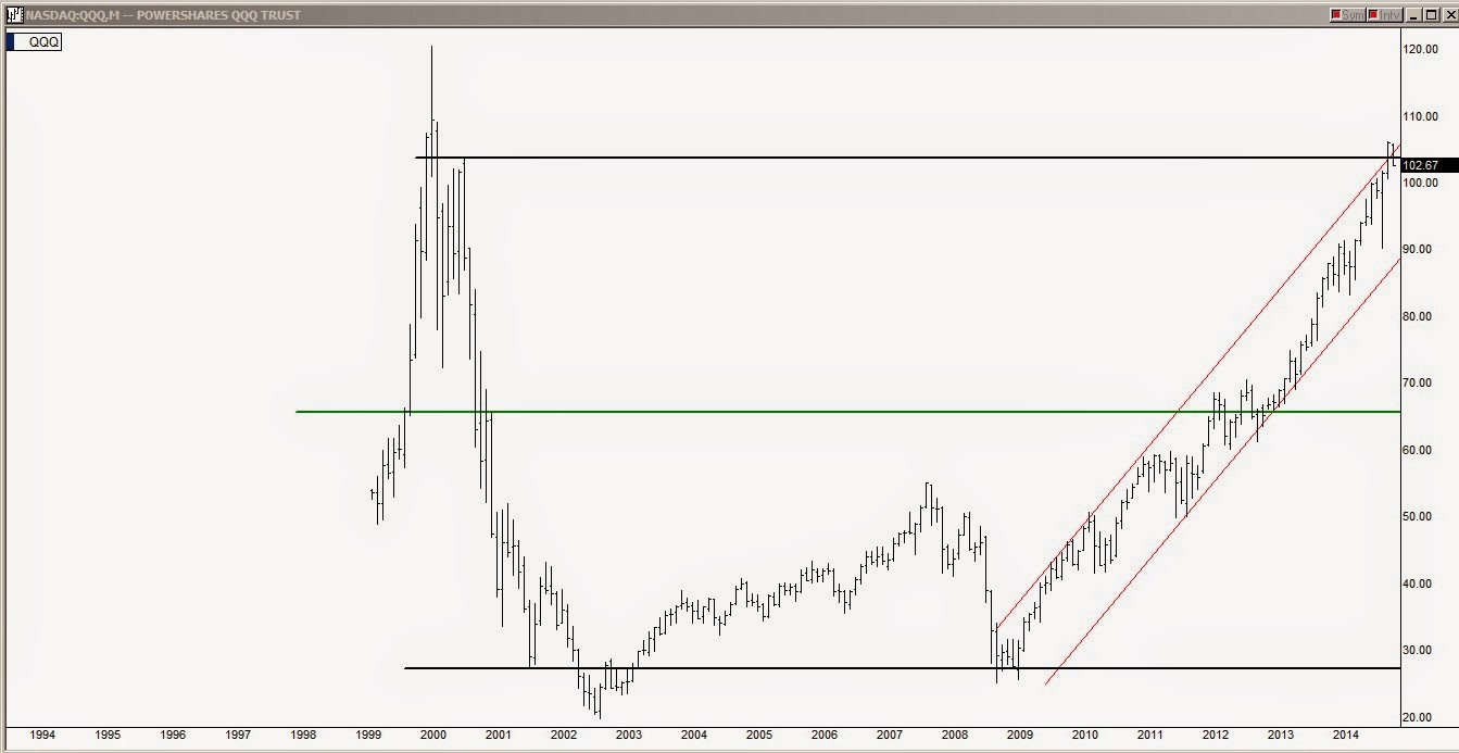
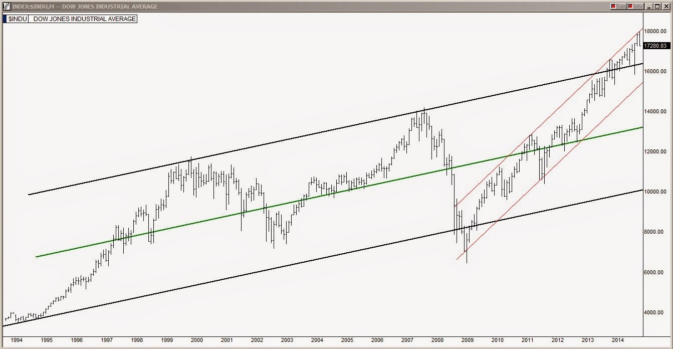
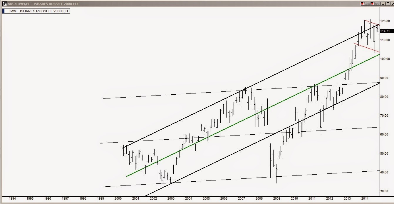
The following are the 20 year charts of the key Indices shown with monthly bars. Long term channels and current midterm channels are both shown on each chart.
In the chart above, the S&P 500 has had a six year run from the lower line of the incline channel to actually reaching the top line about a month ago. The recent peak also happened at the upper line of the ascension channel shown in red.
In the chart above of the NASDAQ, it also reached its upper channel line but obviously has room to put some froth on top as it did at the 1999/2000 bubble. Just like the S&P, the recent peak also happened at the upper line of the ascension channel shown in red.
In the QQQ (NASDAQ:QQQ) chart above, it has reached a little firmer ceiling than the NASDAQ and it also maxed out at its upper line of its 6 year ascension channel shown in red.
The Dow chart above, broke out of its long term channel a year and a half ago but last month maxed out in its 6 year red line ascension channel.
In the Russell 2000 chart above, it has actually been down trending the past year and a half and in the current monthly bar it is being pushed down by both the long term black line channel and its descending red line channel.
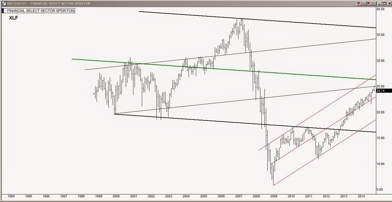
The Financial Select Sector SPDR Fund (ARCA:XLF) chart above found resistance at the 25 level a couple of weeks ago which is the lower line of the gray line channel it traded in from 1999 to 2005. This chart may be key because if the XLF (the large financials ETF) cannot reenter its 1999 to 2005 channel, the past year and a half climb could be looked upon as nothing more than a failed channel recovery attempt. This current bar if seen in candle form would be showing a shooting star topping candle at the 25 level.
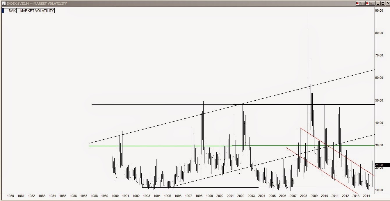
While the VIX chart above has both horizontal and ascending long term channels, the upper line of the six year red line descending channel has meant everything for the stock market for the past six years. During the past six years anytime it has broken above that upper red line the stock market has turned and plunged. The October market dive is shown in the third monthly bar back that peaked at the 32 level. Anytime that the VIX is above that line the stock market is not a friendly place.
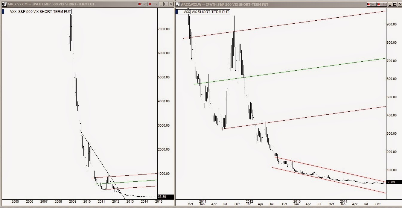
The iPath S&P 500 Vix Short Term Fut (ARCA:VXX) (short term futures for the VIX) chart doesn't need much explanation, it is a pretty visual chart.
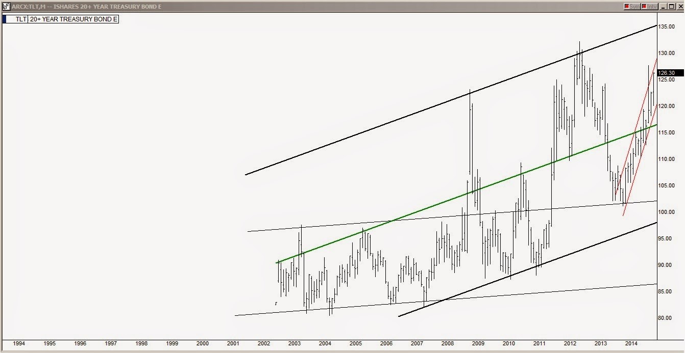
The iShares Barclays 20+ Year Treasury (ARCA:TLT) (ETF for the 20-year treasury bond & king of the bond world, much the same as the SPY is for the stock market world) has been having quite a run since January 1st. It is up approximately 25% for the year.
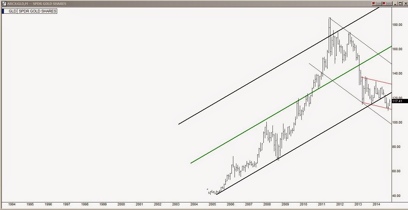
In the SPDR Gold Trust (ARCA:GLD) (Gold ETF) chart above, shows that gold has been making a new up move in the past two months which is a sign of increasing fear about the height of the stock market.
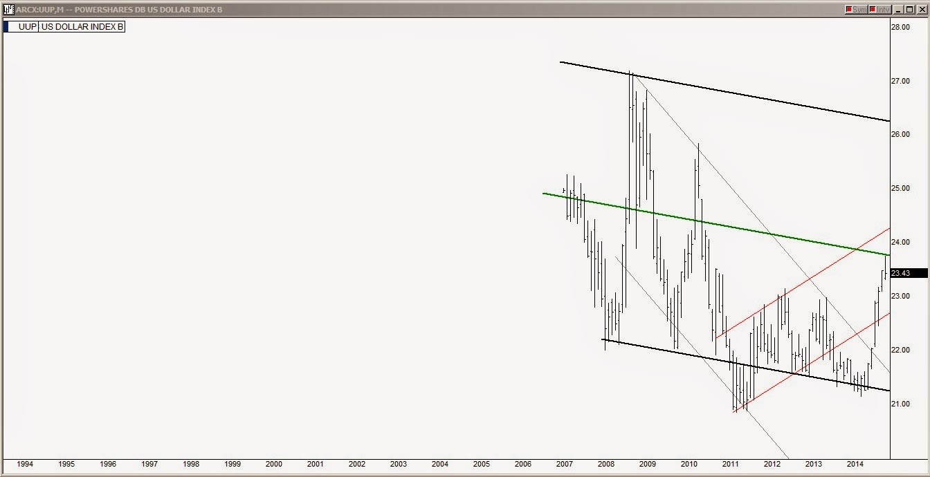
The UUP (US Dollar Index) chart above is showing resistance at the center line of its primary long term channel. Stocks have enjoyed the benefit of having foreign investors buying US dollars and then many going further to hold US Equities in the conversion. If the dollar run stops at the 23.75 level there will be a number of implications across a variety of markets.
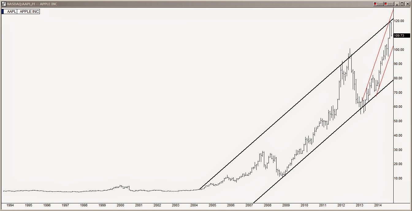
The last chart above is Apple Inc (NASDAQ:AAPL) and while it is not an index, the fact that it is the largest holding with basically every asset manager out there, it tends to behave as an index because it is such a big chunk of the market itself. Looking at its chart, AAPL peaked out at its upper trend line last month and also maxed at its 2 year ascension red line channel.
While the big picture is at least concerning, in the short run traders are looking for a tradable bounce up from the 50 day SMA line the first half of this coming week.

