Current Position of the Market
S&P 500 Long-term trend: The long-term trend is up but weakening. Potential final phase of bull market.
S&P 500 Intermediate trend: S&P 500 may be entering the final intermediate phase of the uptrend which started at 1810.
Analysis of the short-term trend is done on a daily-basis with the help of hourly charts. It is an important adjunct to the analysis of daily and weekly charts which discuss longer market trends.
Market Overview
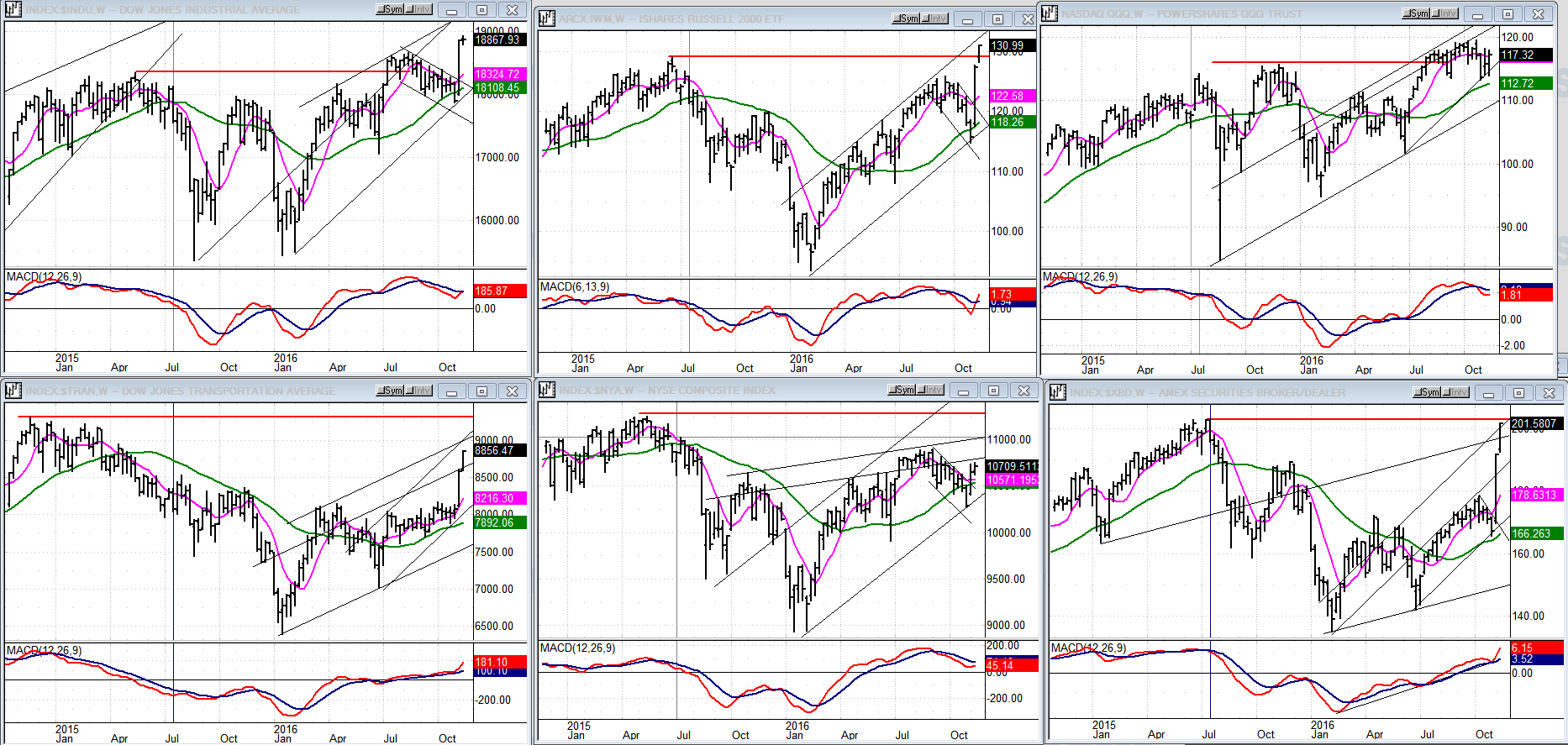
The past two weeks showed quite a bit of disparity in the way individual components of the market performed. The Dow Jones Industrials and the Russell 2000 jumped to new all-time highs, but the most spectacular move saw the ARCA Securities Broker – which had been one of the weakest indices – rally sharply from 167 to 201, nearly equaling its July 2015 bull market high of 203!
Surely this is very bullish behavior. Why, then, did the S&P 500 not make a new high also? And why did the NYSE, the broadest equity-based index, perform so miserably? At least, we now know why the A/Ds action has been so pitiful! The Nasdaq 100 did not do so well either, but it has the excuse of having reached a new all-time high last month! Not so for the NYSE which made its bull market high in 5/15.
There is no question that the recent presidential election hurricane has blown us into unchartered waters and it will take us a little time get our bearings. We’ll just have to take it day by day and week by week until it starts making some sense. Since I only concern myself with analyzing S&P 500 and GDX in detail, my task is relatively simple. I see the former near or at a short-term top. I’ll discuss the latter later.
Analysis (This chart and others below, are courtesy of QCharts.com.)
Daily chart
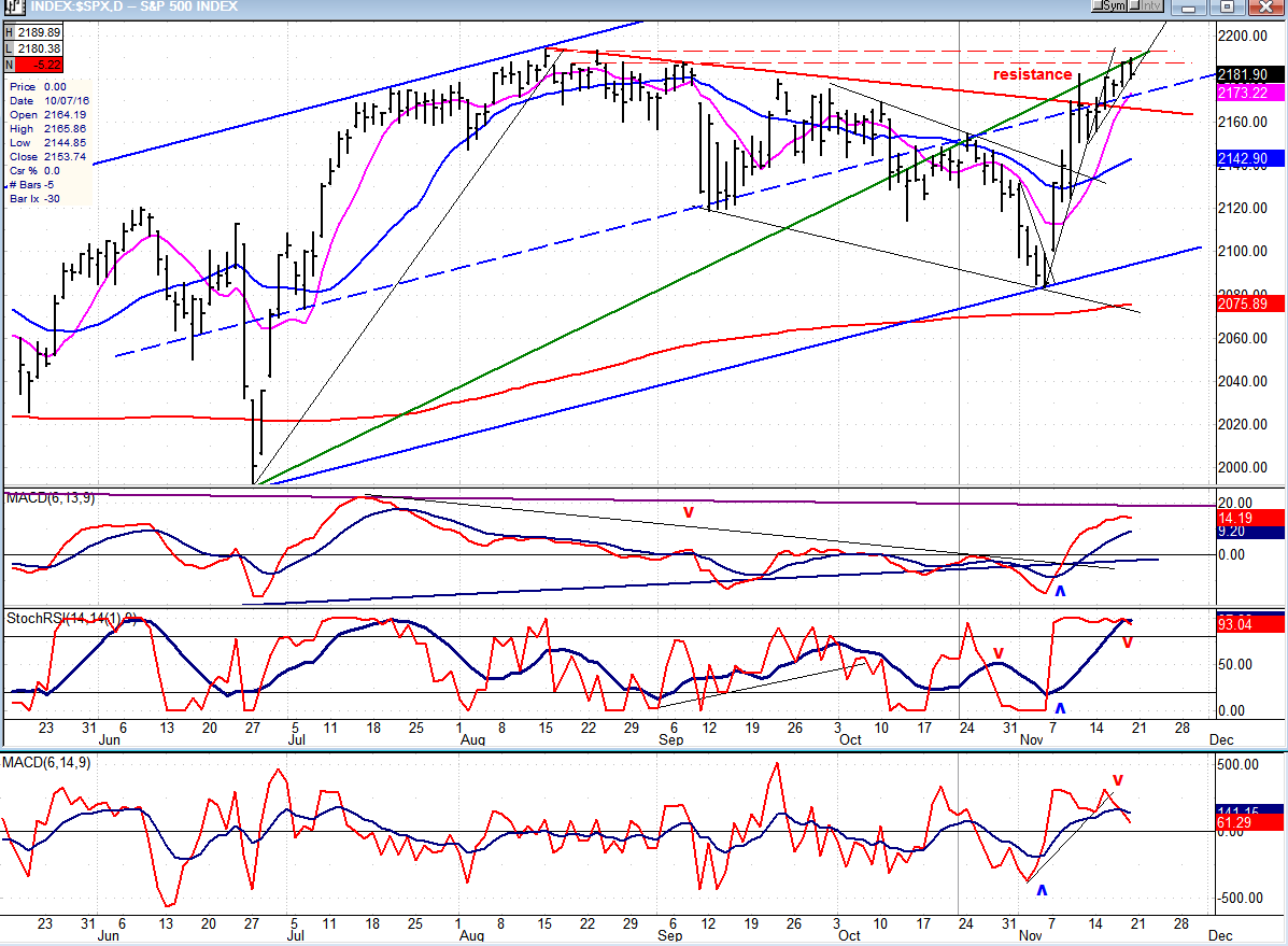
Last week, I mentioned that S&P 500 had run into resistance on its second advance from the 2084 low, and it had caused a pullback. But it was short-lived, lasting only two days. Although the advance resumed
right away, it took the index five days to overcome its recent high of 2182. On the sixth day, it managed to rise above it by one point, and on the seventh (Friday), it jumped to 2189 and pulled back immediately. Since that high corresponds with a P&F count, it’s likely that we have found a short-term top and are getting ready to correct.
The struggle to reach that target can be explained immediately with a glance at the chart below. Former highs around the 2193 peak are, in part, responsible, but the main culprit is the intermediate trend line from 1810 which had previously been back-tested several times in October before the final drop into 2084. The same thing is happening here with prices being repelled at least three times in the past week.
The rally from 2084 appears to have progressed in 5 waves with the last wave showing the normal deceleration pattern. This is another reason for suspecting that we are at a short-term top. The oscillators also support this view. The A/D indicator is by far the weakest, showing some negative divergence on its second top and having already turned down. The two MAs of the SRSI have gone as far as they can go, and a look under the microscope reveals that the shorter one has already made a bearish cross with the longer one. This will be far more apparent on the hourly chart.
Hourly chart
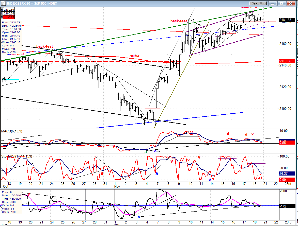
On Friday, S&P 500 challenged the green intermediate trend line at the opening, and immediately lost 9 points. This looks final-- for a while at least! We’ll know better on Monday if we continue to decline and start a short-term correction. If we do, we could find temporary support on the purple trend line, especially since it intersects with the thin red line which connects the declining tops from 2193. But a better target would be a .382 retracement of the entire rally which would take us down to 2149, or 50% at 2137. We could split the difference by holding at the 200 MA which is currently at 2144. Enough congestion has formed since the last phase started at 2152 to accommodate a count to any of these targets. But don’t be surprised if we drop even lower. If all the trading above 2150 is distribution and that level is broken, it could result in a 60-point drop! This could be a re-adjustment to the euphoria of the past two weeks, and could be facilitated by cycles bottoming into early December.
All three oscillators are weak, show negative divergence, and have already turned down ahead of price. It’s a good set-up for the beginning of a correction.
An overview of some major indexes (Weekly charts)
I have already discussed some of these indexes in the Market Overview. The two which made new highs are at the top: Dow Jones Industrial Average and iShares Russell 2000 (NYSE:IWM). The PowerShares QQQ Trust Series 1 (NASDAQ:QQQ) (top right) made a new high last month, but failed to do so in the past two weeks.
Dow Jones Transportation (bottom left) also had a spectacular rise, but nothing like XBD (far right)! These two provide a vivid contrast with NYSE Composite (bottom line center) which hardly moved. The next two weeks could be more revealing than the past two.
PowerShares DB US Dollar Bullish (NYSE:UUP) (dollar ETF)
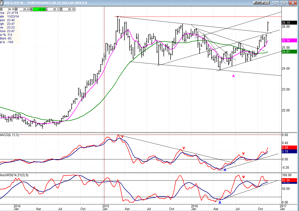
UUP also participated in the fireworks, seemingly ready to challenge its 2015 high. A move to that level would double the width of the previous uptrend channel and most likely create strong resistance to further upward progress. The resistance in that area extends all the way back to 2008, so it would be surprising if the index could continue its uptrend without interruption. Let’s not forget, however, that based on its four-year accumulation pattern (2011-2015), UUP has a valid P&F phasecount to 28 -- which is looking more and more feasible.
Caveat:The dollar P&F chart has already reached its 2015 high of 101. If surpassed, it could keep going right away toward its 121-127 projection.
GDX (Gold Miners ETF (NYSE:GDX))
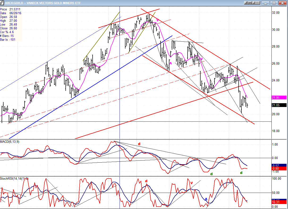
A week ago, GDX extended its correction to 20.13. After a three-day rally, it resumed its decline, but Friday’s action suggests that it is not going to challenge the 20 level just yet. 20.13 represents almost a .618 retracement from the 31.79 top. That’s more than adequate for this type of correction and, although the index does not look ready to establish a new uptrend, it could simply form a base in this area and resume its uptrend from here.
However, odds do not favor this scenario since there are good counts to 18.50-19.0; but these are not written in stone, and there is no absolute requirement that they be met. A final decline just under 20 would be acceptable.In any case, only a move out of its red channel and above 26.00 would be required to confirm that a new uptrend is underway. But what kind of an uptrend? Given the dollar’s potential target, how would that affect gold?It will be best to analyze both individually
Note:GDX is now updated for subscribersseveral times throughout the day (along with S&P 500 ) on Marketurningpoints.com.
USO (NYSE:USO) (U.S. Oil Fund)
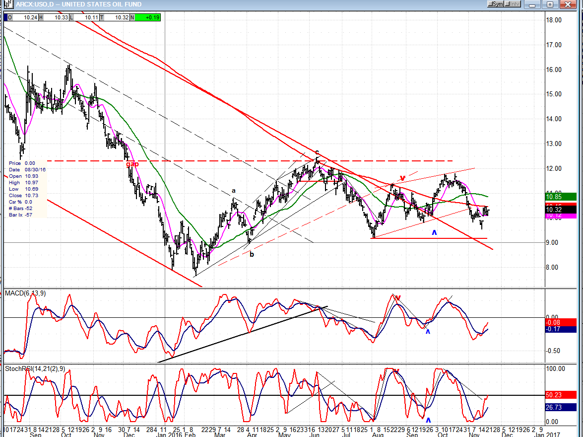
USO continues to consolidate after its extensive decline. When the base formation is complete, it will be able to challenge the top of its current trading range. The formation is already 9-months old, and there has been enough accumulation for a move to about 18--if it’s ready to break out! If the near-term move which is just starting can go past 12.00 it could challenge the dashed red line which represent the top of the formation. The weekly indicators may not be ready for this kind of a move just yet.
Summary
S&P 500 is giving us warning that it is at a short-term high and ready to begin a correction which, based on the timing of some minor cycle lows, could extend into early December.
