Healthy bull market uptrends tend to feature similar risk-taking characteristics. Specifically, market-based participants will invest in a wide range of stock sectors (e.g., industrials, telecom, health care, energy, etc.) and asset types (e.g., large, small, foreign, preferreds, REITs, high yield corporate, convertibles, cross-over corporate bonds, etc.). There is little reason to discriminate because across-the-board risk leads to impressive returns.
Late-stage bull markets are different. Fewer and fewer individual stocks succeed; fewer and fewer asset types gain ground. There is more reason to become selective because across-the-tape risk leads to discouraging results.
I initially identified a changing of the guard in the third quarter of 2014. In fact, it was the first time in the current cycle that I served up questions that challenged unbridled bullishness. (Note: Those who have been reading my commentary for the last decade and/or listened to me on national talk radio circa 1998-2005 know that I am neither a perma-bear nor perm-bull.)
So what hit my radar in the third quarter of 2014? The small-company barometer, iShares Russell 2000 (N:IWM), as well as the iShares Micro-Cap ETF (N:IWC) were both wallowing in technical downtrends. Vanguard Europe (N:VGK) was rapidly deteriorating. The DB Commodity Index Tracking Fund (N:DBC) had revisited 52-week lows. And, history’s favorite risk-off asset, long-term treasuries, had been experiencing a monster rally. In sum, a large percentage of asset types had begun to buckle such that I favored a barbell approach of large-cap stocks and intermediate-to-longer-term treasuries.
In the August 2014 commentary, I also highlighted the similarities between monetary and fiscal stimulus removal in 1936/1937 and the QE stimulus removal in 2014 with subsequent anticipation of rate normalization efforts set for Q1 2015. I wrote:
Most people are aware of the crash in 1929 as well as the capital depreciation that occurred through 1932. Yet many may not be aware of the government stimulus in 1933 that helped the market soar 200% over the next four years. While the stimulus may have aided in pulling the markets higher in the absence of organic economic growth, stocks eventually tanked nearly 50% in a ferocious 1-year bear (3/10/1937-3/31/1938).
Here in December, you can find others who have recently started to talk about historical similarities with 1937. More noticeably, you can find prominent commentators who are beginning to acknowledge the adverse implications of deteriorating market breadth; that is, the lack of breadth across the individual stock landscape, the ten stock sectors, the stock asset class and/or numerous asset types is a major headwind to a continuation of the bull rally.
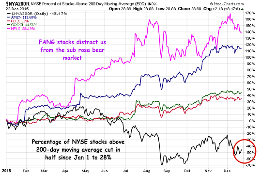
For instance, Jim Cramer of CNBC warned on 12/30 that six of the 10 key stock sectors are in downtrends. Meanwhile, Josh Brown of the extremely popular Reformed Broker didn’t mince words when he posted his “Chart of the Year” on 12/23. (See the chart below.) To wit, Mr. Brown wrote:
You can see that the amount of stocks above this uptrend gauge has been cut in half from the start of the year. At present, just 28% of all NYSE names are in uptrends, or less than 1 in 3 stocks. That’s not a bull market.
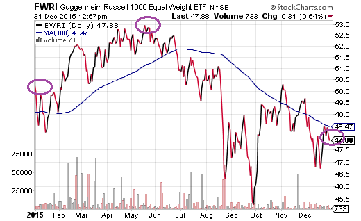
Since I first began identifying the breakdown in market internals in Q3 2014 – a breakdown that has been accompanied by increasing economic strain, undeniable stock overvaluation, a sales recession and a profit shortage – equal-weight proxies like Guggenheim’s Russell 1000 Equal Weight ETF (N:EWRI) have gone nowhere. Equally troubling, like the vast majority of index-tracking investments, it has been many months since the fund has notched a new 52-week high.
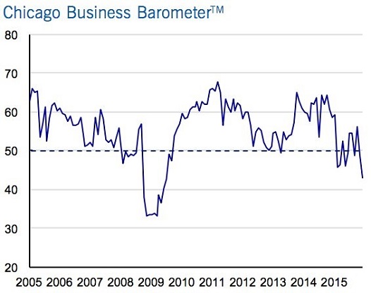
It is not just the deterioration in risk preferences (e.g., widening high yield credit spreads, treasury yield curve flattening, fewer stocks participating in the uptrend, etc.) that investors may wish to heed. As I type my final thoughts for the year (12/31), additional evidence on stock overvaluation as well as economic deceleration provide me with ample reason to reflect. For example, 42.9 on the Chicago Business Barometer is the worst reading since July 2009. The data point is a significant drop from 48.7 in November and it is miles away from the 50.0 reading that economists had expected. (Note: The region’s woes are hardly the only example of national economic headwinds.)
As for the overvalued nature of U.S. stocks, virtually every traditional method suggests stocks are overpriced. This includes trailing P/E, forward P/E, price-to-sales (P/S), market-cap-to-GDP, CAPE and Tobin’s Q Ratio.
Recently, Ned Davis Research may have come up with a progressive methodology: percentage of household assets. At the end of the 1981-1982 bear market, stocks as a percentage of household assets were a meager 15%. At the end of the 2007-2009 financial collapse, the data point was an exceptionally modest 21%.
According to Ned Davis Research, the highest reading came at the height of dot-com euphoria in 2000. A whopping 47%. The third highest level going back to 1951 came before the financial crisis in 2007 (36%). At this moment? Stocks as a percentage of household assets hit 37% in 2015.
The first and third highest percentages – 47% in 2000 and 36% in 2007 – occurred at significant market tops. Indeed, it is somewhat unsettling to recognize that 2015 lays claim to the second highest data point. Did we see the market top in the summertime? Perhaps.
Bear in mind, the above-described markers line up perfectly with another valuation methodology, “Tobin’s Q.” The ratio at its peak in 2015 is second only to the ratio during “New Economy” insanity (2000).


