It has been 75 days since the tragic cessation of the one-month long bear market, and while the Stocks Only Go Up meme is totally saturated into the public mind space, I think the ten charts below are worth your time. I’ve said a few words about each in the caption.
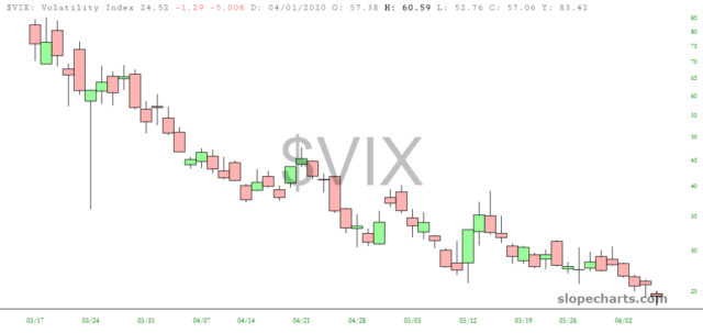
Volatility has been destroyed, falling from almost 90 to the lower 20s.
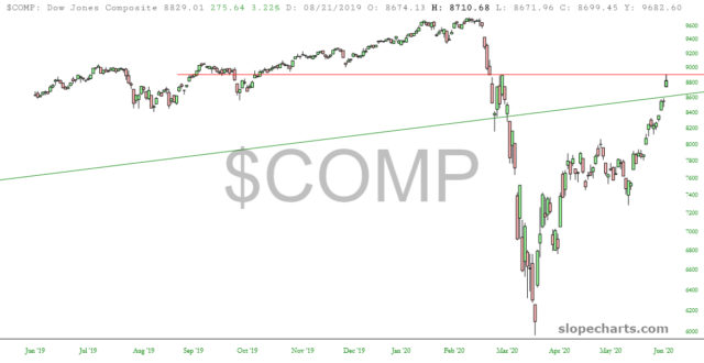
the Dow Jones Composite has pushed above its long-term trendline (green) and is back to the March 3 peak which followed the initial February sell-off.
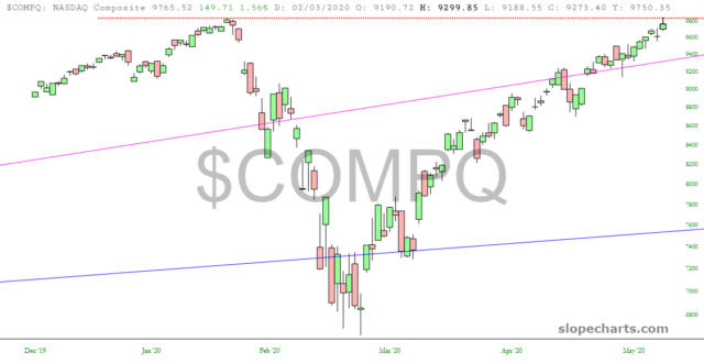
The NASDAQ has, for the moment, double-topped, matching its February high.
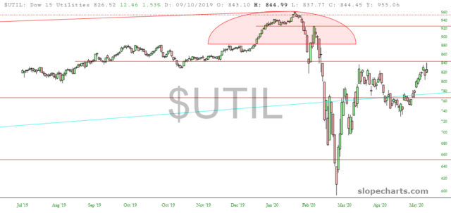
The Dow Utilities has tagged the horizontal beneath the Jan/Feb topping pattern.
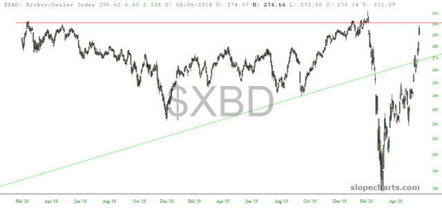
Broker/Dealer index has sealed its last major price gap and is just beneath the lifetime high of February 19th.
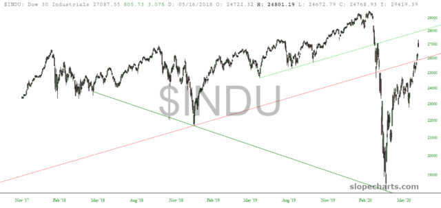
The Dow 30 has increased nearly 10,000 points since late March, and has pushed above its long-term broken trendline and is approaching the underside of the intermediate trendline.
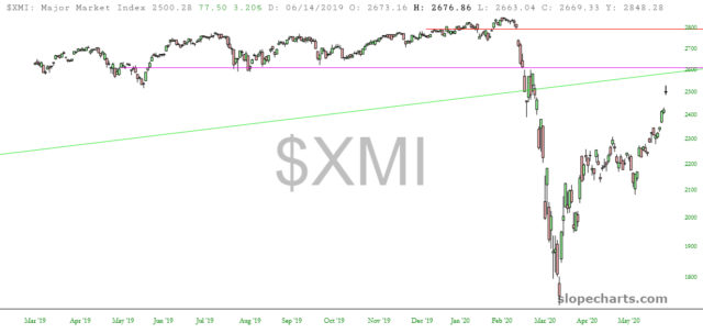
The Major Market Index is at its price gap and has returned to March 3 highs.
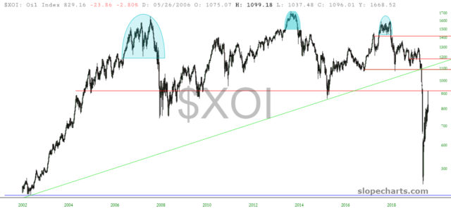
This weekend is a big OPEC meeting, and we’ll see if this marks the reversal beneath that multi-year mountain of overhead supply for the Oil Index.
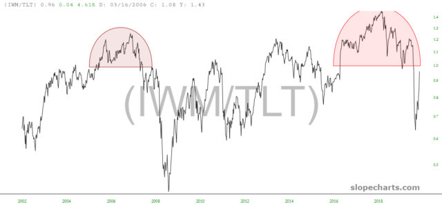
This ratio chart of small caps versus bonds has a very well-formed reversal pattern, and we have rallied almost all the way back to its base.
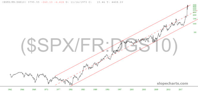
Finally, and perhaps most intriguing, this ratio chart of the S&P 500 versus the 10-year interest rate is a nearly perfect channel, and we are mashed to its upper extreme.
