After a week of steady declines, investors woke up Monday morning to a huge sell-off as both the S&P 500 and Dow dropped hugely in the early minutes of trading.
The Dow plummeted nearly 4% before seeing its largest intraday point swing ever. The spread between the high and low of the day? An astonishing 1,089 points.
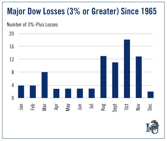
On the heels of this historic market activity, today’s chart looks at the Dow’s largest percentage losses - and the months when they were most common. This bird’s-eye view of market volatility should help us form realistic expectations for the coming months.
To create our chart, we took historical price data for the Dow going back to 1965. We then filtered the data for daily percentage losses of 3% or higher.
As you can see, the largest percentage losses in the market tend to occur between August and November. Of the 20 largest losses in the past 50 years, eight occurred in the month of October.
In his most recent article, Emerging Trends Strategist Matthew Carr noted that of the 20 largest point losses in market history, six were during the month of August.
In other words, big losses this time of year are nothing new for the market. But there is good news...
Six months after these large single-day losses, the market is typically up 5% on average - which means the volatile days and weeks ahead could actually be good for your portfolio. According to Matthew, “now is the time you should be hunting for opportunities, zeroing in on those companies that are oversold.”
If nothing else, investors should take comfort in knowing that there’s some predictability to all this market madness.
One final note...
In pulling together the data for this week’s chart, I stumbled upon another interesting monthly trend. It’s really quite surprising. In fact, it may just change your investment outlook for the rest of 2015.
Stay tuned. I’ll share that with you next week.
