Since my last blog post, titled “What I’m Seeing That Has Me Concerned About the Volatility Index” we saw a near 50% rise in the Volatility Index (VIX) intraday nine days later, on June 29th, which caught quite a few traders off-guard. I shared my insight that day in a piece for CNBC, saying the spike in volatility would likely be short-lived.
Since then, volatility has resumed its downward path, hitting levels that have rarely, if ever, been seen (depending on which measure of volatility you use). In my VIX post I shared a chart of volatility seasonality, which showed that historically the VIX has put in a low around July/August. To expand on the topic of seasonality I want to dive into equity seasonality for August.
Below we take a look at different viewpoints on market seasonality as well as declining market momentum that could pose as a headwind for U.S. equities.
Seasonality
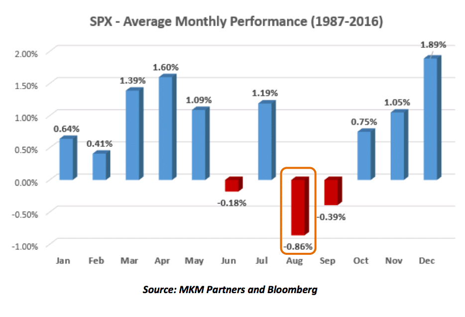
First up is this monthly seasonal chart of the S&P 500 by Jon Krinsky, CMT of MKM Partners, as shared by Josh Brown over at The Reformed Broker. Krinsky notes August has averaged a negative decline over the last 30 years but also points out that not every August has been bearish – ’06, ’09, and ’14 were notable exceptions.
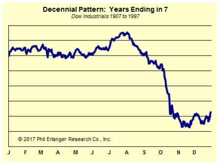
Next is a chart I shared on Twitter which is from Tom Thornton’s daily note, Hedge Fund Telemetry. Tom does an excellent job sharing his insights each day in this letter. This chart looks at the decennial pattern of the Dow Jones Industrial Average going back to the early 1900s for years ending in “7”. As you can see, August has often been an interesting turning point…on average for the seventh year of the last 11 decades.
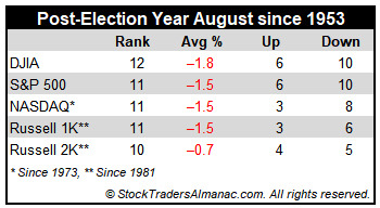
Jeff Hirsch, editor of The Stock Trader’s Almanac, notes that August, in a post-election year, has not been great for stocks. In fact, it’s the worst month for the Dow and the second worst month for the S&P 500, NASDAQ and Russell 1000 with average declines ranging from -18% to -15%, respective of the index.
Momentum
While discussing U.S. equities, we often focus on just the indices themselves, but it’s important to remember that the stock market truly is a market of individual stocks. How those stocks trade is what ultimately impacts the indices themselves.
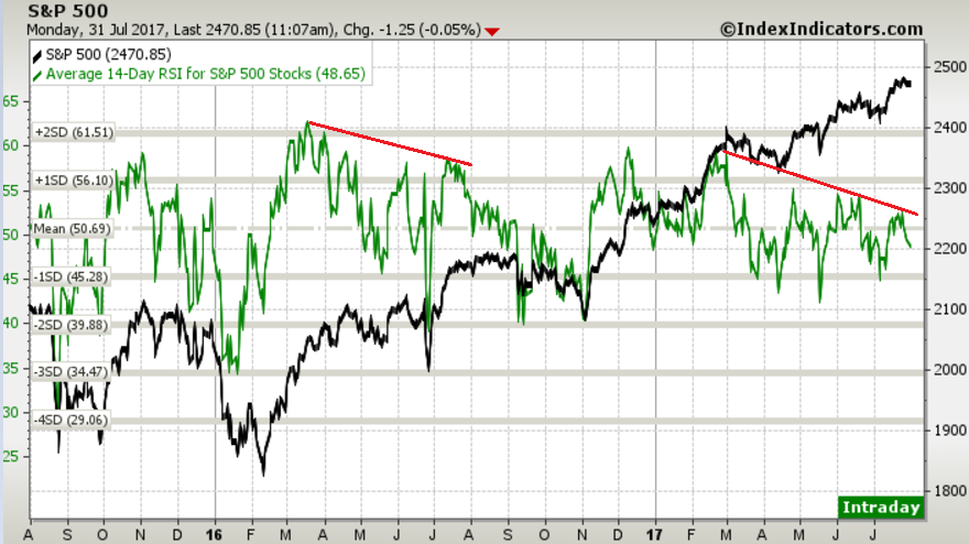
I believe momentum is a powerful tool in stock analysis and can tell us quite a bit on the chart of individual stocks and markets. One such measurement of momentum is the Relative Strength Index (RSI). The chart below shows the average 14-day RSI for each of the stocks that make up the S&P 500.
Since March this figure has been in a steady decline of lower highs while the index itself has been grinding higher. What I find really interesting is that we saw something very similar happen during the same time frame last year. In March 2016, the average RSI peaked and began to diverge through August – just before we saw the largest drawdown for that year.
Will the same type of price action also follow 2017’s momentum divergence? We’ll see.
Another way to look at momentum is through the lens of being ‘overbought’ or ‘oversold.’ While on a short-term basis being ‘overbought’ can act as a headwind for stocks, it’s often a longer-term bullish sign of strong interest in the stock as buyers push momentum to high levels.
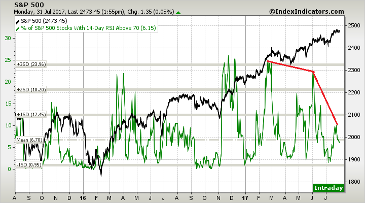
By looking at the number of stocks that are seeing a high level of momentum via the RSI indicator, we can get a different view of the health of momentum for the overall S&P 500 index. Similar to the chart above, we saw a peak in the percentage of S&P 500 stocks with their respective RSI above 70 (a commonly used level to denote ‘overbought’ status) just above 24%.
As the index headed higher fewer and fewer stocks have been able to push their momentum readings above this threshold, with just 6.15% of the S&P 500 stocks getting ‘overbought.’
So there we have it. When looking at the S&P 500, the 50-day Moving Average seems to have become a favorite level of dip-buyers to step up their activity. As of this writing, we are still well above the 50-day as well as the shorter-term, 20-day with the index just a few points off its all-time high.
If we do see weakness in equities I’ll be watching the prior June high as well as the 50-day MA as potential support levels. We are still in a well-defined up trend and that shouldn’t be discounted too quickly. There are plenty of catalysts that could keep prices buoyed, but it’s also important to understand the historical market implications and patterns that we also are facing. This should make for an interesting August for sure.
Disclaimer: Do not construe anything written in this post or this blog in its entirety as a recommendation, research, or an offer to buy or sell any securities. Everything in this post is meant for educational and entertainment purposes only. I or my affiliates may hold positions in securities mentioned in the blog. Please see my Disclosure page for full disclaimer. Connect with Andrew on Google+, Twitter, and StockTwits.
