Whenever we get large moves in the market I like to keep my analysis of where things could potentially be going as simple as possible. It’s easy to throw a bunch of indicators on a chart, a few cycles, trend lines, and maybe a sketch of a dragon and call it a day but what’s truly helpful is often what’s the most basic. So I thought it would be good to take a look at some simple daily and weekly charts of the S&P 500 and see where potential support (if we get declining) and resistance (if we bounce) could come in the near future. Let me start by saying I’m writing this on Sunday, so some of these levels may even get taken out once pre-market trading begins, based on how price moved last week…anything is possible.
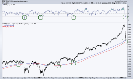
First up we have the a daily chart of the S&P 500 with two simple moving averages and the Relative Strength Index (RSI). Not long ago there major financial news networks dedicated quite a bit of airtime and column inches to the high level of momentum the market was experiencing. How quick things can change. We’re now seeing the RSI momentum indicator under 30, deemed as ‘oversold’ by mean practitioners. What does this mean? Just that there’s been a strong move towards the downside as sellers have out-muscled buyers. Over the last few years when the RSI has gotten under 30 we’ve seen a bounce in equity prices, will that happen this time as well?
Turning the focus to the price chart, on Friday the S&P kissed its 200-day Moving Average (blue line), which isn’t a huge surprise as it seemed at the time that just about everyone was laser-focused on the 20-day MA and while not an algo trader myself, I have little doubt that there are some major algorithms trading this market that probably have the 200-day MA as a trading rule. In fact, while at the Inside ETF Conference just a few weeks ago I met a wholesaler who had an ETF that’s entire strategy was on whether the S&P was above or below the 200-day Moving Average. I’ve also included 1-year (red line) moving average as I think the market often ‘respects’ its 1-year average price. We can see examples of that in June ’15, June ’16, and Nov’ 16. We obviously broke below both of these long-term moving averages during the correction/bear market of late-2015.

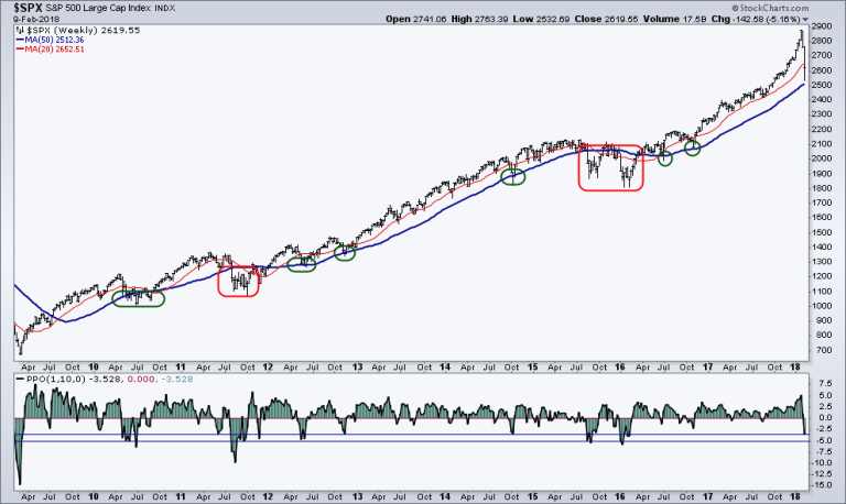
Now lets focus on the weekly chart of the S&P 500. Again, keeping these super simple. We have just a 50-week moving average and a 20-week MA. I’ve noticed that often times when the 20-week MA has been broken, the 50-week has a fair job at ‘catching’ price as support. We saw that play out in 2010, 2014, and twice in 2016. Meantime, the 50-week failed during the larger downside move in 2011 and of course in 2015.
On the bottom panel I’ve put an indicator that shows how far we’ve come from the 10-week Moving Average (would also be the 50-day Moving Average) along with two lines. The top line simply shows where we are now, 3.528% below the 10-week MA and the second line shows if we were to continue to decline and become 5% below the moving average. I think it’s interesting to see that we’ve declined several times approximately 5% below the 10-week during short-term corrections in the past.For example in 2010, 2012, and twice during the decline in 2015. It seems since 2009 that traders have found value in stepping back in to the market after a decline of that magnitude. So basically just another nearly 1.5% to the downside would still keep us within a normal market environment as we’ve experienced over the last 7+ years.
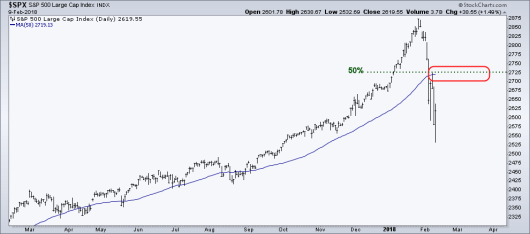
Okay, so what if we do see a bounce and price starts heading higher, what could be some potential resistance levels we should be aware of? The two main ones I’ll be keeping an eye on are the 50-day Moving Average and the 50% retracement. Let me start with the retracement…. I’m the first tell you I’m not a fan of Fibonacci, I wrote about it back in 2013 and you’ll rarely see me ever use it on a chart. There are plenty of other traders that I have great respect for that do use it, have success with it, and that’s great. Personally, I prefer market tools that are directly derived from price and not something that was invented to measure the reproduction of rabbits. Technically, I’m still not using Fib by referencing a 50% retracement as a .50 is not actually a Fibonacci number. It is however, a component of Dow Theory as it’s believed the market often will produce a counter-trend retracement of 50% of the prior move. Using closing values, that would put us at 2,725 which is also right about the same level as the 50-day MA. The fact that these two levels are so close, leads me to think there could be a build up of supply in the market at that point if price does rise another 106 points.

As I wrap up this short post let me emphasis that in each explanation above I use the word ‘potential’ quite a bit – and that’s on purpose. As a trader I keep an open mind to what the market could do without naively thinking I know what the market will do. The above three charts aren’t the only tools in my toolbox I use to evaluate the market, I also spend a great deal of time looking at inter-market relationships (i.e. sector relative strength, asset class performance, etc.) as well as market internals (breadth and sentiment, volatility). As we move into a new week I’ll be very interested to see how price moves and if traders become eager to step back in and retrace a piece or all of this technical-driven decline or of more weakness is on the horizon as loose hands continue to get shaken out.
Disclaimer: Do not construe anything written in this post or this blog in its entirety as a recommendation, research, or an offer to buy or sell any securities. Everything in this post is meant for educational and entertainment purposes only. I or my affiliates may hold positions in securities mentioned in the blog. Please see my Disclosure page for full disclaimer.
