Those that follow my personal account on Twitter will be familiar with my weekly S&P 500 #ChartStorm in which I pick out 10 charts on the S&P 500 to tweet. Typically I'll pick a couple of themes to explore with the charts, but sometimes it's just a selection of charts that will add to your perspective and help inform your own view—whether its bearish, bullish or something else!
The purpose of this note is to add some extra context and color. It's worth noting that the aim of the #ChartStorm isn't necessarily to arrive at a certain view but to highlight charts and themes worth paying attention to. But inevitably if you keep an eye on the charts they tend to help tell the story, as you will see below.
So here's another S&P 500 #ChartStorm write-up:
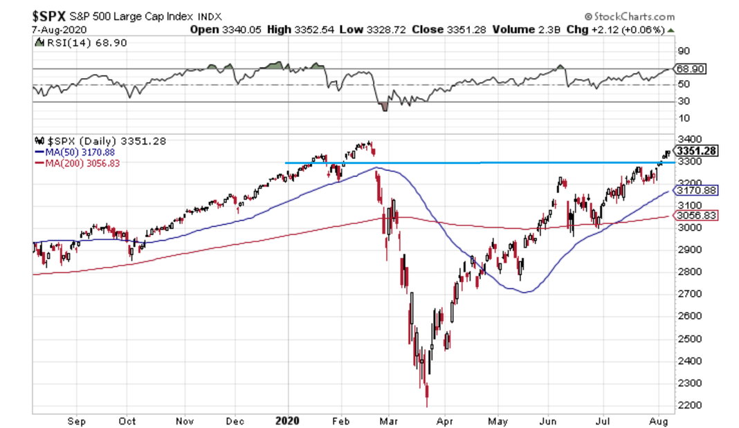
1. Another key level cleared: It might be an understatement to say it was a solid week for the S&P 500. US large caps were up each day and cleared the 3300 hurdle. FAAMG gets a lot of attention, but breadth is improving slightly as we’ll discuss later. As for momentum, possible negative divergence has resolved with pricing moving higher.
What’s next? The all-time highs may in sight, but we are entering some difficult seasonality – late August through September can see bouts of volatility. Corporate earnings beating estimates by the most in at least the last 12 years might not support equity prices much longer as the bulk of reporting season has come and gone.
The SPX remains above key moving averages, however. The rising 50dma will approach 3200 this week while the 200dma is just slightly upward sloping nearly 10% below Friday’s 3351 close. It’s remarkable to look at the 200dma in isolation – you would hardly know there was a 35% drawdown earlier this year.
Bottom line: The beat goes on for the S&P 500. We have not seen much in the way of significant pullbacks in the last 6 weeks. While the area around the all-time high may provide some resistance, there was not a whole lot of trading activity between 3350-3400, so overhead supply should not be too great.
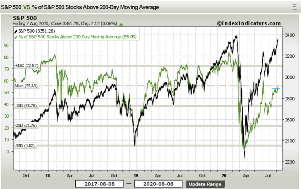
2. That bearish breadth divergence seems to have resolved to the upside, and now an interesting little bullish breadth breakout is underway: the percent of S&P 500 stocks above their 200-day moving average rose to its highest level in almost two months last Friday, helping to confirm recent rising stock prices. The spike in breadth on June 8 was care-of extreme outperformance from some of the biggest laggards during the prior several months.
Large caps and small caps continue to take turns leading the market from day-to-day. As for the S&P 500, the bulls would certainly like to see the percentage of components above their respective 200dma climb further should the index make new all-time highs. In the near-term, however, a small breakout in breadth should help support the index since more stocks could be turning the corner to longer-term uptrends.
Bottom line: The percentage of stocks above their 200dma within the SPX is considerably below levels from earlier this year, but recent action suggests more stocks are participating in the index’s advance.
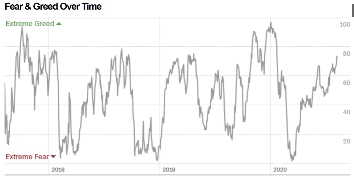
3. The Fear & Greed Index moving further into greed mode: CNN’s Fear & Greed index gets a lot of play on finance Twitter. What is it exactly? CNN looks at 7 indicators: stock price momentum (price versus the 125-day moving average), stock price strength (the number of stocks hitting 52-week highs and lows on the NYSE), breadth (upside volume versus downside volume), the equity Put-Call Ratio, the yield spread between investment grade and junk bonds, the VIX, and finally the return difference between stocks and Treasuries. So it’s a quantitative approach to gauging fear and greed (aka sentiment). CNN’s index has risen to the highest level since early 2020, suggesting more investors are feeling greedy than fearful. What’s driving the latest spike? It might be the equity Put-Call Ratio – we have written on this indicator in recent ChartStorms. It is extremely low; which means investors are buying up call options more than put options.
What do some of the other indicators suggest? The breadth indicator turned ‘extreme greed’ given rising participation we discussed earlier. Also in the ‘Greed’ zone is the price spread above the 125-day moving average (currently 12.4% - rather high). The only indicator at ‘Neutral’ is the VIX which is not far above the long-term average (currently 22.21).
Bottom line: Bulls and bears are driven by fear and greed. At all times. According to CNN’s indicator, euphoria was hit in early 2020 near the S&P 500’s peak. The party was short-lived as equity prices collapsed in February and March. Extreme fear soon gripped the market in mid-late March – a similar drop was seen in Q4 2018. It’s been a strong rise in investor sentiment over the last 4-5 months as many market indicators have recovered. But have they turned around too far, too fast?
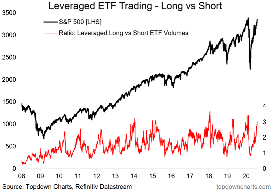
4. Similarly, we're seeing heavier volumes in leveraged long equity ETFs (relative to leveraged short). Spikes in this indicator = short term risk is elevated. Another caution flag being waved is the ratio of trading volume in leveraged long versus short ETFs. We track this indicator at Topdown Charts, and it is at the highest point since early 2020. The classic narrative this year – investors are sitting at home in (semi)-quarantine with not a whole lot to occupy their time, so they just whip out their phone, open a free trading app, and have some fun.
And what’s more fun than leveraged ETFs?? As the stock market has risen, trading from the long side typically increases, and that has played out. Notice how the red line in the chart below dipped below 1.0 during the springtime – it doesn’t happen often. The previous time it dipped near 1.0 was at the Q4 2018 market bottom. Now it is nearing 3.0 – the ratio usually does not hang out above 3.0 very long. So traders – beware.
Bottom line: Leveraged ETFs seem to come and go these days, but that doesn’t mean investors don’t enjoy getting their fix by trading them intraday. Market mechanics today make it all the more likely that these products will be churned. Comparing the trading volume from the long side and short side is a useful gauge of market sentiment – this is yet another sign of greed percolating.
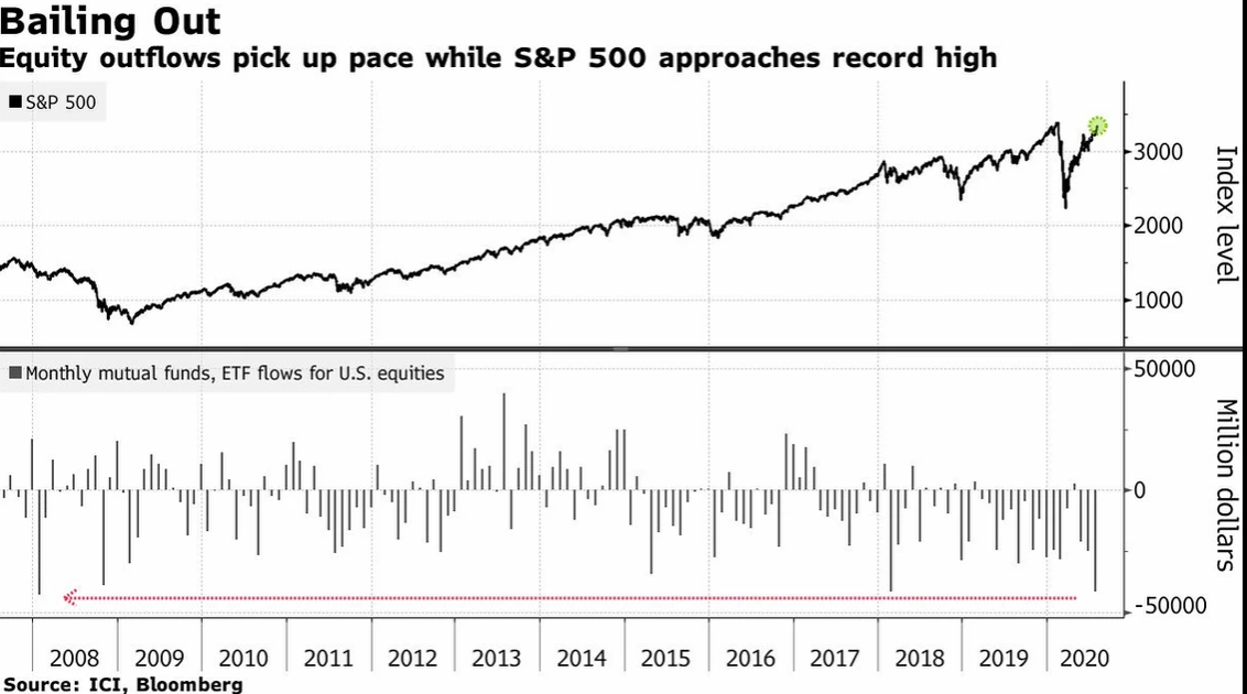
5. Meanwhile investors continue to rotate out of US equity mutual funds and ETFs (maybe cashing out of funds and into single names, now that everyone is a top-quartile PM!). Thanks to @C_Barraud for this Bloomberg chart using ICI data – showcasing the S&P 500’s stellar run while equity outflows continue. Money leaving stock mutual funds and ETFs has been an interesting theme for the US market in the last several years, despite significant price rallies along the way.
Could it be that money is simply moving from funds to single names? In the chart below, Bloomberg notes that July featured the biggest single monthly fund outflow since early 2008. Maybe that is a minor chart-crime, however, since the value of the US stock market today is significantly higher than it was in early 2008. Still, only a few other months since 2008 were similar in terms of the amount of money exiting mutual funds and ETFs for US equities.
Bottom line: The last four years have featured money constantly leaving US equity funds, and July 2020 was the biggest spike in more than a decade. Could it portend bad things for future stock prices? Hard to say – it’s interesting that monthly fund flows earlier this year were nothing to write home about despite immense stock market volatility.
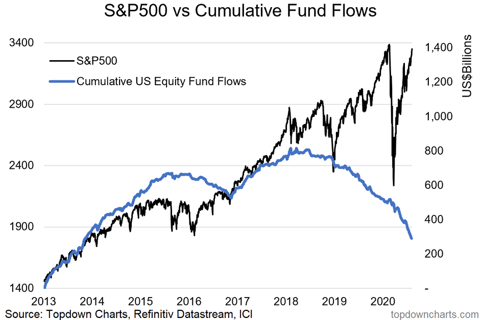
6. On a related note, here's everyone's favorite chart of cumulative net-flows to all US equity mutual funds and ETFs vs the S&P500. Referring to chart 5, we also plot the data cumulatively at Topdown Charts – take a look at chart 6 below. The blue line is the cumulative US equity fund flow with the S&P 500 in black. Signs of outflows began in late 2015, but the trend really began in early 2018, after the huge stock market rally on low volatility during 2017. Interestingly, investors decided to start pulling money from funds after a nice bullish run.
You’d think a bear market and volatility would push investors out of stock funds and ETFs. Could it be that investors actually got a little overconfident, and took money from their index funds to dabble in single-name stock trading? In total, about $500 billion has escaped US equity mutual funds and ETFs in the last 2 ½ years. The blue line is also flat to levels from 2013-2014.
Mutual funds and ETFs are not the only game in town with today’s free trading apps and easy-access to stock trading platforms. What used to take a phone call to your broker with a $30 fee, now takes a swipe and zero commission. It’s never been easier, faster, and cheaper to buy and sell single-name issues. What a time to be alive!
Bottom line: Money leaving equity mutual funds and ETFs has been a theme in recent years. The trend may persist with more coverage of single-name issues (like the FAAMG stocks) garnering attention. And let’s not forget Tesla (NASDAQ:TSLA) and the ‘stocks of the day’ like Hertz & Kodak that seem to flare up on financial news and social media.
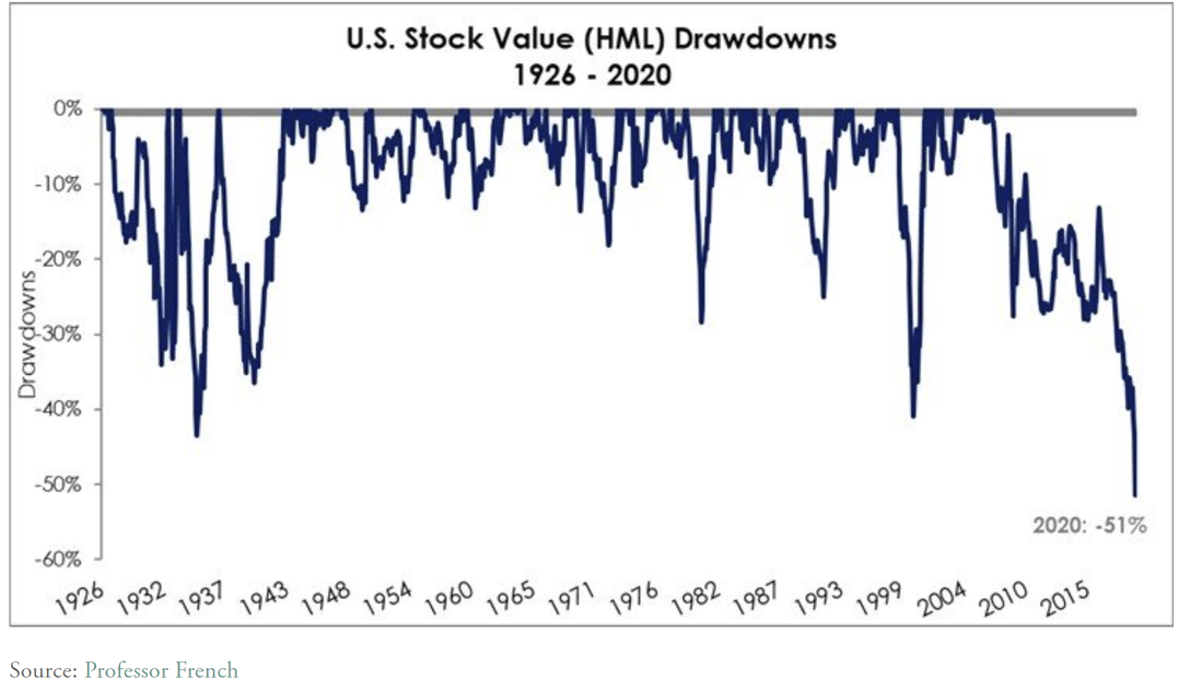
7. Some longer-term perspective on the big value vs growth drawdown: turning from fund flows to our old friend value versus growth. The HML factor, as Fama-French dubbed it, is in its biggest drawdown in recent history. Rather remarkable since we can take this chart back to the early 20th century. Two Centuries blog took a deep dive into previous crashes in value stocks. There are some very interesting findings (and charts) in this piece. Currently, the drawdown reached 51% at the March 2020 low in the stock market – that is a 14-year bear market in the factor.
The researchers actually investigated value versus growth data dating back to 1871. What did they find? There was actually a bigger drawdown in the ‘extended history’ period from 1890 to 1904 – notably, that was 14 years as well, but the drawdown was bigger at 59%. From 1904 to about 1914, the drawdown had been completely retraced as value stocks went on a tear to begin the 20th century. Value investors – try to keep cool on this next part – Two Centuries researchers went on to say that ‘a golden decade for value investing might be ahead’.
Bottom line: It’s been 14 years of misery for value investors as growth stocks have dominated. It feels like ages. The current drawdown is similar to the market environment more than 100 years ago... which of course few even know about. Luckily for us, researchers dug into the data to give us clues on what might lie ahead for today’s value investing crowd. A new golden age for value investors could be nearing.
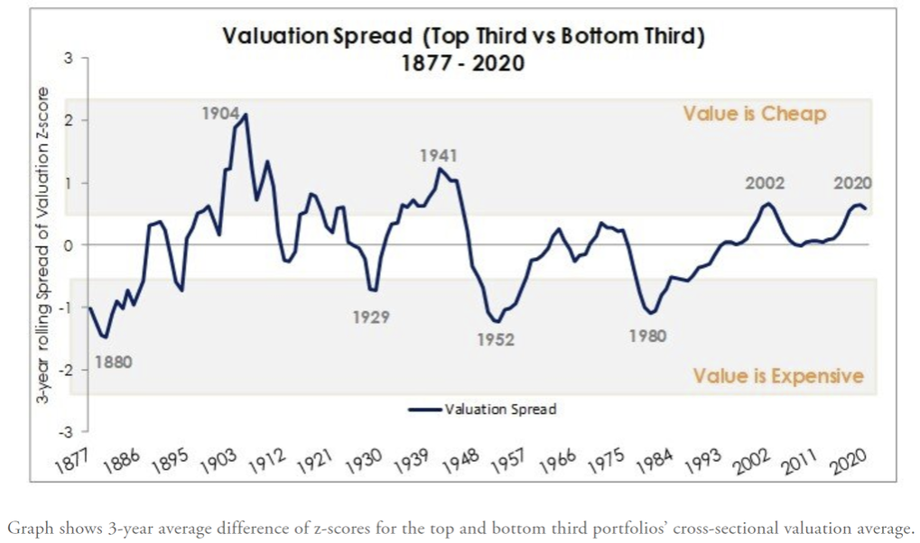
8. And on the value of value: "in 2020 value looks cheap again - on par with the Dot-com and only surpassed in recent history by the Great Depression decade." Compare just the deepest value versus the most growth-oriented stocks, and we notice that the current period is about equal to the spread in the early 2000s. You have to go way back to completely different market regimes (like the Great Depression) to find a time during which deep value was cheaper on a relative basis to growth. In fact, the researchers had to tweak the data and valuation measures just to come up with the earlier data on the chart, so take it with a grain of salt.
Bottom line: While there is an intermediate-term opportunity in value stocks, it doesn’t mean there won’t be more near-term pain. The researchers even indicate that value could retreat another 20% or more to match the drawdown during the 1880s through 1904. That’s often the cost of longer-term opportunity – being willing to suffer more near-term pain as others boast about how awesome their growth stocks have been performing.
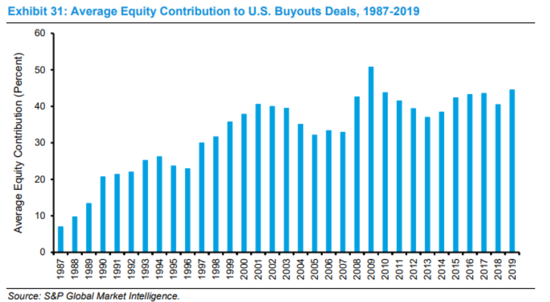
9. Quite interesting to see how leverage is much lower in Private Equity deals these days (even though interest rates are much lower). @JulianKlymochko brings us this chart from S&P Global (NYSE:SPGI) Market Intelligence showcasing equity contribution to buyouts by year. 2019, despite depressed interest rates, featured a relatively high equity contribution – meaning investors put-up more of their own money versus relying on debt to finance deals (and leverage up returns). So leverage was somewhat light versus history.
Take a look at the ultra-leveraged deals that took place during the late 1980s – no guts, no glory, perhaps. Today’s deals appear to be less risky, but that also means less reward for investors as well. If you have to contribute more money to a deal, your cash-on-cash return potential is much lower considering the higher denominator. Taking it from the corporate finance classroom to the real world, maybe today’s cash-heavy firms are simply using their own liquidity and cash flow for M&A activity.
Bottom line: US buyout deals are getting done with more equity versus debt financing despite record low interest rates. It will be interesting to see how 2020’s data looks like given the major drive lower in interest rates and the tremendous amount of central bank support of the debt markets so far this year.
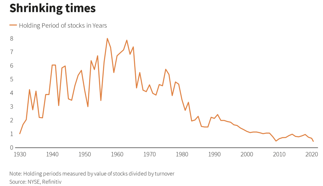
10. As you might guess, average holding period has taken a lurch lower (on the back of higher volatility and greater ease of access to the market for the little guy). Reuters recently discussed the average holding period for value stocks using Refinitiv and NYSE data. Shocking nobody, the average length an investor (using that term loosely) holds a stock has gone from 7-8 years during the 1950s and 1960s to 6-9 months in recent years. While all of the common-sense personal finance articles and nudges that are out there nowadays tell us to think long-term, people crave the buying and selling of stocks as if it were all one big casino. Chalk up a win for the financial news media, maybe.
What’s driving the trend to zero on this chart? The aforementioned ease of access given trading apps, zero commissions, lightning-fast execution. Maybe even social media plays a role – the FOMO effect as our friends, neighbors, and coworkers all seem to take pleasure in letting the world know how awesome of a stock-picker she or he is. Of course algorithmic/high frequency/systematic/computer (whatever you want to call it) trading is also playing a big role.
Bottom line: Fear & greed drive markets. We’ll keep saying it. Ma & pa investors (traders) want to score quick wins in the market, so the holding period of stocks has dropped dramatically. Today’s trading environment is of course night and day compared to that of the 1950s. It’s hard to see this trend stopping any time soon; the COVID-crash only seemed to accelerate it.
So where does all this leave us?
1. Bulls vs. Bears; Greed & Fear.
The S&P 500 extended its winning streak to 6 sessions to end last week. The close at 3351 puts it within 2% of the all-time high struck in February at 3394, which seems like ages ago considering the massive drawdown to the March 23 low at 2192. US large caps stocks have advanced more than 11% from the intraday low on June 29. It’s been an impressive summer rally. Now comes the daunting mid-August through early October stretch which can be tough for the bulls. More stocks are rising above their respective 200dma, so the bulls have that working for them. The bears counter with the CNN Fear & Greed Index that shows sentiment is getting dangerously high care-of an ultra-low Equity Put-Call ratio, among other indicators. Meanwhile, trading activity is surging in leveraged long ETFs relative to leveraged short ETFs – a warning flag that optimism is running rather high. Short-term risk is elevated. Yet, money continues to pour out of US equity mutual funds and ETFs – perhaps this too is a sign that investors are getting too greedy as trading in speculative single-name issues picks up. The trend of money exiting equity funds has been going on for more than two years now.
2. Value vs. Growth.
Value investors have been in the doghouse for the last 14 years. Researchers at TwoCenturies found a similar stretch in the late 1800s and early 20th century. Is more pain to come though? The bloggers suggest more downside could be on the horizon before a golden age for value stocks arises. Mega cap tech growth stocks seem to dominate the narrative right now, and 2020 has been the best year ever for growth versus value. Times have really never been tougher for the value factor made famous by Eugene Fama and Kenneth French decades ago. Relating it back to the S&P 500 – the S&P ‘5’ as it were (Apple (NASDAQ:AAPL), Microsoft (NASDAQ:MSFT), Amazon (NASDAQ:AMZN), Google (NASDAQ:GOOGL), Facebook (NASDAQ:FB)) are helping to drive the market higher, certainly, but other stocks have been participating in the last three months, too. We recently covered the tactical drivers for value vs growth in this video.
3. Institutional & Retail Trends.
US buyout are being done with greater equity contribution (as opposed to debt) versus history while interest rates (the cost of capital) is very low. It seems to be counter-intuitive. Perhaps high cash levels are being drawn upon. Less leverage also caps upside for investors though. On the retail front, there is more risk-seeking behavior – the average holding period for a stock is at all-time lows. Ease of access to free & fast trading lures us all to play our hand in the markets. We all know we shouldn’t think of investing and trading as ‘playing the market’. Our focus should be on risk management and long-term performance. And that’s what we try to do at Topdown Charts. Our research is focused on helping portfolio managers manage risk and focus on data, not false narratives.
Summary
This week was one of those editions with quite a nice mix of long-term perspective building charts, as well as a few more tactically meaningful snippets. Building the tactical picture this week we had another key technical level cleared for the index, a bullish resolution of previous bearish divergences, and yet increasing greed and demand for leveraged trading instruments (against a backdrop of continued exits from US equity mutual funds and ETFs). It's really a picture of momentum. Momentum e.g. rising prices, rising breadth, rising greed, rising use of leveraged ETFs... can persist for longer than you expect, but it still does create an environment of increasing froth that can get summarily skimmed off the surface by an unexpected change in winds.
