Those that follow my personal account on Twitter will be familiar with my weekly S&P 500 #ChartStorm in which I pick out 10 charts on the S&P 500 to tweet. Typically I'll pick a couple of themes to explore with the charts, but sometimes it's just a selection of charts that will add to your perspective and help inform your own view - whether its bearish, bullish, or something else!
The purpose of this note is to add some extra context and color. It's worth noting that the aim of the #ChartStorm isn't necessarily to arrive at a certain view but to highlight charts and themes worth paying attention to. But inevitably if you keep an eye on the charts they tend to help tell the story, as you will see below.
So here's another S&P 500 #ChartStorm write-up!!
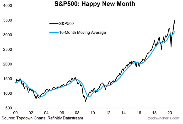
1. Happy New Month! The S&P 500 dropped 3.9% during September in a risk-off trading environment that featured an early melt-up in mega cap tech stocks, only to see them fall sharply over the ensuing few weeks. At the low, SPX was off 10% on an intraday basis as election and political/stimulus risks mounted. The VIX was elevated through September, but dropped back to the mid-20s by late month.
Treasuries continued to be somewhat rangebound with the benchmark US 10-year rate hovering in the 65-70 bps range; since April, the 0.50-0.85% range has generally held. The US Dollar Index was a popular short-trade during the summer, but the Greenback actually rallied 2% during the often-volatile & ‘flight to quality’ month of September. Elsewhere, gold fell 4% while WTI lost 6%.
After surging throughout the summer, stocks finally took a breather. And it was right on cue as September is infamous for being the most volatile month on the calendar and a difficult period for the bulls. We now turn to the fourth quarter, which often features bullish seasonality. This year, however, new risks have emerged with the US election four weeks away and fears of a second wave of COVID-19 hampering economic growth during what is the most important stretch for many businesses’ top line.
Bottom line: September lived up to the hype of being fraught with volatility and downward trending equity markets. US large caps finally felt the brunt of the selling pressure while international equities were down to a lesser extent. Emerging and frontier markets were off just fractionally. Looking ahead, volatility remains elevated, and virtually all equity markets have work to do in order to retrace to new highs.
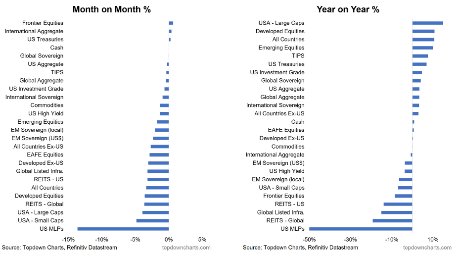
2. Not so happy September for the S&P500—3rd from the bottom for the month. Diving deeper into returns across the global markets and in other sub-asset classes, US small caps could not catch a break versus their large cap brethren. Small issues were down 4.8% versus the 3.9% drop for large caps.
Early in the month, it appeared the mega cap tech/communications/retail stocks were going to fall off a cliff as the FAAMG stocks were all down 10-20%. But the glamour group’s resiliency was shown with buyers stepping in during the last week of September to bring the Information Technology sector to the middle of the pack in terms of sector returns. Info Tech was down 5.3% for the month.
The big loser, as has become familiar by now, was the Energy sector. Shares in oil & gas firms fell another 15% to become just 2.1% of the S&P 500’s market cap – the lowest in its history. Weakness was seen in US MLPs which dropped 14% as well. In the alternatives space, REITs were down 3-4% and are off about 20% for the year. Meanwhile, despite the US Dollar’s advance, non-US equities outperformed – particularly in the Emerging Market and Frontier Market spaces.
Across the Fixed Income world, it was another snoozer of a month. There was little change among Treasuries and International Sovereigns. The only move of significance was about a 2% total-return drop in EM debt (despite EM equities’ relative strength versus US stocks).
Bottom line: September had the early hallmarks of a classic harsh decline for global equity markets, but some strength during the final few days of the month prevented a significant decline. In the end, equities are about where they were back in early August as the gains from Q3 have been consolidated.
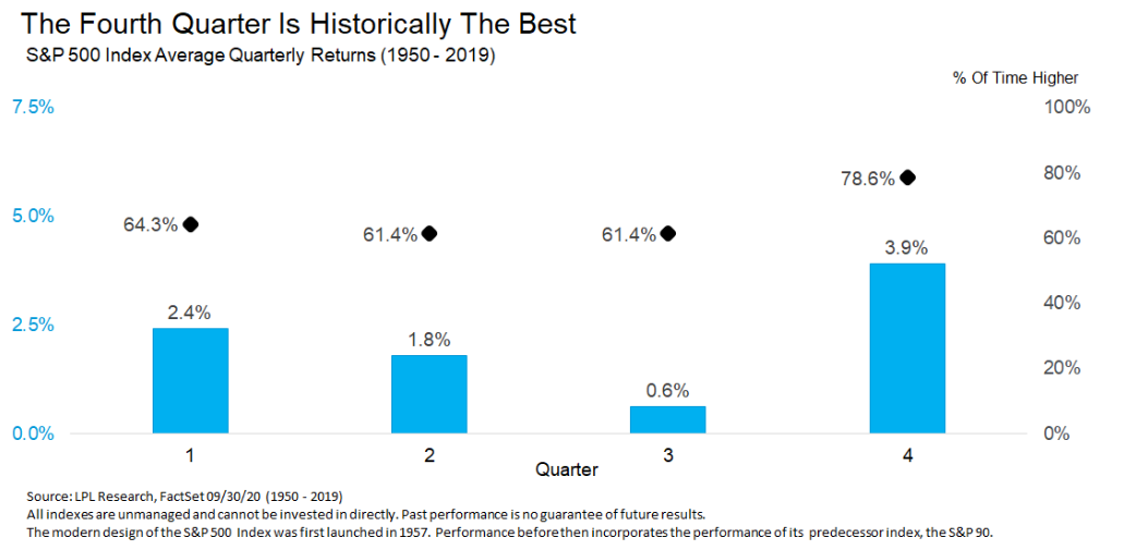
3. Happy New Quarter... typically the best quarter of the year according to this chart from @RyanDetrick. The bulls are relieved to make it to October. While the first half of this month can be quite uncertain, the timeframe kicks off a fairly reliable bullish seasonal trend.
The run-up to year-end is usually strong for global equity markets. For the S&P 500, Ryan Detrick shows us that Q4 is historically the best quarter of the year. The average return since 1950 is 3.9% versus about 1.6% for the other three quarters. Remarkably, the positivity rate (no, not THAT positivity rate) is 79% - meanwhile SPX boasts a positive return in 79% of the Q4s in the last 70 years.
We don’t have to go back to far to find an anomaly though – recall Q4 2018’s sharp correction and a borderline bear market. SPX fell just shy of 20% from the early October peak to the December 26 low that year. It seems like ages ago considering the COVID flash bear market this year.
Bottom line: While there are many takes & spins on seasonality & cycles this time of year (and considering the election cycle comes to a head in four weeks), the definitive word is that Q4 often has a bullish bias. Seasonality should be a secondary indicator of what is happening among the major global equity markets price-wise, but it’s still something to consider if you are aggressively short.
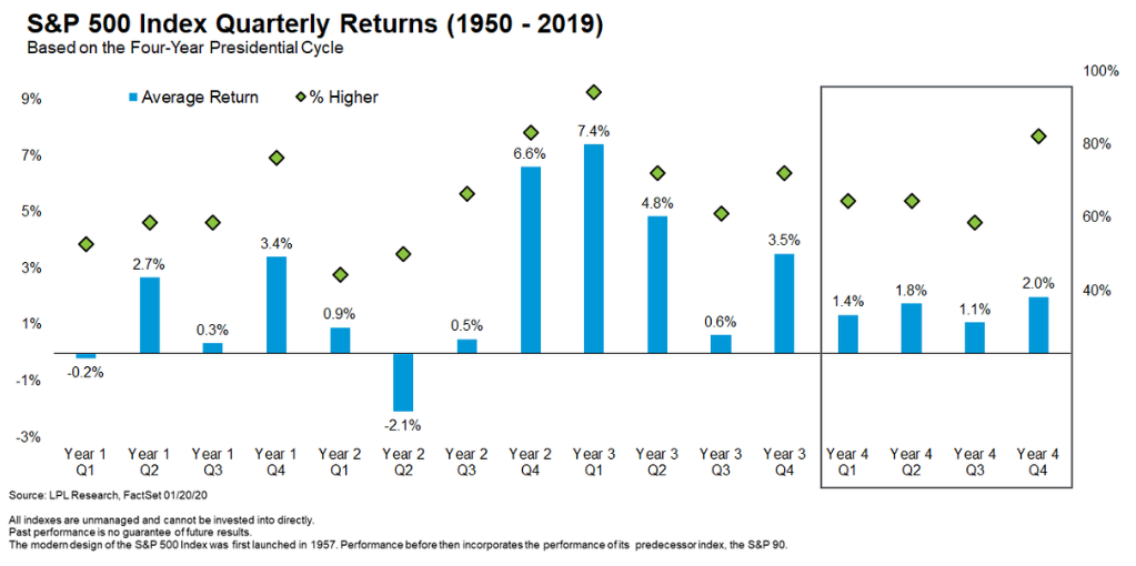
3a. (and for those who will ask, it's still good in election years)
We’d be remiss not to dig deeper into Detrick’s analysis at LPL Research by analyzing S&P 500 quarterly returns based on the highly popularized four-year election cycle. Right now, we find ourselves kicking off Q4 of the ‘election year’. This quarter (out of the 16 in the cycle) is one of the best in terms of its positivity rate – above 80% since 1950.
The average gain is somewhat modest at just 2.0%. The handful of quarters leading up to the election year (aka the pre-election year) are usually the best in the set as politicians look to juice-up the economy so they can keep their cushy jobs in Washington DC. The bearish period of the four-year election cycle begins next quarter (Q1 of the post-election year) and runs through the summer of the mid-term year. So, the bulls may want to soak in the bullish trend for now as the cycle points to volatility starting in just a few months.
Bottom line: While it’s interesting to analyze cycles, any given year can stray greatly from the long-term average. We have seen that all-too-often in the last few years. Q4 2018 (which is Year 2 Q4 in the chart below) was awful for stocks even though the mid-term year Q4 is the 2nd best in the cycle over the long run. And now just this year, 2020 hasn’t followed the seasonal/cyclical script well at all. So, take it all with a grain of salt.
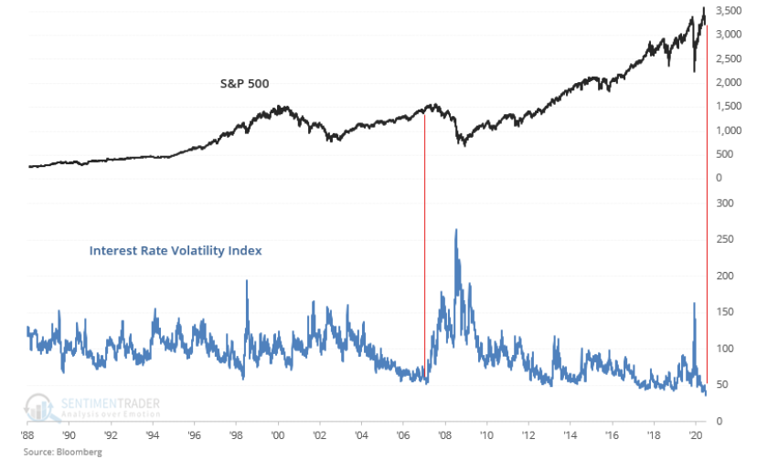
4. Interest rate volatility at record low = warning sign? @SentimentTrader brings us a look at just how calm the fixed income markets have been with this chart of interest rate volatility (since the 1980s, no less!). We mentioned how quiet the 10-year yield has been over the last 6 months. TNX peaked at 0.957% in early June, but it was a brief stint above 80 bps. The low of the year (and all-time low) was 0.398% on March 9, 2020. But for the most part, the range of 50-80 basis points has held since April.
Consider that there has been above-average volatility in equity markets and a great deal of political & legislative uncertainty this year – all the while the US fixed income markets have been quiet. SentimentTrader’s chart shows that volatility in the interest rate market has not been this low since early 2007. That year is of course important since it marked a top in global equity markets. Back in 07, the Fed had gone through a tightening cycle from 2004 to 2006, but then began to ease starting in Q3 2007 with a big 50bps cut in August 2007.
And here we are in 2020 with the Fed already having cut rates to zero after the 2015 to 2018 tightening cycle. Maybe it’s a stretch to compare the two years, but bulls should be mindful of an all-too-quiet bond market.
Bottom line: There isn’t much history on the interest rate volatility index being this low for an extended period. It feels ominous though. The only other period we can compare it to is 2007 – a time when the Fed was just starting to ease credit markets following a multi-year tightening cycle.
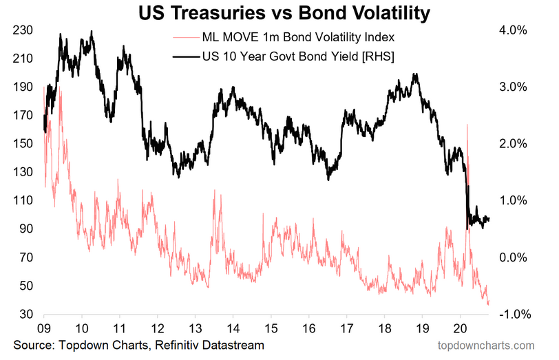
5. Bond market volatility vs Treasury yields. Looking closer at bond market volatility, we feature this chart of the Merrill Lynch MOVE 1-month Bond Volatility Index versus the US 10-year rate. The MOVE Index increases when investors believe interest rates are going to increase sharply. Think of it like the bond market’s VIX. There were some big spikes in the MOVE index in 2009 and 2013 when market participants felt rates were going to be on the increase.
Today, the index is at all-time lows with interest rates also hovering near all-time lows. Historically, these collapses in volatility tend to coincide with important turning points for not only the bond market, but also other areas like equities. Traders will want to keep an eye out for a breakout in the fixed income space since it may portent a key regime shift for across the financial markets.
Bottom line: They say the bond market is the smarter money versus the stock market. Well, right now the smart folks are in hibernation with the ML MOVE Index at its lows. Traders await a breakout or breakdown from the persistent 50-80bps range within which the US 10-year rate has traded for the last 6 months.
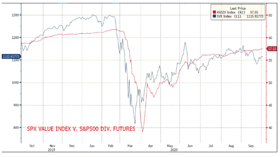
6. S&P500 Value Index vs S&P500 dividend futures. Neither managing a full recovery at this stage. Via @KyleR_IG. S&P 500 dividend futures are pricing in $57.55 of dividends for 2020 versus about $61 for 2019. The 6% decline year-on-year indicates that there has been a modest reduction in the amount of dividends to be paid the owners of the S&P 500. Remarkably though, December 2020 dividend futures were below $40 for a time during Q2.
A solid summer earnings season for the S&P 500 helped bolster dividend futures for the year. Still, a full recovery has not yet been realized while mega caps climbing to new all-time highs in recent months. The value index has also felt pain on a relative basis this year.
Value stocks, those found in financials, energy, and among industrials, are still more than 10% below their early 2020 peak. Value equities feature higher dividend yields versus their growth counterparts, so it makes sense that the two lines on this chart go hand-in-hand.
Bottom line: The hardest-hit areas from the COVID bear market and economic changes are seen in value stocks and high dividend payers. High-duration tech firms have weathered the storm very well (in fact, they have probably benefitted from the ‘new normal’).
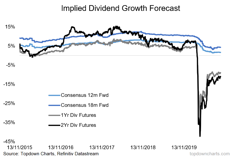
7. On the topic of dividend futures, here's where the dividend futures market implied dividend growth forecasts sit vs consensus of Wall Street analysts. The market expects the next 12 months’ worth of dividends to be about 10% lower versus a year ago while analysts are more happy-go-lucky with their 5% growth rate expectation.
The major sectors cutting dividends are the Consumer Discretionary, Real Estate, and Energy areas. 51% of Discretionary companies have either suspended or cut their dividend this year while 27% Real Estate and Energy firms have done the same, according to JP Morgan’s Bloomberg data.
Often a signaling mechanism, it’s a bold move for a company to slash its dividend, but it’s the last of a series of actions taken by many struggling going-concerns to stay in business this year. Looking ahead, analysts expect the next 18-months to show an increase of about 5% in dividends paid (versus a longer-term average closer to 10%), so firms may be a bit tighter with their purse strings over the coming months. They might also have to deal with a higher tax rate if there are political changes in DC.
But also notice how the futures market is much less optimistic versus the consensus figures. Expect the sellside analyst opinions to continue to come down match were traders expect dividends to be.
Bottom line: The US dividend futures market looks more aligned with a weak economic environment versus the relatively rosy consensus outlook. The implied growth rates found in the futures market are below historical averages and are pessimistic versus Wall Street analyst expectations.
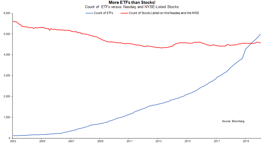
8. "There are now more ETFs than stocks listed on the NYSE and NASDAQ" h/t @VincentDeluard. The trend of fewer stocks and more stock funds continues. In 2019, there was a symbolic crossover in the number of ETFs versus the count of single stocks on the NASDAQ Composite and NYSE. So there’s almost an ETF for everything.
Stock-pickers may like the development as it could imply that all stocks end up getting traded as one when volatility rises – making it easier to buy-up the cheap stocks or ones that show solid technical moves. Thematic investing is also a trend that has helped create a massive influx of new ETFs. The ESG movement, ARKK stocks, risk-on/risk-off plays have all been popularized in recent years. It makes it all the more important to have the best global/macro data and chart analysis at your fingertips as an active money manager.
Bottom line: The COVID new normal has led to a slew of new exchange-traded products. While we have talked about how hot the IPO market has been this year, the trend of fewer public companies and more ETFs continues.
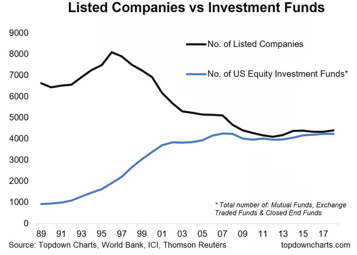
Also, to round it out, here's a similar perspective for all types of US equity investment funds vs listed companies from a piece of analysis we did a year back:
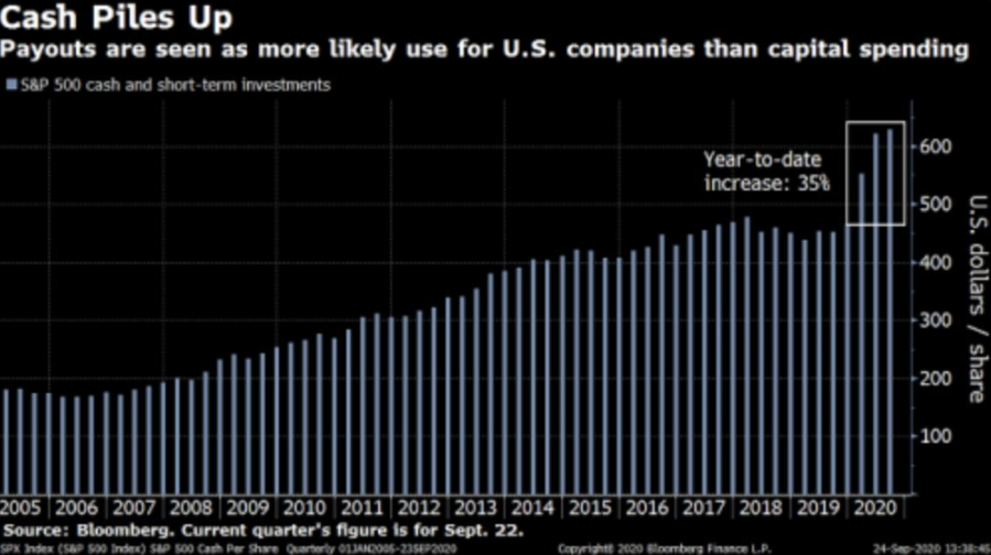
9. S&P500 companies' cash & equivalents increased 35% this year. h/t @trevornoren. It’s always worth checking in on cash levels, particularly in this environment. Earlier this year, we wrote about how much cash was on the sidelines in a defensive stance as global equities had just sunk to multi-year lows following the COVID flash bear market. We dubbed it Quarantined Cash among investors, but the same can be said now among S&P 500 companies.
Cash is piling up according to this chart from Bloomberg. Cash and short-term investments on the balance sheet of corporate America are up a whopping 35% year-to-date, reaching a new all-time high this quarter. While dividend futures are soft, payouts could be on the horizon if there is more stability in the economic picture and more confidence with what the regulatory and tax landscape will look like next year.
Buybacks are probably not going to be the weapon of choice for many companies since share repurchases were demonized by politicians and financial journalists throughout this year. Will dividends be the payout method? Higher tax rates on investors could make them less attractive.
Bottom line: Cash levels are very high among US firms despite the recovery in the stock market. Perhaps managers are uneasy with how the political environment will look in a few months – all while economic growth volatility is at all-time highs considering a 31.4% drop in US GDP during Q2 and a 30% rise expected this quarter.
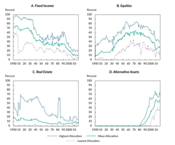
10. US university endowment funds' asset allocations aka, the rise of alts. h/t @Adam_Tooze Let’s go way back and analyze data since 1900 on US university endowment holdings. It used to be that universities’ treasure trove consisted mainly of bonds, but then as equity markets matured, endowments ventured into the stock market.
The asset allocation settled on a nice mix among stocks and bonds with a little real estate until the 1990s when the Alternative Asset space developed. Alternatives, like hedge funds and private equity, provided massive returns with little correlation to traditional assets from the early 1990s through the mid-2000s.
With Alts came higher fees, but the fees were a small price to pay for the big return potential and strong diversification benefits. The most recent 10 years have seen lackluster returns from the Alternatives space though. As interest rates have plummeted, bonds represent a small fraction of total endowment holdings while equities make up just about 30% of the asset allocation.
With big expected changes in how colleges and universities operate, will endowment managers be forced to liquidate some of these opaque positions? Certainly, by our read of expected returns it's going to be a difficult decade for asset allocators - our view: be more active on asset allocation -- allocators themselves should be considered the key driver of portfolio value (and even alpha).
Bottom line: There could be some interesting shifts in not only the university teaching system, but also in the supply/demand dynamics within the alternative asset space.
So where does all this leave us?
1. A new month, a new quarter, the same volatility.
Stocks survived September with a bruise, but not a major wound. US equities dropped about 4% while foreign stocks fell to a lesser extent. The VIX remains rangebound between 20% and 40% dating back to May – above the long-term average of 20%. Elevated volatility among the big tech stocks is having its impact on the broader market. Q3 was a positive one for stocks though, with big gains during July and August and comparatively modest losses during September despite immense headline-risk. Expect more volatility in the coming weeks, but hopefully some certainty is on the horizon once we hurtle past the election. Q4 of an election year tends to be positive, so the bulls can pin their hopes to that historical average. Meanwhile, the bond market has been all-too quiet in the last several months as the Fed has been hard at work growing its balance sheet. Traders should be on the lookout for a key breakout or breakdown from a persistent interest rate range.
2. An uncertain dividend environment.
Amid economic, political, and market uncertainty, US corporations are flushed with liquidity. What to do with that quarantined cash is the big question. Shareholder accretive moves like dividend increases and share repurchases may not on the docket of priorities for corporate managers considering the negative connotation of rewarding stockholders in a shaky economy. Dividend futures markets are much less optimistic than Wall Street analysts, and the latter usually gives way to the former in that battle.
3. Allocations.
As cash is on the rise among corporations, individual investors have plenty ETFs from which to choose as the year of the Robinhood trader continues. Many folks are still working and learning from home, so that leaves a little extra downtime to day trade. The IPO market has been hot, but the ETF creation industry might be even more lit. There are now more ETPs than single stocks on the Nasdaq and NYSE. One of our charts shows that the number of listed companies is about equal to the among of US equity investment funds. Elsewhere, as the fall semester gets underway, university endowments may have to study how to invest their endowments going forward given uncertainty about the solvency of universities in the post-COVID world.
Summary
We made it through September and are now just a few weeks from the election. 2020 will likely continue to surprise us, and staying abreast of the latest important global/macro trends is paramount. The last few weeks have shown some cracks in the bull market’s strength, but the bears have not been able to take down the average more than about 10% so far. Renewed COVID fears and stimulus uncertainty are the risks de jour, but Q3 earnings season could provide better clues into the actual operating environment among global companies. And just like 2016, simply getting the election out of the way (and maybe even regardless of the result) could be a key tipping point/catalyst.
