Those that follow my personal account on Twitter will be familiar with my weekly S&P 500 #ChartStorm in which I pick out 10 charts on the S&P 500 to tweet. Typically I'll pick a couple of themes and hammer them home with the charts, but sometimes it's just a selection of charts that will add to your perspective and help inform your own view - whether its bearish, bullish, or something else!
The purpose of this note is to add some extra context beyond the 140 characters of Twitter. It's worth noting that the aim of the #ChartStorm isn't necessarily to arrive at a certain view but to highlight charts and themes worth paying attention to.
So here's the another S&P 500 #ChartStorm write-up!
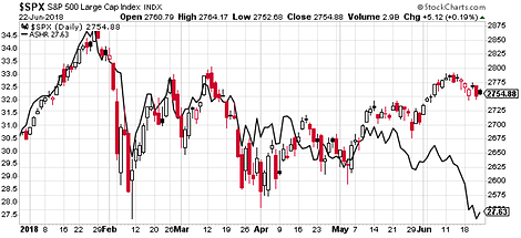
1. S&P 500 vs China A-shares—biggest losers in the Trade War: First up this week is an interesting juxtaposition of the S&P 500 and China A-shares. It's worth noting that the Deutsche X-Trackers Harvest CSI 300 China A-Shares ETF (NYSE:ASHR) is not FX hedged, so it also includes the impact of changes in the exchange rate - which I think is a good thing because a fundamental deterioration in China would show up both in the equities and the currency, so it should serve as a decent indicator in that respect. Anyway, the reason for including it is this past week brought further noise on the trade war or trade skirmish front, and if you look at this chart you might conclude that markets are telling us that China is the biggest loser here. The truth is no one really wins in a trade war, and to that end, maybe this is more of a warning chart than a pithy remark on headline grabbing issue.
Bottom line: It looks like markets are saying that China will be the biggest loser in the trade war.
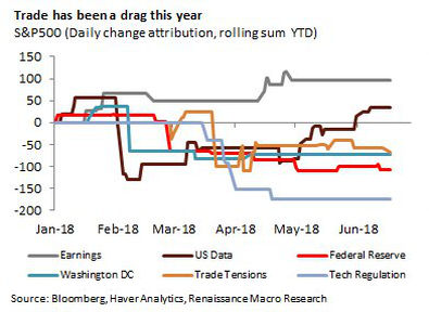
2. Drivers of the S&P 500: Similar line, this chart from Renaissance Macro shows their analysis of the approximate impact of various factors on the S&P 500 this year. In short, earnings and US economic data are positive drivers, while it's basically all policy and politics that are holding the market back. Indeed, this is a time of heightened policy uncertainty, and increased activism/noise from Washington - as the next chart also shows...
Bottom line: Policy and politics are holding the market back.
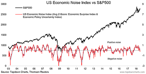
3. Economic Noise Index: On the topic of policy uncertainty, this chart shows what I call the "Economic Noise Index" for America - which is the combination of the signal from the Economic Policy Uncertainty Index (a news based measure of policy uncertainty), and the Citi Economic Surprise Index (a measure of how economic data is turning out vs expectations). Basically, readings below zero indicate greater policy uncertainty and more downside surprises in the data - or "negative noise". Increased readings of negative noise are often found around selloffs and corrections - and indeed often precede them. So it's important then to note how the economic noise index has turned down recently; a possible warning sign for more market turmoil to come...
Bottom line: The economic noise in America is sounding worse lately, and is a possible warning sign.
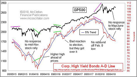
4. S&P 500 vs Corporate Bonds: Somewhat related is the deterioration in market breadth in the corporate bond market, which appears to be displaying bearish divergence against the S&P 500. Tom McClellan highlights how this is still the chart that worries him as high yield bonds tend to trade more like stocks than traditional bonds, and notably, keeping track of this market helped flag the deterioration in underlying conditions in the lead-up to the financial crisis and market crash. So this is not a chart to be taken lightly, particularly given the lukewarm response in corporate bonds to the rebound in stocks.
Bottom line: High yield bond market breadth is deteriorating, which could be a bad sign for stocks.
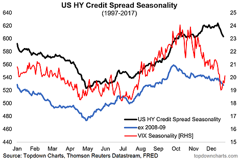
5. Corporate Credit Spread Seasonality: Sticking with high yield credit, this time looking at HY credit spreads, my own analysis shows how there tends to be a seasonal upward bias in credit spreads from around this time of the year through to October. This means going solely on this factor and nothing else you would expect an upward bias in credit spreads (which by the way mirrors what you see in the VIX - so now we are talking about credit risk pricing and equity risk pricing). You never invest on seasonality alone, but it is certainly a factor to keep in mind alongside variables such as valuation, cyclical indicators, and technicals. In this respect, it seems to build on the bearishness highlighted in the previous chart.
Bottom line: The historical seasonal tendency is for credit spreads to rise from around this time of the year.
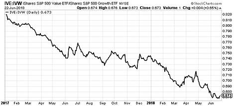
6. S&P 500 Value vs Growth: Moving on to a particularly interesting ratio chart, this shows the relative performance of the iShares S&P 500 Value ETF (NYSE:IVE) vs the iShares S&P 500 Growth ETF (NYSE:IVW). Basically growth stocks have been decisively outperforming value stocks over the past year or so. Although I would note the recent movement in this line, particularly relative to the RSI is potentially consistent with a turning point. Anyway, it goes to highlight the strength in growth stocks - and note that tech stocks are a key component here (e.g. tech makes up almost 40% of the holdings of that ETF - and it's most of the usual suspects there i.e. FAANG etc). You also see a similar pattern with momentum stocks and cyclicals vs defensives, and it all looks a bit frothy.
Bottom line: Growth stocks have been decisively outperforming value stocks.
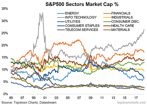
7. S&P 500 Market Cap Weighting: Building on the tech theme, the next chart is particularly interesting - it shows the market cap representation of the various sectors of the S&P 500. Notice how tech is the top at just over one quarter of the index, and at the highest levels since the final stages of the dot com bubble. It's a good reminder of how market cap driven indexes can change over time... and perhaps in ways that are not necessarily ideal (market cap indexes will basically overweight the most bubbly sectors and hence potentially overexpose investors to the more risky parts of the market). Also worth noting in passing is those at the other end e.g. energy and consumer staples - certainly interesting information for the contrarian-minded.
Bottom line: Tech has grown to become the dominant sector of the S&P 500.
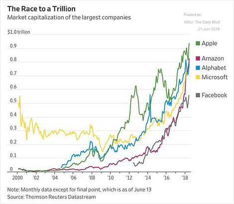
8. The Race to a Trillion: On the topic of tech, here's a particularly interesting chart from the Daily Shot, it shows "the race to a trillion" which is referencing the race between the top companies to become the first listed company in America to break the $1 trillion market capitalization mark. Of course it's important to point out that these are all tech companies!
Bottom line: The race is on between the top (tech) companies to reach a market cap of $1 trillion.
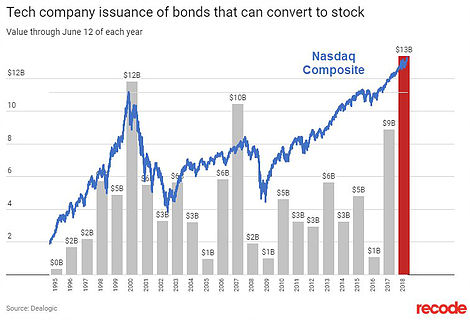
9. Tech Company Convertible Bond Issuance: Keeping again with tech stocks, this chart shared by SentimenTrader shows annual issuance of convertible bonds by tech companies with the NASDAQ Composite overlayed. It just goes to show how it's much easier to raise this type of financing when the market is hot - to that end it is also a gauge of how hot the market is (notice how in 2000 it reached a fever pitch along with the NASDAQ stock index). For tech companies it's a good thing as it lets them raise finance at a lower interest rate and without immediately driving dilution in the stock price which issuing equity financing would do. So it's a win for tech companies, question is whether it will turn out a win for investors...
Bottom line: Tech companies have been issuing record amounts of convertible debt.
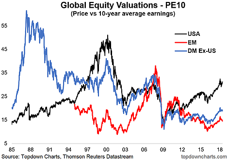
10. PE10 Valuations - US vs the World: Final chart shows the path of valuations for global equity markets. Notably the USA is at the top of the heap - which I guess is in keeping with the themes of the past few charts. It speaks to the relative value picture, but it also highlights how lofty valuations are in America. The cautionary for those planning on bailing out is how valuations drove even higher from this point in the late 1990's (and even more extremely in developed markets ex-US in the late 1980's. If nothing else, you can at least say that the US looks to be progressively later in its market cycle.
Bottom line: After the market correction the US equities are still looking on the expensive side.
So where does all this leave us?
This week there's a few themes covered:
1. Trade, Data, and Policy
In this category we saw how the market reacted to the trade war with regard to Chines stocks, we also saw how policy and politics are holding the market back, and then how the economic noise index has taken a turn to the downside.
2. Corporate Bond Market
On the corporate bond market we saw how market breadth is deteriorating and potentially sending a warning signal for the stock market. We also saw how credit spreads have a historical seasonal tendency to rise from here.
3. Big Tech
On the tech sector we saw how substantial the relative performance of growth vs value has been, and then noticed how the tech sector now accounts for over a quarter of the S&P 500 index. Then we checked in on the 'race to a trillion', and surveyed the record issuance of convertible bonds by tech companies. We finished off with a look at valuations, which shows the US stock market on the expensive side.
Summary
If you didn't notice by now there is a distinctive bearish hue to the charts this week. Maybe this is just due to the selection of charts that happened to make their way in to this week's edition, but maybe it is reflective of a more sinister undercurrent that threatens to take the so-far relatively mild stock market correction further to the wild side. Anyway, the policy problems, credit market warnings, and frothiness in tech are certainly something to keep in mind from a risk management perspective. As I noted with chart number 2 - the earnings/data picture has been supportive for the market, so it's not an unmitigatedly bearish picture, but for now the charts have spoken.
