Those that follow my personal account on Twitter will be familiar with my weekly S&P 500 #ChartStorm in which I pick out 10 charts on the S&P 500 to tweet. Typically, I'll pick a couple of themes and hammer them home with the charts, but sometimes it's just a selection of charts that will add to your perspective and help inform your own view - whether its bearish, bullish, or something else!
The purpose of this note is to add some extra context beyond the 140 characters of Twitter. It's worth noting that the aim of the #ChartStorm isn't necessarily to arrive at a certain view but to highlight charts and themes worth paying attention to.
So here's the another S&P 500 #ChartStorm write-up!
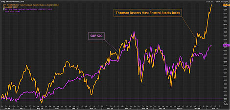
1. Most Shorted Stocks vs the S&P 500: First chart is a really interesting one, shared by Holger Zschaepitz of WELT, it shows the Thomson Reuters "Most Shorted Stocks Index" against the S&P 500. The solid performance by the basket of most shorted stocks indicates that what we have seen is a substantial short-squeeze, where those heavily short are getting wrong footed and rushing to cover losing positions. One thing I would note is how relatively lackluster the performance of the S&P 500 itself has been in the face of this short squeeze. So the question will be can momentum be sustained after the short-covering rally.
Bottom line: It looks like a big short-squeeze has been the thing driving markets higher.
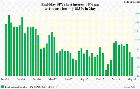
2. Short Interest in SPDR S&P 500 (NYSE:SPY): On a similar line, the next chart from Paban Pandey of Hedgopia shows the short interest for SPY (the largest S&P 500 ETF by assets under management). Similar to the previous chart, it shows a heavy run-down in short interest through May, echoing the sentiment that this appears to be a short-covering rally. This one will be a key indicator to watch for if things lurch to the other side where a lack of shorts will indicate complacency, as we saw around the turn of the year.
Bottom line: Short interest was heavily run-down through May as a short-squeeze took hold.
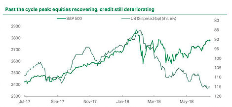
3. S&P 500 vs Investment Grade Credit Spreads: Looking under the surface of the market, some cracks are starting to appear. This chart shared by Jamie McGeever of Reuters shows US Investment Grade credit spreads inverted against the S&P 500, and there appears to be some negative divergence here. The logic is that wider credit spreads reflect a tightening of financial conditions and potentially a reflection of deteriorating fundamentals. Of course it is worth noting that this divergence could easily close by credit spreads tightening instead and higher stock prices. Still it's a risk chart to be noted.
Bottom line: US IG credit spreads appear to be flagging downside risks.
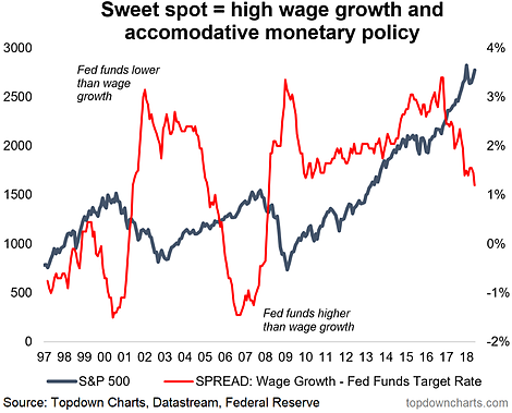
4. S&P 500 and the Fed "sweet spot indicator": On the topic of emerging risks, this graph shows what I call the Fed "sweet spot indicator" against the S&P 500. The logic is that the sweet spot for markets is when wage growth is higher than the Fed funds rate. Historically this appears to be a useful market timing indicator, and the economic logic is sound: when wage growth is high and the Fed funds rate is low it provides the perfect mix of conditions to drive consumer spending and revenue growth, while also creating fuel for investing in the market (higher wages, and stocks more attractive relative to cash). Following the latest Fed rate hike to 2%, the monetary policy sweet spot indicator has contracted to the lowest point since prior to the crisis, albeit the indicator is still positive and has yet to invert, which is when from a risk perspective it becomes more meaningful.
Bottom line: The Fed is slowly exiting the sweet spot for markets.
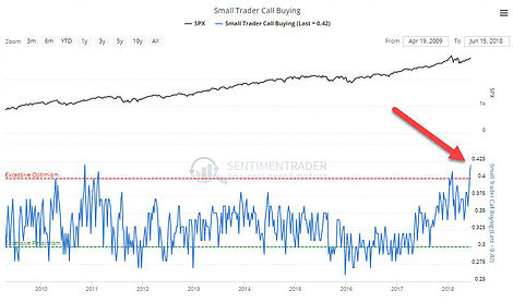
5. Small Trader Call Option Buying: On to a few charts on sentiment, the first one here by Sentimentrader shows intense call option buying activity by small traders. Basically small time traders are betting big time on market upside. The previous climax in this indicator coincided with the market top, and to be sure, it certainly shows an abundance of bullishness.
Bottom line: Small traders have been heavily buying call options
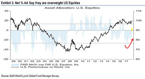
6. Global Fund Manager Allocations to US Equities: From small traders to big global fund managers, this chart from the BAML fund manager survey shows a big turnaround in global fund manager allocations to US equities. After running significant underweight positioning through much of last year, global fund managers are now net-long US equities according to the latest results of the widely followed survey. It harks back to the earlier charts on the turnaround in short interest. If history is any guide we should expect some further overshooting in this indicator, so further allocation and flows from global fund managers.
Bottom line: Global fund managers are flocking back into US equities.
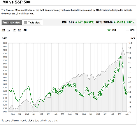
7. TD Ameritrade Investor Movement Index: May also saw a slight rebound in the TD Ameritrade IMX or Investor Movement Index. The rebound comes after a major reset in this indicator, which followed a record high in December last year. If the market was frothy back then, this indicator shows that now this froth has apparently come out of the market, but the latest rebound sort of suggests investors are starting to get back to business.
Bottom line: The TD IMX rebounded in May, following a major reset.
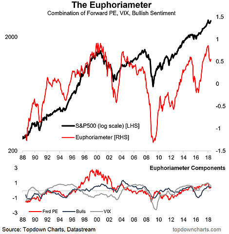
8. The Euphoriameter - Reset and a Rebound: Similarly, the Topdown Charts Euphoriameter (a comprehensive composite measure of investor sentiment) likewise underwent a major reset, falling almost half a standard deviation, and completely unwinding the tax-cut hype. Much like the TD IMX, the Euphoriameter has undergone a slight rebound with the June flash reading. This is important, because if it had continued to decline it would mean that investors had made their mind up on the end of the bull market, but this rebound suggests perhaps again a case of "back to business" as investors dip their toes back in the water
Bottom line: The Euphoriameter rebounded in June after undergoing a major reset since the peak in December.
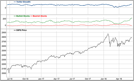
9. Twitter Breadth Bullish Breakout: This time turning to Twitter, via the analysis from TradeFollowers, there appears to be a breakout in bullishness judging by the breadth of bullish tweets on stocks. Notably, the bullishness seen in the tweets has actually surpassed the levels seen prior to the correction, so there seems to be a shift in sentiment going on. Bullish sentiment can definitely feed on itself and create a feedback loop, but when I see such bullishness my inner contrarian starts to get excited from a contrarian bearish standpoint. As I say, in terms of signals, with sentiment it tends to carry momentum information through the range, and contrarian information at extremes.
Bottom line: Bullish tweet breadth has broken out.
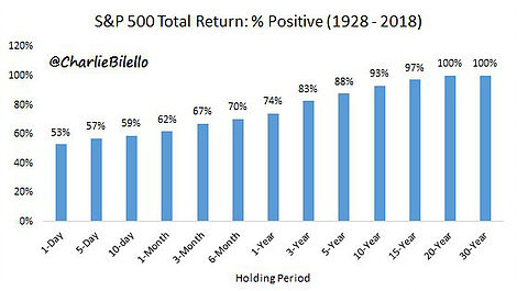
10. Long Term Return Experience - Total Return: The final chart by Charlie Bilello of Pension Partners illustrates the whole "stocks for the long run" or "time in the market" phenomenon. Basically across the period 1928 to 2018, in total return terms, if you held for 1 year, a lot of the time you would have seen positive total returns (74% of the time), yet if you held for 10 years you would have seen positive total returns the majority of the time (93%), and you would have had to have hodl'd for 20 years to have seen positive total returns 100% of the time. So on this analysis, basically to be almost guaranteed of positive returns just through buy and hold you need to take a long term approach. Of course, active investors informed by robust indicators should be able to do better than this.
Bottom line: The longer the holding period the higher the likelihood of positive total returns.
So where does all this leave us?
This week there are 3 themes I can think of:
1. Short Squeeze
The short squeeze was dramatically demonstrated in the first two charts showing the outperformance of the most shorted stocks and the run down in short interest in (SPY).
2. Sentiment Shifts
On sentiment I noted the shifts such as heavy call buying by small traders, rotation back into US equities by global fund managers, a breakout in bullish tweets and a rebound in both the Euphoriameter and the TD IMX following big resets in both.
3. Stress Signs
On stress signs we saw the divergence between IG credit spreads and the S&P 500, and the Fed sweet spot indicator steadily moving to the downside.
Summary
It's a really interesting mix of charts this week, you have clear signs of a short-squeeze, and a major shift in sentiment underway, yet there are a couple of stress signs under the surface. The big question as a hinted at earlier is whether the rally can be sustained after the squeeze. As I noted, the shift in sentiment could have a self-reinforcing effect, and if historical patterns hold we might see further global flows into US equities, and the big reset in the TD IMX + Euphoriameter likewise provide food for thought in this respect. So can it be sustained? probably. Is it sustainable? we'll see.
