Summary: Equities have risen strongly after the first sell-off of more than 10% in 3 years. They are doing so into the seasonally strongest months of the year for equities. Sentiment has not yet become overly bullish. Macro is supportive. Normally, this combination would be a set up for higher prices ahead. That said, after a 12% gain in one month, the normal pattern is for at least a minor retrace. Post-NFP and into the often soft mid-month period, that pattern might well be next.
* * *
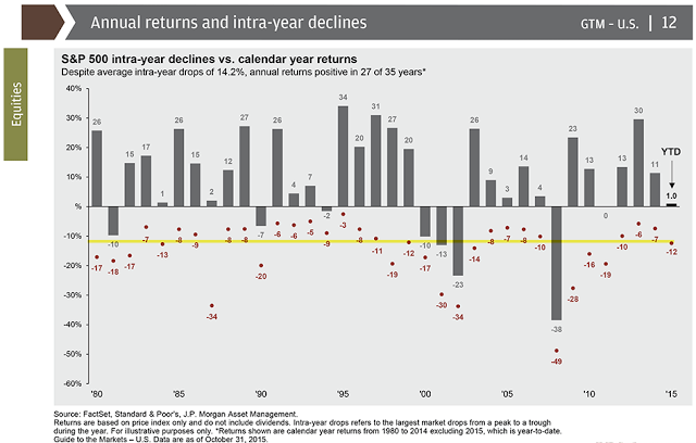
The recent drop in equities felt significant, but in fact it was nothing unusual. The peak in July was only 3 1/2 months ago, and the total correction was just 12%. Since 1980, the average annual drawdown has been 14%. Even if bear markets are excluded, the average annual drawdown has been 10.5%. The swoon of the past few months has been unexceptional (S&P 500 data from JPM).
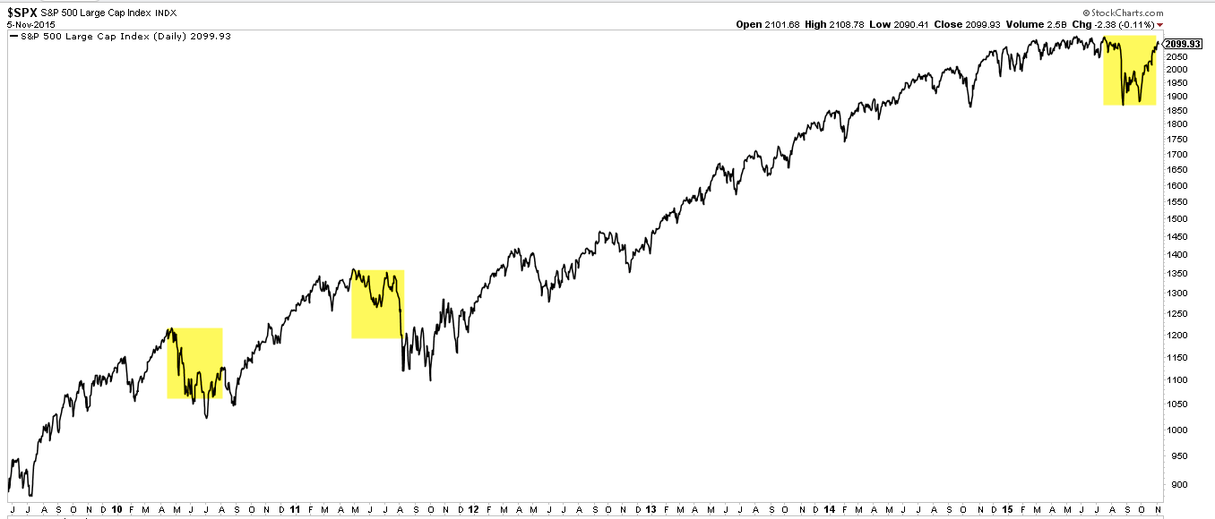
What made it seem more significant is likely due to the relative calm of 2013-14. But even within the context of the current bull market, the recent correction was both brief and shallow (the size of the yellow boxes are the same).
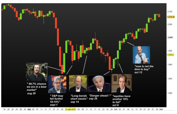
That some pundits thought a more protracted bear market was likely is not unusual. Falls in price bring with them very negative swings in sentiment. The media amplifies these. It is always assumed to be the start of a bear market; no correction of more than 10% has ever been any different (data from Callum Thomas).
For that reason, divorcing perception from reality during a major swoon is especially important. There was no significant change in the macro data before or during the recent correction, yet it was widely stated that a recession was high odds (recent post on this here).
Real retail sales continued to grow unabated, in contrast to the periods before the past recessions. The same is true more generally for personal consumption expenditures.
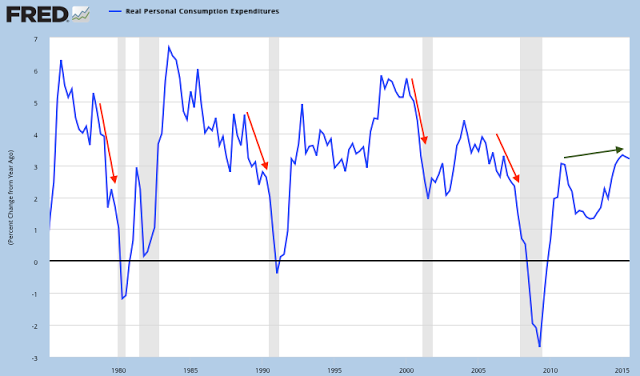
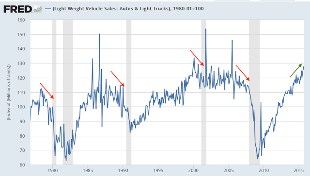
Similarly, auto sales data released this past week shows demand at a fresh 10 year high, in contrast to the weakness seen before the past 4 recessions (red arrows).
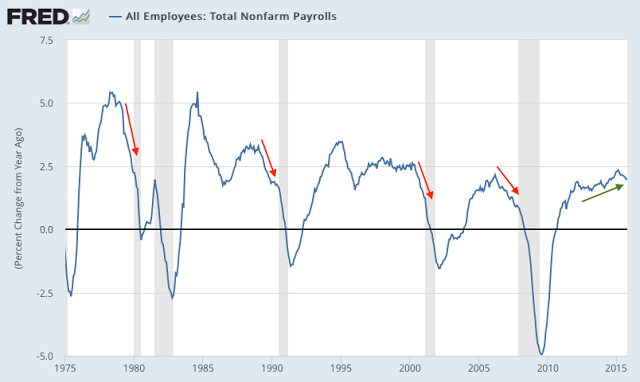
Employment growth has been slower than during the late-20th century, but the trend is higher and growth this year has been better than at anytime in the past 15 years. This remains a tailwind for the economy into 2016.
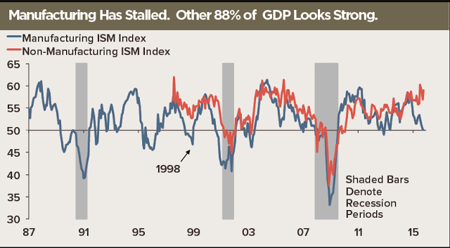
That is not to say that all of the macro data has been good. In particular, manufacturing has been persistently weak (blue line), but that has been the case for the past year and, importantly, manufacturing is relatively small compared to the services sector (red line; data from Jim O'Sullivan).
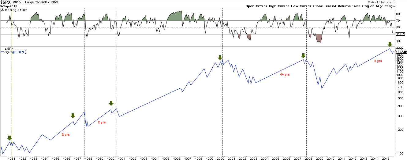
Bear markets occur either concurrent with a recession or in the aftermath of excessive bullish sentiment. The latter remains a possible trigger. Let's explain.
The technical pattern into a bear market has been for the long bull uptrend to first weaken. As we have said previously, the first drop of 10% (arrows) does not coincide with the start of a bear market (vertical lines), it instead starts with the retest of the high that fails. We are now at the point of the retest of the high, so a severe drop now would be very bearish.
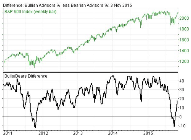
One trigger for a severe drop would be excessive bullishness. As an example, drops in 1987 and 2007 started when the number of bulls was more than 3-4 times the number of bears as measured by Investors Intelligence. The current ratio is just 1.7 times. A continued, unabated rise in price could lead to excessive bullishness. Right now, it's following the constructive pattern from late-2011.
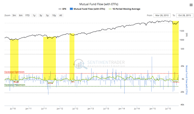
Another way to measure sentiment is through fund flows. Outflows from equity funds (including ETFs) into the recent low were rivaled only by those at the lows in 2009 and 2011. Since then, fund inflows have been light; this week it was just $5b.
The chart below looks at the average of the last 10 weeks (lower panel); net flows are still below zero, meaning more money was withdrawn in the selloff than has since been added back in. This is remarkable, given that the NASDAQ 100 (NDX) is at new highs and the SPDR S&P 500 ETF (N:SPY) has closed within 1% of its high. The yellow shading shows similar periods before the average crossed above zero; each was a bottom with further gains ahead.
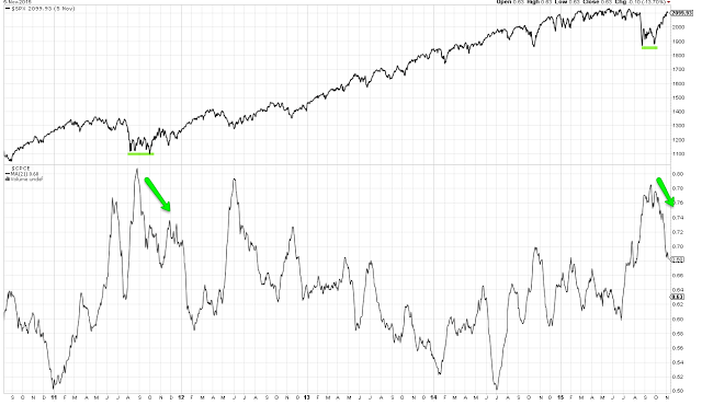
Other data, like the 21-dma of the equity-only put/call ratio, are similar. It would be normal for investors to become more bullish, and for the put/call ratio to fall from it's very high readings from a month ago. On balance, none of these are near bullish extremes.
Is lagging participation bearish? Probably not.
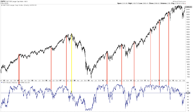
The most commonly cited concern is the number of stocks above their 200-dma. For the SPX, that proportion is now just 60%. Coming out of a steep fall, the current percentage is not unusual. When it has been this low in the past (yellow lines), the index has continued higher.
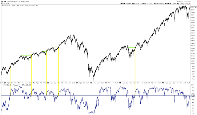
If anything, the index has struggled when the proportion of stocks above their 200-dma has been 80-90% (red lines); this has often marked an exhaustion top.
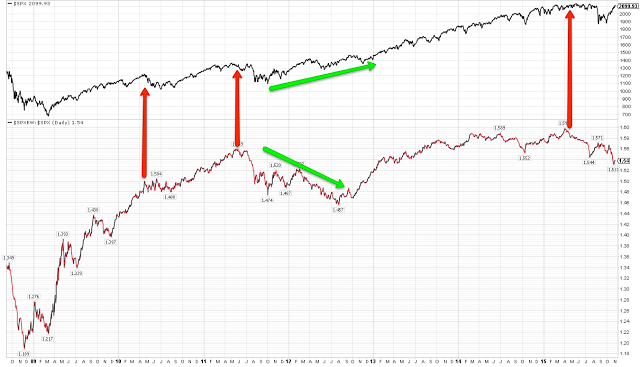
Another way of looking at this is the performance of SPX relative to its equal-weight counterpart (S&P 500 Equal Weighted) (SPXEW); when the equal-weight index lags, the index is being pushed higher by relatively fewer stocks. But this hasn't been consistently bearish either; in fact, the rise out of the 2011 low was exactly the same (green arrows). Peaks in 2010, 2011 and this year came when the equal-weight index was outperforming SPX (red arrows). Like the chart above, the index has run into trouble when too many stocks were doing well, not when too few were doing so.
Sentimentrader looked at the data and arrived at the same conclusion. In the past, it hasn't mattered whether the percentage of SPX stocks above their respective 200-dma was more than 50% when the SPX crossed back above its 200-dma. The worst participation rates were in October 1998, March 2003 and December 2011 - all occasions leading to significant gains in the months ahead. In fact, the worst returns happened when participation was the highest.
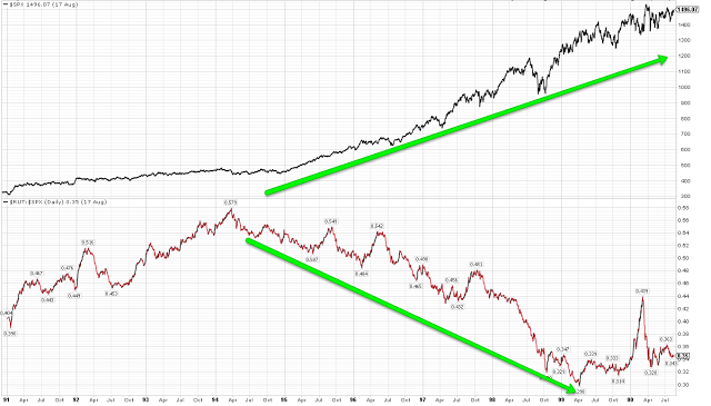
Is the underperformance of small caps a concern? Evidence there is also too mixed to be useful. Importantly, note that small caps underperformed through most of the 1990s bull market (and, yes, it was a commonly cited concern then, too).
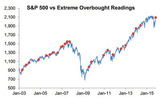
While some are worried that too few stocks are supporting this rally, others are fretting that the index's move higher has been too strong. SPX is 2 standard deviations from its 50-dma. This has happened many times before, sometimes at major tops. But in the vast majority of cases, the index has continued higher. There is no consistent downside edge (data from Birinyi).
So, what to expect next? After a very strong thrust in the past month, there is likely to be a retracement of some of those gains in November.
SPY rose close to 12% during the past month. The boxes in the chart below are all equal in size to the current rally. There have been 8 comparable thrusts off a low in the past 6 years. All except 1 (green shading) retraced some of those gains before going much higher (arrows). It would be unusual if SPY didn't do the same now. That doesn't preclude a move to a higher high first, but those gains would likely be given back.

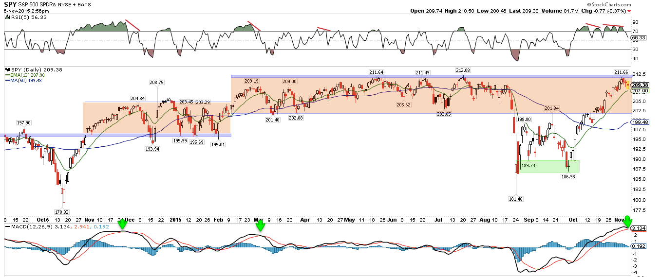
SPY has traded back to the top of its prior range. That was strong resistance in May, June and July. Any drop that ends above 203 (the bottom of the range) would be less than a minor 38% retracement. Note MACD (lower panel).
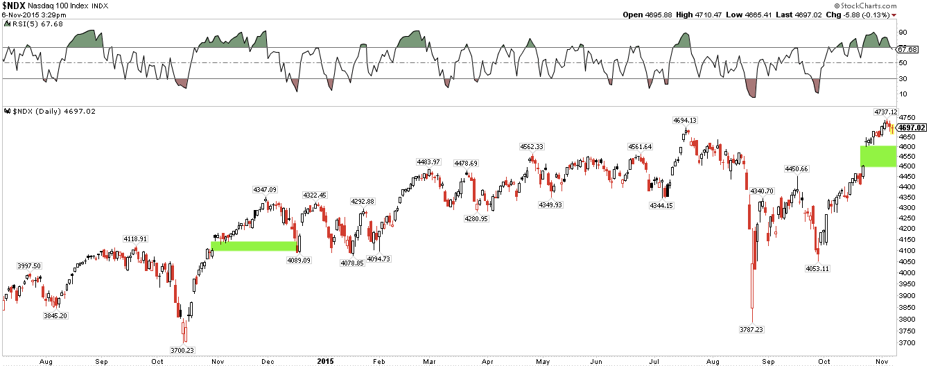
It's a fair point that NDX has made new all-time highs, so perhaps SPX will too. That might be. NDX also left an enormous open gap after having already risen 10% (green shading). Of note, it also did this last year, and that gap eventually filled, something to watch on any weakness ahead. Last time, the filled gap became strong support.
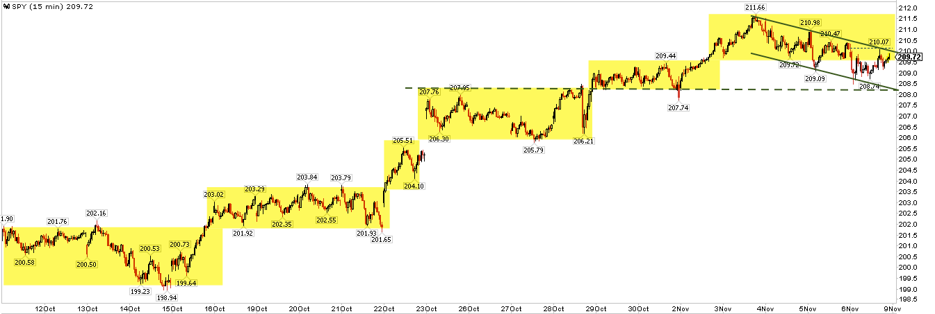
SPY has been stair stepping higher since the September low. Since Tuesday, SPY has been making lower highs and lows in a downward channel. For the first time since the September low, the stairs are starting to overlap. If this pattern continues into early next week, the prior stair bottom, near 208, should be support. Conveniently, that is the location of the 13-ema.
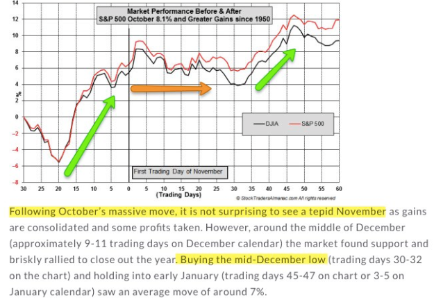
Seasonality softens in the next two weeks. The first week of November is typically strong, but then equities tend to retreat (orange arrow). That has particularly been the case in those instances when SPX has risen strongly in October (first green arrow). Seasonal strength returns at the end of the month and into December (data from Stock Almanac).
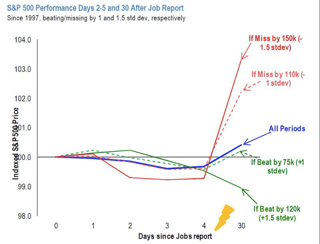
Strong "beats" in NFP (such as what happened on Friday) are often followed by weakness in the following few days and longer (green lines), another potential headwind (data from Tom Lee).
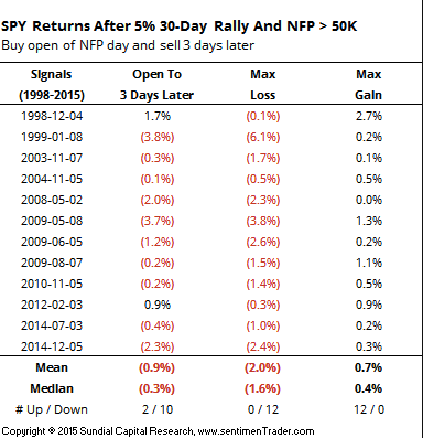
The combination of strong gains in SPY and then a large "beat" in NFP has left stocks lower 3 days later 10 of the last 12 times (data from Sentimentrader).
In summary, the current set-up remains bullish. But, more likely than not, a retrace in the indices is ahead before any further, durable gains into year-end.
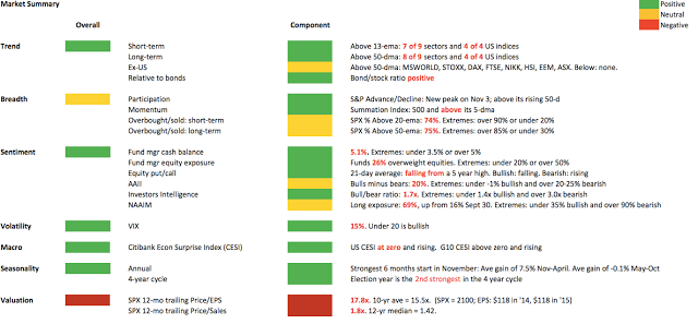
Our weekly summary table follows:
If you find this post to be valuable, consider visiting a few of our sponsors who have offers that might be relevant to you.
