Last week I mentioned that my mean-reversion indicator had 75% of its components flip negative. While we didn’t see aggressive selling, the S&P 500 finished the week down 0.68%, the Dow was off by 0.88%, and the NASDAQ fell just 0.54% last week. Normally this bearish of a reading on this indicator is followed by larger drops in the equity market, so while this doesn’t dictate a larger move, I’ll be watching to see if selling pressure increases this week or if the bulls are able to regain control.
Trend
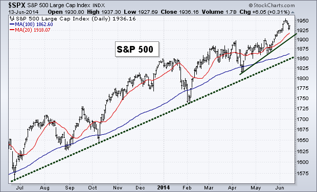
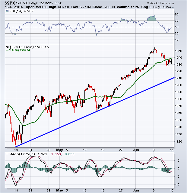
While we saw a small period of selling last week, it was less than 1% and the equity market’s up trend is still intact. I’ve added a short-term trend line to our chart below that connects the April and May lows. This could act as potential support if selling continues this week.
Breadth
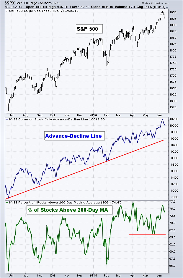
Like trend, the selling last week did not do much damage to the internals of the major indices. Both of our breadth measures are still well off their lows and continue to be in long-term and short-term up trends.
Volatility
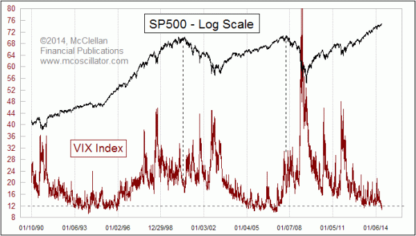
The extremely low level in the Volatility Index (VIX) has garnered a great deal of attention lately and probably rightfully so. Tom McClellan wrote an interesting piece last week, looking at prior market highs and the corresponding level of the VIX. Tom states:
A low VIX is a sign of option trader complacency, and complacency is a problematic sign for the market which can lead to a price decline. But when the VIX gets really REALLY low, the message changes. Sure, it is a sign of an absence of worry, and a correction is possible. But the really big price tops do not appear when the VIX is this low.
Tom continues to discuss how in 2000 and 2007 the Volatility Index climbed from extremely low levels to an area closer to 16 when the equity market peaked. I’d also point out that while not an ‘official’ bear market, the intermediate top in 2011 was also accompanied by a VIX reading of around 16, not an extreme low such as what we are seeing now.
So while yes, we’ll most likely see a rise in volatility eventually, history has shown that a low reading at this level in the VIX has not marked recent significant market highs.
Momentum
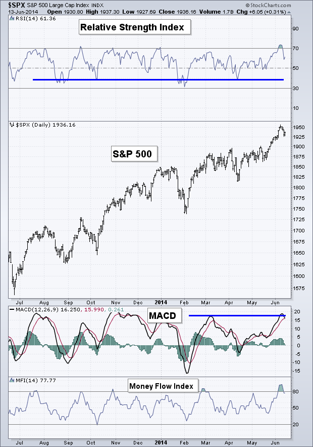
Last week I wrote about the ‘overbought’ reading in the Relative Strength Index. This has now been worked off as price has weakened slightly. While ‘overbought’ readings can bring short-term weakness, it also tells us that there is a healthy amount of buying taking place in a market, as momentum gets pushed up to these historically high levels – a bullish long-term sign. The MACD indicator hit its prior high and bounced lower and the Money Flow Index, like the RSI, worked off its ‘overbought’ status last week.
June Options Expiration Seasonality
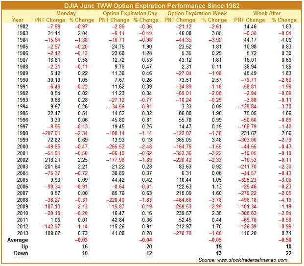
I’m a big fan of the Stock Trader’s Almanac as a great resource of historical market data. Recently Christopher Mistal wrote on the Stock Trader’s Almanac Blog about the bearish seasonality that occurs around June options expiration week. The one portion of his post that really stood out to me was:
The weeks after Triple-Witching Day are horrendous. This week has experienced DJIA losses in 21 of the last 24 years with average losses of 1.1%. S&P 500 and NASDAQ have fared slightly better during the week after over the same 24 year span, declining 0.8% and 0.2% respectively on average.
87.5% of the time, over the last 24 years we have seen down weeks following June expiration week. That was pretty surprising to me. The table below shows you each year’s performance over the course of this specific time period, going back to 1982.
60-Minute S&P 500
Not much to discuss on the intraday chart for the S&P 500. We had the RSI kiss the ‘oversold’ 30 level, giving bulls an excuse to step in and start buying again. We finished trading on Friday just under the 50-1hr Moving Average; I’ll be watching to see if this short-term MA can be cleared to the upside, or if it acts as resistance.
Rydex Money Flows
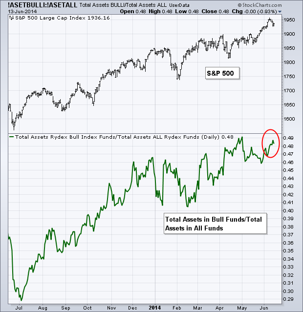
I found this pretty interesting. While we didn’t see massive selling last week, we did see the indices close in the red. But this didn’t prevent investors from pushing more money into the bullish Rydex funds, as shown by the red circle on the chart below. We can see that during the most recent drops in the S&P the percentage of assets in bullish funds had weakened each time. However, last week, I guess, was different. The small drop didn’t scare away the buyers and the ratio of bullish funds to Rydex assets advanced higher as it approached its previous high set in May.
Last Week’s Sector Performance
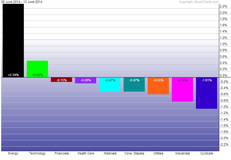
No surprise, Energy (SPDR Energy Select Sector Fund (ARCA:XLE)) was the best performing sector last week with Technology (SPDR Select Sector - Technology (NYSE:XLK)) being the only other sector to outperform the S&P 500. Consumer Discretionary (SPDR Consumer Discretionary Select Sector (ARCA:XLY)), Industrials (Industrial Sector SPDR Trust (ARCA:XLI)) and Utilities (SPDR Select Sector - Utilities (NYSE:XLU)) were the worst performers for the week.
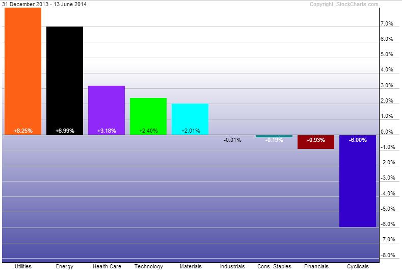
Year-to-Date Sector Performance
Utilities continue to be the best performer YTD. However, Energy is quickly approaching the leader, with Health Care (SPDR - Health Care (ARCA:XLV)) a distant third. Consumer Discretionary remains the worst performer this year with Consumer Staples (SPDR - Consumer Staples (ARCA:XLP)) joining the ranks of under-performers, along with Industrials and Financials (Financial Select Sector SPDR Fund (ARCA:XLF))
Disclaimer: Do not construe anything written in this post or this blog in its entirety as a recommendation, research, or an offer to buy or sell any securities. Everything in this post is meant for educational and entertainment purposes only. I or my affiliates may hold positions in securities mentioned in the blog. Please see my Disclosure page for full disclaimer.

