There are different ways to measure breadth in markets.
One common approach is to measure the percent of stocks in an index above the 50-day average and above the 200-day average. However, that does not tell you what the averages themselves are doing.
While we recognize the importance of the 50-day and 200-day averages, we also like to look at the 3-month (63-day) and 1-year (252-day) averages; and also to note the direction of those averages at their tip (are they up or turning up).

This table compares the breadth of the S&P 500 large-caps, S&P 400 mid-caps, and S&P 600 small-caps using the 3-month and 1-year averages, and a determination of the direction of the last 10-days of those averages.
By these breadth indicators, it looks like small-caps are stronger than the mid-caps, and that the mid-caps are stronger than the large-caps.
Convention says that as an overall market deteriorates, the small-caps lose breadth before the mid-caps, and that the large-caps are the last to fade.
That has not always been the case (such as in the 2000 dot-com crash), but is often the case. If that conventional wisdom holds in this case, the market it not ready to roll over, because the small-caps and mid-caps have better breadth than the large-caps.
On the other hand, for all three market-caps, the breadth indicators are not particularly strong in the high 40’s to mid 60’s.
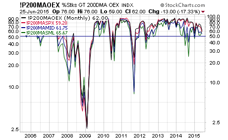
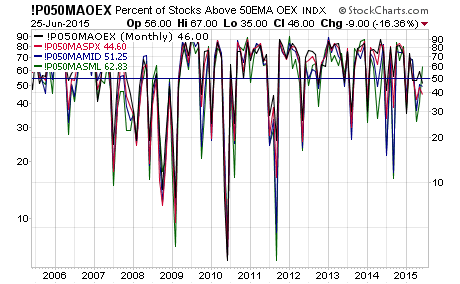
Using the more conventional 50-day and 200-day approach, the deterioration in the breath for all three market-caps plus the mega-cap S&P 100, gives a reasonably assuring picture. The breadth has been stronger, but the markets are not yet in trouble with breadth indicators.
% Above 200-day (S&P 100, 500, 400 and 600) 10 years monthly

% Above 50-day (S&P 100, 500, 400 and 600) 10 years monthly

