Still Slowing Down
Year-end distortions have begun to slowly come out of the data, and while broad true US money supply growth remains fairly brisk, it has begun to slow again relative to January’s y/y growth rate, to 7.8% from 8.32%.
So far it remains in the sideways channel (indicated by the blue lines below) between approx. 7.4% and 8.6%, in which it has meandered since mid 2013. We believe the next break “below the shelf” is likely to be a significant event.
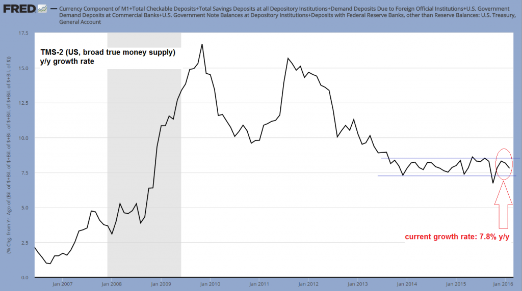
Broad true US money supply TMS-2, annual growth rate: still in the channel, but slowing again from January’s brief upward spike – click to enlarge.
Readers may recall that it was primarily the US treasury’s general account at the Fed which was responsible for the recent upward spike in the growth rate of TMS-2, combined with a year-end surge in deposit money. We suspect the latter had to do with offshore dollars being moved to domestic accounts at year-end for various accounting-related reasons. This suspicion has been confirmed by the fact that the move has been largely reversed in the new year.
As an aside, total bank credit growth (total loans and leases, excl. mortgage debt) stands at 8.24% y/y as of the end of February, which is still well below the peak growth rates seen in previous boom periods (these were closer to 13%).
As can be seen below, the amount of money held in the general account has declined further in February as well, but it seems to us that this money has merely moved into other demand deposits, i.e., there has simply been a shift from one categorization to another:
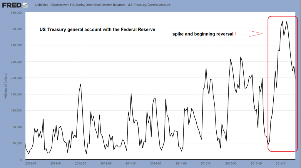
Money held in the treasury’s general account at the Fed – the recent record spike has begun to reverse – click to enlarge.
Readers not familiar with the method we employ in putting together the true money supply should take a look at this excellent summary and explanation by our friend Michael Pollaro, which contains numerous links to additional references (it will be time well spent). The basic principle is that we define money in line with the following suggestion penned by Murray Rothbard (in New Directions in Austrian Economics, pp-143-156, 1978):
“Money is the general medium of exchange, the thing that all other goods and services are traded for, the final payment for such goods on the market.”
This means that some things that are included in traditional money supply measures are left out, on account of the fact that they represent credit transactions rather than money, while others that are not part of the traditional aggregates are included because they clearly are money according to the above definition.
Demand deposit growth has spiked at year end to nearly 12% y/y, but then crashed to zero early in the new year and has since begun to recover again. This recovery should at least partly be due to the above mentioned shift. Note that demand deposits consist of both covered and uncovered money substitutes (i.e., fiduciary media); the currently very high level of excess reserves in the system means that the proportion of covered money substitutes has grown strongly since the 2008 crisis.
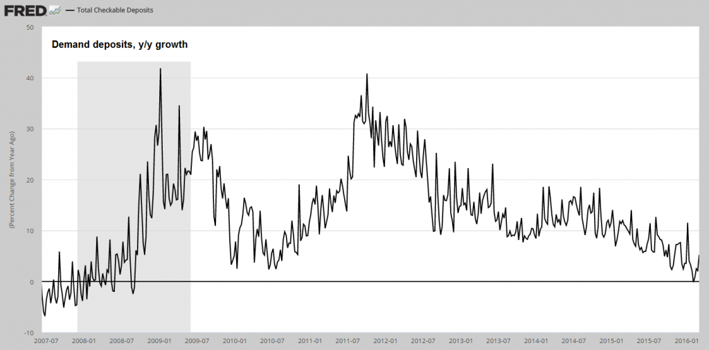
Demand deposits, y/y growth rate: after a brief spike at year-end, the overarching downtrend has essentially resumed – click to enlarge.
The important thing about the above chart is that the annualized growth rate of deposit money continues to be mired in a downtrend, which is reflected in the growth of narrow money supply aggregates as well. We are still using M1 as a proxy for the narrow money supply. This is not perfect, but it contains the most important components of TMS-1, namely currency and demand deposits (while the lone non-money component is so small as not to matter).
M1 is more volatile than TMS-2, but often serves as a good leading indicator for the latter. In order to show this, we have plotted the monthly y/y growth rates of TMS-2 and M1 on the same chart for comparison purposes. As can be seen, during periods of heavy Fed pumping in recent years, the growth rate of M1 rose especially quickly, and it has also declined quite quickly since the Fed has stopped with its QE program.
Currently it is perilously close to the point where one would have to expect that various bubble activities in the economy will be seriously hampered. Among these are in our opinion not only the oil patch (which is currently getting a brief respite) and other commodity industries (such as the coal industry, which is basically disappearing from the US), but also numerous parts of the technology industry.
We believe that just as during the internet boom of the late 1990s, a lot of spending in the industry is highly dependent on credit expansion and the steady flow of investment funds nowadays. A lot of demand for data storage, assorted hardware, office space, expensive residential units, swanky cars and so forth is likely to disappear in a flash when the flow of fresh funds supporting assorted start-ups and “unicorns” is finally drying up.
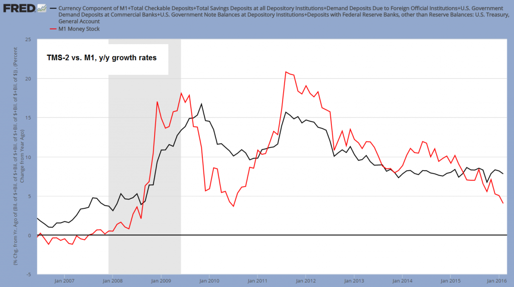
Y/y growth rate of TMS-2 (black line) vs. M1 (red line) – 7.8% vs. 4.03% as of February – click to enlarge.
The greater inertia of TMS-2 is due to its very large savings deposits component. While these deposits are de facto available on demand (the legal small print says that banks can in theory enforce a 30 day waiting period, which is in practice never enforced), it is clear that they are far less often used for day-to-day transactions.
In terms of effects on short term economic activity, it makes therefore sense to look at the growth rate of narrow money supply aggregates as well. Moreover, as the above chart indicates, in narrow money growth rates will often tend to lead (see e.g. the period late 2008 – early 2012), and we think this is once again the case.
Corporate Debt – Still the Economy’s Achilles Heel
In recent weeks, the worst hit sectors of the stock market have experienced large relief rallies, as oversold commodities and emerging market currencies have begun to rebound (commodities have followed the gold price higher with a lag, as they always tend to do). In line with this, we are now also seeing short term improvements in manufacturing surveys. Unfortunately, not much can be concluded from those yet (except, as we have been saying for some time, that there is no recession in train yet). Such bounces can be a sign that genuine improvement is in store, but they just as often happen just before the bottom really falls out for good.
As we have previously noted in an update on corporate loan charge-offs, perceptions about commodity prices have been altered by yet another massive credit binge in China (and the associated bump in China’s money supply growth rates). Moreover, the trend in commodity prices certainly depends not only on perceptions about economic growth. It also depends on the money relation, and the relative level of commodity prices at a given time (anyone remember “stagflation?”).
We have recently seen junk bond yields come in a bit (as bonds of commodity producers are rebounding), concurrently with a rebound in stock prices. Of course, one has to wonder just how many credit binges China can afford. Judging from the actions and announcements of China’s planners in recent months, they are trying to have their cake and eat it too.
Here is a long term chart comparing the effective yield on the worst-rated junk bonds (CCC and below) to the Wilshire total market index. We think we are so to speak merely seeing a pause that refreshes, but we will try to keep an open mind about it.
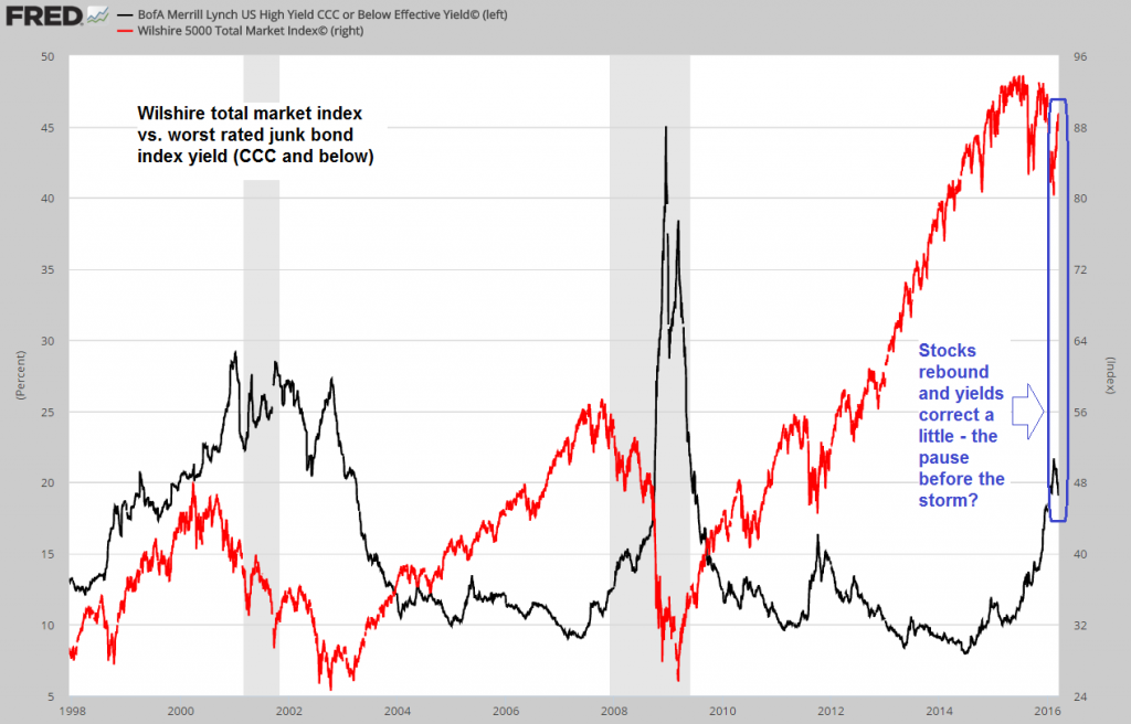
Effective yield of the worst-rated junk bonds (black line) vs. the Wilshire 5000 Total Market index (red line) – click to enlarge.
One reason why corporate debt in general remains the greatest Achilles heel of the economy is its sheer size. Below we show the total debt of corporate America, excluding foreign debt (i.e., the sum of domestic bond issues and bank borrowings). As you can see, the so-called “great” (and not to forget “beautiful”!) deleveraging was but a mere hick-up.
Egged on by ZIRP, corporations have continued to lever up, and are now in debt up to their eyebrows. This debt continues to be cheap, but a lot of it has been wasted on financial engineering instead of capital maintenance and expansion (and what capital spending there was has turned out to be malinvestment in a still growing number of cases). In short, we believe that quite a bit of this towering debtberg will turn out to be of the unsound variety and that eventually a lot of it will come crashing down.
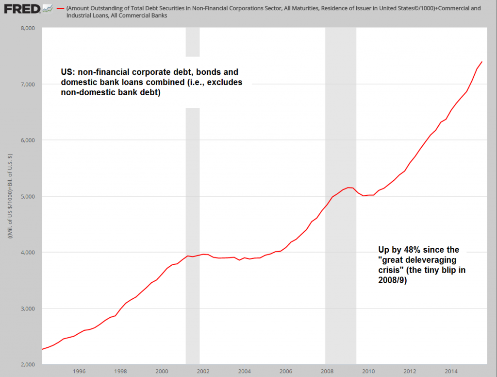
The US non-financial corporate debtberg (domestic debt only) – click to enlarge.
Why anyone would think that the huge surge in debt since 2008 will result in a different or better outcome than the two previous debt surges depicted above is beyond us. Why should it? Quite the opposite seems likely – given that even more real capital has been squandered in order to produce ephemeral accounting profits, the eventual denouement should be a real zinger (that’s a scientific term used by some economists as a a stand-in for “doozy”).
Lastly, here is a chart comparing TMS-2 growth to total private credit growth including mortgage loans. Once upon a time, mortgages were a strong driver of credit growth – nowadays they are holding it back in aggregate terms. At the peak of the housing bubble in 2006, this debt aggregate grew at 13.52% y/y – nowadays it is growing at a mere 4.67% y/y, in spite of the enormous surge in outstanding corporate debt.
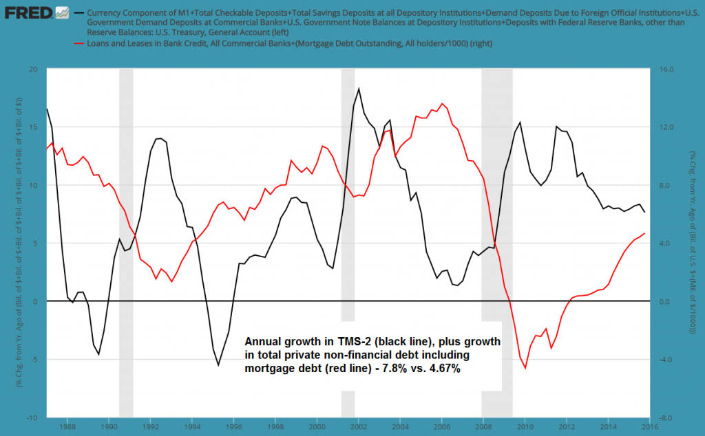
Annual growth of TMS-2 (black line) vs. the growth rate of total private debt including mortgages (red line) – click to enlarge.
Conclusion
It appears to us that the slowdown in US money supply growth is likely to continue. We believe this is ultimately far more important for asset prices than European money supply growth, which is admittedly still going gangbusters.
China’s credit and money supply growth rates are affecting perceptions about commodity prices, and are therefore important for the short term performance of asset prices as well, but we suspect that the next set of problems will come from an unexpected corner and not from the one area everybody is focused on already.
This is why we are mentioning the technology sector as a potential “gray swan”. While everybody knows about the crazy valuations in private markets and the staggering amounts of money thrown at anything that moves and looks faintly digital, there is relatively little focus on how vulnerable this particular sub-bubble probably is. Keep in mind, this is not about the fact that there are likely numerous great ideas among the new businesses that have been and continue to be created. It is all about the prices that are being paid and the flow of money necessary to sustain them.
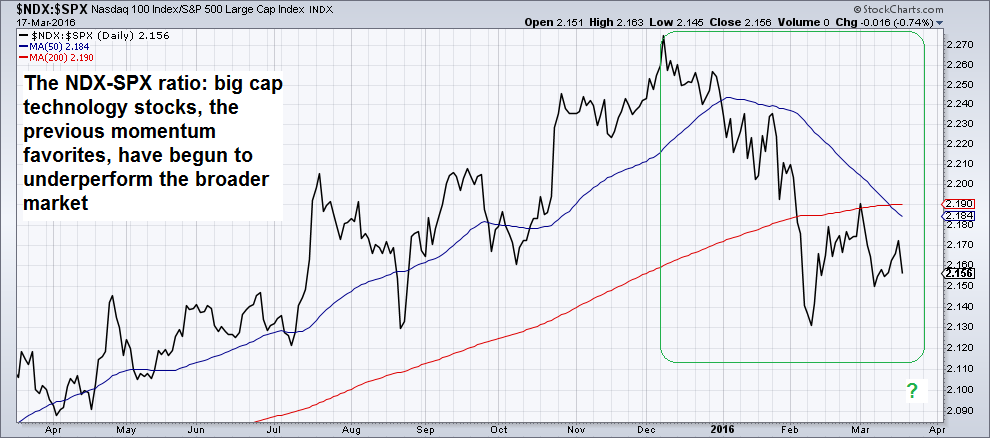
Recent weakness in the NDX-S&P 500 ratio could turn out to be an ominous sign – click to enlarge.
Regarding unexpected left-of-field problems that might strike the unwary, we also want to point readers to an article at Business Insider about Horseman Capital Management, which friends have assured us is a highly successful, fleet-of-foot hedge fund that makes its money from acting on unusual contrarian ideas. The topic discussed in the article is the likelihood of a banking crisis striking in Japan. As portfolio manager Shannon McConaghy remarks, in light of the importance of Japan as the world’s largest creditor, such a crisis could easily end up upsetting the global “risk” apple cart.
Experience tells us that one should occasionally look at potential vulnerabilities few others are considering, and perhaps not worry too much about what is already widely known. We freely admit that we have no idea what exactly will keel over first – but if US money supply growth does continue to slow down, something will.
Bonus Chart: Coal Disaster
Bloomberg informs us that Peabody Energy Corp (NYSE:BTU), a.k.a. “Coal’s Last Man Standing”, is standing no more. A mere year ago the markets were still convinced that if one coal company would survive the disaster that has befallen the industry, it would be BTU. Since then the stock has collapsed by nearly 98% – now the company has announced that it is delinquent on an interest payment and may be forced to file for bankruptcy protection soon.
A sizable amount of perceived wealth is about to go to money heaven, as BTU is weighed down by $6.3 billion in debt. It is the 5th large listed US coal company to sink beneath the waves over the past few years, along with hundreds of smaller unlisted ones. This will of course be to the benefit of the survivors, an increasingly small and exclusive list. In total, listed US coal companies have lost some $65 billion in market cap since 2011 – and are now worth a mere $6 billion combined.
This is a reminder of what an extended period of capital malinvestment can ultimately lead to. All the accounting profits coal companies have recorded during the boom have turned out to be nothing but smoke and mirrors.
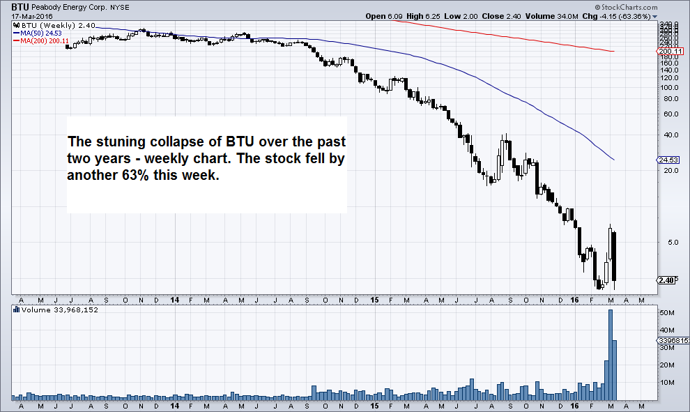
Wednesday’s disaster du jour, BTU – coal’s “last man standing” is keeling over – click to enlarge.
Charts by: St. Louis Federal Reserve Research, StockCharts
