It seems the warning flags that the market internals (momentum and breadth) had been showing us were correct. Back on September 22nd I wrote:
I think right now the U.S. equity market is showing some negative symptoms. This doesn’t mean we need to call the morgue but there seems to be something happening based on the internals and the information price action is providing us.
Since then we’ve seen price fall 5%. Now, based on your personal investment time frame, that 5% could be irrelevant or the volatility you needed to add some alpha.
Trend
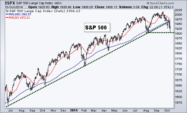
For quite a while the trend portion of my Weekly Technical Market Outlook had been pretty self-explanatory. With this recent period of volatility some major levels of support have been broken. The 100-day Moving Average and rising trend line that had been keeping investors bullish have now been put in price’s rear view mirror.
The S&P 500 (SPX) now sits just a few hairs above its August low as well as the 200-day Moving Average (not shown). A meaningful drop here would create a lower low and potentially signal the end to the current up trend. I say meaningful because I’ll be looking for price to get lower than just 1897, but closer to 1880 to gain confidence that the bears are truly in control and the trend has changed, but that’s just me.
Treasury Bonds
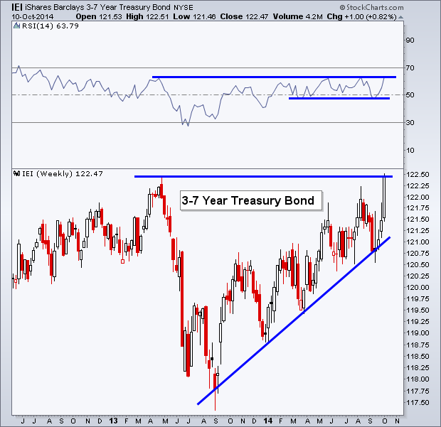
As traders have left the warm familiarity of stocks and shifted to bonds, the various portions of the Treasury yield curve have been rising steadily. The more popularly discussed iShares Barclays 20+ Year Treasury ETF (ARCA:TLT) has already exceeded its prior high. Today, however, I'd like to focus on the shorter-term iShares Barclays 3-7 Year Treasury Bond ETF (ARCA:IEI). This Treasury ETF held support in the Relative Strength Index (RSI) just a few points under 50 while it pushed against its rising trend to make a run for its 2013 high. Price now sits right at that early 2013 peak along with its momentum indicator, ready to break its own level of resistance.
Breadth
The following chart was one of the signs we had that trouble may have been brewing for stocks. The Advance-Decline Line failed to make a new high along with price, creating a bearish divergence. While the S&P 500 sits right at its prior low, this measure of breadth has broken its own August low and now finds itself back at a level not since seen April of this year.
Meanwhile, the Percentage of Stocks Above Their 200-day Moving Average has dropped down to its December 2011 level with fewer and fewer stocks able to keep their heads above their proverbial trend water line.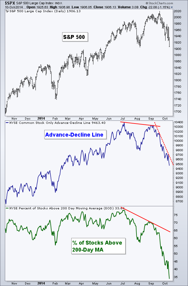
Cotton
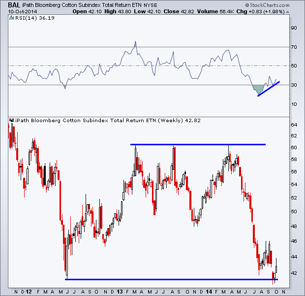
Back in August I wrote a piece for See It Market looking at the potentially bullish setup in price, sentiment, and COT data for Cotton. Since then we have not seen cotton prices move very much. They began to rise only to weaken once again and put in a slightly lower low. However with this recent low we now have a bullish divergence in the Relative Strength Index (RSI) on the weekly chart as it did not confirm the move lower. Looking at price, it appears we may have a false breakdown under the 2012 low. I’ll be watching to see if cotton, via the iPath DJ-UBS Cotton TR Sub-Index (NYSE:BAL) can stay above this level going forward. When checking back in with the COT data since August, Commercial Traders have continued to add to their net-long position. They are now holding their largest net-long position in at least 4 years.
While cotton prices haven’t shot higher since my last writing on the commodity, the bullish case for higher prices in cotton continues to hold true in my opinion.
Momentum
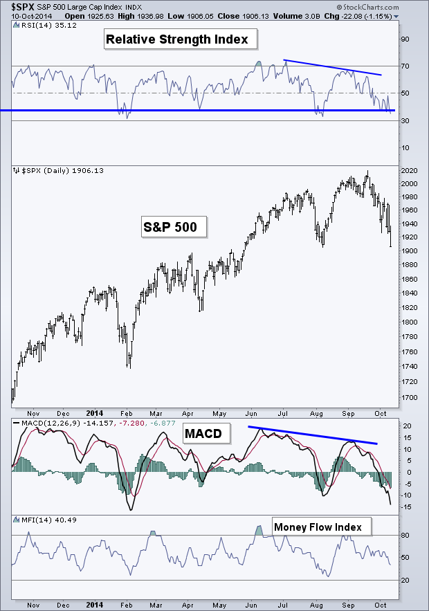
Like the Advance-Decline Line for breadth, the RSI and MACD momentum indicators were flashing warning signs back in September as they were unable to confirm the new high. We now have the RSI sitting right at its support level. Will we get a bounce or will momentum move to an ‘oversold’ level before the bulls get any reprieve.
S&P 500 Bollinger Bands
As anyone who has been around the markets for any extended period of time can attest, oversold markets can always become MORE oversold. And this is also true when it comes to the use of Bollinger® Bands, and is something I want to point out before diving into this next chart.
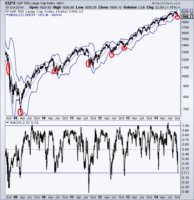
Below is the S&P 500 along with a set of Bollinger Bands. Typically these bands use a 20-period Moving Average with the outside bands set at 2 standard deviations. But one set of bands that I watch uses the 65-day MA and a 2.5 standard deviation. I’ve noticed that we see prices put in a low when they reach this lower Bollinger Band. In the bottom panel of the chart is the %B indicator, which simply shows where price is in relation to the bands. As you can see, when price has previously reached its lower band, a low is often put in or not too far away. The obvious exception from the last six years was the 2008 bear market.
The drops that we’ve seen in the S&P 500 each year (excluding 2013 since we didn’t see any material decline) seem to have come to an end at the lower band of this set of Bollinger Bands. Will this decline be different?
Emerging Markets
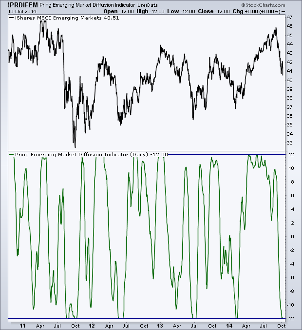
Martin Pring, who wrote Introduction to Technical Analysis and developed many different indicators created a Diffusion Indicator to be used with different markets. Pring’s Diffusion Indicator looks at the number of stocks within a given market and how many are above their 40-day Moving Average. Pring then takes a 10-day Moving Average, which is what’s plotted below for the Emerging Market Index.
As the chart shows, when this indicator has gotten down to -12 over the last several years it’s signaled a bottom for the iShares Emerging Market ETF (ARCA:EEM). This is a helpful tool I use to help find potential short-term turning points within certain markets. I’ll be watching to see if this low in the Pring Diffusion Indicator helps put in a low for EEM.
Last Week’s Sector Performance
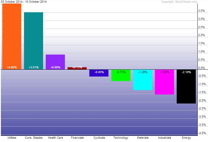
It's of little surprise that the strongest sectors last week were the three defensive portions of the market, Utilities (SPDR Select Sector - Utilities (NYSE:XLU)), Consumer Staples (SPDR - Consumer Staples (ARCA:XLP)), and Health Care (SPDR - Health Care (ARCA:XLV). While stocks bled for most of the week, Utilities and Staples actually closed out on Friday in the green. Energy (SPDR Energy Select Sector Fund (ARCA:XLE), Industrials (Industrial Sector SPDR Trust (ARCA:XLI)) and Materials (SPDR Materials Select Sector (ARCA:XLB)) took the brunt of the damage.
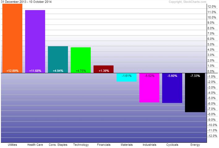
Year-to-Date Sector Performance
With Utilities' recent strength, it has moved back to the top spot for 2014. Close behind is the Health Care sector, followed by Consumer Staples and Technology (SPDR Select Sector - Technology (NYSE:XLK)). The Energy sector remains the worst performing part of the market YTD followed by Consumer Discretionary (SPDR Consumer Discr. Select Sector (ARCA:XLY)).
Based on the Sector Rotation Model at stockcharts.com, it’s a bit concerning to see Utilities, Health Care, Staples, and to a lesser degree Financials, leading the way so far this year, as those four sectors sit at the top of the economic cycle. Much more digging would need to go into this type of analysis but I believe it’s an important note to make.
Disclaimer: Do not construe anything written in this post or this blog in its entirety as a recommendation, research, or an offer to buy or sell any securities. Everything in this post is meant for educational and entertainment purposes only. I or my affiliates may hold positions in securities mentioned in the blog. Please see my Disclosure page for full disclaimer.
