When a doctor is attempting to diagnosis a patient he or she will attempt to collect as much information as possible regarding the patients symptoms. Based on the different aliments, the doctor can then make their diagnosis. I think right now the U.S. equity market is showing some negative symptoms. This doesn’t mean we need to call the morgue but there seems to be something happening based on the internals and the information price action is providing us. While the current deterioration is concerning, we are close to finishing out one of the historically weakness months of the year and are approaching the strongest six-month period for stocks.Will that be enough to correct the concerns shown on the charts? We’ll see.
Since the short-term low on Sept. 15th we’ve seen price advance to hit new highs. However at the same time we’ve seen the number of stocks making new 52-week lows on the NYSE also climb higher right along with price. Normally we see this data set decline when price is heading higher. While the S&P 500 (SPDR S&P 500 (ARCA:SPY)) was just a few points away from its record high, we saw the number of new 52-week lows hit its highest level since December 2013! And this all happened on the largest amount of volume on the S&P 500 since March.
Trend
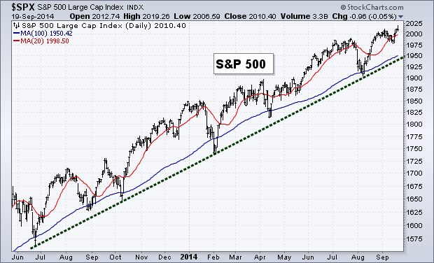
With the new high in the S&P 500 the trend remains positive. The major index has now climbed back above its 20-day Moving Average and remains above its 100-day MA and long-term trend line.
Breadth
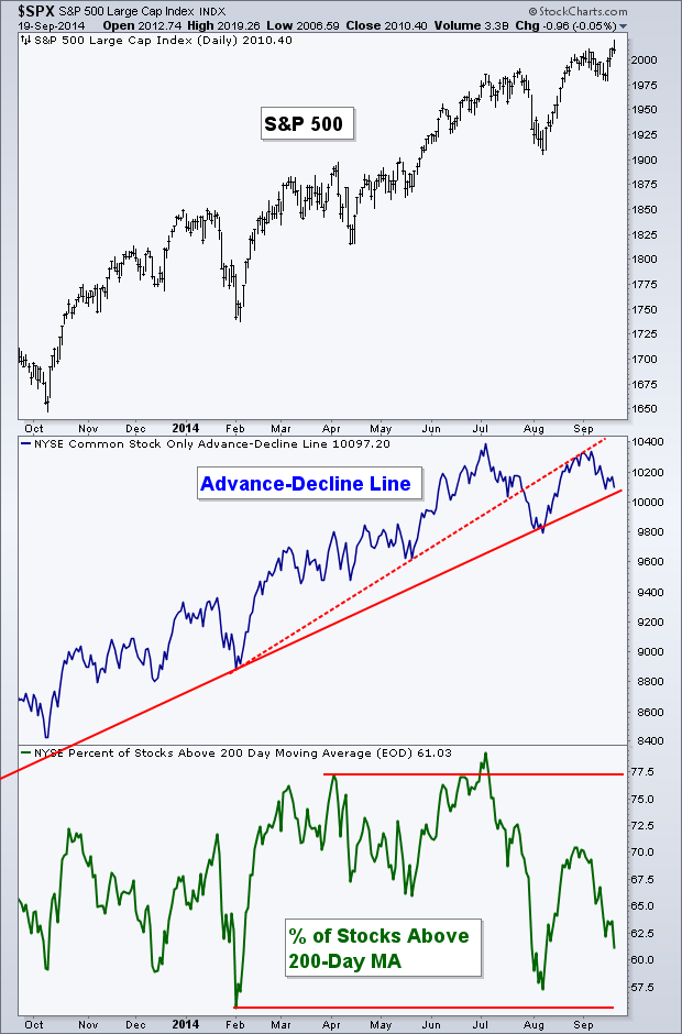
As many noted last week, breadth for the equity market has begun to struggle. The support that has now become resistance (dotted red line) for the Common Stock-Only Advance-Decline Line remains above the indicator as the A-D line approaches its long-term trend line (solid red line). While breadth remains in an up trend, it’s begun the process of changing trend as we now have a lower high and we may see a lower low if it can get back to 9,800.
I also want to note, although they aren’t shown on the chart, that the Volume A-D Line, the S&P 500 A-D Line, and the more widely discussed, NYSE A-D Line have also not confirmed the most recent high in the S&P 500. While each measure I just mentioned varies in its degree of divergence, its interesting that warning signs are going up on each of them.
S&P 500 Relative to 52-Week High-Low
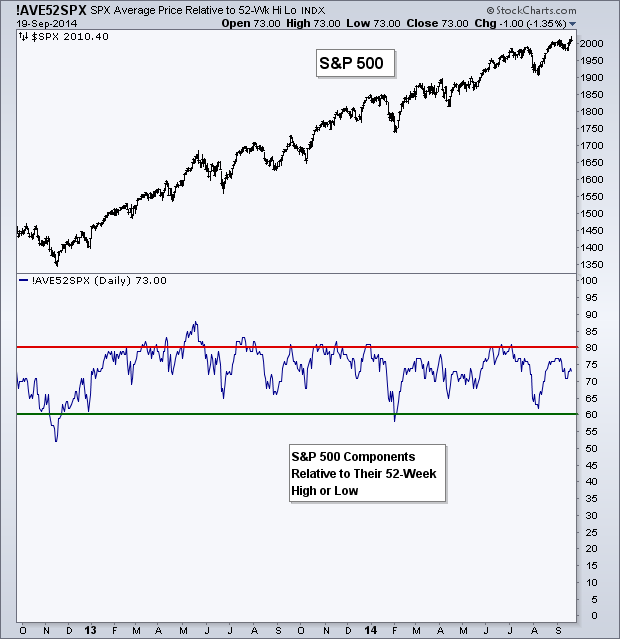
I’ve shown a similar chart like this before, except it was for the Dow Jones Industrial Average. Today I want to look at the S&P 500. In the bottom panel is an indicator created by DecisionPoint that looks at the average ‘score’ of each of the S&P 500 stocks based on their relative position vs. their 52-week high and low. For example, if it’s at a 52-week low it’ll earn a ‘score’ of 0, if a stock is in the middle between its respective high and low then its score would be 50, and so on.
I use this tool for two purposes. One, to look for potential signs of mean reversion, as stocks tend to pull back on the short-term when the average score gets above 80 and puts in a short-term low when its falls under 60 during a defined up trend.
Second, for divergences with price. During the last two years, as shown on the chart below, we’ve seen the indicator consistently touch the 80 mark as price ebbed and flowed higher. However, most recently the average score for the S&P 500 stocks has drifted lower, forcing the indicator to divergence from price. The most recent new high saw the average score for the index right around 75. This is another potential sign that participation in the equity market is beginning to wane.
Momentum
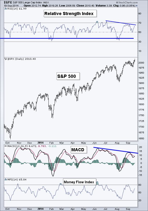
Another example of the increasing number of divergences can be found on the chart I show each week for momentum. The bearish divergence that started a couple of weeks ago is still ‘in play’ and became more severe as another lower low was created this past week in the Relative Strength Index (RSI). The MACD indicator, which also has been diverging from price, has yet to have its histogram break back above zero.
While we did see the RSI indicator hold its mid-point (50) during the most recent short-term drop, which is positive for the ‘health’ of momentum. The divergences that continue to plague the U.S. stock market continues to issue yellow flags for the current up trend. I’ll be watching to see if price confirms these warning signs or if they go ignored and price keeps heading higher.
Crude Oil
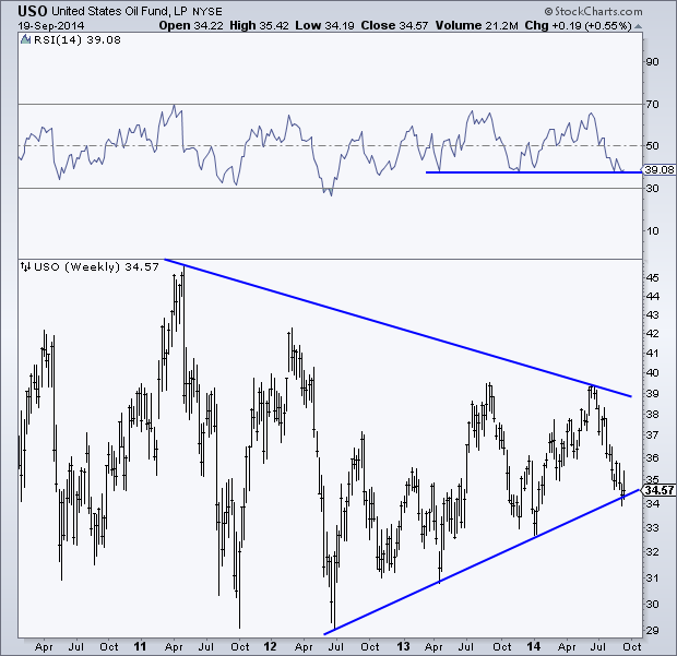
Last week I wrote a post about Gasoline, looking at the latest price action, COT data, Sentiment, and Seasonality. As it appears gas prices may be heading higher, crude oil also seems to be finding some support.
Below is a weekly chart of the United State Oil Fund (United States Oil Fund (NYSE:USO)) going back to mid-2010. By connecting the series of higher lows since 2012 we can create a trend line that price is currently testing. At the same time the Relative Strength Index in the top panel of the chart is also testing support based on two prior lows.
It’s always interesting to see two markets that are connected like Gasoline and Crude Oil begin to show similar signs of bottoming out based on different sets of data. We’ll see if the oil bulls come back to the table and take price higher or if support gives way and oil continues to fall.
Volatility
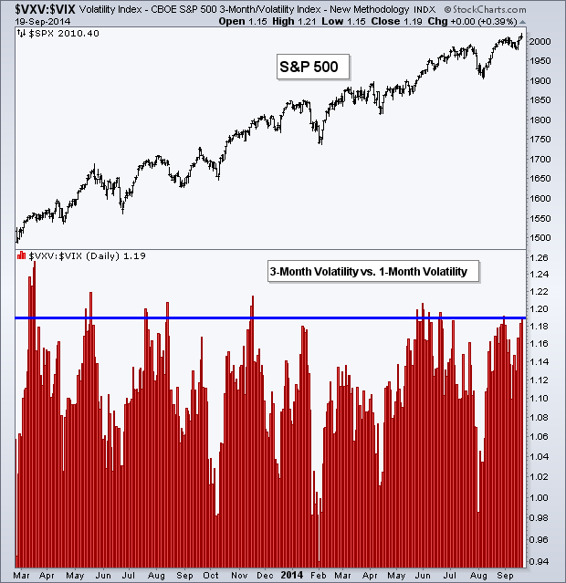
I often look at the relationship between the 1-month and 3-month Volatility contracts as they enter and exit backwardation and contango. But today I’ve flipped the ratio, with the follow chart showing the S&P 500 and the 3-month VIX divided by the 1-month VIX. The ratio between these two contracts is now near the higher end of its range over the last year. While it has gone higher, traders are currently pricing in much less volatility in the short-term relative to 3-months out. I’ve put a blue line to show the current level compared to past instances. Is this a sign of too much optimism?
Relative Rotation Graph – Sectors
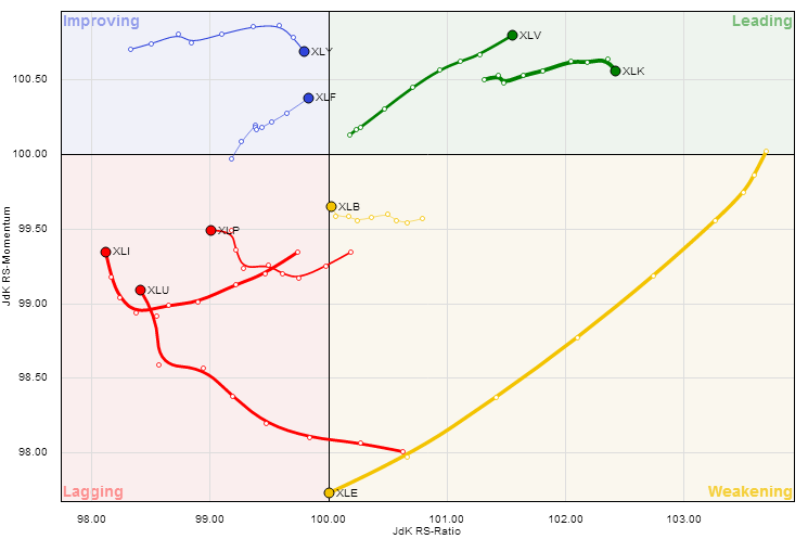
Last week we looked at the Relative Rotation Graph for the nine S&P sectors. Go here to see last week’s chart and get a better explanation of what’s being shown. I highlighted last Monday that Financials (Financial Select Sector SPDR Fund (ARCA:XLF)) appeared to be strengthening, and it seems that continued during trading last week as the momentum of the trend in relative performance increased for the sector. Health Care (SPDR - Health Care (ARCA:XLV)) also saw an increase while Technology (SPDR Select Sector - Technology (NYSE:XLK)), which is still firmly in the ‘leading’ category, saw its momentum of the trend in relative performance drop by a few points. Energy (SPDR Energy Select Sector Fund (ARCA:XLE)) also continues to decline, seeing the largest move of the nine sectors.
Relative Rotation Graph – International
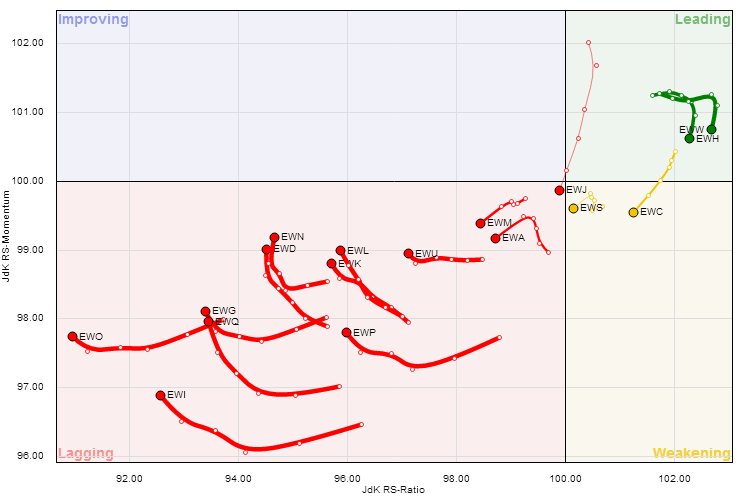
I normally only show the S&P sectors on the RRG, but I found the graph for international ETFs pretty interesting too. While I’ve shown multiple charts in this post pointing out the weakening internals for the U.S. equity market, that does not seem to be persuading traders from showing favor to domestic markets relative to international.
Nearly every country-specific ETF is in the ‘Lagging’ category or is moving towards it. The two countries that are currently showing strength compared to the S&P 500, Mexico (iShares MSCI Mexico (ARCA:EWW)) and Hong Kong (iShares MSCI Hong Kong (ARCA:EWH)), have begun to decline and are heading towards ‘Weakening’ and we currently have no International ETFs in the ‘Improving’ category. I find this very interesting as traders are being very apparently in their bias for U.S. markets.
Disclaimer: Do not construe anything written in this post or this blog in its entirety as a recommendation, research, or an offer to buy or sell any securities. Everything in this post is meant for educational and entertainment purposes only. I or my affiliates may hold positions in securities mentioned in the blog. Please see my Disclosure page for full disclaimer.
