I read an interesting paragraph on Friday night (click for easier reading):

I decided to fire up a few charts and test that theory, because intuitively it makes a lot of sense. I therefore did percentage performance charts of three major, but differently-constructed, indexes—the S&P 500, the NASDAQ 100, and the Russell 2000.
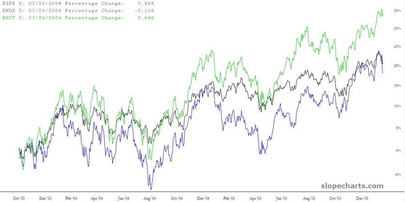
Below, for instance, is this trio during a broadly healthy market period around 2004-2005. The indexes aren’t identical, of course, but on the whole they are moving with each other, with little in the way of meaningful variance.

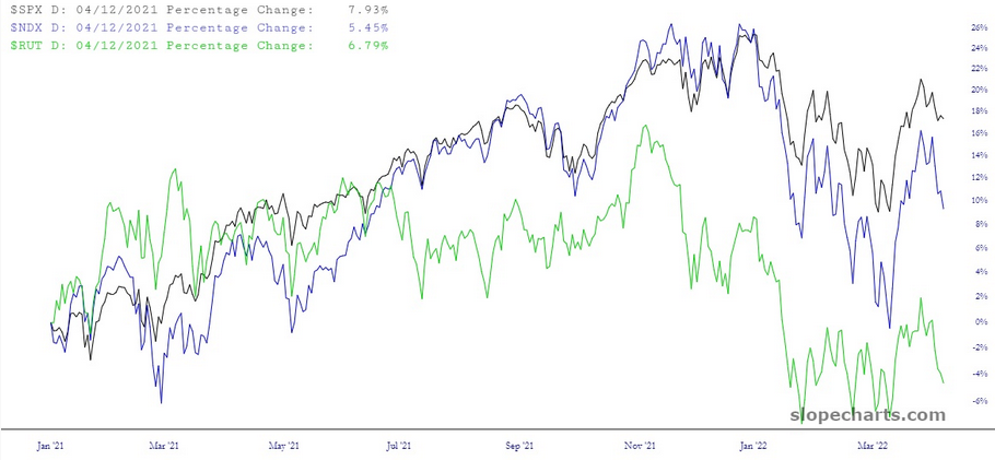
Look at the same trio recently: the Russell started weakening months before the others, and the divergences between them are growing larger by the day. You can definitely see a “peeling away” that is indicative of an unhealthy market.

Next let’s take a look at two very different financial instruments: bonds—by way of iShares 20+ Year Treasury Bond ETF (NASDAQ:TLT) and stocks—by way of SPDR® S&P 500 (NYSE:SPY).
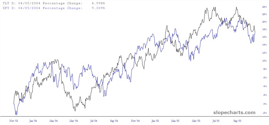
Using once again the period 2004-2005, which was a very healthy market overall, these two presumably different financial worlds are moving in virtual lockstep with one another.

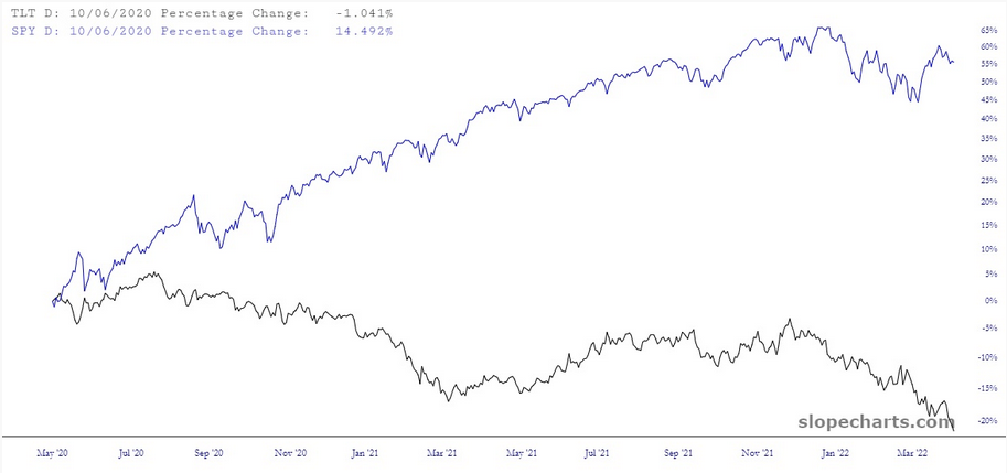
How about these days? I’d say “not so much” leaps to mind. I’d also say once it finally sinks into the very thick skulls of equity traders that the world has changed for the worst, stocks will “catch down” to join their more sensible bond brothers.

Incidentally, if you’re interested in divergences in general, may I direct you to this page. It’s packed to the gills with them, and you won’t find anything else like it anywhere on the web.
