Micron surges after one of the biggest beats in U.S. semis history
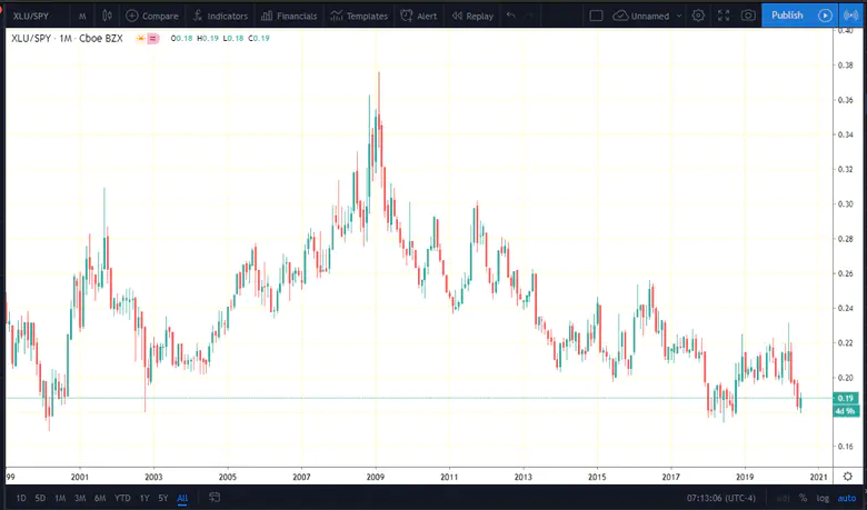
This week’s technical chart of the week is a look at the Utilities sector relative to the S&P 500. Technicians like to use ‘ratio charts’ or ‘relative charts’ to compare one asset to another in order to find relative strength or weakness.
I zoomed out the XLU/SPY ratio chart back all the way to 1999. What we find is that XLU is near its lows on a relative basis to the overall US stock market. What does it mean?

If history is any guide, utilities could rally from here – versus SPY. That may mean US stocks fall and utilities hold their own, or it could imply that utilities (for whatever reason) surge as the broader equity market rallies.
Technicians don’t care why things happen; we just look at the charts for what the price-action tells us.
Looking back into history, utilities were relatively weak at the end of the tech bubble, natural. Then the 2000-2002 bear market hit, and the traditionally defensive sector showed its value in beating the riskier parts of the stock market. What really jumps out on the chart is late 2008 and early 2009 when XLU soared versus SPY – a time when risk-aversion was extreme. It’s been a steady decline in the ‘utes’ versus the S&P 500 since.
Last week, utilities rallied while the S&P 500 dipped somewhat. Recall the broader trends that are at play – Facebook (NASDAQ:FB), Amazon (NASDAQ:AMZN), Apple (NASDAQ:AAPL), Microsoft (NASDAQ:MSFT), Google (NASDAQ:GOOGL) – these are the mega cap technology stocks that have been powering the US stock market higher in recent months and years. Maybe the XLU/SPY chart is hinting that it could be time for some rotation into areas that have been relatively poor performers.
