Stocks experienced a volatile trading session on Friday, with the market fluctuating before finishing higher but remaining within the recent range of the past few days.
In the Nasdaq 100, it’s becoming more evident that a rising wedge pattern is still intact, and there’s now a possibility of a diamond top forming.
A similar setup occurred in mid-July, marking the peak in the NASDAQ, which was followed by a subsequent decline.
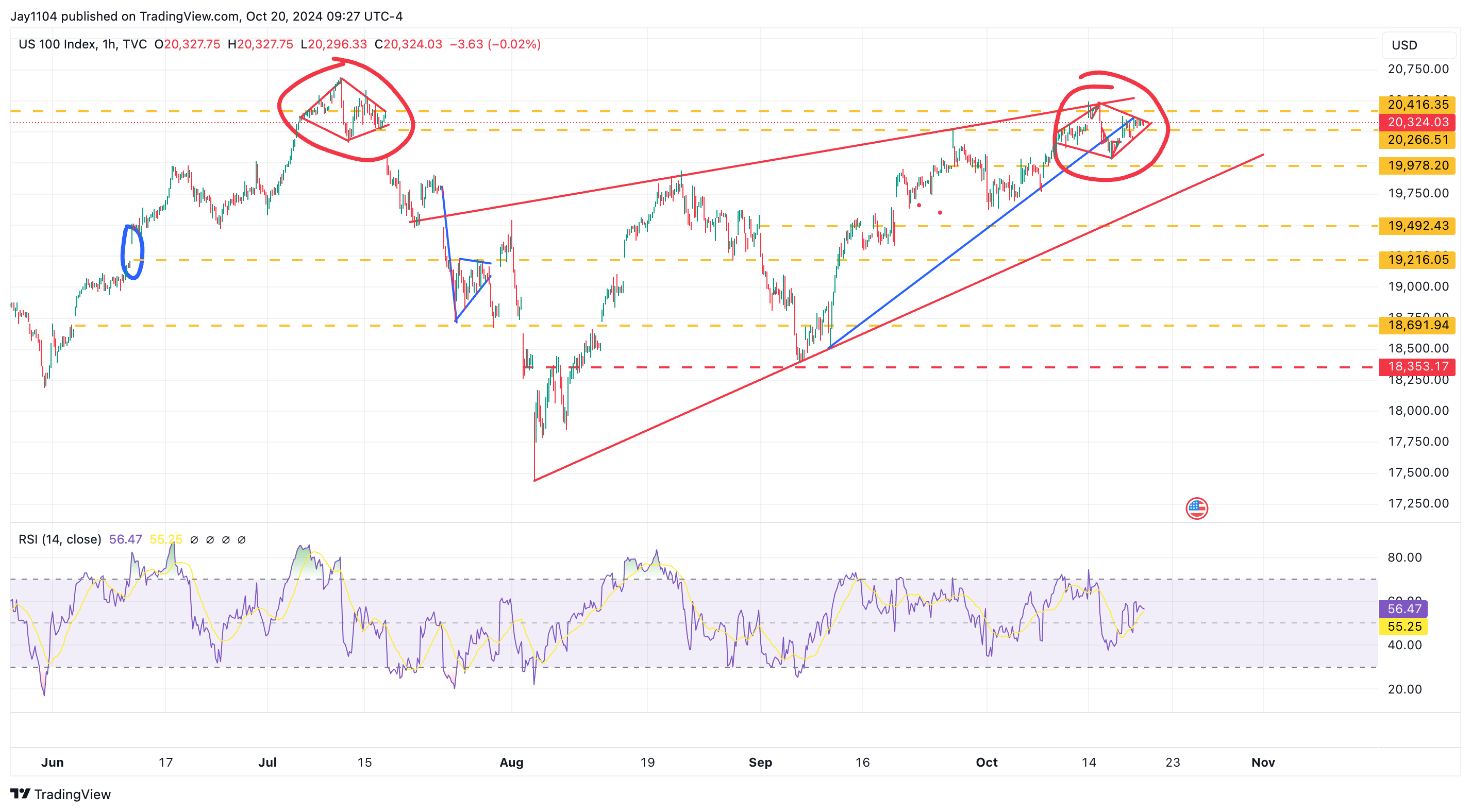
That previous diamond pattern formed around earnings season; now, another diamond is shaping up during the current earnings season.
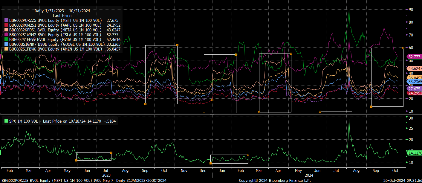
There may be a reason for this, related to the implied volatility dispersion trade that often occurs heading into earnings.
Systematic volatility funds typically sell implied volatility at the index level while buying implied volatility in mega-cap stocks, hedging their positions by going long on the underlying equities.
However, we are now at that point in the cycle where the bid in mega-cap names should fade.
As earnings reports start rolling in, that trade will begin to unwind, causing implied volatility to crash as each company reports. This is a seasonal pattern, as shown in the chart below.
You can track the unwinding process by watching the 1-month implied correlation index, which has dropped back to 13, at the very low end of its historical range.
As this index rises, it will confirm that the implied volatility trade is unwinding because the implied volatilities of individual stocks will begin to drift lower.
More importantly, the implied volatilities of these stocks should start to align again with the implied volatility of the S&P 500, indicating a greater correlation.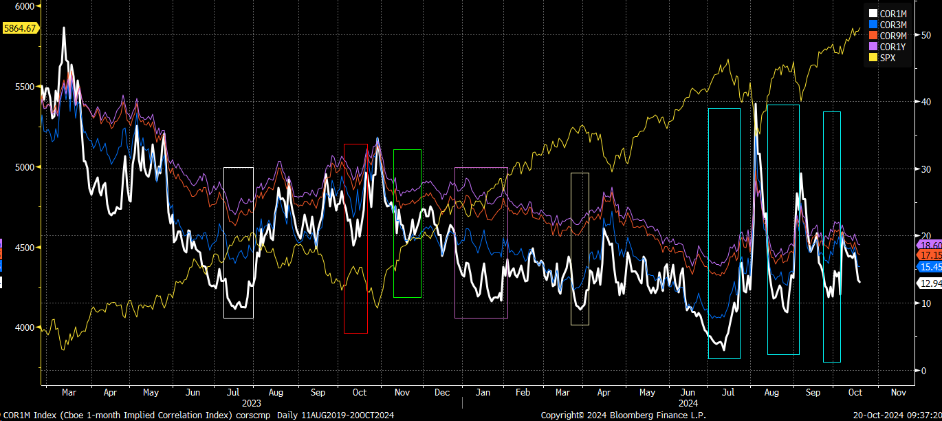
When the 1-month implied correlation index begins to rise, it’s typically associated with a decline in the S&P 500. This is how the mechanics have played out repeatedly.
Generally, when the market falls, individual stocks and their implied volatility levels tend to become more correlated with the broader index.
From a technical perspective, this aligns well with the patterns we’ve observed in recent weeks.
This also makes the potential diamond pattern forming in the NASDAQ particularly interesting, as a similar setup occurred in July, right around the start of earnings season—a time when seasonality often plays a role.
Additionally, the index has successfully retested the break of the smaller rising wedge pattern and now appears poised to test the 19,650 region.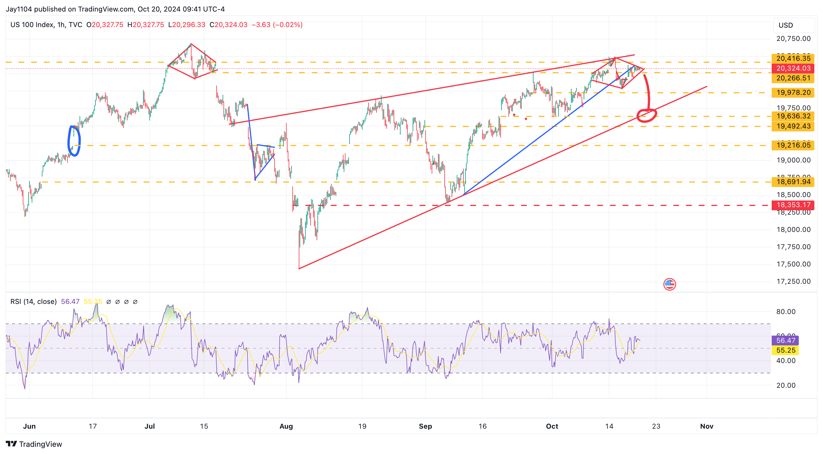
We’ve been patiently watching this pattern develop for what feels like an eternity, but unfortunately, these formations can take time to play out fully. So far, the pattern has progressed mainly as expected.
While the S&P 500 doesn’t have a diamond pattern like the NASDAQ, it has a similar cup with a rising handle.
In July, we saw a similar pattern just before the market turned lower, and now, this week’s setup appears to be happening at an ideal time for another potential downward move. At this point, a test of 5,730 seems likely as an initial target.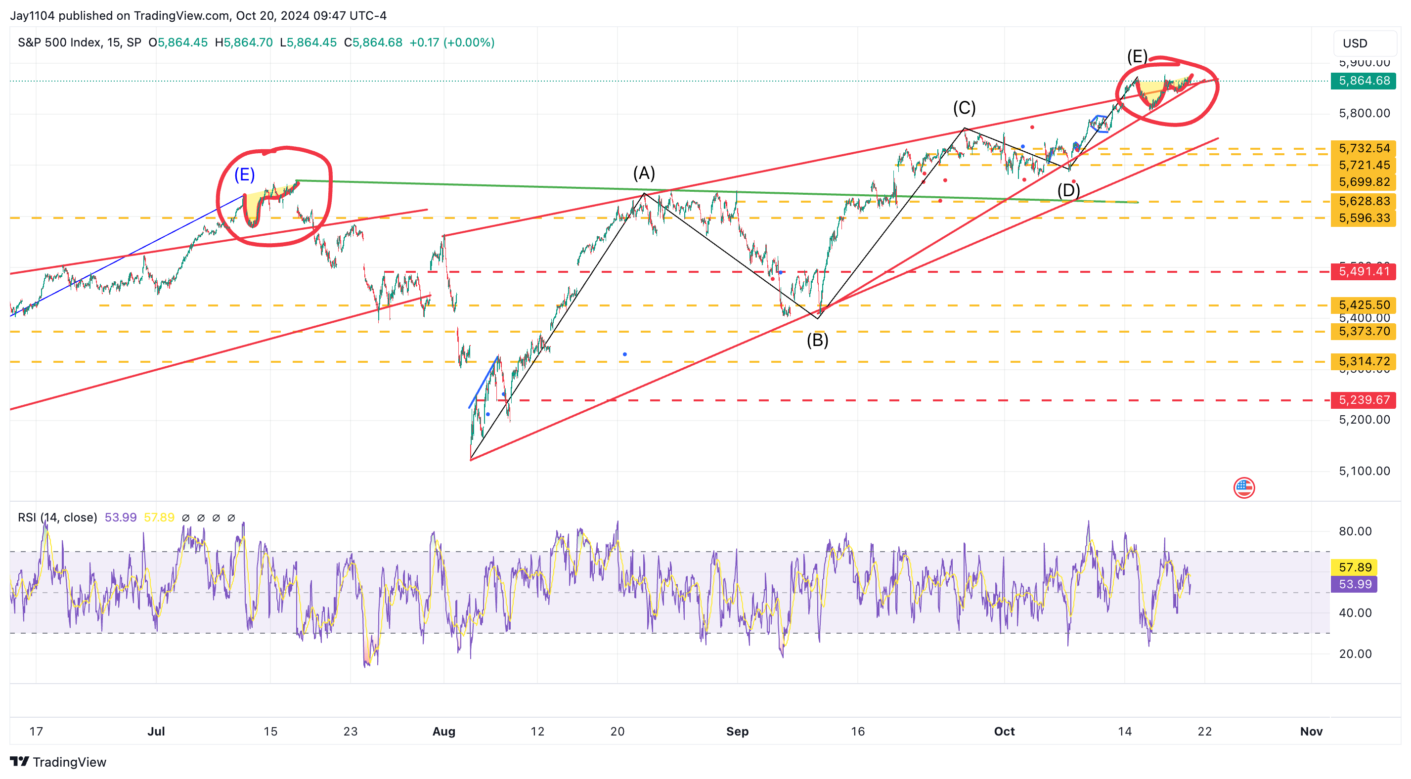
The RSP ETF, which represents the S&P 500 equally weighted index, is showing the same rising wedge pattern that we’ve observed in the broader market.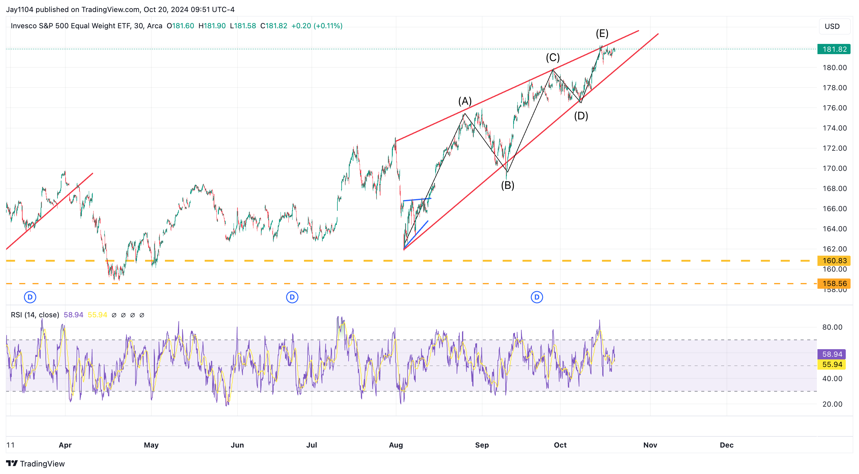
Meanwhile, the USD/CAD continued to weaken this past week, but we have yet to see the S&P 500 move lower.
Historically, these two have shown an inverse relationship, but so far, that hasn’t been the case. For now, we’ll have to wait and see if and when this relationship returns to normal.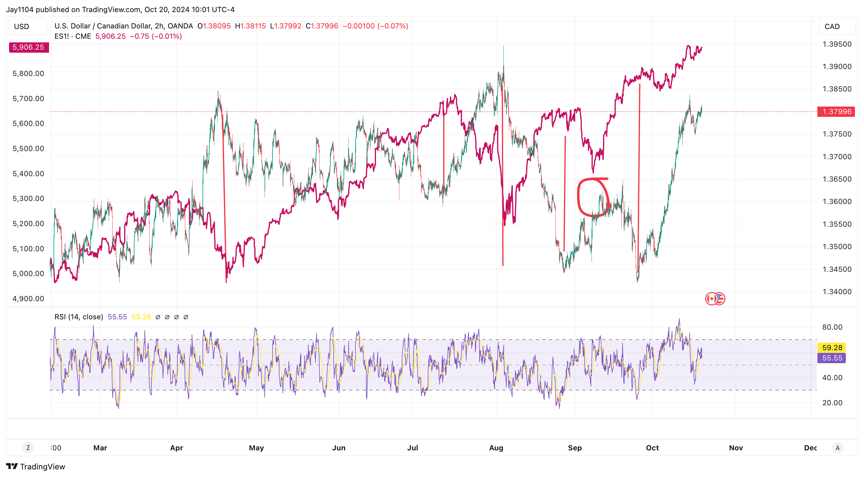
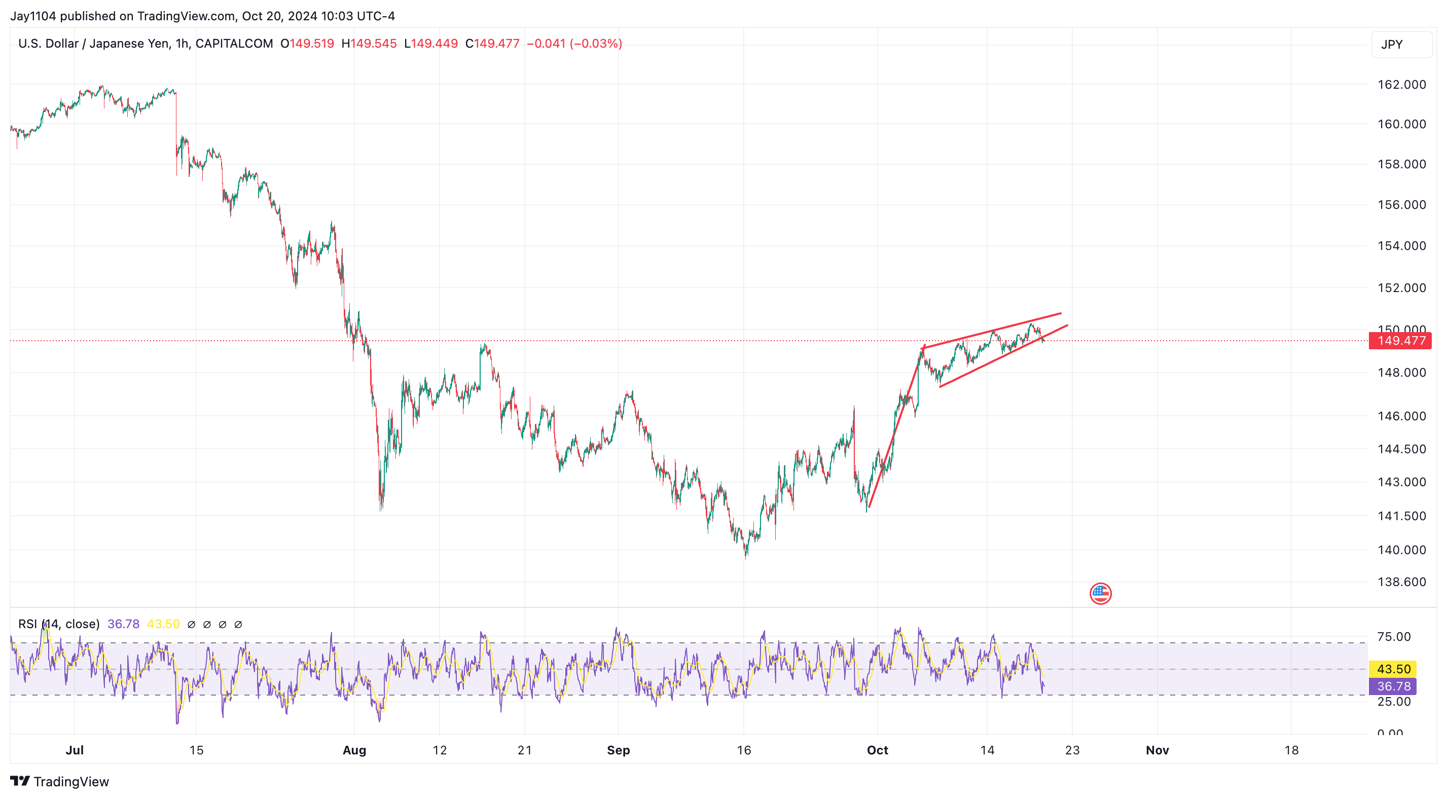
It also appears that the USD/JPY is getting close to breaking its recent weakening trend, with what looks like a pole and rising flag pattern, which tends to be bearish.
If this pattern holds, we could see the USD/JPY begin to strengthen again and move toward the 141 area.