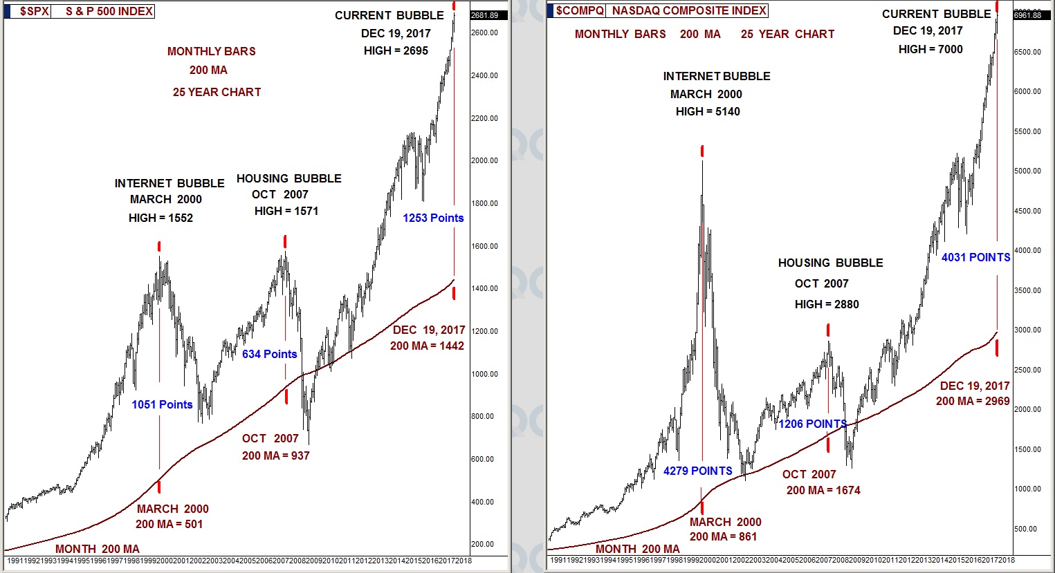
Over-extensions in the stock market are easy to see using the 25-year chart with monthly bars and the 200-month moving average.
The chart below shows the March 2000 and October 2007 bubble peaks plotted as to how many points they had moved away from their 200-month moving average before they pulled fiercely back.

S&P 500
- Looking at the left chart of the S&P 500, we see the peak of the internet bubble was extended 1,051 points from its 200-month moving average on that date.
- The peak of the 2007 housing bubble was a not-so-absurd 634 points from its 200-month moving average on that date.
- This week, the S&P has become extended 1,253 points above its 200-month moving average, which is a roughly 20% greater over-extension than the peak of the internet bubble when the average stock lost 80% of its value in the two years that followed.
NASDAQ
- Looking at the right chart of the NASDAQ, we see the peak of the internet bubble was extended 4,279 points from its 200-month moving average on that date.
- The peak of the 2007 housing bubble was 1,206 points from its 200-month moving average on that date.
- This week, the NASDAQ has become extended 4,031 points above its 200-month moving average, which is just a few percentage points from matching the NASDAQ's internet-bubble peak, which is considered the most absurd financial event in history as the average stock lost 80% of its value in the two years that followed.
Many talking heads in the media are saying we are not in a bubble, that things are different this time. Perhaps it is best for investors to judge for themselves.
