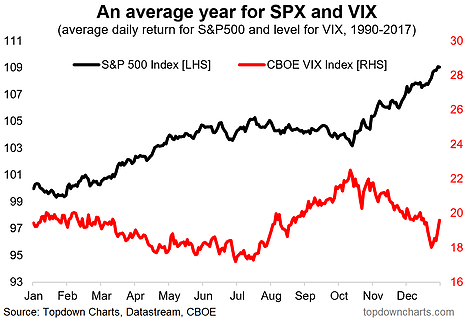
Another year, another datapoint... Regular readers will be familiar with the first chart which shows the average daily returns for the S&P 500 across the year against the average level of the VIX across the year. This stock market seasonality map has been updated to include the 2017 data and the same conclusions and cautions hold. In this article we review this chart and explore seasonality patterns across a few key asset classes.
The first thing to note about seasonality however is that it is imperfect, and can break down at times. That's why I often say that seasonality should probably be one of the final factors you look at. So for example if there was a compelling valuation case, and variables like sentiment, monetary policy, etc. were all bullish and the seasonal tendency was also positive it would be a useful confirming indicator or something to add to the case from a tactical standpoint. Other than that it can also be useful information from a risk management standpoint e.g. if you are long an asset into a seasonally weak period.
Anyway, looking at the charts there are some interesting, and for the most part intuitive seasonal tendencies across the asset classes looked at (S&P 500, VIX, US dollar, Treasuries, and gold). In the immediate term, the first quarter of the year tends to see stronger stock prices, a largely stable VIX, weaker treasuries, stronger gold prices and a stronger US dollar. Time will tell if these patterns repeat this year!
The main takeaways and rules of thumb on cross asset seasonality are:
-The S&P 500 tends to do well early and later in the year and worst from July-October, and the chart shows the VIX (implied volatility) more or less does the opposite.
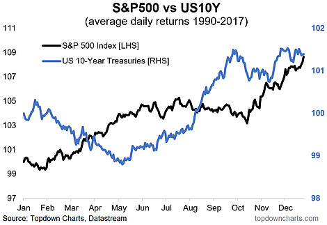
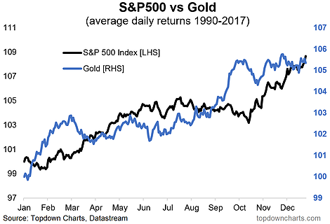
-Traditionally known as defensive assets, gold and treasuries seasonally perform well during the period where stocks perform the worst (which lines up with that intuition/rule of thumb).
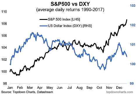
-The US dollar index tends to do well in the first quarter, and bonds tend to do poorly.
1. S&P 500 Seasonality: First up is the S&P 500 average daily returns across the period 1990 to 2017. The stronger parts of the year for the S&P 500 are the February-May period and the October-December period. The weaker part of the year is July-October. Looking at the VIX, there is an interesting pattern where it tends to mirror the seasonality in the S&P 500 (as you might expect). The VIX tends to be higher on average during the weaker part of the year and usually trends down from March-July.

2. Treasuries Seasonality: Looking at the price index of the US 10-Year treasuries there is a tendency for bond prices to fall in the first quarter of the year and again perhaps unsurprisingly bonds do better at the time of the year when stocks do worst. This is particularly interesting given the action we are currently seeing in the bond market – basically seasonality adds to the case we talked about.

3. US Dollar Seasonality: The US dollar index also has an interesting seasonal tendency. The DXY will often rise in the first quarter of the year and weaken thereafter, with the seasonal weakness reaching a nadir at about the same point that the stock market does (around October). Given the wide consensus that the US dollar weakens this year, a bout of strength in Q1 would be quite interesting!

4. Gold Seasonality: Finally, looking at the gold price there has been a tendency across the period looked at for gold to see strength in the January-February period and a general sideways movement or softness through the Auguest-October period... again this lines up with what you see in the stockmarket and is quite intuitive. I find it interesting that the seasonal tendencies line up with some of the asset allocation rules of thumb, e.g. that gold and bonds are defensive assets – and the experience is that from a seasonal standpoint they do better when stocks are doing worse.

