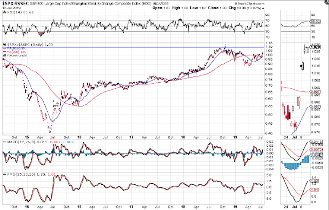
There have been numerous reports of an economic slowdown (and even contraction in some sectors) in China, one of which describes those in detail at ZeroHedge. While some of China's difficulties may have been exacerbated by a fairly recent trade war with the U.S., it certainly didn't start them. Other factors were already in play and bear responsibility for its inception, as explained therein.
There are a couple of gauges that seem to measure the strength/weakness of both the United States' and China's economies, namely the Loonie and the Aussie dollar, respectively.
Canada exports many commodities to the U.S., while Australia exports many to China. The strength/weakness of those exports is reflected in their respective currencies, and, hence, in the economies of the U.S. and China.
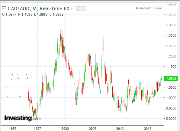
The long-term monthly forex chart below of CAD/AUD shows that the Loonie has, essentially, outperformed the Aussie dollar since February 2012, albeit with several periods of sustained volatility peppering it along the way.
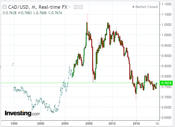
The monthly forex chart of CAD/USD shows that price has, once again, pierced above major resistance around the 0.76 level. Watch for that level to hold to, potentially, signal continued strength in the U.S. markets, versus China's weakness.
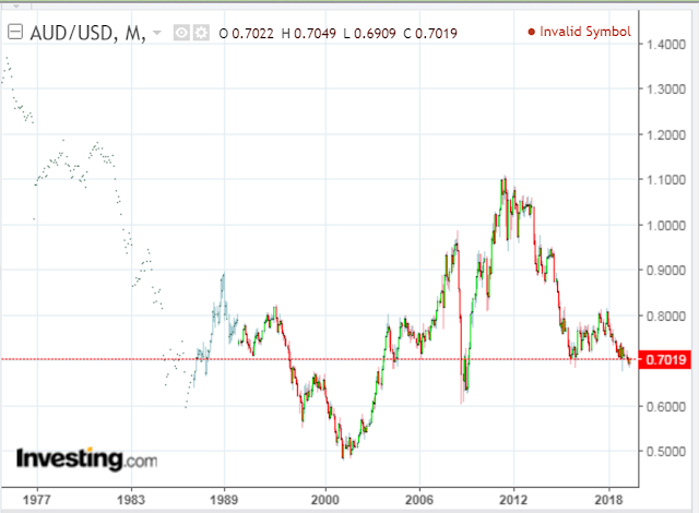
The monthly forex chart of AUD/USD shows that price is hovering just above major support at 0.70. If this level is broken with force and held, watch for continued China weakness.
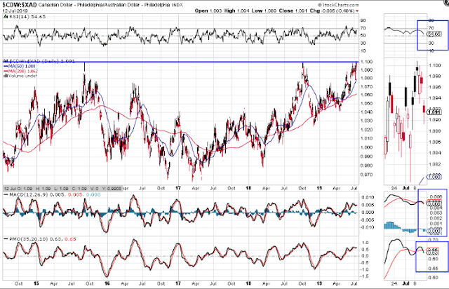
The following daily forex chart of the Loonie versus the Aussie dollar (CDW/XAD) shows that price briefly broke above major resistance at 1.100 several days ago, hinting of further weakness ahead for China.
Watch for price to possibly retest this level, and if it breaks above and holds, I'd like to see the RSI tick up again and both the MACD and PMO indicators reverse back to the upside in support of further strength in the Canadian Loonie...potentially, signaling further weakness ahead for China.
The following Year-to-date percentages gained/lost graph of the major world currencies illustrates the difference between the Loonie and Aussie dollar. There's quite a gap between the two in terms of Loonie gains and Aussie dollar losses, so far, this year.

The following one-week percentages gained/lost graph shows a slight uptick of the Aussie dollar over the Loonie this past week...one to keep a close eye on over the coming days/weeks, along with the above-mentioned charts and price levels, as potential gauges in determining the strength/weakness of China's economic health.

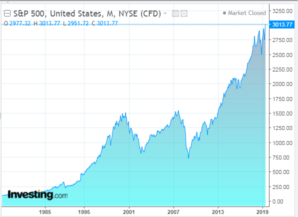
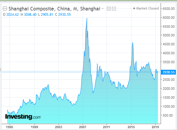
In addition, the following two monthly charts give a long-term bird's eye view of the S&P 500 Index (SPX) and China's Shanghai Index (SSEC).
China's weakness since mid-2015 is striking, compared with the strength of the U.S. market. I don't think that can be entirely attributed to the current trade war, which is relatively recent, and I think that more weakness may lie ahead.
Finally, I'd just point out that the following SPX:SSEC daily ratio chart shows that the SPX is poised to continue outperforming the SSEC, with minor short-term resistance some distance above at 1.10...another gauge to throw into the mix of, purely technical, analysis of the United States' and China's economic and market health.
