Not much happened overnight, but I did want to point out in broad strokes the distinction in just how much different segments of the stock market have recovered over the past two months, for it was almost exactly two months ago that the selling stopped.
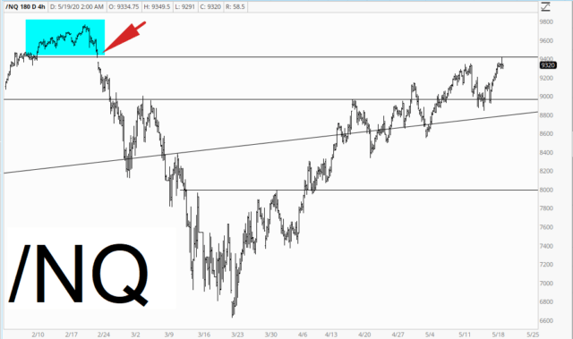
The strongest, by far, is the NASDAQ, which is relatively close to the highest levels in human history. One slightly interesting “achievement” overnight was that it finally sealed up its price gap when all the selling began (marked with an arrow). So the last major price gap is finally filled.
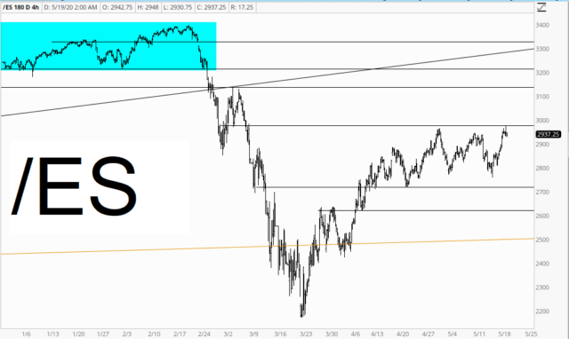
A less extreme recovery is shown in the S&P 500, by way of the /ES, which is bonking its head on the horizontal, tagging the top of a price range, which has been in place for a solid month now.
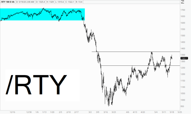
Although it was extremely strong the past couple of days, overall the weakest recovery has been from the world of small cap stocks (In all three of these cases, what I am trying to illustrate is the spread between present price levels and the blue tinted topping zone).
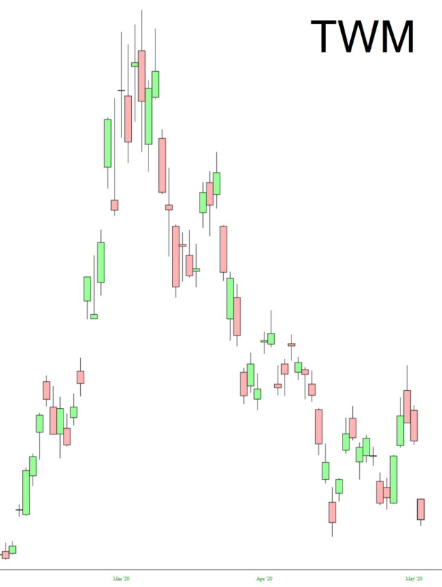
Speaking of small caps, here’s an interesting little object lesson about leveraged funds. Below is the TWM, which is the double-leveraged based on the small caps. In short, this thing went up way more than 100% during the market’s selloff, and then it absolutely gave back every penny of those gains. What is interesting about this is that the small caps (that is, the Russell 2000) is far, far below where it was when the selling began, but the persistence of the recovery has obliterated the bearish fund shown here.
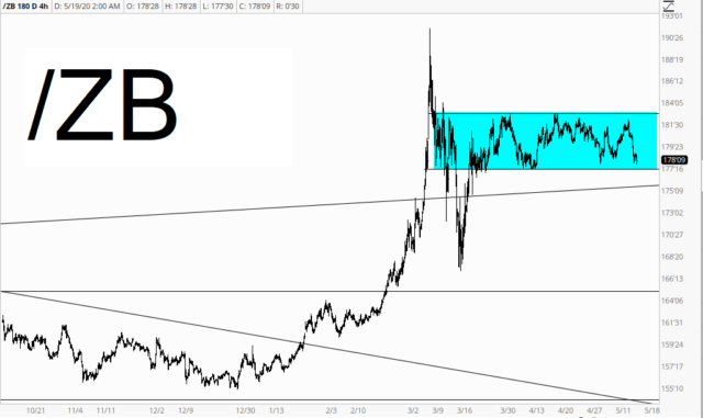
One final thing to keep an eye on it bonds, which are clearly range-bound. A break above this range would, I believe, indicate more equity weakness. A break below this range would, by definition, mean higher interest rates, which would be a stifling burden on a debt-choked global economy. Interesting times.
