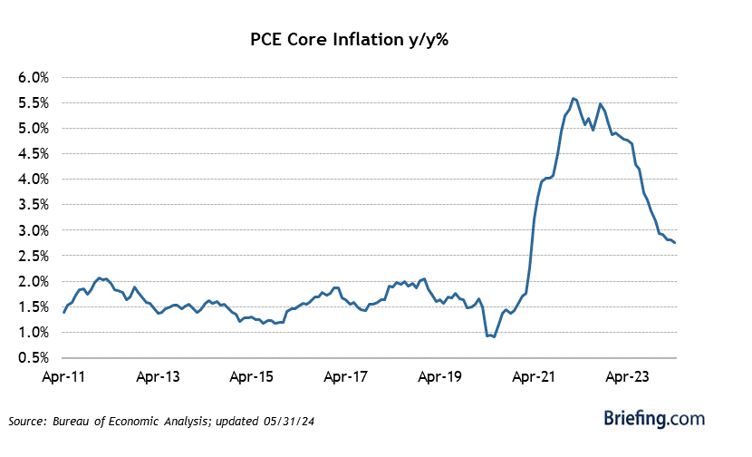
The first graph shows April ’24 PCE data after Friday, May 31’s release. The 2nd table below the graph shows the actual chronological progression of the April Personal Income, Consumption, and PCE data. The PCE data is the last 2 lines.
Readers should listen carefully to the financial media rhetoric and monologues and watch the data. Core PCE, which is the Fed’s preferred measure of inflation is looking “friendlier”.
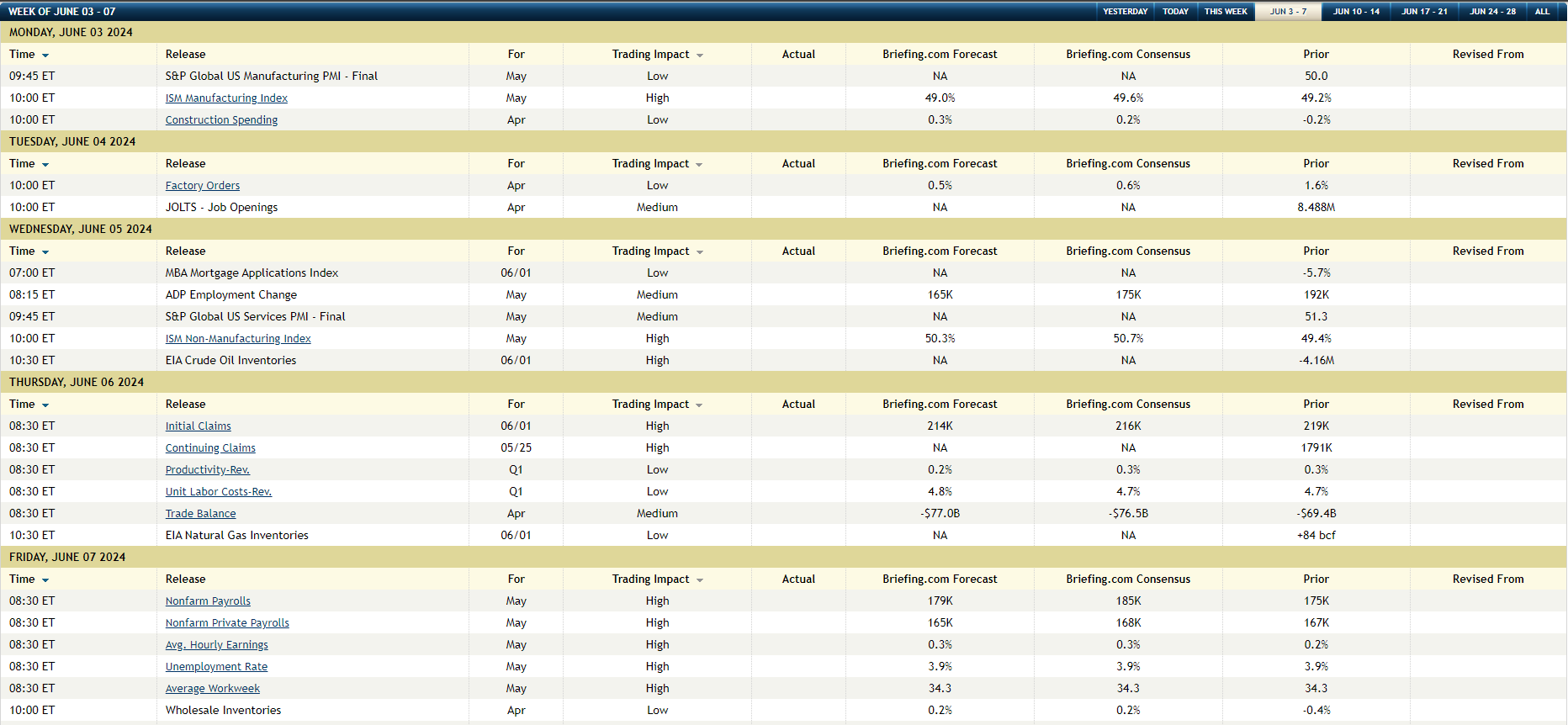
The last data box shows the expectations for what is “labor week” or the the first week of every month, where the May ADP, jobless claims and then on Friday June 7th, the May ’24 nonfarm payroll report is released.
The consensus expectation for May ’24 payroll growth is roughly the same as where it’s been for a quite a while: the Briefing.com consensus is 168,000 for private payrolls and 185,000 for both public and private payrolls.
It’s funny: on Super Bowl Sunday in February ’24, it took Scott Pelley to get Jerome Powell to articulate publicly that the Fed’s primary concern is always, “jobs, jobs, jobs”. Inflation matters, but jobs matter more. If American’s can’t work and pay the bills, their political party loyalty becomes – how shall we say – quite fungible.
This coming week, through several reports, investors get a good look at May ’24 jobs data.


S&P 500 Earnings:
- The S&P 500 forward 4-quarter estimate (Q1 ’24 to Q4 ’24) rose this week to $252.89 vs last week’s $252.61, and early January’s $243.98;
- The PE ratio compressed a smidge this week to 20.9x vs last week’s 21x;
- The S&P 500 earnings yield rose a little this week (on the S&P 500’s drop) to 4.79% from last week’s 4.76%.
- The S&P 500’s “upside EPS surprise” is still over 8% at 8.1%. That’s a plus.
- The S&P 500 revenue surprise has slid a little to +1.1%, vs the +2% range from 2022;
There is nothing amiss yet with S&P 500 earnings as we move into the final month of 2nd quarter.
This blog will have a longer S&P 500 Earnings update on Monday, June 3rd, ’24.
The data and the trends are actually very positive.
Conclusion:
There will be a separate post coming on S&P 500 earnings this week, but this is a quick look at what’s expected for jobs data. It’s remarkable how strong the US economy has been, given the jump in interest rates. “Annual” returns for various fixed-income asset classes look pretty grim.
Frankly, you have to wonder why the Fed / FOMC / Jay Powell has been in such a hurry to want to cut the Fed funds rate in a still-decent US economy and I think I got the answer this weekend with Jack Ciesielski’s Accounting Observer update. Jack used to write regularly until he retired, and now contributes one post a week, usually on Friday night. It’s always an interesting read for financial analyst/accounting geeks like myself, who like to get into the nitty gritty of publicly-traded company’s financials.
Jack’s article, with full attribution to other sources, talks about the unrealized losses on bank bond portfolios since it’s “the 9th straight quarter of unusually high unrealized losses” in bank portfolios.
Personally, I think the Fed wants a return to a normally-sloped yield curve since it takes the pressure off banks, and firms like Schwab, where they are forced to pay out more on their money market funds, than can be earned on a credit risk-free (i.e. Treasury) portfolio.
With Silicon Valley Bank’s collapse, the Fed immediately opened the discount window for other banks under stress, thus staving off any panic on the part of depositors, but this issue is still lingering. And it seems the Fed discount window has worked, but the issue remains and the unrealized losses continue to grow.
A flat US jobs market with a gradually rising unemployment rate, wouldn’t be a bad thing today. It’s an opinion, but the Treasury yield curve has the Fed / FOMC / Jay Powell caught between the proverbial rock and the hard place.
None of this is advice or a recommendation. Past performance is no guarantee of future results. Investing can involve loss of principal, even over short periods of time. Any S&P 500 EPS and revenue data is sourced from LSEG, and the economic data and charts are sourced from Briefing.com.
Thanks for reading.
