Trend Model signal summary
Trend Model signal: Neutral
Trading model: Bullish (upgrade)
The Trend Model is an asset allocation model used by my inner investor. The trading component of the Trend Model keys on changes in direction in the Trend Model - and it is used by my inner trader. The actual historical (not back-tested) buy and sell signals of the trading component of the Trend Model are shown in the chart below:
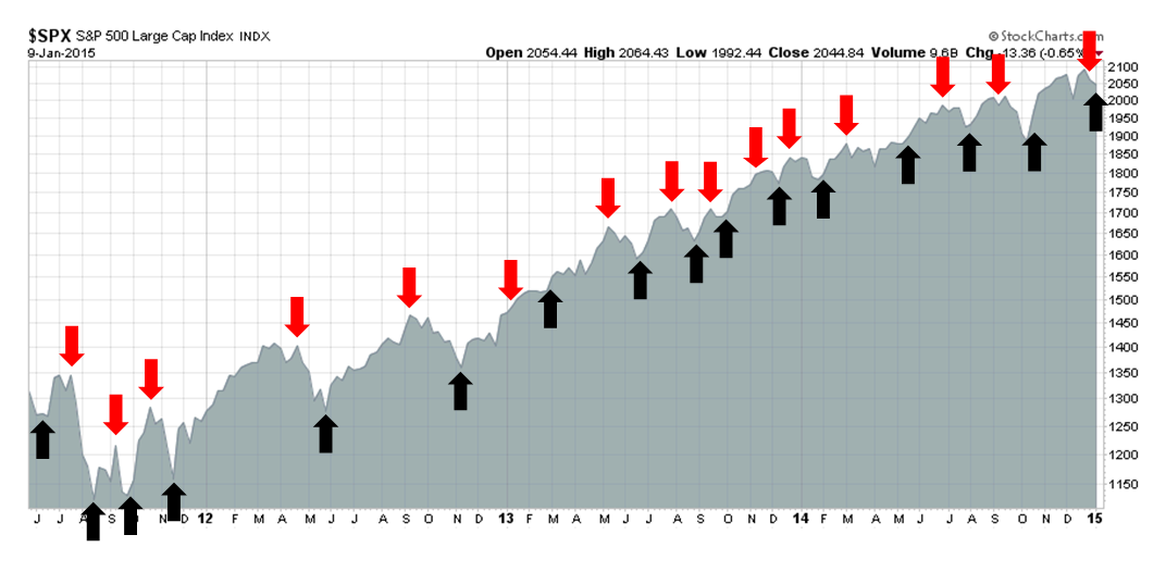
Update schedule: I generally update Trend Model readings on weekends and tweet any changes during the week at @humblestudent. In addition, I have been trading an account based on the signals of the Trend Model. The last report card of that account can be found here
A tactical buy signal
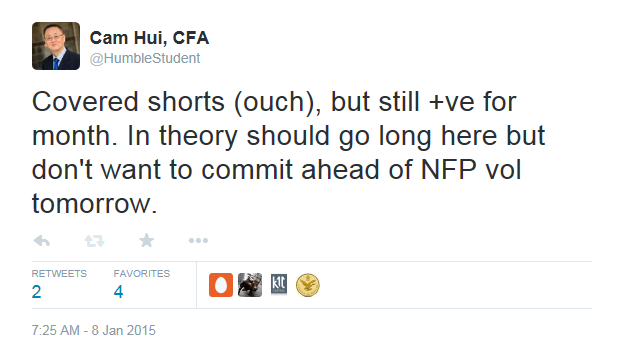
I wrote last week that market "moves have tended to be sharp and brief". I didn't realize how sharp or brief until the trading model reversed itself and moved from bearish to bullish last week. In the wake of the strong stock market rally, I moved to cash on Thursday:
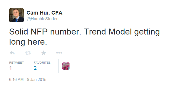
...and went long on Friday:
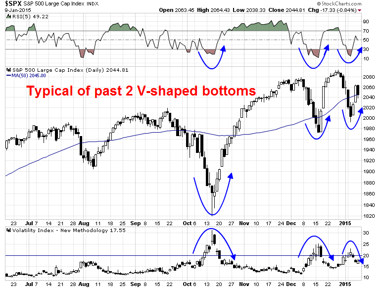
Tactically, the SPX is behaving much in the same way as it did in the last two V-shaped bottoms. The 5-day RSI moved from an oversold reading to neutral (top panel) and the VIX Index moved from above 20, which is an oversold reading, to below (bottom panel). As the market closed on Friday, the index is sitting right at its 50 day moving average, which should act as support for a rally to test new highs in the next week or two.
In addition, I am seeing a reliable tactical buy signal from the VIX term structure, which is shown by the vertical lines in the chart below. In the past two years, whenever the term structure has inverted and the VIX-VXV ratio falls below 1.0 and then further falls below 0.92, that has been a very consistent buy signal with little downside.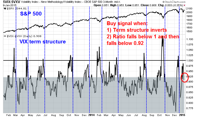
Steve Burns summed up the short-term technical picture perfectly this way:
SPY broke out above the 50 day sma on Thursday: In the past 4 years after SPY crossed over the 50 day, 5 days later there were 21 wins/8 losses Average win 1.6% average loss -1.33%.
SPY bounced and regained the 50 day by the end of day on Friday...
It is normal the majority of the time for price to pull back to a major moving average at least once before a new trend takes off.
In addition, the CNN Fear and Greed Index is tilted towards a fear reading, indicating that downside risk is relatively low.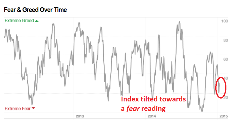
As Earnings Season kicks off this coming week, I would expect the market to respond positively to better corporate guidance from lower energy prices, both in the form of lower input costs and higher consumer spending. Currently, forward estimates are falling largely because the negatives of lower oil prices are obvious, but the benefits are more diffuse.
Worrisome signs of a top
Even though a bear market is not part of my base case scenario, good investors should always be aware of the risks to their forecasts and understand what could go wrong. It is with that in mind that I would like to explore a bear case scenario for US stocks in 2015.
From a technical viewpoint, the most worrisome sign for US equities are signs of diminishing momentum. The chart below shows the 20 year monthly history of the Wilshire 5000 with the MACD histogram in the bottom panel. In the last 20 years, there have been four times when the monthly MACD histogram has dipped into negative territory. Three of those instances have marked the start of a bear phase for the stock market.
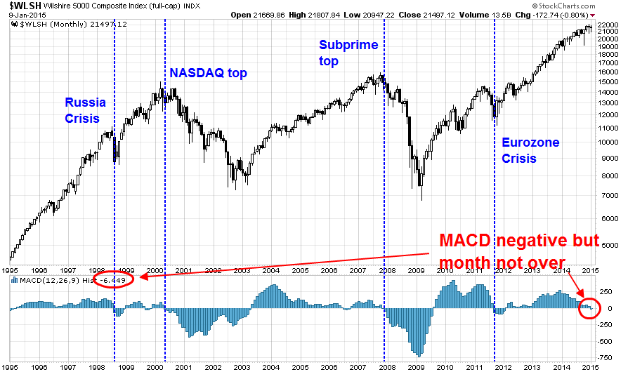
While the month isn't over yet, MACD is marginally negative for the Wilshire 5000. Is this a warning sign that a bear phase may be about to start?
Here is my interpretation: MACD is a momentum indicator. When it dips into negative territory, it indicates a loss of price momentum. In plain English, risk appetite is waning - and that`s a red flag.
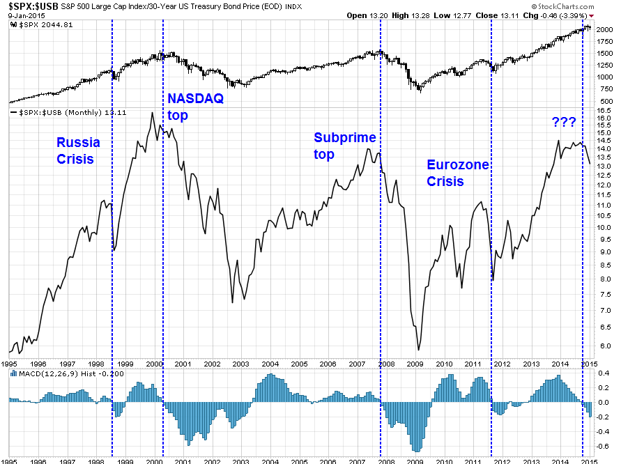
As confirmation of this investment theme, the chart below shows the SPX to US long Treasury bond price ratio as a measure of risk appetite. When the ratio (middle panel) is rising, stocks are outperforming bonds, indicating rising risk appetite; and when it is falling, the reverse is true. As the bottom panel of this chart shows, MACD already turned negative in late 2014.
Another way of thinking about the loss of momentum for economically sensitive assets is to look at the oil to gold ratio. Both oil and gold are commodities and therefore have inflation protection qualities, but oil is more sensitive to global growth. The chart below shows the oil to gold ratio (in grey) compared to the SPX to long Treasury bond price ratio (in green). These two ratios have been correlated to each other in the last 20 years. What does the plunge in the oil to gold ratio telling us? Is this just a special case of excess supply of oil, or is the drop also indicative of slowing global demand, which would negatively affect the growth outlook?
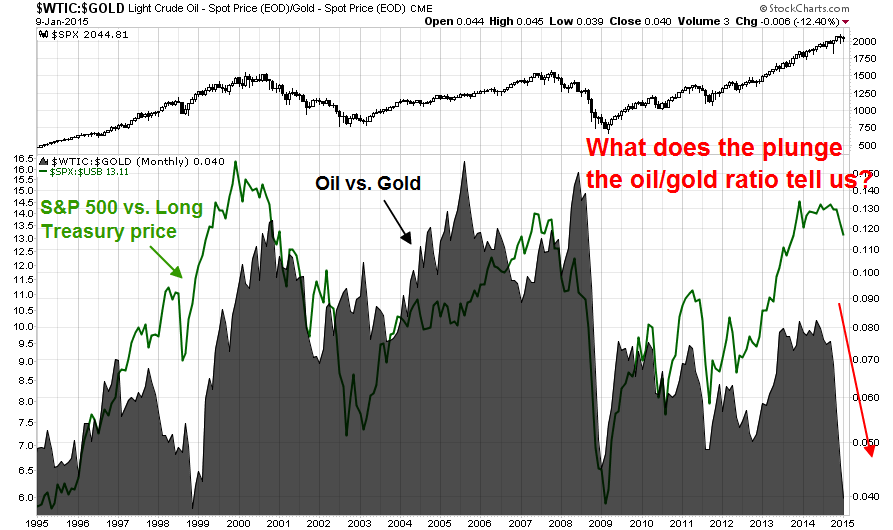
The above chart suggests that the fall in oil is attributable to more than just supply issues. James Hamilton ran a regression of WTI to copper, USD and 10-Year bond yield. He concluded:
That is, of the $55 drop in the price of oil since the start of July, about $24, or 44%, seems attributable to broader demand factors rather than anything specific happening to the oil market. That’s almost the same percentage as when I performed the calculation using data that we had available a month ago.
So what’s been happening on the supply side of oil markets is important. But so is what’s been happening on the demand side.
Mark Hulbert recently wrote a column warning that risk appetite is at excessive levels that puts the stock market at risk:
The risk of a major bear market in stocks is now higher than it’s been in years.
That, at least, is the message of an indicator that keys off the amount of risk incurred by the top-performing advisers. On average, the top 10 finishers in the 2014 Hulbert Financial Digest performance scoreboard recommended portfolios that were more than three times riskier than the stock market itself.
That is one of the highest levels to have emerged from the Hulbert Financial Digest’s more than three decades of performance tracking. In calendar 2011, in contrast, the comparable risk level among the top 10 finishers was less than a quarter as much. It’s been growing more or less steadily ever since.
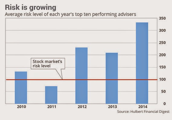
What makes this trend so alarming is that the stock market has been near a major top whenever the top performers’ risk levels were at or close to current levels. In 2006, for example, the last calendar year prior to the 2007-2009 bear market, it rose to slightly higher than current levels: 3.85 times riskier than the market versus last year's 3.32 times.
In 1999, the last calendar year prior to the bursting of the dot.com bubble, the comparable level was 2.58.
In other words, top advisers have to take on more and more risk to outperform and be in the top 10. That works, as long as you are in a bull market, but current levels are historically excessive, indicating market euphoria.
Bottom line: These indicators are telling a story of waning risk appetite and possibly falling global growth, which could be negative for stock prices.
What causes a bear market?
While I use a lot of technical tools, I am not an investor who only reads the charts without regard to fundamentals. Despite the warnings sounded by the charts that I have shown, the case for a significant bear market needs fundamental support in the form of a credible bearish scenario.
I outline the causes for bear markets, from the most serious to the least serious from a market impact viewpoint, which is an enhancement of David Rosenberg's list:
- Recession: Recessions cause earnings growth to fall and stock prices to tank..
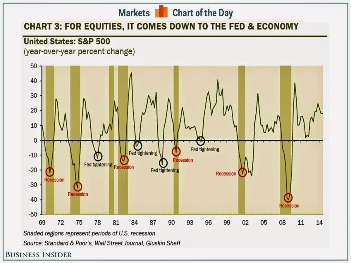
- Tight money: Past examples occurred in 1982, when the Fed tightness engineered a recession to cool off inflationary expectations, 1987, when the Fed tightened into a market crash, and 2000, when the Fed started to withdraw liquidity after flooding the system with money in anticipation of Y2K.
- Financial crisis: Think Russia Crisis (1998), which was a sharp but brief bear, and Subprime/Lehman (2007-2008), which led to a global recession (see 1).
We also have to consider two factors that exacerbate the magnitude of bear markets. Those are the presence of excessive leverage and high valuation. The NASDAQ bubble that ended in 2000 was financed mainly by equity with little leverage and therefore the ensuing economic damage was relatively contained. By contrast, the 2008 downturn was financed by excessive leverage caused by real estate speculation. That result was a global financial crisis that the world is still trying to recover from, seven years later.
Similarly, unreal market valuations can cause a minor market crack to cascade into a major bear market. In 1987, the Fed tightened into a market crash. In 2000, the withdrawal of Y2K liquidity may have been the spark that ended the NASDAQ bubble.
No recession in sight
Fortunately, we can rule out the possibility of a recession. New Deal Democrat has done excellent work in this area. In addition, Jeff Miller watches a number of pundits and indicators, none of which are showing a recession risk. The US economy remains in the mid-cycle phase of an expansion.
Tight money: It`s all about earnings growth
Tight money, which is one of Rosenberg's causes of bear markets, is a concern as the Fed prepares to hike interest rates in mid-2015. In the past, however, the first rate hike has not sparked bear markets as the negative effects of rising interest rates have been offset by the positive effects of an acceleration in economic growth.
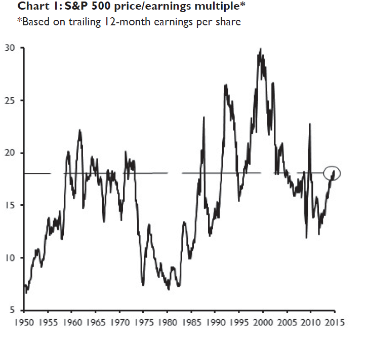
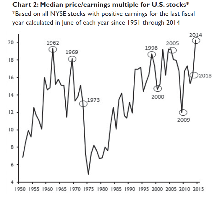
In the current instance, the market cannot expect much downside support from valuation. Multiples are elevated, though not stupidly high as they were in 1987 or 2000. However, James Paulsen of Wells Capital Management makes a case that valuations are dangerously high. Here is the chart of trailing PE, which shows my interpretation that market valuations are elevated but not excessive:
Instead of analyzing the capitalization weighted PE ratio, Paulsen showed that the median PE of US stocks is at a record level:
The median PB ratio is also highly stretched:
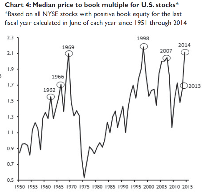
Unlike the Tech Bubble, where the excessive valuation was concentrated in only a few sectors, Paulsen warned that stock are expensive across the board, which is a more insidious form of over-valuation:
Is the current widespread valuation extreme more dangerous than a concentrated extreme simply because concentrated extremes tend to be more obvious and eye-catching? A concentrated valuation extreme tends to loudly announce itself whereas a broad-based valuation extreme seems more stealth and, therefore, perhaps more dangerous.
Paulsen's analysis of historically high PE ratios is confirmed by Goldman Sachs, who analyzed forward PE ratios instead of trailing PEs. The team at Goldman Sachs indicated that current SPX forward PE of 16.7 is high by historical standards, but the median forward PE of 17.6 is even higher as it in the top 2% of history from 1976.
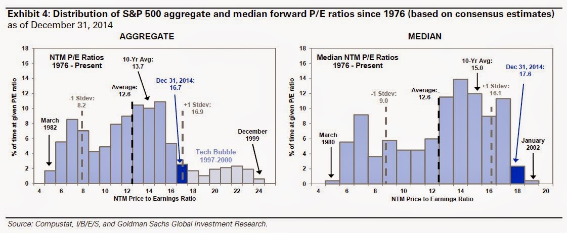
I would temper those alarmist remarks by pointing out that both inflation and interest rates are very low compared to the study period shown by Paulsen and Goldman Sachs. While market multiples aren`t low by historical standards, stocks can continue to rise as long as earnings continue to rise. The analysis from Wells Capital Management showed that the market was expensive in 2005 across the board as well, but the market did not peak several years later. The grey bars depict the PE valuation percentiles (a low percentile is expensive compared to its own history) in 2005 and the black bars in 2014.
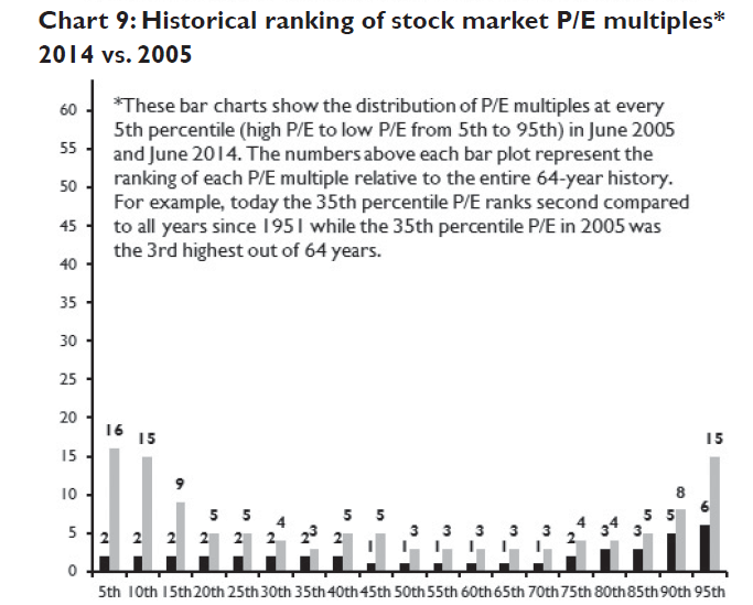
Here is Paulsen`s caveat:
The 2005 stock market also exhibited excessive valuations across all P/E percentiles. However, the stock market did not suffer any major decline until almost three years later (and from higher levels) in 2008.
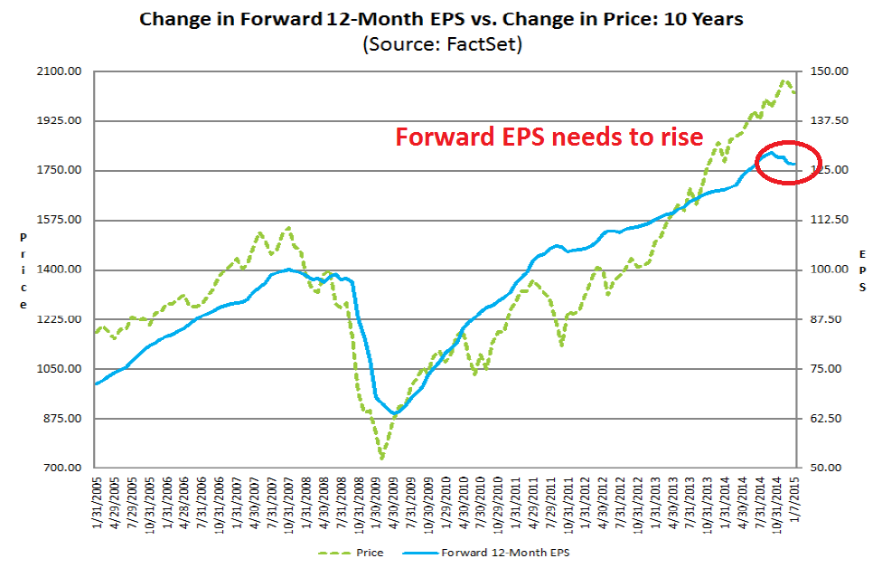
In the end, earnings matter as much as PE multiples. I am therefore watching carefully how forward EPS estimates change in the near future. This chart from John Butters at Factset (annotations in red are mine) show that past pauses in EPS growth have coincided with either corrections or bear markets. I believe that forward EPS should get revised upwards soon because of the boost from lower oil prices, but we need to see how that evolves as I am cognizant of the fact that US large caps are vulnerable to the negative effects of a rising USD (see my recent post Focus on small caps in 2015):
Financial dislocation: Always a wildcard
The third cause of a bear market has been a financial dislocation somewhere in the world sparking a financial crisis. Not all financial crisis spread and cause bear markets. For example, the market shrugged off the Dubai default of 2010, which occurred during a period when the financial system was still frail from the Lehman Crisis of 2008.
The most likely sources of financial crisis and contagion are China and Europe. China has always been a wildcard, largely because its economy is so opaque. I believe that China risks are relatively low in the medium term as the current regime has undertaken to enact reforms. Should the Chinese economy really tank, Beijing have also shown the flexibility to stimulate and kick the can down the road. That strategy works as long as the road is long - and it seems to be at the moment.
The bigger risk of financial crisis and contagion comes from Europe, but the source is not as obvious as the headlines show. While the Greece-Germany-ECB tug of war will continue to be a source of drama for months to come, it is the usual European theatre and noise that can be safely ignored. The parents fight and the kids hear everything, but in the end they still want to stay married.
The biggest source of worry is the British election scheduled in May. As I pointed out before (see 2015: Bullish skies with periods of volatility), that election has the potential to shatter the British social compact and render the UK ungovernable. Here is the warning from Anatole Kaletsky (emphasis added):
Britain could become literally ungovernable after the election, with no single party or coalition of parties able to form a majority government. Current public opinion polls predict that neither the Conservatives nor the Labour Party will win enough seats to form a majority government — even in a coalition with Liberal Democrats.
Conservative-Liberal and Labour-Liberal majorities may both prove arithmetically impossible because of the rise of previously insignificant fringe parties. The Scottish Nationalists look able to boost their six seats in Parliament to anything between 20 and 50, largely at Labour’s expense. The United Kingdom Independence Party is threatening dozens of Conservative incumbents. Meanwhile, the Liberals are almost certain to lose about half their 56-seat representation. As a result, a ruling coalition may have to include not just two parties but three or four, including fringe nationalist groups.
The Scottish National Party is sure to demand another Scottish independence referendum as its price for supporting a coalition, while the UK Independent Party will likely insist on Britain’s withdrawal from the European Union. It is hard to imagine either Labour or Conservatives agreeing to such terms.
This means that a government may have to be formed without a majority in Parliament. While minority governments are quite common in continental Europe, the British Parliament has only once failed to produce a government majority — during a brief interlude in 1974 under Harold Wilson. It created seismic upheavals in Britain’s adversarial politics.
The presence of fringe parties like the Scottish National Party or UKIP in the government will raise the specter of another Scottish referendum, or worse, the risk of Brexit from the EU. While the political commitment of the European elite is very much pro-Europe, there is no such consensus from the British.
The mere whiff of the possibility of Brexit would put into question of not just the euro, but the European Union. Such political instability in a major trading bloc would raise risk premiums around the world. Moreover, this scenario is not on the radar screen of most market analysts and strategists and would be a major shock to the financial system.
Should such a scenario unfold, the good news is that the bear market is likely to be short and sharp, much like the Russia and LTCM Crisis or the Crash of 1987, rather than long and drawn out like a recessionary bear market like 1980-82. For buy-and-hold investors who can keep their nerve and maintain their investment, that would be good news. It means that if you blink and ignore the downturn, you would barely feel its effects.
My inner investor and trader diverge
In light of this analysis, my inner investor is more cautious than he has been in the past. He has moved back from his aggressive position from an overweight position in equities to a more balanced portfolio between stocks and bonds. He is watching forward EPS estimates carefully as Earnings Seasons progresses to see if there is earnings support for US equities. In addition, he is monitoring the polls in Greece and the UK to see how the political situation develops in Europe over the next few months.
By contrast, my inner trader is seeing numerous technical signs that the brief market hiccup is over. He has covered his shorts and gone long the market, but with tight stops.
Disclosure: Long SPXL, TNA . Cam Hui is a portfolio manager at Qwest Investment Fund Management Ltd. ("Qwest"). This article is prepared by Mr. Hui as an outside business activity. As such, Qwest does not review or approve materials presented herein. The opinions and any recommendations expressed in this blog are those of the author and do not reflect the opinions or recommendations of Qwest. None of the information or opinions expressed in this blog constitutes a solicitation for the purchase or sale of any security or other instrument. Nothing in this article constitutes investment advice and any recommendations that may be contained herein have not been based upon a consideration of the investment objectives, financial situation or particular needs of any specific recipient. Any purchase or sale activity in any securities or other instrument should be based upon your own analysis and conclusions. Past performance is not indicative of future results. Either Qwest or Mr. Hui may hold or control long or short positions in the securities or instruments mentioned.
