Disbursement. And disbursement leads to concentration. Eb and flow. Yin and yang. You can’t breathe in without at some point also breathing out. Sometimes we take a very deep breath, and we may even hold it for a period of time, but there is no chance we don’t breathe out again. Not doing so leads to unfortunate outcomes.
With that in mind, let’s look at the latest deep, deep breaths in financial markets.
As much as I loathe them, a recent report from the criminal class, specifically, JPMorgan, where they’ve highlighted some of the issues.
Key Takeaways
- The recent rise in stock market concentration has been the steepest in 60 years, with just a few stocks driving most of the returns.
- Today, the top 10 stocks by market cap account for approximately 29.4% of the overall equities market.
- Historically, a steep rise in stock market concentration has always reversed, with the Invesco S&P 500 equal-weighted index outperforming the market cap-weighted index.
The stock market has experienced its steepest concentration rise in 60 years, with a small number of stocks driving most returns (Nvidia (NASDAQ:NVDA) ring a bell?).
This trend is a not an entirely surprising byproduct of the massive migration from "active" to "passive" funds since the 2008 crisis, which has further been amplified with the rapid shift from a zero-interest-rate policy (ZIRP) to "higher-for-longer." A recent piece from JPMorgan notes:
Sharply higher rates and a slower growth outlook have resulted in an outflow from long-duration and cyclical assets. Mega-cap companies have been beneficiaries of this market rotation, as they offer attractive liquidity, sustainable growth, and much stronger pricing power,
This shift has led to a significant divergence in index weight concentration between mega-cap stocks and the next tier of large caps. Currently, the top 10 US stocks by market cap in S&P 500 make up almost 30% of the total equities market.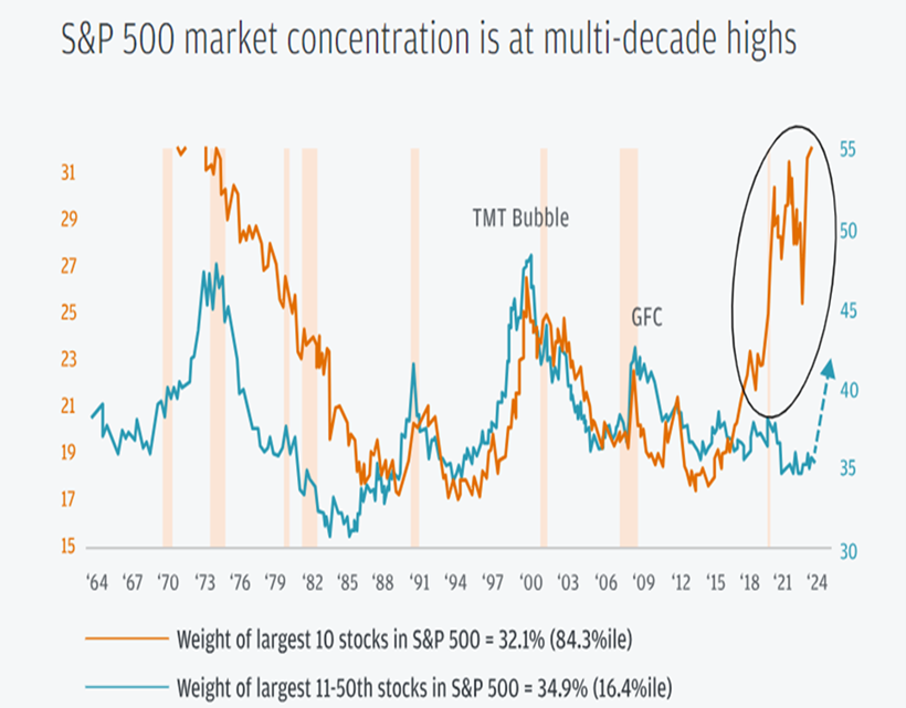
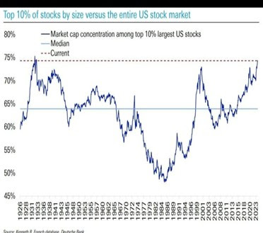
Here is the same sort of thing, but from a slightly different perspective and a much longer time frame:
We decided to have a little fun and put a few charts together to demonstrate how hard it has been to make money if you were not invested in a few large-cap tech stocks (let’s call them the Magnificent 7 and friends).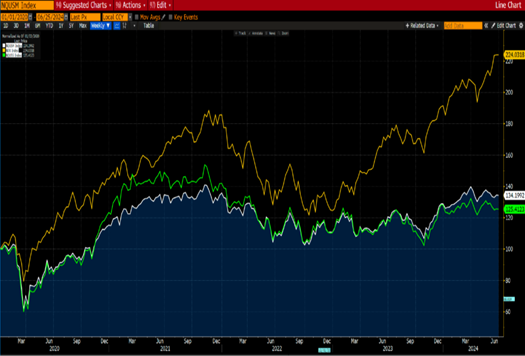
Nasdaq 100 (yellow), Nasdaq Mid Cap Index (white), Nasdaq Small Cap (green) all indexed
Now, here is a twist. There are more industrial stocks listed on the Nasdaq than technology stocks. In fact, there are more financial stocks as well.
Let’s take small-cap tech stocks on the Nasdaq:
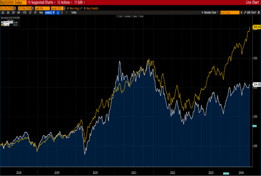
Nasdaq Small Cap Tech Index (white) and Nasdaq 100 (yellow)
They tracked each other and then this all broke down towards the start of 2023. So even if you had randomly chosen a basket of 30 tech stocks on the Nasdaq at the beginning of 2022, you would be losing money today!
We think it is fair to say that the average stock listed on the Nasdaq has been in a bear market since late 2022.
Now, here is something of interest. Perhaps it is just coincidental or there is something else going on. Seems to us that there is a relationship between the cost of capital (interest rates) rising and the average stock not underperforming, as per the Value Line Index below (being an equally weighted index of 1,600 stocks in the US).
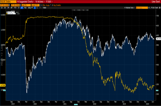
Value Line Geometric Index (white) vs US 2-year yield Inverted (yellow)
Note the inversion of the 2-year yield (scale on the left-hand side).
Could we go so far as to say that if interest rates continue to rise, it will be a struggle for stocks in general? For sure. You are going to have to be rather discerning at the stocks you invest in.
It’s probably a good time to remind you of the chart we shared a few weeks ago.
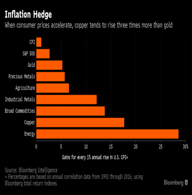
We think that eventually even the "Mag 7" will feel the effects of the gravitational pull of rising cost of capital (interest rates). Mean reversion is one of the most powerful forces in the investment universe.
And we revert back to that classic Kiwi saying: good things take time.
Inflation
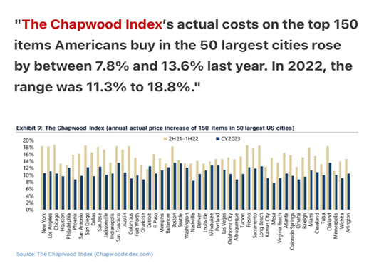
If you want to know why that is, just consider what the underlying problem here is. It isn’t that the cost of all of these goods magically suddenly rises. Sure, we have cycles, but is that all there is to it?
No. What happens mostly is that the value of the underlying currency keeps falling.
It is the same thing with buying a house. Your house doesn’t get better. In fact, it gets older and needs repair and maintenance. So how is it that it "goes up in price?" It doesn’t. The shitty currency just falls.
Consider it from the standpoint of a meme coin:
- 34 trillion supply
- No supply cap
- 1 node
- 25% of supply minted in the last 6 months
- 1% of holders own 30%
- Backed by the U.S. government who are backed into a debt corner
Yeah, no thanks. I’ll take the "stuff" myself.
