Some stock sectors thrive when an economic recovery gains traction. Industrials tend to perform well due to increases in the demand for capital goods. In a similar vein, consumer discretionary companies spike alongside improvements in employment data, where people spend more of the money they make.
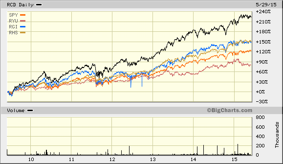
One can visualize the above-described outperformance of cyclical sectors by charting corresponding ETFs over the initial six years of the current economic recovery. The Guggenheim S&P 500® Equal Weight Consumer Discretionary ETF (N:RCD) as well as the Guggenheim S&P 500® Equal Weight Industrials ETF (N:RGI) outhustled the S&P 500 SPDR Trust (N:SPY). The cyclical segments also performed better than (or the same as) non-cyclical sector ETFs like Guggenheim S&P 500® Equal Weight Consumer Staples (N:RHS) and Guggenheim S&P 500® Equal Weight Utilities (N:RYU).
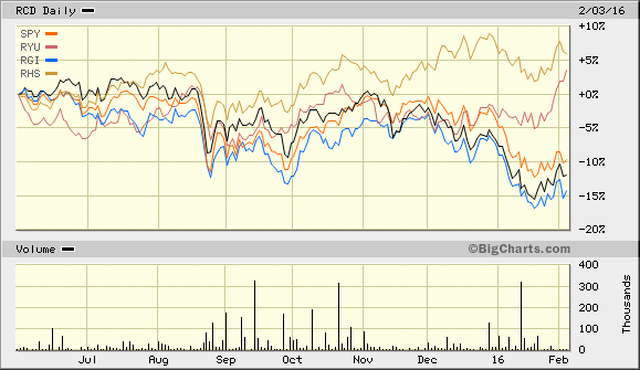
When an economy loses steam, however, non-cyclical segments like utilities and consumer staples provide better risk-adjusted results. Since June of 2015, both of these sectors – staples and utilities – provided late-stage bull market gains as well as relative safety. Industrials and consumer discretionary have not; the S&P 500 SPDR Trust (SPY) has not.
How might you have anticipated a slowdown in the business cycle back in June of 2015? Market internals.
In my June 2, 2015 commentary, Tactical Asset Allocation Changes? Track This Exchange’s Advance-Decline (A/D) Line, I wrote: “Since late April, the number of declining stocks have started to put pressure on the number of advancing stocks.” In my July 28 article, Remember July 2011? The Stock Market’s Advance-Decline Remembers, I explained that more individual securities were losing ground than gaining it; indeed, market breadth was rapidly deteriorating such that there were more underachievers than overachievers. And prior to the meltdown in mid-August, I suggested that waning economic data, exorbitant valuations and crumbling market internals meant that we had likely witnessed an intermediate-term market top.
Market internals can tell us about the demand (or lack thereof) for different stocks, sectors, styles and sizes. The same holds true for asset types, including investment grade bonds, cross-over corporates and high yield bonds. There are volume indicators as well as under-the-hood analyses for the percentage of issues in uptrends.
That said, the most widely used tool remains the A/D line. When a market-cap weighted index like the S&P 500 is appreciating in value or holding its own, yet the A/D line is sloping downwards, the lack of breadth in the benchmark’s rally often forewarns the benchmark’s breakdown.
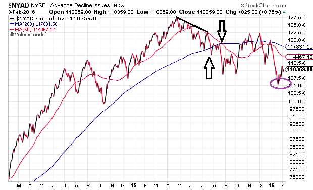
Stepping back in time a bit, the New York Stock Exchange Advance-Decline (A/D) Line peaked in late April of 2015. The A/D Line hit a series of “lower highs” for roughly three months, before falling below its 200-day trendline in July. That had not happened in four long years. (In July of 2011, the A/D Line broke below its 200-day prior to the worst of the euro-zone crisis.) By August of 2015, the A/D Line’s 50-day moving average had dropped below its 200-day moving average – a bearish event in chart-land known as a “death cross.” Incidentally, the 50-day still remains below its 200-day.
Some dismiss market internals faster than Ted Ginn Jr. running a 40-yard dash. They have the right to do so. On the other hand, investors using tools like the A/D Line wisely began reducing their equity exposure prior to the tech wreck of 3/2000-10/2002. They did the same before the financial collapse of 10/2007-3/2009.
Consider the chart below. A downward sloping NYSE Advance Decline (A/D) Line preceded the dot-com disaster as well as the banking catastrophe. Equally impressive, an upward sloping A/D Line preceded the phenomenal bull market recoveries.
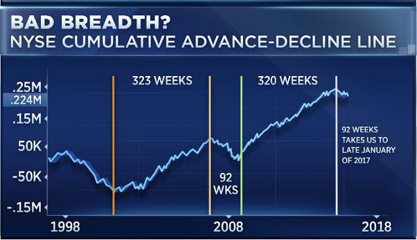
It has been roughly 40 weeks since the A/D Line peaked in late of April of last year. If history were to repeat itself, we would not see the end of the current stock market malaise – a period that began with the S&P 500’s all-time record of 2130 last May – until the tail end of January 2017. Worse yet, if history were to repeat itself, we would see yet another 50%-plus stock bear.
To be clear, history is not likely to repeat itself, but it is likely to rhyme. A defensive asset allocation makes sense when a deterioration in market internals combines with economic weakness and fundamental overvaluation.
Since June of last year, moderate growth and income clients at Pacific Park Financial, Inc. have seen their 65%-70% equity stake reduced to 45%-50%. Moreover, the holdings themselves have been more defensive in nature, with allocations to less volatile large-caps like iShares MSCI USA Quality Factor (N:QUAL), iShares USA Minimum Volatility (N:USMV) and Vanguard High Dividend (N:VYM). We reduced the 30%-35% bond stake to 20%-25%, where we focused exclusively on credit quality in intermediate-term treasury bonds and municipal bonds.
The tactical asset allocation shift has resulted in a 25%-30% cash/cash equivalent stake. The preservation component will be reallocated to riskier assets when market internals, valuations and/or the economy demonstrate substantive improvement.
Perhaps unfortunately, the economy does not seem to be doing its part. The Institute for Supply Management reported that its index tracking non-manufacturing/services hit a two-year low; meanwhile, manufacturing has already contracted for 4 consecutive months. And loan demand? Commercial and industrial loans across all business sizes have plummeted in the current quarter.
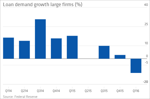
Recall that Federal Reserve leaders have admitted to front-loading an enormous stock and real estate rally with zero percent rate policy (ZIRP) and quantitative easing (QE). What’s more, monetary policy authorities actually believed that they might extricate themselves from stoking the risk-taking fires through exceptionally gradual hikes in the cost of borrowing. Yet when you stimulate risky behavior on the front side, seemingly modest shifts toward stimulus removal on the back side can adversely impact everything from currencies to commodities, sovereign credit to corporate credit, equity prices to equity valuation.
Going forward, then, what potential scenarios might arise? One, the economy does not materially worsen in 2016 where sub-par growth keeps the Fed on hold and corporate earnings growth stabilizes, as opposed to declines. Here one might justify paying a 20% premium Forward P/E of 15.5 for near-zero interest rates (rather than 3.5%-4% T-bills), or approximately 1900 on the S&P 500. This scenario represents -7.0% on the year for the heralded index.
A more upbeat near-term possibility for risk takers? The Fed wastes no time in introducing a version of QE4 and/or zero percent interest rates or even negative rate policy. The economy gets a 1-2 year jolt, earnings growth recovers handsomely, and Forward P/Es of 17 are viewed as quite reasonable once again. The S&P 500 ends its corrective activity and sets new record highs between 2200 and 2250.
This is not to suggest that endless stimulus from central bankers is the answer to corporate, consumer and investor prayers. Rather, it is a simple acknowledgment that the Fed might be able to front-load another risk-on rally for stocks and real estate.
Of course, there is a gloomier possibility as well. The economy materially worsens, a domestic recession emerges, earnings contraction intensifies and the Fed (as well as Congress/White House) are seen as having responded too slowly. Low rates alone no longer justify P/E premiums; rather, a median 35-year Forward P/E of 13 might allow the S&P 500 to cling to the 1500 level. This scenario translates into -26.5% for the S&P 500 in 2016.
(If you’re leaning toward the gloomier possibility, you might want to consider multi-asset stock hedging. Here is a chart of the performance of the FTSE Multi-Asset Stock Hedge Index (MASH) since the recent Fed rate hike.)
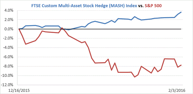
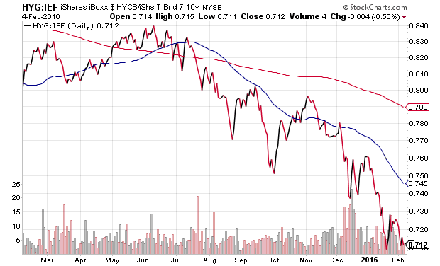
Notice that, absent an extraordinary reversal by the front-loaders of stock and real estate rallies, I am not anticipating an upbeat risk-reward year. The economic, fundamental, technical and central bank headwinds favor maintaining a less risky allocation than I might otherwise advocate. Nevertheless, when market internals like the NYSE Advance-Decline (A/D) Line and key credit spreads begin painting a prettier picture, I expect to put sidelined cash back to work.
Disclosure: Gary Gordon, MS, CFP is the president of Pacific Park Financial, Inc., a Registered Investment Adviser with the SEC. Gary Gordon, Pacific Park Financial, Inc, and/or its clients may hold positions in the ETFs, mutual funds, and/or any investment asset mentioned above. The commentary does not constitute individualized investment advice. The opinions offered herein are not personalized recommendations to buy, sell or hold securities. At times, issuers of exchange-traded products compensate Pacific Park Financial, Inc. or its subsidiaries for advertising at the ETF Expert web site. ETF Expert content is created independently of any advertising relationships.
