A weaker-than-expected headline Consumer Price Index (CPI) print didn’t provide the PMs with much stimulation, as gold rallied by 0.08%, silver by 1.27%, the GDX ETF by 0.71% and the GDXJ ETF by 0.12%.
In contrast, the Nasdaq and the S&P 500 rallied by more than 2%. Moreover, with the US Dollar Index declining by 1.10% and U.S. Treasury yields also dropping, the PMs’ relative weakness is profoundly bearish.
Gold Left Out in the Cold
With the CPI coming in cold, jubilation overwhelmed the financial markets, as the S&P 500 and risk-on currencies surged. However, with gold, silver, and mining stocks underperforming, the PMs were largely forgotten during the bullish feeding frenzy.
Moreover, while the consensus celebrates the inflation deceleration, I warned before the opening bell that a slowdown was likely. I wrote:
With investors eagerly awaiting the release of the CPI, the results could sway short-term sentiment. Moreover, while the headline CPI is expected to show a year-over-year (YoY) deceleration – due to the decline in oil and gas prices – the economic pain required to reduce the metric to 2% is materially underestimated by the consensus.
Therefore, while investors may take a glass-half-full approach when analyzing the data, the medium-term implications of eliminating inflation should weigh heavily on gold, silver, and mining stocks.
To that point, with lower oil and gas prices as the main culprits, the medium-term roadmap continues to unfold as expected.
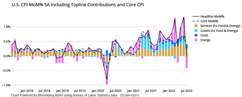
To explain, the black line above tracks the month-over-month (MoM) percentage change in the headline CPI, while the colored bars above represent the various components' contributions. If you analyze the right side of the chart, you can see that energy (the purple bar) was the only component to decline MoM in July. As a result, the print didn't reveal anything that we didn't expect.
Likewise, the idea of "peak inflation" is much more semblance than substance. For example, there is a misnomer in the financial markets that the battle is won when inflation stops going up. However, the reality is that reducing inflation to 2% is much more difficult than reducing the pace of the increases. As such, the consensus drastically underestimates the amount of economic pain that's required to achieve true normalization.
In addition, the core CPI increased by 0.31% MoM in July, so inflation is still increasing despite the energy respite. More importantly, investors celebrated an event that occurred several times in the 1970s and1980s, in June 2021 and in March 2022.
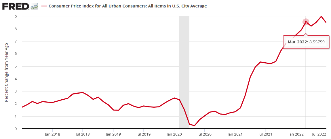
To explain, the red line above tracks the YoY percentage change in the headline CPI. Remember when “peak inflation” was initially present in March? Likewise, the headline CPI also decelerated from June to August 2021 before increasing once again.
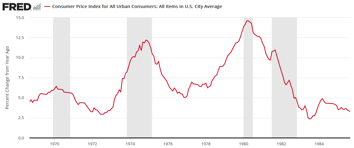
Furthermore, the “peak inflation” crowd also enjoyed plenty of premature celebrations in the 1970s and 1980s.
To explain, the red line above also tracks the YoY percentage change in the headline CPI, and the gray vertical bars represent recessions. Moreover, notice how plenty of short-term decelerations (declines or pauses in the red line) were present. Even during the largely uninterrupted surge from 1978 to 1980, the YoY percentage change in the headline CPI declined or flatlined twice along the way. Therefore, while sentiment rules the day in the short term, the crowd is overly-optimistic about how this all ends.
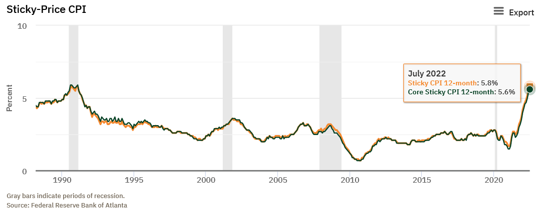
As further evidence, the Atlanta Fed’s Sticky CPIs hit new 2022 highs.
The orange and green lines above track the YoY percentage changes in the Sticky and core Sticky (excluding food and energy) CPIs. If you analyze the right side of the chart, you can see that neither decelerated in July. For context, the Atlanta Fed defines the metrics as:
“The Sticky CPI is calculated from a subset of goods and services included in the CPI that change price relatively infrequently. Because these goods and services change price relatively infrequently, they are thought to incorporate expectations about future inflation to a greater degree than prices that change on a more frequent basis. One possible explanation for sticky prices could be the costs firms incur when changing price.”
Moreover, a report by Atlanta and Cleveland Fed researchers came to the same conclusion. An excerpt read:
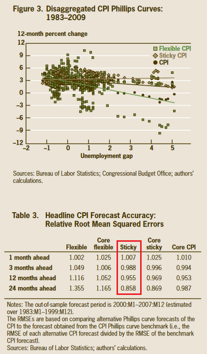
“We are interested in whether changes in the flexible CPI or sticky CPI improve the forecast of headline inflation at various numbers of months into the future…. We find that forecasts of the headline CPI that are based on the sticky-price data tend to be more accurate than the forecasts based on headline inflation. Further, CPI predictions using sticky-price data perform pretty well relative to CPI forecasts using core CPI data. We also find that the relative accuracy of the sticky-price Phillips curve increases as the forecast horizon gets longer.”
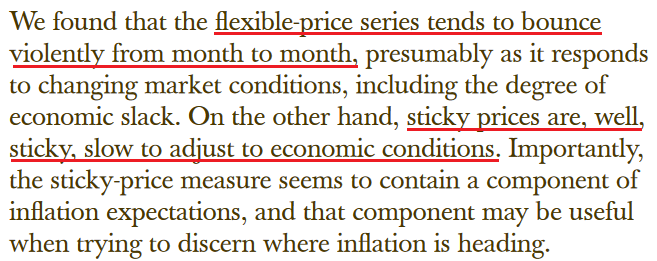
The chart and the red box above show how the Sticky CPI has the smallest forecasting error when attempting to predict the future direction of the headline CPI. Therefore, with the metric hitting a new 2022 high in July, investors' optimism contrasts with the “sticky” realities. To that point, the researchers concluded:
Source: Atlanta/Cleveland Fed
Thus, while volatility in the energy markets made the headline CPI look more attractive to the “soft landing” crowd, the Sticky CPI provides important clues about how embedded inflation is in the U.S. economy.
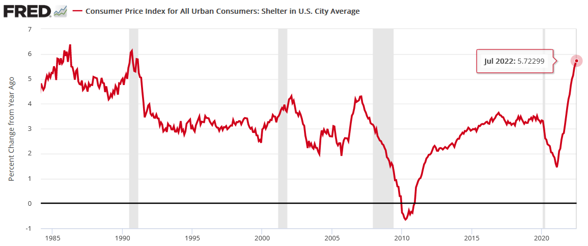
Continuing the theme, I’ve long warned that rent inflation would prove problematic for the headline CPI. Moreover, with the Shelter CPI hitting a new 2022 high, it’s another indicator of why the Fed’s war with inflation will be one of attrition.
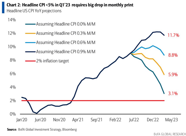
Finally, while the inflation pause was met with applause, the headline CPI could repeat the feat for another eight months and still be 1.1% above the Fed’s 2% target in March 2023.
To explain, the various lines above track the trajectory of the YoY percentage change in the headline CPI, assuming different MoM scenarios. If you analyze the teal line, you can see that a flat headline CPI for the next eight months would put the headline CPI at 3.1% YoY in March 2023.
However, with the sticky inflation components still increasing, that forecast would require energy prices to decelerate MoM for the next eight months. Conversely, the light blue and gold lines are more reflective of fundamental reality. Under those scenarios, 0.3% to 0.6% MoM increases would put the headline CPI at 5.9% YoY and 8.8% YoY in March 2023.
Thus, those front-running a potential dovish pivot don’t realize that material deflation is needed to reach the Fed’s 2% target anytime soon; and with the Sticky CPI hitting a new 2022 high, does it seem like we’re near that point?
Fed Not Impressed
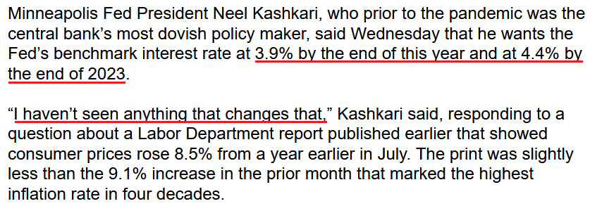
While investors clamor for the next round of QE, Fed officials poured cold water on that notion on Aug. 10. For example, Minneapolis Fed President Neel Kashkari (a reformed dove) said:
“I think a much more likely scenario is we will raise rates to some point and then we will sit there until we get convinced that inflation is well on its way back down to 2% before I would think about easing back on interest rates.”
As a result, the man “who prior to the pandemic was the central bank’s most dovish policymaker” sees the U.S. federal funds rate (FFR) moving materially higher in the months ahead.
Source: Bloomberg
Moreover, while Chicago Fed President Charles Evans welcomed the monthly pullback, he said on Aug. 10 that inflation remains “unacceptably high” and “that we will be increasing rates the rest of this year and into next year to make sure inflation gets back to our 2% objective.”
The Bottom Line
While the headline CPI retreated in July, the impact of lower oil and gas prices was far from unexpected. Moreover, while stock investors went all in, the PMs underperformed, and the GDXJ ETF gave up nearly all of its intraday gains. In addition, the relative weakness occurred alongside a decline in U.S. Treasury yields and a sharp drop in the US Dollar Index. As such, the PMs likely understand what the stock bulls will realize in the months ahead.
In conclusion, the PMs rallied on Aug. 10; but when considering the pullback in interest rates and the U.S. dollar, their performances were relatively poor. Therefore, the medium-term backdrop is much less optimistic than the S&P 500's price action suggests.

