Since I’m near Ft. Worth, Texas right now, I thought I’d give this post an appropriate theme.
This weekend I wanted to focus on exchange traded funds (ETFs), since they are sporting some pretty interesting patterns lately. I’ll do five today and another five tomorrow.
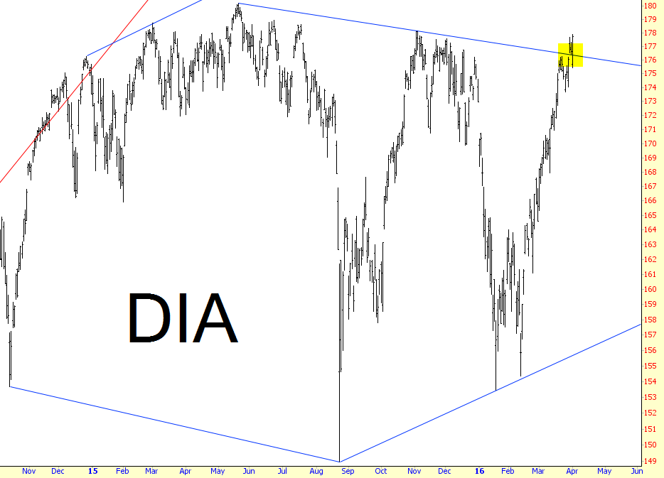
The first one of these ten is the only disappointing one to me, and that is the “diamonds”, which are based on the Dow 30 Industrials. The DIA had formed what was – and I’m using the past-tense, please note – a beautiful diamond topping pattern. I try to avoid using “rubber trendlines”, since I want my graphs to have integrity, so I’ll show you below how this pattern has been violated and is probably at this point rendered moot.
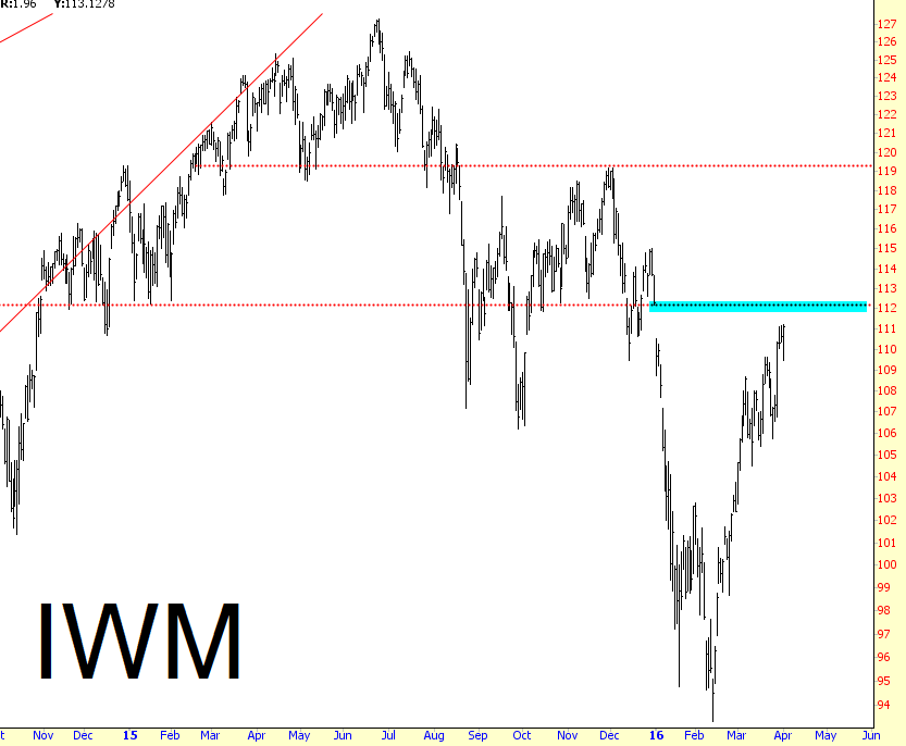
The Russell 2000, however, is still in a very exciting configuration. Unlike the Dow, it is nowhere near its lifetime high, and it has just about perfectly closed a gap, which I’ve tinted in blue.
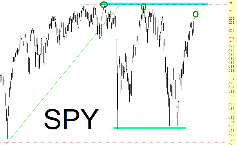
The S&P 500 (“spiders”) has been in a broad range for years now. The bottom of the range tends to be around 180, and the top of the range is around 205-210. Please note something important, though. Even though the market falls fairly consistently to the same level, its rises have been with diminishing peaks (circled below). In any event, I think we can all agree that the price is at the upper end of its range, and frankly, if the powers that be think that these countertrend rallies will provide some kind of calming salve to the public psyche, that calm gets ripped away in a big hurry when the market plunges again for the umpteenth time.
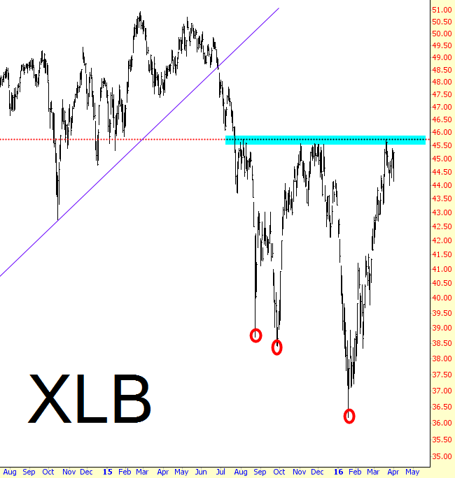
The materials ETF (NYSE:XLB) has a bit of a similar situation, since it rises to about the same level (45.50 or so) but has recently been falling with increasing gusto (red circles).
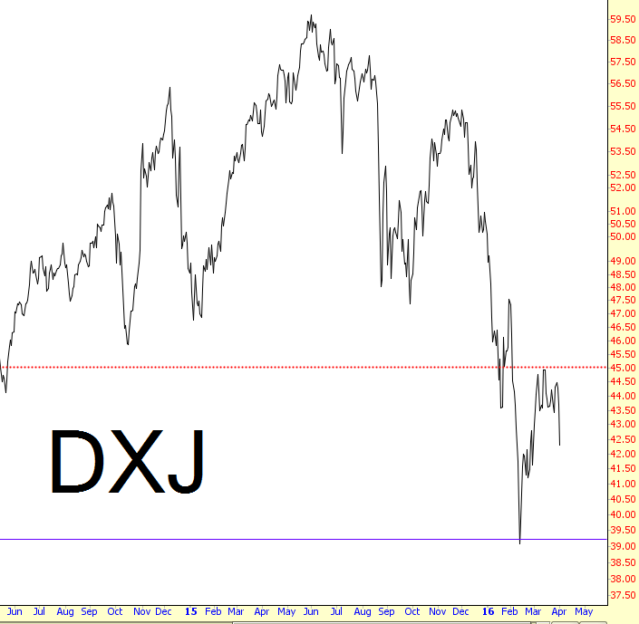
Finally, a favorite of mine, the Japanese ETF symbol NYSE:DXJ, which is a blend of both equities and the Japanese yen, has one of the cleanest-looking topping patterns out there, and its weakness on Friday exhibited that nicely.
I’ll have five more interesting charts like this tomorrow.
