“Financial bubbles tend to get more extreme over time as credit availability to fuel them expands as our incomes and wealth expand.”
That is Principle 6 from page 146 in The demographic cliff.
Add in the fact that central banks are fueling those dangerous bubbles with $14 trillion of money printing.
The presses are running…
Principle 7 states: Bubbles become so attractive that they eventually suck in even the skeptics.
This bubble is certainly proving all of these concepts and looking to pull in all the last suckers before the fabled Titanic sinks.
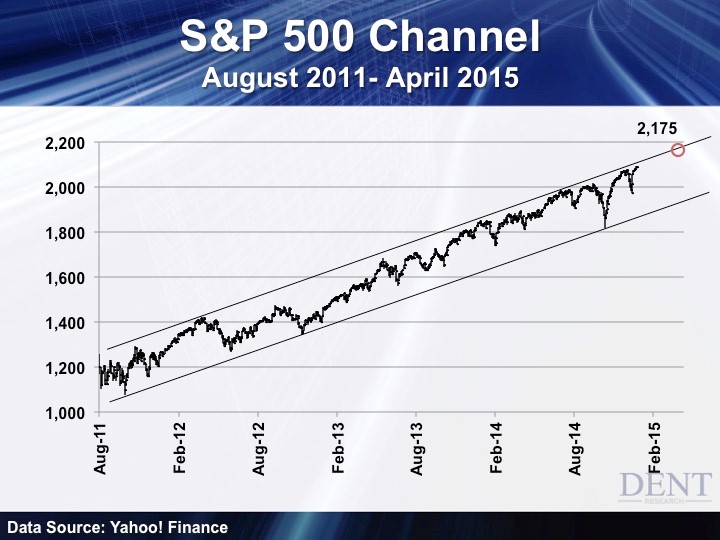
There are many charts we’ve been tracking in an attempt to anticipate when this bubble will finally peak, and make no mistake, it will. Here’s the one that is working the best thus far.

Ever since the 20% correction in this bubble market back in mid- to late 2011, the S&P 500 (and Dow) have been marching up a linear channel and leaning increasingly towards the upper side.
Note that when we have corrections like the one that just bottomed on October 15, the markets tend to rally back very sharply but then just barely edge up for months towards the top of this channel.
If the markets keep edging up and into our most likely turning point ahead, around mid-March, the S&P 500 should peak around 2,175 and the Dow around 19,000. That would imply gains of about 4% from the recent tops.
Such a target would be closely in line with the only resistance left in stocks and that’s at the all-time high and peak of 5,050 (5,133 intraday) on the Nasdaq which is 5% to 6% higher from where we are now.
If stocks break out above this channel then we could see a potential high of 2,300 on the S&P 500 and 20,000 on the Dow in a blow-off top. I see that as possible, but less likely in this increasingly precarious world of geopolitical risks and falling commodity and oil prices.
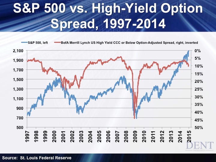
The next chart seems to be the best leading indicator and that’s an inverse of the high-yield spread above a risk-free rate. In other words, the most sensitive to risk bonds will smell trouble before stocks do because that is their focus.

This indicator gave warnings to the early 2000 top and crash by over two years, but it also presented signals much closer to the late 2007 top and crash. Take note that it also fell less sharply just ahead of that serious 20% correction in 2011.
High-yield bonds are starting to spike again (which points down in this inverse version) with falling oil prices and concerns over defaults in the fracking and energy sectors that I’ve covered in recent articles.
If this indicator keeps falling a bit, we could see another minor correction just ahead. If it turns back up that would be bullish and confirm higher prices, which seems more likely.
When it starts to turn down more sharply this bubble should be very close to over. That could occur in January, but more likely around March forward of 2015.
It looks like oil prices are fishing for a short-term bottom around $49 to $50. If it bounces for a few months, which is likely, then this indicator should move back up and stock prices could keep edging up towards 2,175 or higher on that S&P 500 channel above.
Then again, oil looks like it’s heading towards $32 in the coming months, with no support below the present level, there is heavy resistance between $75 and $80 where oil broke down out of a long channel recently.
I’ll be looking for oil to rally back towards $64 to $75 and then start heading down again as the first leading indicator. I’ll also be looking for this inverse high-yield spread to head back down more sharply as the second signal of an impending peak possibly looming on the horizon.
Oil crashes again, high-yield bond rates spike higher and stocks start to crash. That’s the most likely scenario ahead.
