by Pinchas Cohen
In yesterday’s Opening Bell, we noted a global equity high, which later also led to some record closes.
A sure confirmation of investor risk-on sentiment is sustained gains in growth assets even as safe-havens are scorned. The two most popular assets in the latter category are gold and the Japanese yen. This is not something we'd recommend banking on, of course, but it does provide additional evidence that for now the downtrend in gold—and the yen—could continue since safe-havens are widely expected to move in mirror image to equities, as they fluctuate based on investor sentiment between risk-on and risk-off.
We italicized the word widely in the sentence above, because gold's trajectory is actually more complicated than it would at first seem. To begin with, gold is directly affected by the dollar and interest rates. Second, a closer study of the price correlation reveals that gold and equities often move in tandem, or even with indifference to each other.

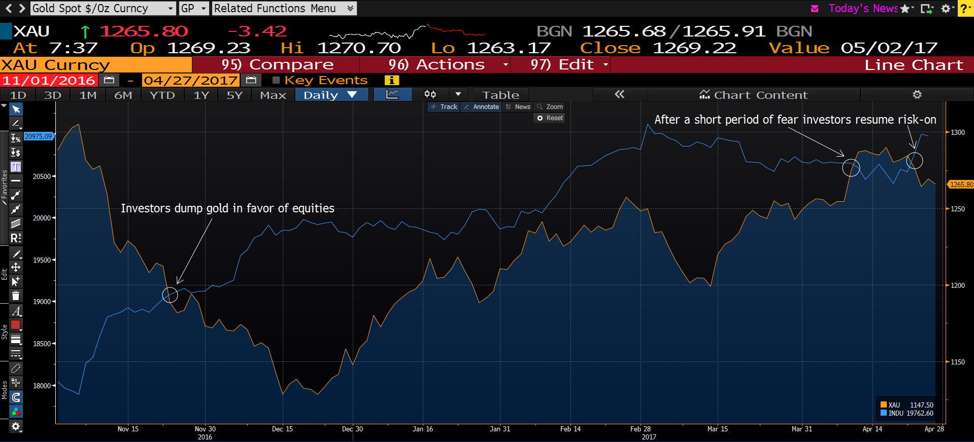
In the interest of brevity, we'll only discuss the post-election correlation of gold versus the Dow, above. Investors greedily and impulsively bought equities following the US election results, adding 10% to the Dow's value after November 8, 2016, even as they dumped gold, which lost 13.5% at the same time. Between the elections and mid-December there was a clear negative correlation.
However, while equities flattened between mid-December and mid-January 2017, gold recovered almost 8% during that time, showing marked indifference to the fact that equities were languishing.
During February, the pair “found each other” but in March they separated again—both times displaying correlations. However, while the correlation in March was negative, in February it turned positive. In other words there's no fixed correlation investors can truly rely on.
However, while gold crossed below equities post-election, after crossing back above them in mid-March to April 24 when equities rallied again, the yellow metal just crossed back below them again.

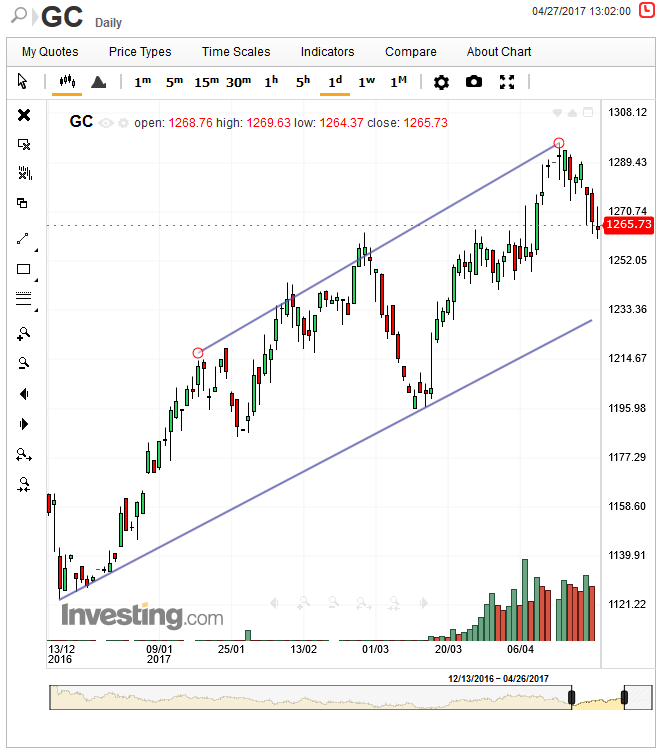
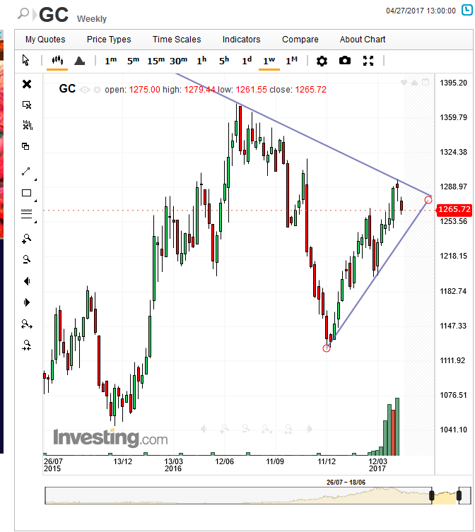
But when looking at the daily chart of gold, above, you might be tempted to say, 'wait a minute, gold is trading within a clear rising channel.' Our answer would be to refer you to the weekly chart, below:

While on the daily chart it seems the rising channel only appeared since mid-December, the weekly chart reveals a falling trendline going back to July. A senior trendline carries more weight than one that's junior. And additional confirmations of its resistance only increases its gravitas.
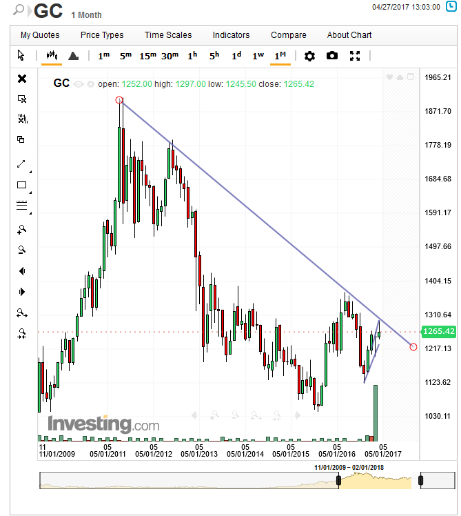
'Hold on,' you might then say, 'but what about the fact that gold overcame its 200-day moving average?' Our answer to that would be the monthly chart, below:

It shows that we’re actually talking about a falling trendline going back to 2011. Looking at this chart reveals that in truth, gold has been flat, on a long-term basis, since 2013, which means that in this case at least, moving averages may not be all that effective.
